|
|
| Line 183: |
Line 183: |
| | https://docs.google.com/spreadsheets/d/1IlT3Na8Ujlv9izY-0PWvCWEWzfqOmzq3jGHIbWCDiwk/edit?usp=sharing | | https://docs.google.com/spreadsheets/d/1IlT3Na8Ujlv9izY-0PWvCWEWzfqOmzq3jGHIbWCDiwk/edit?usp=sharing |
| | | | |
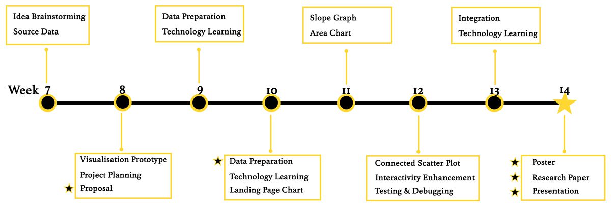
| − | [[File:ChargeMetrics_Timeline.jpg.png|1200px|center|ChargeMetrics_Timeline]] | + | [[File:ChargeMetrics_Timeline.jpg|1200px|center|ChargeMetrics_Timeline]] |
| | | | |
| | | | |
Revision as of 01:09, 15 October 2018
Motivation
Household electricity consumption in Singapore has increased by about 17% over the past decade, according to a report by the National Environment Agency in May 2018. On aggregate levels, Singapore households consumed 7,295 GWh (gigawatt hours) in 2017, which roughly translates to an average expenditure of $1,000 a year on electricity per household.
Electricity consumption is a national issue, especially given that Singapore has finite energy sources. It is therefore important to encourage households to consume electricity in more sustainable ways.
Traditionally, the lack of transparency surrounding electricity use has been acknowledged as a possible challenge in raising awareness on electricity consumption. Improving visualisation of household electricity consumption can help people in Singapore gain better clarity of their consumption habits and expenditure, and thus more incentive to reduce electricity usage.
Our project visualises the distribution of household electricity consumption across planning regions in Singapore, accounting for type of residential homes, income and demographic profiles. We aim to better communicate electricity consumption in everyday life to people in Singapore, and ultimately engage them to reduce electricity consumption.
Objectives
Data
| Datasets
|
Data Attributes
|
Rationale Of Usage
|
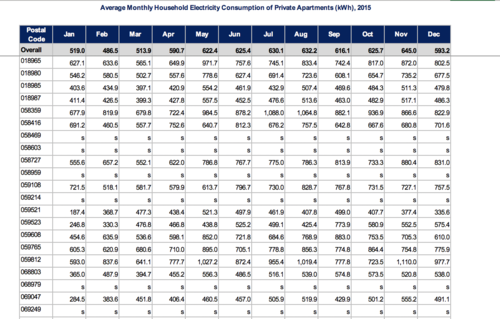
EMA Household Energy Consumption
Source: https://www.ema.gov.sg/Statistics.aspx
|
- Postal Code (2013-2016)
- Room Type
- Month
- Electricity Consumption
|
There are 2 group of dataset. 1. Household Energy consumption
|
Bus Stop Names and Locations
(https://www.mytransport.sg/content/mytransport/home/dataMall.html#)
|
- Bus Stop Number
- Bus Stop Roof Number
- Bus Stop Name
- X
- Y
- Latitude
- Longitude
|
This dataset aims to complement the main dataset by providing detailed information about the latitude and longitude of the bus stops located around HDB. We use a javascript geocoding script to convert all the X and Y coordinates to EPSG:4326 latitude and longitude coordinates.
|
Mrt Stations Names and Locations
(https://www.mytransport.sg/content/mytransport/home/dataMall.html#)
|
- MRT Station Number
- MRT Station Name
- X
- Y
- Latitude
- Longitude
|
This dataset aims to complement the main dataset by providing detailed information about the latitude and longitude of the MRT stations located around HDB. We use a javascript geocoding script to convert all the X and Y coordinates to EPSG:4326 latitude and longitude coordinates
|
Master Plan Subzone Boundary Names and GeoPolygon
(https://data.gov.sg/dataset/master-plan-2014-subzone-boundary-no-sea)
|
- Polygon
- Name
- Subzone Number
- Subzone Code
- Region Name
- Area Code
- Area Indicator
|
This dataset aims to complement the main dataset by providing detailed information about all the subzone in Singapore. We use a javascript library toGeoJson.js to help us convert .KML file to .GeoJson file
|
Related Works
The following related work
There are many charts and visualisations available which illustrates the various trends of house prices and index. We have selected a few of these to study and learn before we begin developing our own visualizations.
| Related Works
|
What We Can Learn
|
|
An Analysis of the trend and correlation between resale prices and flat production
Source: http://www.teoalida.com/singapore/hdbprices/
|
- The use of 2 different chart types with a secondary axis is effective in illustrating the correlation between resale prices and flat production.
- The colours used are striking and contrast well with each other.
- There are dips in both variables which are not explained in the infographic itself (E.g. 1997 Asian crisis, 2003 SARs outbreak). This events could be incorporated into the charts to make it more informative.
- However, major events are not shown in the chart itself. This makes it difficult for the audience to understand the various changes throughout the years. It would be much clearer if events were annotated directly on the charts.
|
| An interactive heatmap of Singapore’s house prices in various districts
Source: https://www.srx.com.sg/heat-map
|
- This heatmap uses colours appropriately so that the house prices of each district can be identified intuitively (Red means expensive, blue means cheap, orange means mid-range)
- The use of filters allows user to find out more about the price distribution of each house type easily.
- When user mouseover a district on the heatmap, the corresponding district on the legend is highlighted. This improves usability as users do not have to match district numbers manually.
- Even though the colours are intuitive, it could still be confusing as audience might still have to constantly refer back to the colour scale to interpret the colours. Colour intensity of a single colour could be used instead of to illustrate the difference in prices.
|
| An interactive visualization of house prices along MRT stations
Source: https://www.srx.com.sg/mrt-home-prices/property-listings-near-east-west-line
|
- This visualization makes use of unique ways to illustrate the relation between nearby facilities and house prices. Thus in a glance, a person can tell where are the expensive areas based on the MRT stations.
- The separating of the various MRT lines using filters at the top prevent too much information from being shown in one page
- However, this chart could be too high level and general. Illustrating this on the Singapore map would be more useful instead, where each house's proximity to the MRT station and their respective resale price is shown. Also, in order to drill down, you would have to navigate to another page and then search for a specific house based on a table view which does not help one visualize where the resale flat is actually located at.
|
| Four Ways to Slice Obama’s 2013 Budget Proposal
Source: http://www.nytimes.com/interactive/2012/02/13/us/politics/2013-budget-proposal-graphic.html
|
- This visualization makes use of unique ways to illustrate Obama's Budget Proposal
- The various circles denote the various types of proposed budget items and the circles are sized based on the proposed budget amount.
- Users can toggle the links to slice and dice the initial visualization into different views so that a user can get different insights from the same initial visualization.
- This chart is very interesting and it is something that we wanted to use to present the changes in resale prices based on different flat types. If we have the time, we could do different filters as well but for now, we will try doing it for flat-type.
|
| OneMap Visualization of resale flat prices
Source: https://www.onemap.sg/main/v2/propertyquery
|
- This is a screenshot of an implementation of a interactive map by OneMap which allows users to search for resale flats on the map and view information related to the selected flat easily.
- We found this very good as it was very informative if you only wanted to look at one flat.
- However, the map looks very ugly and out-dated in terms of style and coloring and this map does not allow one to easily do comparisons between flats.
|
Prototype
Project Schedules
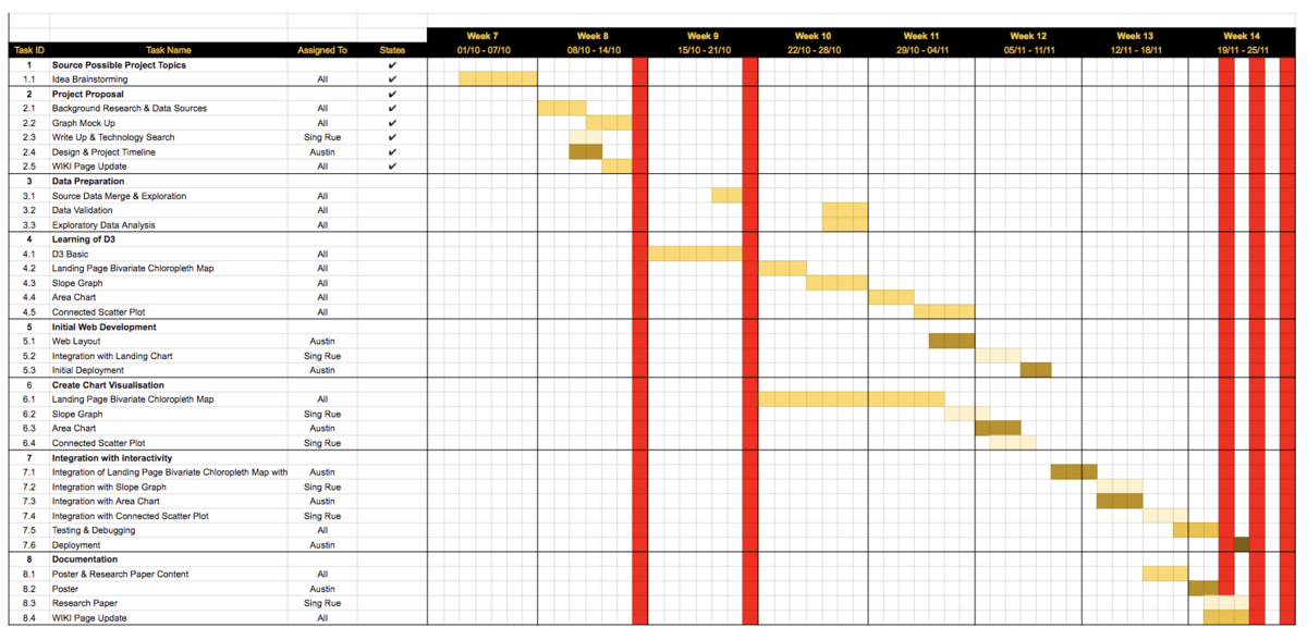
https://docs.google.com/spreadsheets/d/1IlT3Na8Ujlv9izY-0PWvCWEWzfqOmzq3jGHIbWCDiwk/edit?usp=sharing
Challenges
| Challenges
|
Possible Solutions
|
|
Unfamiliar with D3.js
|
- Independent learning through online learning resources
- Validating learning outcome through review and coding practices
|
Data Merge, Cleaning and Transformation
|
- Subzone energy usage data:
- Missing NA records: government have purposedly removed some data points to enforce the data privacy. We will be examine the effect of remove the NA and decide the appropriate action to take.
|
Choice of web hosting provider
|
- A quick production pipeline required due to the time limit
- Examine the requirement of the data visualisation: dynamic or statics
- Current solution is to use Github Page as a hosting provider there is no dynamic data retrieval required
|
Unfamilar with implementation efforts required for customized D3.js interactivity
|
- The week will be spending 2 weeks to familiarize with D3.js structure & syntax
- Follwing 2 weeks will be trying out the customized D3.js interactivity
- The project scope and plan will be re-examined based on the project objective, complexity and time available
|
References
[1] Energy Market Authority (https://www.ema.gov.sg/singapore_energy_statistics.aspx)
[2] Data Gov Database (https://data.gov.sg)
[3] D3.js (Documentation https://d3js.org/)
[4] Observalehq (https://beta.observablehq.com/)
[5] One Map (https://www.onemap.sg/main/v2/)
[6] Energy Consumption Predition Example (http://cs109-energy.github.io/building-energy-consumption-prediction.html)
Feedback
Please feel free leave your comments, suggestions or anything interesting :)


