Difference between revisions of "FoodScapers Proposal"
| Line 296: | Line 296: | ||
[https://docs.google.com/spreadsheets/d/12RFeLBXOvVz46y3DUP_SQvvO9sbPxyHJm6nFdWSSFdM/edit?usp=sharing Food Scrapers Project Timeline (Google Sheets)] | [https://docs.google.com/spreadsheets/d/12RFeLBXOvVz46y3DUP_SQvvO9sbPxyHJm6nFdWSSFdM/edit?usp=sharing Food Scrapers Project Timeline (Google Sheets)] | ||
| − | + | ||
==<div style="background: #ffbd4a; padding: 15px; line-height: 0.3em; text-indent: 15px; font-size:18px; font-family:Helvetica"><font color= #3c3c3c><b>Ideation Drafts</b></font></div>== | ==<div style="background: #ffbd4a; padding: 15px; line-height: 0.3em; text-indent: 15px; font-size:18px; font-family:Helvetica"><font color= #3c3c3c><b>Ideation Drafts</b></font></div>== | ||
| Line 306: | Line 306: | ||
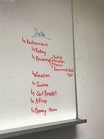
| '''Data of Essence to our visualization''': An attempt to select relevant variables from the data rich source that is yelp | | '''Data of Essence to our visualization''': An attempt to select relevant variables from the data rich source that is yelp | ||
|- | |- | ||
| − | | [[File:Data Discussion.jpg| | + | | [[File:Data Discussion.jpg|150px|center]] |
|- | |- | ||
|- | |- | ||
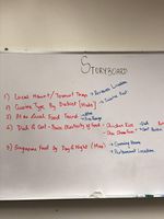
| '''Storyboard objectives''': An attempt to clarify and narrow our scope | | '''Storyboard objectives''': An attempt to clarify and narrow our scope | ||
|- | |- | ||
| − | | [[File:Storyboard Objectives.jpg| | + | | [[File:Storyboard Objectives.jpg|150px|center|storyboard objectives]] |
|} | |} | ||
| − | <br | + | <br> |
==<div style="background: #ffbd4a; padding: 15px; line-height: 0.3em; text-indent: 15px; font-size:18px; font-family:Helvetica"><font color= #3c3c3c><b>Challenges and Assumptions</b></font></div>== | ==<div style="background: #ffbd4a; padding: 15px; line-height: 0.3em; text-indent: 15px; font-size:18px; font-family:Helvetica"><font color= #3c3c3c><b>Challenges and Assumptions</b></font></div>== | ||
Revision as of 18:59, 27 October 2018
Contents
Problem and Motivation
Singapore is well-known for its diversity and fusion of food, with influences from the Chinese, Indians, Malays, to the French and even Italian. Interesting, this unique blend of authentic Singaporean food can only be found in Singapore. More often than not, restaurants in present-day Singapore can be seen serving fusion food inspired by Singapore’s diversity. Instead of having the differences divide the country, Singapore’s diversity serve as a spark to Singapore’s unique melting pot of food culture.
As the Singapore government seeks to place more emphasis on our food landscape as integral to our intangible heritage[1], it becomes all the more urgent that our policy-planners from the Ministry of Culture, Community and Youth (MCCY), National Heritage Board (NHB), and the Singapore Tourism Board (STB), fully understand the current gastronomical landscape of Singapore.
One way to do just that, would be through data.
Our data visualisation project hopes to provide planners with a cockpit view of the local food landscape, by mapping the distribution of the different cuisines in Singapore, to help identify ethnic food enclaves, trace the popularity trends of specific local foods in Singapore, as well as to understand how price elasticity of local food impacts it's economic accessibility and review ratings.
Objectives
This Data Visualisation project aims to provide policy makers with a dashboard that will allow planners to gain insights into the local food landscape.
With this dashboard, planners will be able to :
- Get an overview of the distribution of restaurant by cuisine type, and to discover ethnic food enclaves by filtering by cuisine type.
- Get a sense of how the local food landscape changes by the time of day. Users will be able to filter restaurants by opening hours.
- Understand the price elasticity of different local dishes. Users will be able to filter restaurants for a specific local dish, and see the price elasticity of this selection on a chart.
Related Works
| Visualizations | Explaination |
|---|---|
|
Source: http://shirleylei.com/projects/yelp.html |
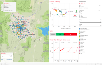
Shirley Lei's work on Yelp's Restaurant Data, uses Tableau as a visualisation platform to draw correlations between the neighbourhood the restaurant is in, the primary attributes of each restaurant (type of cuisine, outlet type, etc.), and the secondary attributes of each restaurant (WIFI and Child-friendly category tags). |
|
Source: https://blog.data.gov.sg/is-dirty-delicious-f176bbb6e15e |
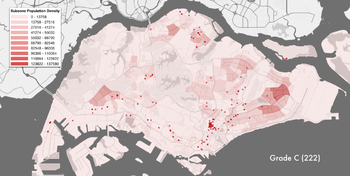
Lin Zhaowei & Gaille Teo's work on visualising cleanliness ratings of hawker stores, combines both Yelp's Restaurant Ratings Dataset, as well as NEA's cleanliness score dataset, to draw parallels between a store's cleanliness rating, and Yelp user review ratings. The results attempt to debunk a common misconception that 'dirtier' hawker stores are reviewed better.
|
|
Source: https://www.yelpblog.com/2018/08/pokes-journey-from-local-favorite-to-national-staple |
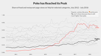
Carl Bialik is a Data Editor at Yelp. In this work, he uses data visualisations to tell a story of the rapid rise in popularity of Hawaiian Poke between 2013 and 2018. By visualising the rise of Hawaiian Poke over time, in relation to the popularity of other food categories allow users a better context of the American food landscape, one in which the Hawaiian poke is an outlier.
|
Datasets and Sources
We need a vast dataset that covers the various aspects of dining in Singapore, and for this reason, we have chosen the following data sources to obtain a rich dataset.
- Postal Codes - List of all possible postal codes where a restaurant/hawker centre could exist within Singapore. Retrieved from OneMap API:
- Possible Restaurants of Interest - List of all restaurants that exist on the yelp portal at the postal codes provided. Retrieved from Yelp API:
- Restaurant Details - Details posted on yelp for the restaurants of interest. Retrieved using a crawling and scraping script on the Yelp Website.
- Patron Reviews and Patron Details- Comments and reviews regarding the patrons' experience at the specific restaurant. Additionally, public details about the patron were obtained. Retrieved using a crawling and scraping script on the Yelp Website.
Below is the list of Table Header name, description and an example for each table.
1. Postal Codes: Retrieved in JSON format using the OneMap API. Only showing attributes used.
Source : http://developers.onemap.sg
| Name | Description | Example |
|---|---|---|
| Address | Full address of the Postal Code | "7 MAXWELL ROAD AMOY STREET FOOD CENTRE SINGAPORE 069111" |
| Coordinates | Latitude and Longitude of the Postal Code. |
           {
               "latitude": 1.28035,
               "longitude": 103.84472
           }
|
2. List of Restaurants at a postal code: Retrieved as a JSON Array. Only showing attributes used.
Source : https://api.yelp.com/v3/businesses/search?location=069120
| Name | Description | Example |
|---|---|---|
| id | Unique ID of the restaurant. | "fY1IkBnRft1KR0O2tqu7pg" |
| Name | Name of the restaurant. | "Tian Tian Hainanese Chicken Rice" |
| URL | URL of the of the restaurant's yelp page, used for web scraping. | https://www.yelp.com/biz/tian-tian-hainanese-chicken-rice-singapore-7 |
| Categories | Type of Restaurant Cuisine. | "Hainan" |
3. Restaurant Details: Retrieved using Python and returned in JSON format
Source : https://www.yelp.com/biz/din-tai-fung-singapore-5?osq=Din+Tai+Fung
| Name | Description | Example |
|---|---|---|
| Name | Name of the Restaurant | Din Tai Fung |
| Location | Address at which the restaurant is located |
Wisma Atria |
| Opening Hours | Opening Hours of the restaurant | 11:30 am - 10:00 pm |
| Cuisines - Menu | Cuisines offered by the restaurant | Taiwanese, Dim Sum |
| Expected Attire | Attire expected of patrons when visiting the restaurant | Casual |
| Price Range | Price Range of food offered by the restaurant | $$
later converted to a price bucket |
| Rating | Average Overall Ratings provided by the patrons | 4.5 stars |
| Reviews | Number of Reviews regarding the restaurant | 116 |
4. Patron Details and Reviews: Retrieved using Python and returned in JSON format
Source : https://www.yelp.com/biz/din-tai-fung-singapore-5?osq=Din+Tai+Fung
| Name | Description | Example |
|---|---|---|
| Name | Patron's Name | Bob B. |
| Location | Patron's Hometown | Houston, TX |
| Rating | Patron's rating awarded to the restaurant | 5 stars |
| Review | Patron's review of the restaurant |
The Best Dim Sum / steamed dumpling and noodle restaurant in the world. This restaurant is located in a hotel lobby. It is Hands down the best. Be prepared to wait because the lines are ... (truncated for brevity) |
Based on the retrieved data, we will do data cleaning and entity extraction in order to understand some of the dishes on the menu and their cost (if available).
Storyboard
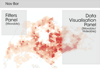
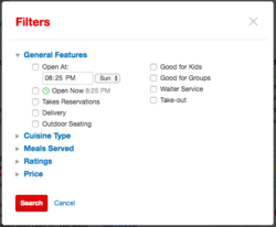
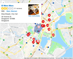
This dashboard will be designed according to the data visualisation task taxonomy as posited by Ben Shneiderman [2], which suggests that interactions should follow the flow to first provide an overview, then allow a zoom or filter and finally, provide details on demand. This flow will allow users with a more intuitive interaction with the dashboard.
The storyboard below displays an instance of how Shneiderman's task taxonomy is applied :
| Storyboard Step | Explaination |
|---|---|
|
200m Hexagon Aggregation |
|
|
Filter Panel |
|
|
Popup on Hover |
|
Tools/ Libraries
Data Preparation
- Python
- Postman
Data Visualisation
- R 3.5.1
- R Shiny
- Plotly
- dplyr (From the Tidyverse Package)
Project Timeline
The Project Timeline is live and constantly updated. You can view our progress in the link below :
Food Scrapers Project Timeline (Google Sheets)
Ideation Drafts
This section is updated based on meetings and the ideation process behind the visualization that will be our final output.
| Data of Essence to our visualization: An attempt to select relevant variables from the data rich source that is yelp |
| Storyboard objectives: An attempt to clarify and narrow our scope |
Challenges and Assumptions
The challenges we face include:
| No. | Challenges | Description | Proposed Solution |
|---|---|---|---|
| 1. | Data Cleaning and Transformation |
The data collected under the patrons' reviews is generally representative of the patrons own characteristics and often includes their cultural identity through fillers like lah, as well as spelling errors, that can make entity recognition difficult. |
Use of a dictionary and spell check tool to improve the quality of the data to ensure entity recognition is successfully applied |
| 2. | Information Presentation |
Determining the most effective way to visualise and display the data in an interactive format is of the essence. It is necessary that the most important information is easily discernible from the visualisations. |
Gain exposure to different visualisation techniques. |
The assumptions we made include:
- If data regarding a restaurant is not available on yelp, we assume that the restaurant is not popular i.e. not much footfall reaches the restaurant. Therefore the restaurant would not add much value to our visualisation.
References
[1] NHB. (n.d.). Hawker Culture. Retrieved October 14, 2018, from https://www.oursgheritage.sg/hawker-culture/
[2] Shneiderman, B. (2005) “The eyes have it: A task by data type taxonomy for information visualization” IEEE Conference on Visual Languages (VL96), pp. 336-343.
Comments
Please feel free to leave comments / suggestions!
| No. | Name | Date | Comments |
|---|---|---|---|
| 1. | Insert your name here | Insert date here | Insert comment here |
| 2. | Insert your name here | Insert date here | Insert comment here |
| 3. | Insert your name here | Insert date here | Insert comment here |
