Difference between revisions of "The Olympiad"
Sytian.2016 (talk | contribs) |
Sytian.2016 (talk | contribs) |
||
| (22 intermediate revisions by the same user not shown) | |||
| Line 1: | Line 1: | ||
[[File:The Olympiad.png|center|550px]] | [[File:The Olympiad.png|center|550px]] | ||
| − | <!-- Header Start--> | + | <!--Sub Header Start--> |
| − | {| style="background-color: | + | {| style="background-color:white; color:white padding: 5px 0 0 0;" width="100%" height=50px cellspacing="0" cellpadding="0" valign="top" border="0" | |
| − | | style="vertical-align:top;width:16% | + | | style="vertical-align:top;width:16%;" | <div style="padding: 3px; font-weight: bold; text-align:center; line-height: wrap_content; font-size:16px; border-bottom:1px solid #3D9DD7; border-top:1px solid #3D9DD7; font-family:helvetica"> [[The Olympiad| <b>Proposal</b>]] |
| − | | style="vertical-align:top;width:16%;" | <div style="padding: 3px; font-weight: bold; text-align:center; line-height: wrap_content; font-size:16px; font-family: | + | | style="vertical-align:top;width:16%;" | <div style="padding: 3px; font-weight: bold; text-align:center; line-height: wrap_content; font-size:16px; border-bottom:1px solid #3D9DD7; border-top:1px solid #3D9DD7; font-family:helvetica"> [[The Olympiad: Poster| <b>Poster</b>]] |
| − | | style="vertical-align:top;width:16%;" | <div style="padding: 3px; font-weight: bold; text-align:center; line-height: wrap_content; font-size:16px; font-family: | + | | style="vertical-align:top;width:16%;" | <div style="padding: 3px; font-weight: bold; text-align:center; line-height: wrap_content; font-size:16px; border-bottom:1px solid #3D9DD7; border-top:1px solid #3D9DD7; font-family:helvetica"> [[The Olympiad: Application | <b>Application</b>]] |
| − | | style="vertical-align:top;width:16%;" | <div style="padding: 3px; font-weight: bold; text-align:center; line-height: wrap_content; font-size:16px; font-family: | + | | style="vertical-align:top;width:16%;" | <div style="padding: 3px; font-weight: bold; text-align:center; line-height: wrap_content; font-size:16px; border-bottom:1px solid #3D9DD7; border-top:1px solid #3D9DD7; font-family:helvetica"> [[The Olympiad: Research Paper | <b>Research Paper</b>]] |
| − | | style="vertical-align:top;width:16%;" | <div style="padding: 3px; font-weight: bold; text-align:center; line-height: wrap_content; font-size:16px; font-family: | + | | style="vertical-align:top;width:16%;" | <div style="padding: 3px; font-weight: bold; text-align:center; line-height: wrap_content; font-size:16px; border-bottom:1px solid #3D9DD7; border-top:1px solid #3D9DD7; font-family:helvetica"> [[The Olympiad: Team | <b>Team</b>]] |
|} | |} | ||
| + | <!--Sub Header End--> | ||
| + | <br> | ||
| − | + | ==Introduction== | |
<p>The Olympic Games can be traced back to 776BC and were dedicated to the gods of Olympia. Today, the Olympic Games has become the world’s largest sports competition, with more than 200 nations participating every four years. The Olympic Games provide an international platform for sportsmen from all walks of life and origins to display their skills and be rewarded for their persistence and dedication to the sport. All athletes participating in the Olympics stand a chance to attain national and possibly, international fame. </p> | <p>The Olympic Games can be traced back to 776BC and were dedicated to the gods of Olympia. Today, the Olympic Games has become the world’s largest sports competition, with more than 200 nations participating every four years. The Olympic Games provide an international platform for sportsmen from all walks of life and origins to display their skills and be rewarded for their persistence and dedication to the sport. All athletes participating in the Olympics stand a chance to attain national and possibly, international fame. </p> | ||
| − | + | ==Problem== | |
| − | <p>The Olympic Games prides itself on the culture of excellence, competition and fairness. However, during its history, the formation of Olympic Dynasties have become a common occurrence – whereby certain sport events are consistently dominated by a particular country or continent. Nevertheless, many are still unaware of the severity of this issue. The current state of the Summer Olympics largely represents a monopoly, with Olympic Dynasties in total control. All of which leads to a fundamental question – is it still a competition if the Summer | + | <p>The Olympic Games prides itself on the culture of excellence, competition and fairness. However, during its history, the formation of Olympic Dynasties have become a common occurrence – whereby certain sport events are consistently dominated by a particular country or continent. Nevertheless, many are still unaware of the severity of this issue. The current state of the Summer Olympics largely represents a monopoly, with Olympic Dynasties in total control. All of which leads to a fundamental question – is it still a competition if the Summer Olympics are mostly a one-team race? |
<br> | <br> | ||
<br> | <br> | ||
Meanwhile, every four years, different countries are given the opportunity to host this quadrennial event. In the sporting world, the phenomenon of Home Ground Advantage exists due to various reasons, eg. influence of home crowd or familiarity of playing environment. However, in the Summer Olympics, it is a tradition for host countries to be granted automatic qualification. Once again, this contradicts the fundamental values of the Olympic Games – is it fair for the host country to be given this privilege? | Meanwhile, every four years, different countries are given the opportunity to host this quadrennial event. In the sporting world, the phenomenon of Home Ground Advantage exists due to various reasons, eg. influence of home crowd or familiarity of playing environment. However, in the Summer Olympics, it is a tradition for host countries to be granted automatic qualification. Once again, this contradicts the fundamental values of the Olympic Games – is it fair for the host country to be given this privilege? | ||
| + | </p> | ||
| + | |||
| + | ==Motivation & Objectives== | ||
| + | On the surface, the Olympic Games exudes the spirit of competition and equality. However, the issue of Olympic Dynasties and Home Ground Advantage is very much prevalent in this prestigious event. Yet, many are still unaware about the severity of these issues. As such, the goal of this project is to provide drilled-down visual analyses that '''educate the public''' about the following: | ||
<br> | <br> | ||
<br> | <br> | ||
| − | |||
| − | |||
| − | |||
| − | |||
| − | |||
# Severity of Dominance of Continents in various sports | # Severity of Dominance of Continents in various sports | ||
# Severity of Dominance of Countries in various sports | # Severity of Dominance of Countries in various sports | ||
# Severity of Bias for the Host Country | # Severity of Bias for the Host Country | ||
| + | <br> | ||
| + | To appeal to the average reader, the team adopted the style of '''data journalism''', whereby visualisations are presented in the form of a news article. Ultimately, this project seeks to assist the public to understand the Summer Olympics as it truly is – inclusive of all possible dominance and bias, via an engaging and interactive reading experience. | ||
| − | + | ==Dataset and References== | |
{| class="wikitable" width="100%" | {| class="wikitable" width="100%" | ||
| Line 141: | Line 144: | ||
|} | |} | ||
| − | + | ==Background Survey of Related Works== | |
{| class="wikitable" width="100%" | {| class="wikitable" width="100%" | ||
| Line 247: | Line 250: | ||
|} | |} | ||
| − | + | ==Proposed Storyboard== | |
| − | + | {| class="wikitable" | |
| + | |- | ||
| + | ! style="font-weight: bold;background: #1d1d1d;color:#ffffff;width: 20%;" | Visualisation Element | ||
| + | ! style="font-weight: bold;background: #1d1d1d;color:#ffffff;width: 40%" | Rationale | ||
| + | |- | ||
| + | | <center>'''Data Journalism''' <br> | ||
| + | [[File:Data_journalism.png|450px|frameless|center]] | ||
| + | </center> | ||
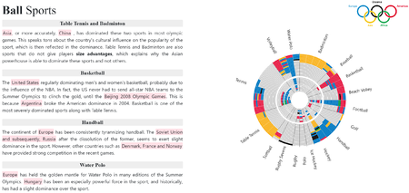
| + | || <center>To appeal to the average reader, the team adopted the role of a journalist, and presented the visualisation in the form of a news article. A sample of the data journalism article is shown below. Users can read the insights of author and view the appropriate visualisation simultaneously.</center> | ||
| + | |- | ||
| + | | <center>'''Sunburst Diagram''' <br> | ||
| + | [[File:Sunburst diagram.png|450px|frameless|center]] | ||
| + | </center> | ||
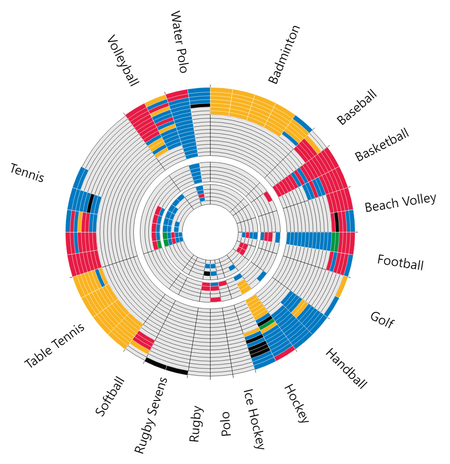
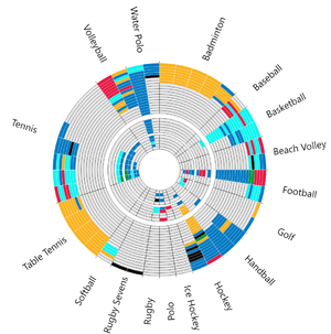
| + | || <center>The goal of the sunburst diagram is to visualise dominance by continents and countries. We decided to use a sunburst to tackle the issue of showing a large number of sports at once. This was crucial, because other alternatives would require the user to toggle between sports often. The action of toggling is extremely disruptive to the reading process. | ||
| + | <br> | ||
| + | <br> | ||
| + | A traditional sunburst diagram is a multilevel pie chart used to display the proportion of various categories at every hierarchical level. In this case, each level of the sunburst diagram represents an Olympic Event. Thus, each individual arc is separated from the next arc by a time period of 4 years, due to the quadrennial nature of the Summer Olympic Games. The sunburst diagram is then segmented by various sports. Due to the large number of sporting events, five sunburst charts had to be generated, with each diagram adhering to a specific theme. | ||
| + | <br> | ||
| + | <br> | ||
| + | [[File:Legend.png|frameless]] | ||
| + | <br> | ||
| + | Each sub-unit in the sport category represents a gold medal that is won by a participant. The sub-units are coloured according to the continent that the participant belongs to. The legend above details the colours that were used to represent each continent. Thus, by observing the number of sub-units of a particular colour across multiple iterations of the Olympic Games, the reader is able to assess whether the continent has been relatively dominant in the sport. | ||
| + | <br> | ||
| + | <br> | ||
| + | [[File:4-tooltip.png|frameless|center]] | ||
| + | <br> | ||
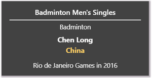
| + | Tooltips were also included for each sub-unit, displaying relevant information such as the name of the participant, the country that won the gold medal and the sporting event, the sport discipline. | ||
| + | <br> | ||
| + | <br> | ||
| + | To allow the user to focus on particular countries as he or she reads the web article and visualisation, we incorporated the use of interactive text. An excerpt of text from the visual guide included in the article is shown below. | ||
| + | <br> | ||
| + | <br> | ||
| + | [[File:Hover-text.png|frameless]] | ||
| + | <br> | ||
| + | <br> | ||
| + | [[File:Highlighted chart.png|frameless]] | ||
| + | <br> | ||
| + | Upon hovering across the interactive text, the relevant sub-units in the appropriate sunburst chart will be highlighted as shown below. This allows the reader to easily follow the flow of the article, while interacting with the chart. By including such interactivity, we are able to communicate insights about dominance at the country level. | ||
| + | </center> | ||
| + | |- | ||
| + | | <center>'''Time-Series Line Chart''' <br> | ||
| + | [[File:Line chart host bias.png|450px|frameless]] | ||
| + | </center> | ||
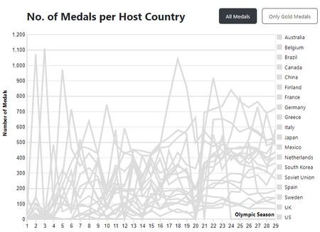
| + | || <center>A time series is a series of data points indexed in a timely order. A time-series line graph displays these data points via connecting them together through a line. As the history of Summer Olympics include results across every 4 years, a time-series line graph would be ideal to provide an overview of how results have changed over time. | ||
| + | <br> | ||
| + | <br> | ||
| + | In this case, we will utilize this element to visualise the magnitude of Home Ground Advantage. Since countries host the Summer Olympics on different occasions, any pattern or trend with respect to the year in which the country hosted in would be clearly displayed. As the Olympic Games were cancelled during World War I and II, the Olympic Season is displayed as the x-axis instead to ensure the generation of continuous lines. | ||
| + | <br> | ||
| + | <br> | ||
| + | [[File:Highlighted line.png|frameless|center]] | ||
| + | <br> | ||
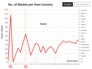
| + | Next, upon hovering over the country, the line corresponding to the hover will be highlighted, along with the cities and years in which the country hosted the Olympic Games in. This allows the user to immediately identify any trends with respect to host country bias. | ||
| + | Lastly, users are also able to select between all medals or only gold medals. As the degree of difficulty to attain each medal type differs, i.e. Bronze, Silver and Gold, the number of medals won could differ significantly as well. As such, this option allows for further analysis and comparison between each medal tier. | ||
| + | |- | ||
| + | | <center>'''Scatter Plot''' <br> | ||
| + | [[File:Scatter plot.png|450px|frameless]] | ||
| + | </center> | ||
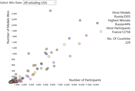
| + | || <center>Via this scatter plot, we can observe the relationship between number of participants sent by a country and the number of medals won. | ||
| + | <br> | ||
| + | Secondly, the scatter plot allows viewer to identify the truly dominating countries, i.e. dots will appear as an outlier above the trend line. | ||
| + | <br> | ||
| + | <br> | ||
| + | Included in the win rate drop down selection are bins of win rates for further exploration. Additionally, a graph without the USA is included to show a better distribution of win rates in the array of countries. Hovering over the legend will also reveal the respective country on the plot in that category. | ||
| + | |} | ||
| + | |||
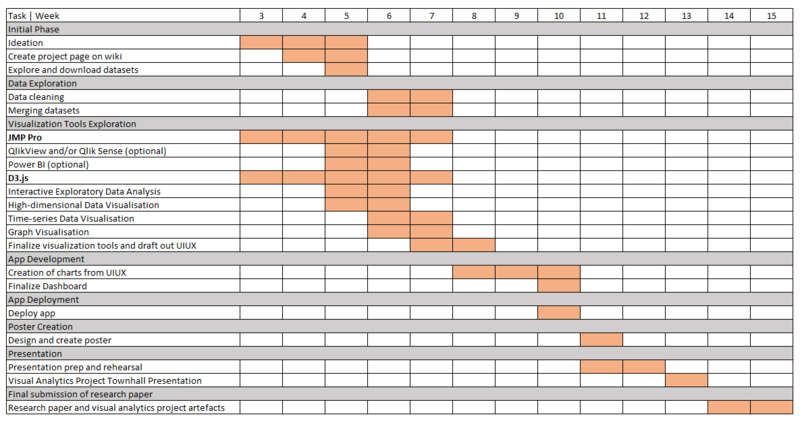
| + | ==Project Timeline== | ||
[[File:Project Timeline.png|800px|frameless|center]] | [[File:Project Timeline.png|800px|frameless|center]] | ||
| + | |||
| + | ==Comments== | ||
Latest revision as of 17:48, 23 November 2018
Contents
Introduction
The Olympic Games can be traced back to 776BC and were dedicated to the gods of Olympia. Today, the Olympic Games has become the world’s largest sports competition, with more than 200 nations participating every four years. The Olympic Games provide an international platform for sportsmen from all walks of life and origins to display their skills and be rewarded for their persistence and dedication to the sport. All athletes participating in the Olympics stand a chance to attain national and possibly, international fame.
Problem
The Olympic Games prides itself on the culture of excellence, competition and fairness. However, during its history, the formation of Olympic Dynasties have become a common occurrence – whereby certain sport events are consistently dominated by a particular country or continent. Nevertheless, many are still unaware of the severity of this issue. The current state of the Summer Olympics largely represents a monopoly, with Olympic Dynasties in total control. All of which leads to a fundamental question – is it still a competition if the Summer Olympics are mostly a one-team race?
Meanwhile, every four years, different countries are given the opportunity to host this quadrennial event. In the sporting world, the phenomenon of Home Ground Advantage exists due to various reasons, eg. influence of home crowd or familiarity of playing environment. However, in the Summer Olympics, it is a tradition for host countries to be granted automatic qualification. Once again, this contradicts the fundamental values of the Olympic Games – is it fair for the host country to be given this privilege?
Motivation & Objectives
On the surface, the Olympic Games exudes the spirit of competition and equality. However, the issue of Olympic Dynasties and Home Ground Advantage is very much prevalent in this prestigious event. Yet, many are still unaware about the severity of these issues. As such, the goal of this project is to provide drilled-down visual analyses that educate the public about the following:
- Severity of Dominance of Continents in various sports
- Severity of Dominance of Countries in various sports
- Severity of Bias for the Host Country
To appeal to the average reader, the team adopted the style of data journalism, whereby visualisations are presented in the form of a news article. Ultimately, this project seeks to assist the public to understand the Summer Olympics as it truly is – inclusive of all possible dominance and bias, via an engaging and interactive reading experience.
Dataset and References
| Athletes and Results | |||||||||||||||||||||||||||||||||||||||||||||
|---|---|---|---|---|---|---|---|---|---|---|---|---|---|---|---|---|---|---|---|---|---|---|---|---|---|---|---|---|---|---|---|---|---|---|---|---|---|---|---|---|---|---|---|---|---|
| Medal results, and basic biological data of participants of the Athens 1896 to Rio 2016 Games. | Source | |||||||||||||||||||||||||||||||||||||||||||||
|
| NOC Code and Country | ||||||||||||
|---|---|---|---|---|---|---|---|---|---|---|---|---|
| National Olympic Committee 3 letter code for each country | Source | ||||||||||||
|
| World Countries and Continents Details | |||||||||
|---|---|---|---|---|---|---|---|---|---|
| World countries with their corresponding continents , official english names, official french names, Dial,ITU,Languages and so on. | Source | |||||||||
|
| Host Countries for Past Olympic Seasons | ||||||||||||
|---|---|---|---|---|---|---|---|---|---|---|---|---|
| Olympic seasons along with data on the world countries which hosted it, the year and the city it was held in | Source | ||||||||||||
|
Background Survey of Related Works
| Winter Olympics 2018: Which Country Leads in the Medal Count? |
|---|
| Description |
| The best country in the Olympics is a subjective statement, and often depends on how one counts the worth of a medal. A gold medal could be worth 200 silver medals or could be equal in terms of value. In this visualisation by Josh Katz, the countries are ranked by ingenious use of interactivity – as the reader hovers over the charts, the worth of the medals change, and the rankings of the countries are dynamically updated. |
| Learning Points |
| During our search of Olympic Dynasties, it is important to realise that the rankings of countries are subjective, and therefore, the definition of dominance is subjective. Using advanced methods of interaction, we can cater to various definitions of dominance by varying the inclusion or exclusion of silver and bronze medals. |
| Source |
| https://www.nytimes.com/interactive/2018/02/14/upshot/which-country-leads-in-the-olympic-medal-count.html |
| Chicago’s Murder Problem |
|---|
| Description |
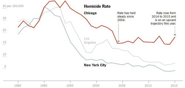
| This time-series shows the severity of Chicago's murder issues, and compares it with two other states, New York City and Los Angeles. |
| Learning Points |
|
| Source |
| https://www.nytimes.com/interactive/2016/05/18/us/chicago-murder-problem.html |
| Olympic Feathers |
|---|
| Description |
| More than 5000 Olympic events have had a winner in the Summer Olympics since the first games of 1896. In Olympic Feathers you can investigate how each of these medals has been won in the 56 different sporting disciplines that have competed at the games, of which 41 are still held at Rio 2016. |
| Learning Points |
|
| Source |
| https://www.visualcinnamon.com/portfolio/olympic-feathers |
| Russia's surprise meteor and Earth's craters |
|---|
| Description |
| This map uses proportional symbols to represent the largest known craters to have marked our Earth. The legend shows two sizes that are representative of symbol sizes on the map. The largest crater is 99.4 miles in diameter (in South Africa) and, appropriately, the largest symbol size used in the legend represents a crater with a 99-mile diameter. The smaller symbol in the legend represents a 20-mile diameter, and although there are craters with smaller diameters on the map, it is easier to visually see the differences with smaller symbol sizes. The earth is marked with about 180 named craters that are scars from previous run-ins with asteroids like the one that exploded over Russia recently. This map was designed to be interactive, as the map user can hover over the symbols and see the particular size, place and age of the craters. |
| Learning Points |
|
| Source |
| http://www.washingtonpost.com/wp-srv/special/world/russia-meteor/index.html |
| Predicting the Next Bear Market in Six Charts |
|---|
| Description |
| This is an e-article by The Wall Street Journal that incorporates journalism and news-reporting with visualisations, providing the reader a data-driven view, while providing a standard text-based reporting style. |
| Learning Points |
|
| Source |
| https://www.wsj.com/graphics/bear-market-signs/?ns=prod/accounts-wsj
Note: Wall Street Journal account is required |


