Difference between revisions of "IS428 AY2018-19T1 Kung Jung-wen"
Jwkung.2015 (talk | contribs) |
Jwkung.2015 (talk | contribs) |
||
| (18 intermediate revisions by the same user not shown) | |||
| Line 1: | Line 1: | ||
== Problem & Motivation == | == Problem & Motivation == | ||
| + | |||
| + | Air pollution is a huge concern in Bulgaria with its PM2.5 and PM10 concentrations constantly breaching the EU and the World Health Organization (WHO) standards, this imposes major health concerns to the country, as polluted air increases the risk of heart disease, lung cancer, respiratory diseases and stroke. | ||
| + | |||
| + | This visualization aims to focus on analysing the air quality in Sofia City by using the data provided from the official air quality measurements (EEA) and citizen science air quality measurements (AirTube), as well as finding the relationship between air quality and weather data. | ||
== Dataset Transformation Process == | == Dataset Transformation Process == | ||
| Line 12: | Line 16: | ||
2. All the CSV files provided contains the air quality station identifiers, air pollution measurement, time period of measurement and other links. To obtain the geographic location of each air station, we then merged the data with metadata using left merge in Python to obtain mainly the longitude and latitude points of each station. | 2. All the CSV files provided contains the air quality station identifiers, air pollution measurement, time period of measurement and other links. To obtain the geographic location of each air station, we then merged the data with metadata using left merge in Python to obtain mainly the longitude and latitude points of each station. | ||
| − | 3. The date variables need to be standardised and cleaned up in a format that is readable in Tableau. | + | 3. The date variables need to be standardised and cleaned up in a format that is readable in Tableau. The date variable is changed to a format that tableau can read. The current DatetimeBegin and DatetimeEnd variables contain time in milliseconds, as the data will only be analysed on either an hourly or daily level, the date is transformed to include the date and hour of the measurement time in Python. |
| − | |||
[[File:EEA date transform.jpg|600px|center|EEA date transform.jpg]] | [[File:EEA date transform.jpg|600px|center|EEA date transform.jpg]] | ||
| − | '''Working with Air Tube | + | '''Working with Air Tube Datan in R:''' |
| − | 1. Merge both of the Air Tube files - data_bg_2017 and data_bg_2018 into a data frame in R | + | 1. Merge both of the Air Tube files - data_bg_2017 and data_bg_2018 into a data frame in R studio. |
| − | 2. Convert the geocode into Longitude and Latitude in R using Geohash Package | + | 2. Convert the geocode into Longitude and Latitude in R using the Geohash Package. |
| − | 3. Lastly, transform the date into a readable format in Tableau using Lubridate Package and export the Data Frame as a CSV file | + | 3. Lastly, transform the date into a readable format in Tableau using Lubridate Package and export the Data Frame as a CSV file. |
[[File:Working with airtube 2.jpg|600px|frameless|center]] | [[File:Working with airtube 2.jpg|600px|frameless|center]] | ||
| Line 41: | Line 44: | ||
# Extremely poor daily PM10 Concentration in December and January: from Daily PM10 Concentration Chart, most of the peaks are around December and January period and the PM10 level can reach as high as 400+ range. | # Extremely poor daily PM10 Concentration in December and January: from Daily PM10 Concentration Chart, most of the peaks are around December and January period and the PM10 level can reach as high as 400+ range. | ||
# Poor monthly average PM10 concentration in 2014 and 2016: The two peaks shown in the Monthly Avg PM10 Concentration Chart, are December 2014 and January 2016 which is consistent with the findings above. | # Poor monthly average PM10 concentration in 2014 and 2016: The two peaks shown in the Monthly Avg PM10 Concentration Chart, are December 2014 and January 2016 which is consistent with the findings above. | ||
| − | # No improvement in monthly PM10 concentration for January and November: as it was found that the air quality had an overall improvement in 2018, however it seems that the average monthly PM10 level in January and November is on the rise. We cannot make this conclusion about improved air quality in 2018 November and December as the data is not available yet. However, it seems that the main activity that causes | + | # No improvement in monthly PM10 concentration for January and November: as it was found that the air quality had an overall improvement in 2018, however it seems that the average monthly PM10 level in January and November is on the rise. We cannot make this conclusion about improved air quality in 2018 November and December as the data is not available yet. However, it seems that the main activity that causes poor air quality is being shifted to November. |
'''What does a typical day look like for Sofia city? ''' | '''What does a typical day look like for Sofia city? ''' | ||
| + | |||
[[File:Day in Sofia.png|700px|center]] | [[File:Day in Sofia.png|700px|center]] | ||
| + | |||
| + | The shading and label of the average hourly PM10 is based on the PM10 air quality categories provided by Ambient Air Quality NEPM, allowing us to have a clearer comparison of the air quality. | ||
| + | |||
The graph above shows the average hourly PM10 concertation from the air quality stations within the Sofia City for the year 2017 and 2018. Data in 2016 and before are excluded as they are incomplete, where as 2017 data includes the November and December hourly data that complements with 2018’s hourly data from January to September. | The graph above shows the average hourly PM10 concertation from the air quality stations within the Sofia City for the year 2017 and 2018. Data in 2016 and before are excluded as they are incomplete, where as 2017 data includes the November and December hourly data that complements with 2018’s hourly data from January to September. | ||
# Hours with worst air quality for 2017 and 2018: In a typical day in Sofia City, 12 am -1 am, 7am to 8am and 7pm and 12 pm have the higher concentration of PM 10 level. Generally the PM10 yearly concentration by hour is within the acceptable range. | # Hours with worst air quality for 2017 and 2018: In a typical day in Sofia City, 12 am -1 am, 7am to 8am and 7pm and 12 pm have the higher concentration of PM 10 level. Generally the PM10 yearly concentration by hour is within the acceptable range. | ||
| Line 78: | Line 85: | ||
| − | '''Can you detect any unexpected | + | '''Can you detect any unexpected behaviours of the sensors through analyzing the readings they capture? ''' |
| − | [[File:Q2 detect anomaly 1.png| | + | [[File:Q2 detect anomaly 1.png|900px|frameless|center]] |
By plotting the average P1 and P2 measurements for each sensor by month in Tableau, we can identify anomaly measurements. This particular sensor measured an average of P1 2000 ug/m3 and P2 1000 ug/m3 for the month of June. There are about 7 sensors that have abnormal measurements based on the chart above. | By plotting the average P1 and P2 measurements for each sensor by month in Tableau, we can identify anomaly measurements. This particular sensor measured an average of P1 2000 ug/m3 and P2 1000 ug/m3 for the month of June. There are about 7 sensors that have abnormal measurements based on the chart above. | ||
'''Which part of the city shows relatively higher readings than others?''' | '''Which part of the city shows relatively higher readings than others?''' | ||
| − | [[File:2 c time difference.png| | + | [[File:2 c time difference.png|900px|frameless|center]] |
#By highlighting the top monthly concentration observations from the Monthly Average Concentration chart, we can see that most of these sensors are located at the central region of Sofia city. | #By highlighting the top monthly concentration observations from the Monthly Average Concentration chart, we can see that most of these sensors are located at the central region of Sofia city. | ||
| − | #The difference is indeed time dependent, from the average P2 concentration by month and hour chart, those sensors that have higher monthly average concentration readings captured higher level of P2 concentration in April, July and Aug. Where as in dashboard with all sensors selected, only January, November and December have poor air quality scores. | + | #The difference is indeed time-dependent, from the average P2 concentration by month and hour chart, those sensors that have higher monthly average concentration readings captured the higher level of P2 concentration in April, July and Aug. Where as in dashboard with all sensors selected, only January, November and December have poor air quality scores. |
| − | #The month of April has | + | #The month of April has significantly higher hazardous hourly P2 reading of 220+ ug/m3 at around 12 pm to 2 pm compared the right dashboard which shows around P2 reading of 6-7+ ug/m3 at the same period. The maximum hourly average P2 (226 ug/m3) from the right dashboard is 4 times higher than the maximum hourly average P2 (57 ug/m3) from the left dashboard. |
| + | |||
| + | === Q3: Factors Affecting Air Quality in Sofia === | ||
| + | |||
| + | 1. Meteorology Factors | ||
| + | [[File:Meteo 5.png|700px|center]] | ||
| − | + | By plotting PM 10, P1 and P2 pollutant concentration against the meteorology measures, there is a clear negative correlation between pollutant concentration between average temperature, dew point temperature, precipitation and visibility. While the rest of the meteorology factors does not seem to have a clear correlation with the pollutant concentration. | |
| − | |||
| − | |||
| − | + | Factors that are strongly correlated to the air pollution level in Sofia: | |
| + | #Average Temperature: higher average temperature in a day is linked to lower air pollution as observed from the chart. | ||
| + | #Dew point temperature: dew point is the temperature which air is saturated with water vapour, the factor is closely linked to humidity as well. With higher dew point temperature, the air pollution appears to be at its lower from the chart. | ||
| + | #Precipitation: precipitation refer to rain fall, raining cleans out the sky by removing the air particles. | ||
| + | #Visibility: visibility is clearly a factor that is highly correlated with bad air quality, with higher concentration of air particles, the visibility of the city should be low which corresponds to the observation from the chart. | ||
| − | + | The dashboard can be accessed here: https://public.tableau.com/profile/sofiakung#!/vizhome/SofiaAirQuality/AirQualityinSofia | |
=== References === | === References === | ||
# https://www.epa.vic.gov.au/your-environment/air/air-pollution/pm10-particles-in-air | # https://www.epa.vic.gov.au/your-environment/air/air-pollution/pm10-particles-in-air | ||
Latest revision as of 00:58, 20 November 2018
Contents
Problem & Motivation
Air pollution is a huge concern in Bulgaria with its PM2.5 and PM10 concentrations constantly breaching the EU and the World Health Organization (WHO) standards, this imposes major health concerns to the country, as polluted air increases the risk of heart disease, lung cancer, respiratory diseases and stroke.
This visualization aims to focus on analysing the air quality in Sofia City by using the data provided from the official air quality measurements (EEA) and citizen science air quality measurements (AirTube), as well as finding the relationship between air quality and weather data.
Dataset Transformation Process
Before starting with the analysis in Tableau, each feature within the data set is being analysed to better understand the context of the problem and to ensure that the data transformation process is performed accurately.
Working with EEA Data:
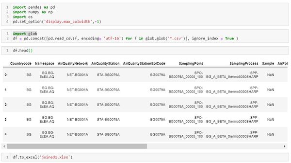
1. Merge all the EEA air quality data: As there are 28 csv files being provided from the data source, we first combining all the data within python.
2. All the CSV files provided contains the air quality station identifiers, air pollution measurement, time period of measurement and other links. To obtain the geographic location of each air station, we then merged the data with metadata using left merge in Python to obtain mainly the longitude and latitude points of each station.
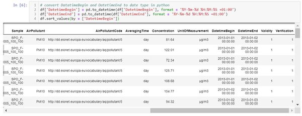
3. The date variables need to be standardised and cleaned up in a format that is readable in Tableau. The date variable is changed to a format that tableau can read. The current DatetimeBegin and DatetimeEnd variables contain time in milliseconds, as the data will only be analysed on either an hourly or daily level, the date is transformed to include the date and hour of the measurement time in Python.
Working with Air Tube Datan in R:
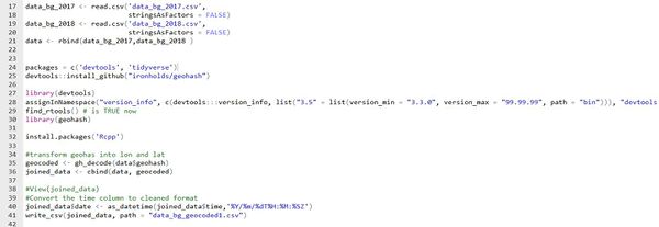
1. Merge both of the Air Tube files - data_bg_2017 and data_bg_2018 into a data frame in R studio.
2. Convert the geocode into Longitude and Latitude in R using the Geohash Package.
3. Lastly, transform the date into a readable format in Tableau using Lubridate Package and export the Data Frame as a CSV file.
Interesting & Anomalous Observations
Using the dashboard as a platform for investigation and analysis, the following aims to provide answers to the questions posed.
Q1: Spatio-temporal Analysis of Official Air Quality
Characteristic of the past and most recent situation with respect to air quality measures in Sofia City
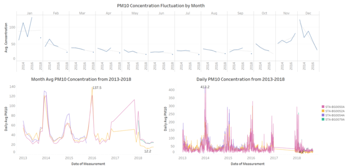
- The overall trend of slight improvement in air quality: Sofia City’s PM10 level is on the fall, air quality is becoming better over the years with lower peaks in 2015 onwards compared to 2014. The PM10 level reached a new minimum level in 2018 with a PM 10 concentration of 12.2.
- Overall improvement in air quality in 2018: from the chart showing the PM10 Concentration Fluctuation by Month, every month in 2018 has the lowest PM10 concentration compared to previous years.
Anomaly pattern in PM10 Concentration
- Extremely poor daily PM10 Concentration in December and January: from Daily PM10 Concentration Chart, most of the peaks are around December and January period and the PM10 level can reach as high as 400+ range.
- Poor monthly average PM10 concentration in 2014 and 2016: The two peaks shown in the Monthly Avg PM10 Concentration Chart, are December 2014 and January 2016 which is consistent with the findings above.
- No improvement in monthly PM10 concentration for January and November: as it was found that the air quality had an overall improvement in 2018, however it seems that the average monthly PM10 level in January and November is on the rise. We cannot make this conclusion about improved air quality in 2018 November and December as the data is not available yet. However, it seems that the main activity that causes poor air quality is being shifted to November.
What does a typical day look like for Sofia city?
The shading and label of the average hourly PM10 is based on the PM10 air quality categories provided by Ambient Air Quality NEPM, allowing us to have a clearer comparison of the air quality.
The graph above shows the average hourly PM10 concertation from the air quality stations within the Sofia City for the year 2017 and 2018. Data in 2016 and before are excluded as they are incomplete, where as 2017 data includes the November and December hourly data that complements with 2018’s hourly data from January to September.
- Hours with worst air quality for 2017 and 2018: In a typical day in Sofia City, 12 am -1 am, 7am to 8am and 7pm and 12 pm have the higher concentration of PM 10 level. Generally the PM10 yearly concentration by hour is within the acceptable range.
- Three period of bad quality time: Analysing the hourly concentration for every month, January, November and December have the worst hourly P10 hourly concentration. In January, the PM10 concentration reached very poor category for 2-4 hours consecutively. The hours that have very poor air quality are around midnight, in the morning 8-9 am and at the night time around 8 to 11pm.
- Good air quality most of the time: months other than January, November and December, the air quality is within the good air quality range and in certain months 11 am to 3 pm can achieve very good air quality.
Do you see any trends of possible interest in this investigation?
- From the analysis above, we should investigate the activities that cause January, November and December to hit poor air quality score.
- Understand why from certain months, for instance, April to September is able to achieve very good air quality score during the 11 am to 3 pm hours.
How do these affect your analysis of potential problems to the environment?
From the analysis we identified that the worst PM10 concentration level can reach as high as 413 in a day which is hazardous to any human being and during the January, November and December period, some hours are consistently reaching very poor air quality standard. It is then important to identify the factors behind these patterns and allow the public of Sofia City to be adequately prepared in these periods with masks.
Q2: Spatio-temporal Analysis of Citizen Science Air Quality Measurements
Characteristic of the sensors’ coverage, performance, operation and distribution over the entire city
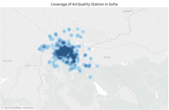
Using the density function within Tableau, each point represents a sensor, the darker regions on the map indicates there are more sensors located around the area. The coverage of the sensors is mainly located at the central part of Sofia city, the northern and southern parts of Sofia has no coverage at all.
Are they all working properly at all times?
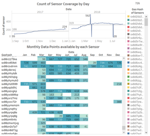
The Count of Sensor Coverage for each chart show the distinct count of sensors that captured data points for each month in 2017 and 2018. There is only on average 319 sensors taking measures for each day in 2018 while there are in total 726 sensors available in the city of Sofia.
- In the early months of 2018, there are relatively less sensors measuring air quality compared to the rest of the year, we can also see that there is an increasing number of sensors being deployed from 2017 to 2018.
- The Monthly Data Points available by each Sensor table shows the number of data points captured by each sensor for each month. The missing data for each sensor is huge judging from the number of white spaces.
- From the observations above, we can conclude that the sensors are not operating consistently for every month of the year as they may be new sensors being deployed.
Can you detect any unexpected behaviours of the sensors through analyzing the readings they capture?
By plotting the average P1 and P2 measurements for each sensor by month in Tableau, we can identify anomaly measurements. This particular sensor measured an average of P1 2000 ug/m3 and P2 1000 ug/m3 for the month of June. There are about 7 sensors that have abnormal measurements based on the chart above.
Which part of the city shows relatively higher readings than others?
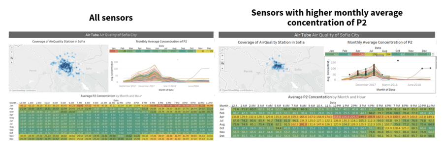
- By highlighting the top monthly concentration observations from the Monthly Average Concentration chart, we can see that most of these sensors are located at the central region of Sofia city.
- The difference is indeed time-dependent, from the average P2 concentration by month and hour chart, those sensors that have higher monthly average concentration readings captured the higher level of P2 concentration in April, July and Aug. Where as in dashboard with all sensors selected, only January, November and December have poor air quality scores.
- The month of April has significantly higher hazardous hourly P2 reading of 220+ ug/m3 at around 12 pm to 2 pm compared the right dashboard which shows around P2 reading of 6-7+ ug/m3 at the same period. The maximum hourly average P2 (226 ug/m3) from the right dashboard is 4 times higher than the maximum hourly average P2 (57 ug/m3) from the left dashboard.
Q3: Factors Affecting Air Quality in Sofia
1. Meteorology Factors
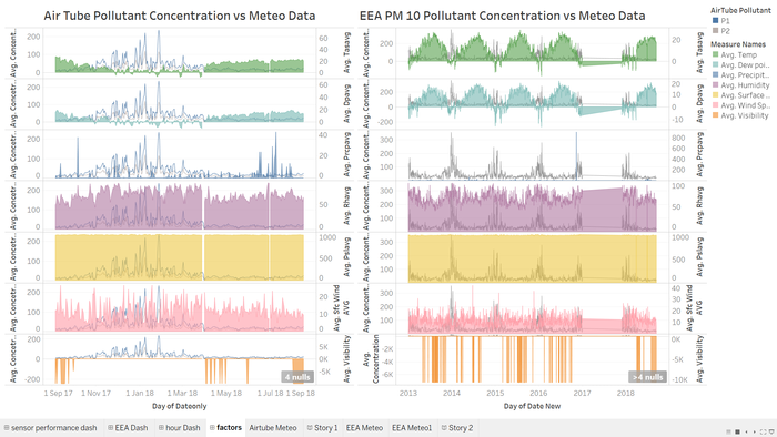
By plotting PM 10, P1 and P2 pollutant concentration against the meteorology measures, there is a clear negative correlation between pollutant concentration between average temperature, dew point temperature, precipitation and visibility. While the rest of the meteorology factors does not seem to have a clear correlation with the pollutant concentration.
Factors that are strongly correlated to the air pollution level in Sofia:
- Average Temperature: higher average temperature in a day is linked to lower air pollution as observed from the chart.
- Dew point temperature: dew point is the temperature which air is saturated with water vapour, the factor is closely linked to humidity as well. With higher dew point temperature, the air pollution appears to be at its lower from the chart.
- Precipitation: precipitation refer to rain fall, raining cleans out the sky by removing the air particles.
- Visibility: visibility is clearly a factor that is highly correlated with bad air quality, with higher concentration of air particles, the visibility of the city should be low which corresponds to the observation from the chart.
The dashboard can be accessed here: https://public.tableau.com/profile/sofiakung#!/vizhome/SofiaAirQuality/AirQualityinSofia
