Difference between revisions of "IS428 AY2018-19T1 S Jonas Nevin"
Sjnevin.2015 (talk | contribs) |
Sjnevin.2015 (talk | contribs) |
||
| (4 intermediate revisions by the same user not shown) | |||
| Line 1: | Line 1: | ||
| − | <div style="background: #3b3b3b; padding: 15px; font-weight: bold; line-height: 1em; text-indent: 15px; border-left: #a9a9a9 solid 32px; font-size: 20px"><font color="white">Visual Detective -Solving the Mystery behind Sofia City</font></div> | + | <div style="background: #3b3b3b; padding: 15px; font-weight: bold; line-height: 1em; text-indent: 15px; border-left: #a9a9a9 solid 32px; font-size: 20px"><font color="white">Visual Detective - Solving the Mystery behind Sofia City</font></div> |
| Line 6: | Line 6: | ||
Air quality in Bulgaria is a big concern: measurements show that citizens all over the country breathe in air that is considered harmful to health. In fact, Sofia City, Bulgaria has been identified as one of the most polluted cities in the world with one of the highest readings of PM2.5 and Pm10. | Air quality in Bulgaria is a big concern: measurements show that citizens all over the country breathe in air that is considered harmful to health. In fact, Sofia City, Bulgaria has been identified as one of the most polluted cities in the world with one of the highest readings of PM2.5 and Pm10. | ||
| − | However, that is not to say that Bulgaria alone is solely to be blamed for these high readings. There could be external factors that could be causing this. Thus, with what I’ve learnt in class I aim to create a data visualization that would help users to | + | However, that is not to say that Bulgaria alone is solely to be blamed for these high readings. There could be external factors that could be causing this. Thus, with what I’ve learnt in class I aim to create a data visualization that would help users to observe trends and easily identify what could be possible reasons for the high pollution readings captured. |
| Line 61: | Line 61: | ||
'''Solution:''' | '''Solution:''' | ||
Download an external software such as 7zip (https://www.7-zip.org/download.html) to help extract these files. | Download an external software such as 7zip (https://www.7-zip.org/download.html) to help extract these files. | ||
| + | |||
'''Issue 2:''' | '''Issue 2:''' | ||
| Line 94: | Line 95: | ||
| − | Issue 3: After combining both the 2017 and 2018 datasets in the AirTube data folder, it can be noticed, as per the following screenshot, that the points are populated all around Bulgaria and not in Sofia City alone when plotting the geographical distribution using the geocodes. Therefore, the points not in Sofia City will have to be removed. | + | '''Issue 3:''' After combining both the 2017 and 2018 datasets in the AirTube data folder, it can be noticed, as per the following screenshot, that the points are populated all around Bulgaria and not in Sofia City alone when plotting the geographical distribution using the geocodes. Therefore, the points not in Sofia City will have to be removed. |
[[File:Jns14.png|600px|center]] | [[File:Jns14.png|600px|center]] | ||
| − | Solution | + | '''Solution:''' |
To remove the unnecessary points, the following steps were taken: | To remove the unnecessary points, the following steps were taken: | ||
1. Create a CSV with just the latitude and longitude of Sofia City: | 1. Create a CSV with just the latitude and longitude of Sofia City: | ||
| Line 114: | Line 115: | ||
The column headers in the dataset are difficult to decode on its own. For example, daily average temperature is denoted as “TASAVG”. As a result, it may be difficult when trying to create visualizations while working with such headers. | The column headers in the dataset are difficult to decode on its own. For example, daily average temperature is denoted as “TASAVG”. As a result, it may be difficult when trying to create visualizations while working with such headers. | ||
| − | '''Solution | + | '''Solution:''' |
Rename the headers so that they can be understood at first glance. Also, the precipitation columns can be removed as all rows have the values of either -9999 or 0. The other headers have been renamed as follows: | Rename the headers so that they can be understood at first glance. Also, the precipitation columns can be removed as all rows have the values of either -9999 or 0. The other headers have been renamed as follows: | ||
| Line 153: | Line 154: | ||
[[File:Jns17.png|600px|center]] | [[File:Jns17.png|600px|center]] | ||
| − | Solution | + | '''Solution:''' |
Do the following: | Do the following: | ||
1. Right click on any of the following columns> “Create Calculated Field” | 1. Right click on any of the following columns> “Create Calculated Field” | ||
| Line 160: | Line 161: | ||
[[File:Jns19.png|600px|center]] | [[File:Jns19.png|600px|center]] | ||
| − | <div style="background: #3b3b3b; padding: 15px; font-weight: bold; line-height: 1em; text-indent: 15px; border-left: #a9a9a9 solid 32px; font-size: 20px"> | + | |
| + | <div style="background: #3b3b3b; padding: 15px; font-weight: bold; line-height: 1em; text-indent: 15px; border-left: #a9a9a9 solid 32px; font-size: 20px"><font color="white">Interactive Visualization</font></div> | ||
| + | |||
The interactive visualization can be accessed here: https://public.tableau.com/profile/jonas.nevin#!/vizhome/VisualDetectiveAssignment/SofiaCityStoryboard?publish=yes | The interactive visualization can be accessed here: https://public.tableau.com/profile/jonas.nevin#!/vizhome/VisualDetectiveAssignment/SofiaCityStoryboard?publish=yes | ||
{| class="wikitable" | {| class="wikitable" | ||
| Line 170: | Line 173: | ||
[[File:Jns20.png|400px|center]] | [[File:Jns20.png|400px|center]] | ||
|valign="top"| | |valign="top"| | ||
| − | Storyboard | + | '''Storyboard''' |
| + | |||
The storyboard function was opted for as the main way to traverse through the different dashboards. Though there is no correct order in which the data should be analysed, there was a clear approach taken to understand this data better and this function was the best way to bring that across. As one traverses through the different stories, he/she gets a brief overview on what to expect from each of the dashboards. The following are the various types of visualizations used in the various dashboards: | The storyboard function was opted for as the main way to traverse through the different dashboards. Though there is no correct order in which the data should be analysed, there was a clear approach taken to understand this data better and this function was the best way to bring that across. As one traverses through the different stories, he/she gets a brief overview on what to expect from each of the dashboards. The following are the various types of visualizations used in the various dashboards: | ||
|- | |- | ||
|[[File:Jns21.png|400px|center]] | |[[File:Jns21.png|400px|center]] | ||
|valign="top"| | |valign="top"| | ||
| − | Time Series | + | '''Time Series''' |
| + | |||
Across the 3 datasets, the time series is essential to help understand the patterns across the various measurements of time (monthly, daily, hourly). | Across the 3 datasets, the time series is essential to help understand the patterns across the various measurements of time (monthly, daily, hourly). | ||
Main Features: | Main Features: | ||
| Line 185: | Line 190: | ||
[[File:Jns22.png|400px|center]] | [[File:Jns22.png|400px|center]] | ||
|valign="top"| | |valign="top"| | ||
| − | Heatmap Calendar | + | '''Heatmap Calendar''' |
| + | |||
The heatmap calendar enables users to easily view trends identify time periods where there are unique observations. | The heatmap calendar enables users to easily view trends identify time periods where there are unique observations. | ||
|- | |- | ||
| Line 192: | Line 198: | ||
[[File:Jns23.png|400px|center]] | [[File:Jns23.png|400px|center]] | ||
|valign="top"| | |valign="top"| | ||
| − | Symbol Map | + | '''Symbol Map''' |
| + | |||
By combining the map and boxplot, users can specifically identify specific areas on the map just by highlight and the points on the boxplot. | By combining the map and boxplot, users can specifically identify specific areas on the map just by highlight and the points on the boxplot. | ||
| + | |||
| + | |||
Main Features: | Main Features: | ||
| + | |||
Slider filter: Makes it easier for the user to traverse between the different time periods. | Slider filter: Makes it easier for the user to traverse between the different time periods. | ||
|- | |- | ||
| Line 201: | Line 211: | ||
[[File:Jns24.png|400px|center]] | [[File:Jns24.png|400px|center]] | ||
|valign="top"| | |valign="top"| | ||
| − | Correlation Matrix | + | '''Correlation Matrix''' |
| + | |||
This visualization type is extremely useful for the 3rd task where we identify relationship between different factors and air measurements. | This visualization type is extremely useful for the 3rd task where we identify relationship between different factors and air measurements. | ||
|- | |- | ||
| Line 228: | Line 239: | ||
|} | |} | ||
===Trends and Findings=== | ===Trends and Findings=== | ||
| − | Trend 1 | + | '''Trend 1''': |
| + | |||
[[File:Jns27.png|600px|center]] | [[File:Jns27.png|600px|center]] | ||
| Line 234: | Line 246: | ||
| − | Trend 2 | + | '''Trend 2:''' |
[[File:Jns28.png|600px|center]] | [[File:Jns28.png|600px|center]] | ||
| − | From the cycle plot, another trend can be observed. There seems to be an inverse relationship between of the concentration readings among the various years for the month of January and December- the two months with the highest readings. For example, in January 2013, when the concentration is below the average of 9,563, the converse is seen for the month of December 2013 | + | From the cycle plot, another trend can be observed. There seems to be an inverse relationship between of the concentration readings among the various years for the month of January and December- the two months with the highest readings. For example, in January 2013, when the concentration is below the average of 9,563, the converse is seen for the month of December 2013. This trend is observed over the 4 years of data. |
| − | Trend 3: | + | |
| + | '''Trend 3:''' | ||
[[File:Jns29.png|600px|center]] | [[File:Jns29.png|600px|center]] | ||
| Line 292: | Line 305: | ||
| − | <div style="background: #3b3b3b; padding: 15px; font-weight: bold; line-height: 1em; text-indent: 15px; border-left: #a9a9a9 solid 32px; font-size: 20px"><font color="white">Identifying Relationships </font></div> | + | <div style="background: #3b3b3b; padding: 15px; font-weight: bold; line-height: 1em; text-indent: 15px; border-left: #a9a9a9 solid 32px; font-size: 20px"><font color="white">Task 3: Identifying Relationships </font></div> |
Latest revision as of 23:59, 11 November 2018
Contents
Background & Objective
Air pollution is an important risk factor for health in Europe and worldwide. The Organisation for Economic Cooperation and Development (OECD) predicts that in 2050 outdoor air pollution will be the top cause of environmentally related deaths worldwide. In addition, air pollution has also been classified as the leading environmental cause of cancer. Air quality in Bulgaria is a big concern: measurements show that citizens all over the country breathe in air that is considered harmful to health. In fact, Sofia City, Bulgaria has been identified as one of the most polluted cities in the world with one of the highest readings of PM2.5 and Pm10.
However, that is not to say that Bulgaria alone is solely to be blamed for these high readings. There could be external factors that could be causing this. Thus, with what I’ve learnt in class I aim to create a data visualization that would help users to observe trends and easily identify what could be possible reasons for the high pollution readings captured.
The data given contained 4 different folders – Air Tube (Citizen science measurements), EEA (Official air quality measurements), METEO, TOPO. Data transformation had to be done these different datasets to solve the following issues:
EEA Dataset
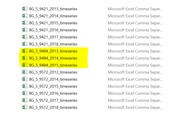
Issue 1: Though the data were provided from 6 different stations, the data as denoted from the highlighted part of the image below is seen to be given from only 2013 to 2015. As a result, this might not be current and relevant.
Solution: This data has been completely removed from our analysis.
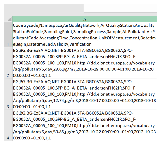
Issue 2: When opening each of these datasets, at first glance, all the data is contained in a single column. The header in Cell A1 shows the different data given.
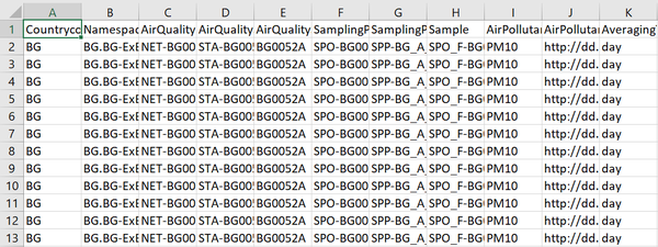
Solution: The data is separated into their separate columns by using the text-to-column function under the Data tab of Excel. From the data would thus, be as follows:
Issue 3:
All the data are separated by different sheets according to the different years. This makes it more tedious as there are too many different files to work with. Also, as we will see later, it would help ease the data transformation process in issue 4.
Solution: All data that share taken from similar stations will be combined to form a compiled sheet of all the different years. Eventually, there would be 5 compiled sheets for the 5 different stations.
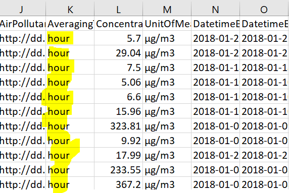
Issue 4: For 2018 data among the 5 different stations, it is noted that the data under “AveragingTime” are either in terms of hours or variables while, data for other years are in terms of days. Therefore, this must be standardised or else, it might lead to inaccurate comparison of data between the different years.
Solution: All data for 2018 are converted to daily figures instead. The steps are as follows:
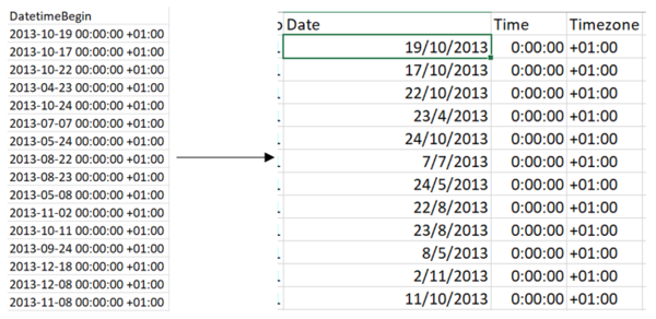
a. Separate the DatetimeBegin to 3 separate rows in terms of Date, Time and Timezone as follows. Time and Timezone can be removed completely from the dataset since we will only base our analysis on daily figures.
b. Cut this new Date column and paste it on an empty space on the right of the sheet, including the concentration corresponding to it. We will work with just these 2 columns to convert them into daily figures.
c. All the concentration levels which share the same date will be averaged to get the unique daily figure for that date using an ‘AVERAGEIF’ function. This would convert all the hour data into a daily average concentration. Rename the title for the dates as ‘DatetimeBegin’.
d. Thereafter, link this new concentration column and link it back to the original data where the other columns such as Country and Namespace are. The should look like as follows. The ‘DatetimeBegin’ column would not have any repetitive dates.
Airtube Dataset
Issue 1: When first extracting, the data would in this GZ format. Therefore, I was unable open it.
Solution: Download an external software such as 7zip (https://www.7-zip.org/download.html) to help extract these files.
Issue 2:
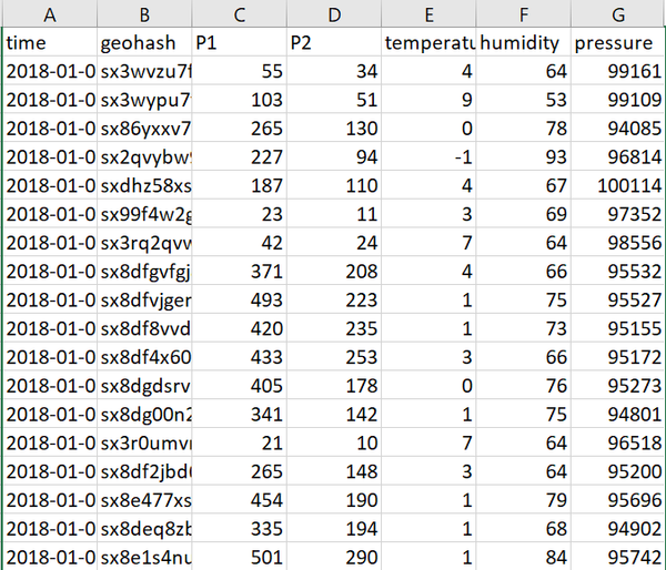
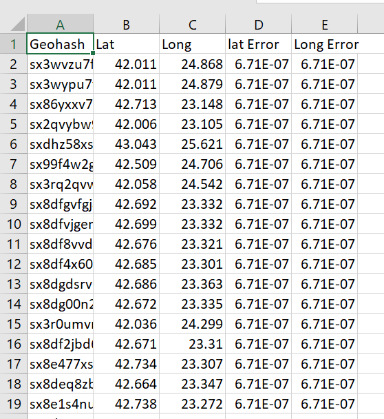
It can be observed that the datasets in the Air Tube folder only provide the geohashes for the locations. Instead, the latitudinal and longitudinal values are needed.
Solution: To convert the geohashes into latitudinal and longitudinal values, R Studio must be used. The steps taken are as follows:
a. Extract just the ‘Geohashes’ column from the 2017 and 2018 data file into separate CSVs respectively.
b. In each of the CSV, remove duplicates using the ‘Remove Duplicates’ function under the data tab in excel. This removes unnecessary time and effort for R to calculate.
c. Move these files to a separate folder in any drive on the computer. I placed mine in my C drive of windows.
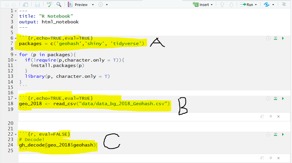
d. Open R Studio and open a R Notebook. Save it into the same folder the data files are in. Then, do the following steps in R. The steps below are shown just for the 2018 CSV. These steps have to be repeated for the 2017 file and changes in the naming have to be made accordingly.
A. Ensure the geohash package is installed and running in your R Studio before you transform the data.
B. Import the data. Ensure that the name of the file is copied exactly, especially since it is case sensitive.
C. To convert the geohash to latitudinal and longitudinal, use this code. The ‘$geohash’ in the code ensures that the decode function works on every value in the CSV.
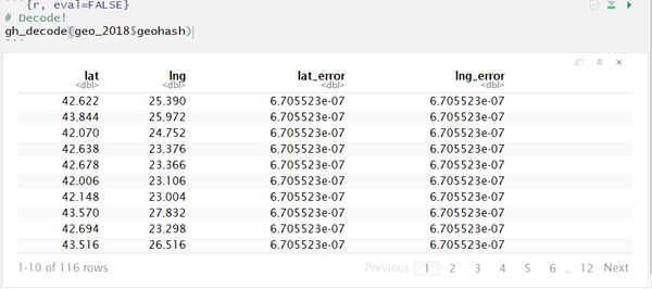
e. Running the code would present the output after which they would need to be copied page by page manually and pasted into the specific CSV it is for. Since I’ve decoded the 2018 CSV in this example, I would copy these data and paste it into the 2018 CSV so that all the rows are filled. These steps would be repeated for the 2017 data.
The final output in the CSV should look something like this. This file will be denoted as Table 1.
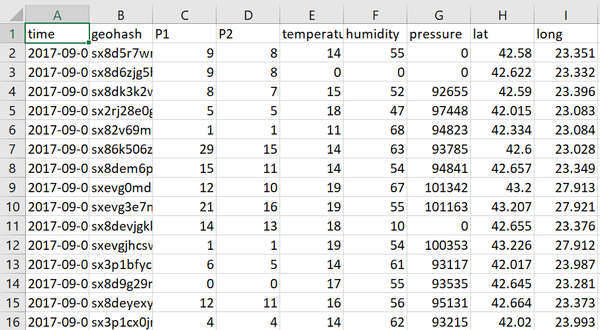
f. This data would then need to be merged with the original data which contains the other variables such as pressure and time. Move the ‘lat’ and ‘long’ values from Table 1 to this original dataset by first, moving the sheet over and then using the “VLOOKUP” function to copy the values from one sheet to another.
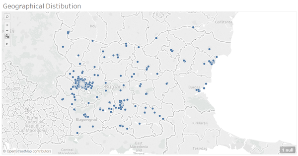
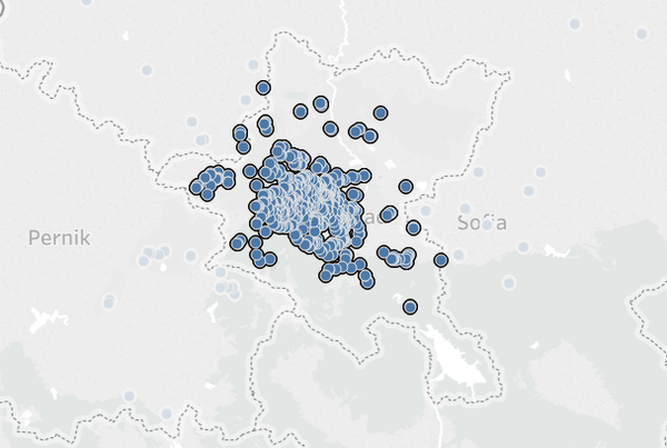
Issue 3: After combining both the 2017 and 2018 datasets in the AirTube data folder, it can be noticed, as per the following screenshot, that the points are populated all around Bulgaria and not in Sofia City alone when plotting the geographical distribution using the geocodes. Therefore, the points not in Sofia City will have to be removed.
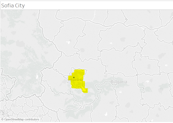
Solution: To remove the unnecessary points, the following steps were taken: 1. Create a CSV with just the latitude and longitude of Sofia City: a. Latitude: 42.69833 b. Longitude: 23.31994 2. Create a new tableau map visualization to identify how Sofia City looks on the map as follows:
3. After identifying how and where Sofia City is on the map, head back to the air tube geographical visualization and using the lasso tool, highlight the same area to select only the points in Sofia City.
4. Hover over any of the highlighted points and select Keep Only. That would filter out any other points that are not part of Sofia City. If needed, you can zoom in even further and individually remove point that are not in the region by right clicking the data point and selecting “exclude”.
METEO Dataset
Issue 1: The column headers in the dataset are difficult to decode on its own. For example, daily average temperature is denoted as “TASAVG”. As a result, it may be difficult when trying to create visualizations while working with such headers.
Solution: Rename the headers so that they can be understood at first glance. Also, the precipitation columns can be removed as all rows have the values of either -9999 or 0. The other headers have been renamed as follows:
TASMAX to MaxTemp
TASAVG to AvgTemp
TASMIN to MinTemp
DPMAX to MaxDewPointTemp
DPAVG to AVGDewPointTemp
DPMIN to MinDewPointTemp
RHMAX to MaxHumidity
RHAVG to AVGHumiditiy
RHMIN to MinHumidity
sfcWindMAX to MaxWindSpeed
sfcWindAVG to AVGWindSpeed
sfcWindMIN to MinWindSpeed
PSLMAX to MaxSurfacePressure
PSLAVG to AVGSurfacePressure
PSLMIN to MinSurfacePressure
VISIB to AVGvisibility
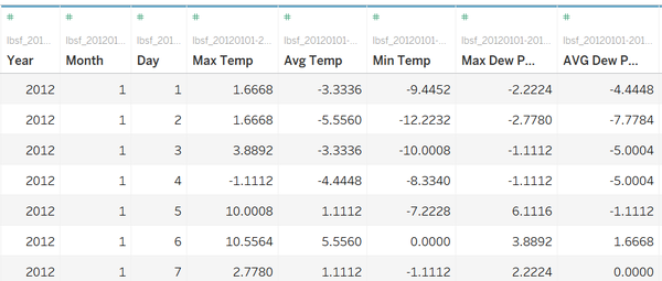
Issue 2: As per the screen shot below, the Meteo data splits the data in terms year, month and day into 3 separate columns. This makes it harder to work with to create visualizations.
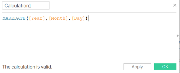
Solution: Do the following: 1. Right click on any of the following columns> “Create Calculated Field” 2. Type the following formula down and click ok:
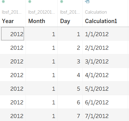
That would create a new column with the full date.
The interactive visualization can be accessed here: https://public.tableau.com/profile/jonas.nevin#!/vizhome/VisualDetectiveAssignment/SofiaCityStoryboard?publish=yes
|
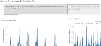
Storyboard The storyboard function was opted for as the main way to traverse through the different dashboards. Though there is no correct order in which the data should be analysed, there was a clear approach taken to understand this data better and this function was the best way to bring that across. As one traverses through the different stories, he/she gets a brief overview on what to expect from each of the dashboards. The following are the various types of visualizations used in the various dashboards: | |
|
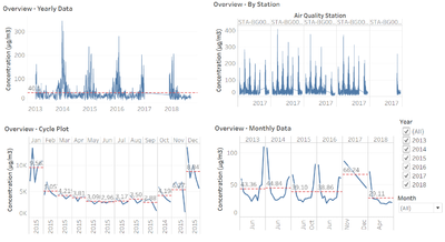
Time Series Across the 3 datasets, the time series is essential to help understand the patterns across the various measurements of time (monthly, daily, hourly). Main Features: Trendlines: To help identify what the average is and in which time periods most pollution take place. Filters: To enable the user to pinpoint to a specific time period. | |
|
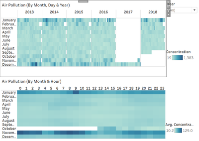
Heatmap Calendar The heatmap calendar enables users to easily view trends identify time periods where there are unique observations. | |
|
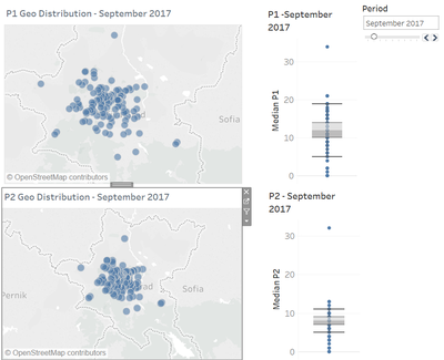
Symbol Map By combining the map and boxplot, users can specifically identify specific areas on the map just by highlight and the points on the boxplot.
Slider filter: Makes it easier for the user to traverse between the different time periods. | |
|
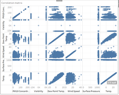
Correlation Matrix This visualization type is extremely useful for the 3rd task where we identify relationship between different factors and air measurements. |
Anomalies
| Screenshot | Anomalies |
|---|---|
|
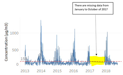
There is missing data from January 2017 to October 2017. This might affect our analysis as this missing data can be considered as very recent data and coupled with the fact that there not all months of data for 2018 are available, it might hamper our analysis. | |
|
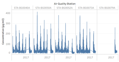
There are a lot of missing data for the year 2017 as well among all 5 air quality stations. This prevents us from clearly identifying trends from year to year. |
Trends and Findings
Trend 1:
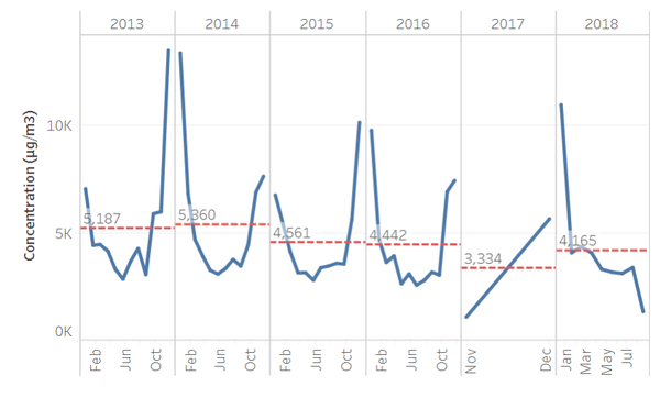
Overall, there is high variability in the readings from 2013 to 2018. However, a clear trend is observed in which the concentration readings are highest at the start and the end of the month. For example, looking at year 2013 from the image above, months January and December had the highest readings in concentration that were way above the average of 5,187 μg per metre cube. Also, the months in the middle of the year seem to have the lowest reading over the years. It might be interesting to understand why this might be the case.
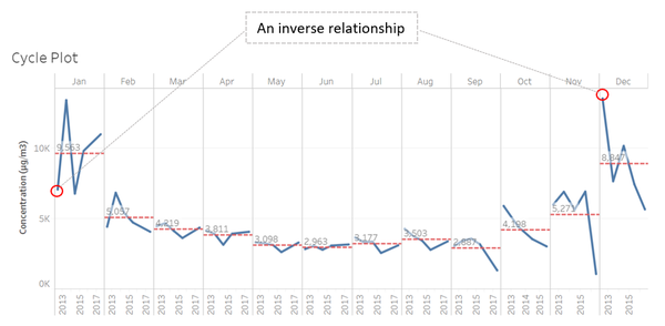
Trend 2:
From the cycle plot, another trend can be observed. There seems to be an inverse relationship between of the concentration readings among the various years for the month of January and December- the two months with the highest readings. For example, in January 2013, when the concentration is below the average of 9,563, the converse is seen for the month of December 2013. This trend is observed over the 4 years of data.
Trend 3:
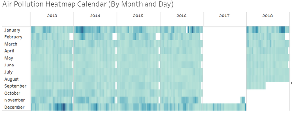
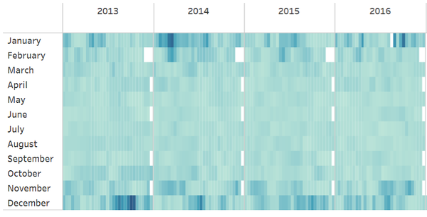
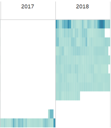
From the Heatmap calendar view titled “Air Pollution Heatmap Calendar (By Month and Day”, 2 observations can be made.
As we just fix our attention to the visualization between 2013 to 2016, the concentration of PM10 seems to the significantly greater toward the second half of December. More specifically, the concentration seems to be higher on months that are around 25th of December (Christmas Day).
Secondly, from 2017 and 2018 part of the visualisation it can be see that in January, denoted by first row in the image right above, from the 10th to the 24th, the concentration is not as high as towards the start and end of the month. The reason why these 2017-2018 data is read separately from the years before is because, the 2017-2018 data was initially by hours and had to be transformed to daily data. Also, in 2017, there are a lot of missing data.
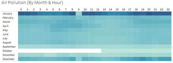
For the data titled “Air Pollution (By Month & Hour), there is what seems to be an anomaly in January at hour 9. However, it just happens to be that data in hour 9 for most of the days in 2018 were not recorded down. This might affect our analysis as it might not be able to tell us whether there is a cyclical data by hours. For example, when looking at the visualization just above, it seems that the concentration is high on hour 0-1, then it dips from hour 2-6, then rises again from hours 8-10 and so on and so forth. This trend seems to continue till hour 23. Also, from hour 18 onwards on December, the concentration seems to be the highest.
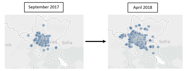
Looking at these two visualizations for September 2017 and April 2018, the sensor coverage can be seen to be increasing dramatically. Initially, in September 2017, most of the sensors are populated in the central area of Sofia City and as months go by, more sensors appear. As a result, the sensor coverage seems to increase and more sensors that seem to appear toward the four corners of the region, but this only happens when it gets closer to April 2018.
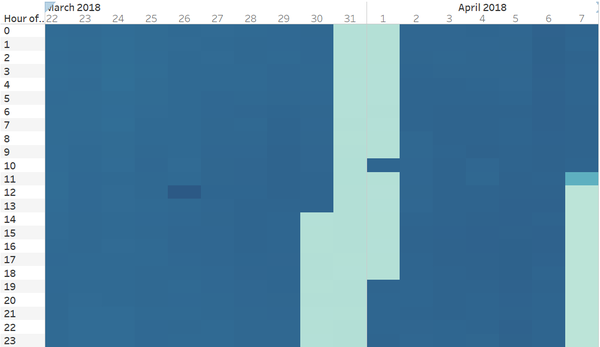
The sensors calendar visualization in the data supports this finding as well. When scrolling from September 2017 to April 2018, the visualization (Screenshot below) becomes darker, denoting that the number of sensors has increase. The spread of sensors over the months have been quite even apart from a few outliers. Two of these outliers can be seen from the screenshot that follows.
Firstly, from 2pm on 29th March till 6pm on 1 of April, the number of sensors running seems to have decreased drastically, as shown by the light blue area in the screenshot above. This similar pattern in once again observed on the 7th of April from 7pm onwards. This could possibly be because the sensors were not working during those times. Overall, no unexpected behaviours of the sensors could be captured.
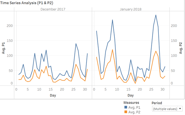
The time series graphs of P1 and P2 air pollution measure by month and day shows that P1 has higher readings than P2 throughout the entire period. Moreover, there is a trend that can be observed over the months. As per the screenshot above, it can be noticed that on the 2 most polluted months, there are two distinctive peaks observed – one from day 5 to 10 and another between day 25 to 30. This trend is only observed from November 2017 to January 2018 – the three months with greatest pollution.
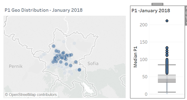
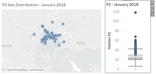
Overall, the geographical visualisation of both P1 and P2 follows a similar trend in which areas that are darker in blue with regards to P1 measures would be somewhat replicated on the geographical visualization for P2. An example can be seen above in the screenshot. Also, similar to the EEA data findings, the Citizen Science Air visualization shows December and January to have the highest level of pollution. Using January as a gauge since it was the most heavily polluted month, I tried to identify where the most populated locations were specifically at in Sofia City. As can be seen from the screenshots, I highlighted every point above the third quartile line in the boxplot so that is reflects on the map visualisation. This was repeated for both P1 and P2 measures. Interestingly, only points mainly located at the upper half of Sofia City were highlighted in the visualization of both P1 and P2. Therefore, there could be some special characteristics of the central and northern regions that may cause them to be more polluted that the rest. This similar trend can be observed for the other months as well.
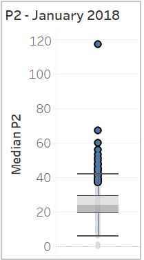
To identify whether the top polluted cities are the same throughout the various months and whether there is a time dependence, the boxplot from the “P1 & P2 Geo Distribution” visualization was used through the following: 1. Start highlighting the top most points – perhaps from the 75th Percentile onwards till the last point for any month. For illustrative purposes, I used the month of January since it was the most polluted and focused on P2 measure.
2. Traverse using the ‘Period’ slider filter over all the different months starting from the first month (September 2017) till the last month (April 2017). What can be observed is as follows.
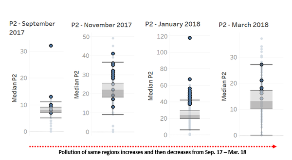
When traversing through the data, it’s observed that areas that were heavily polluted on January 18 were not heavily polluted throughout all the months data were captured for. For example, as can be seen from the screenshot above, the most heavily polluted areas in January are reflected to be in the median range in September 2017. Also, these areas pollution decrease again after January and in March 2018, most of the points near the median region. These trends are observed for P1 measures and for other What this shows is that the Citizen Science air pollution measurements are all time-dependent. There might be external factors such as temperature that could be causing areas to be more polluted on some months and not the rest.
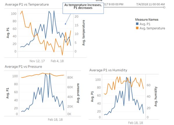
As per AirTube trends visualization, it can be noted that there is a significant relationship the air pollution measures and temperature. More specifically, the graph in the top left shows that there in an inverse relationship whereby in months where the temperature in high, the air pollution is low and vice versa. These observable trends for pollution measures cannot be seen against pressure and humidity. *Note that only P1 data is used for illustrative purpose in the screenshot. These trends are also observed for P2* Also, these findings could also explain why more regions are polluted in December and January than other months as observed in task. It could be mainly because of the cooler temperature that causes more of the polluted gas to be trapped on the surface and hence, increasing the values.
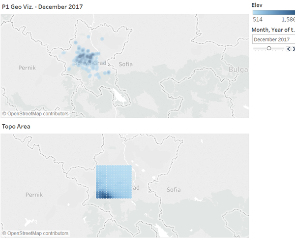
The topo visualization shows that there are no clear trends between air pollution and top (as observed by the screenshot. The visualization below refers to the topographical map of Sofia City. The lower left of the “Topo Area” is darker blue denoting that there is where the areas with high elevation are at. Overall, the pollution seems to not be occurring at the regions that have high elevation. As can be seen above for December 2017 in “P1 Geo Viz., most of the heavily polluted areas are located towards the centre or slightly towards the top- away from the elevated areas.
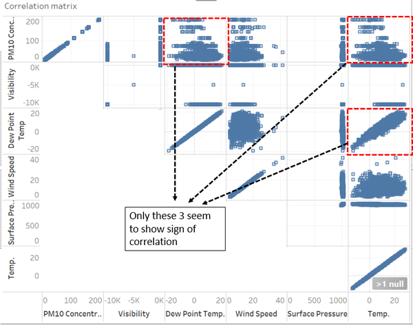
In the correlation matrix, data of PM10 concentration from EEA data was joined with the METEO data as they both share common daily dates. This visualization shows that there is a negative correlation between PM10 concentration and temperature and dew point temperature (both these are close to perfectly correlated). This coincides with our data earlier which mentions that temperature has a negative correlation with P1 and P2 measures. The other factors do not seem to show any sign of correlation.
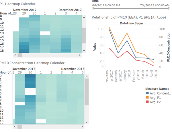
Overall, the trends for PM10, P1 and P2 are very similar. PM10 refers to that from official measures while P1 and P2 are taken from citizen science air measurements. As seen on the time series graph, whenever P1 or P2 increases, PM10 levels increases as well. However, something unique is that towards April 2018, the official measures of PM10 is becoming greater than the citizen science measures of P1 and P2. In the previous months, it is the citizen science readings that are greater than that of the official readings. This could possibly due to the decrease in number of sensors for Citizen Science air measurement as noted in task 2 findings. Due to the decrease in the number of sensors from end march onwards, there may not have been enough sensors covering the areas near the regions where the official measurements were taken- areas where there might have been some unique behaviour.
