Difference between revisions of "Apple Crunch: Proposal"
Tllevan.2016 (talk | contribs) |
|||
| (10 intermediate revisions by 2 users not shown) | |||
| Line 25: | Line 25: | ||
<!-- Start of Problem & Motivation --> | <!-- Start of Problem & Motivation --> | ||
| − | == Proposal == | + | [[File:Kick Finisher Logo 2.png|800px|frameless|center]] |
| + | == '''Proposal''' == | ||
{| class="wikitable" | {| class="wikitable" | ||
|- | |- | ||
| − | ! | + | ! '''PROBLEM & MOTIVATION''' |
|- | |- | ||
|} | |} | ||
| Line 39: | Line 40: | ||
<!-- End of Problem & Motivation --> | <!-- End of Problem & Motivation --> | ||
| − | |||
<br> | <br> | ||
| Line 45: | Line 45: | ||
{| class="wikitable" | {| class="wikitable" | ||
|- | |- | ||
| − | ! | + | ! '''DATA''' |
|- | |- | ||
|} | |} | ||
| Line 93: | Line 93: | ||
<br> | <br> | ||
| + | |||
| + | <!-- Start of Charts --> | ||
| + | {| class="wikitable" | ||
| + | |- | ||
| + | ! '''VISUALISATION DASHBOARD & CHARTS''' | ||
| + | |- | ||
| + | |} | ||
| + | {| class="wikitable" | ||
| + | |- | ||
| + | ! Chart !! Description and Analysis | ||
| + | |- | ||
| + | | | ||
| + | <center>'''Visualisation Dashboard'''</center> | ||
| + | |||
| + | |- | ||
| + | |||
| + | | [[ File: 1.01.png|thumb|350px|center]] | ||
| + | <br> | ||
| + | <center> <b> Drill down Tree-map : Main Category </b> </br> | ||
| + | |||
| + | || | ||
| + | The first visualization that we are going with is the “Drill-down Tree-map” with the size being the number of campaigns and the color being the category. The visualization showcases all the Main-Categories and Sub-Categories with their respective size being the number of campaigns. The main category is stated at the top left corner with the number while the sub-categories are faded in the background. The visualization contains the data of campaigns between 2015 and 2018 – which indicates the recent trends on the Kickstarter platform. | ||
| + | |||
| + | |- | ||
| + | |||
| + | | [[ File:1.02.png | thumb |350px|center]] | ||
| + | <br> | ||
| + | <center><b> Drill down Tree-map : Sub Category </b></br> | ||
| + | |||
| + | || | ||
| + | This example visualization showcases the number of campaigns for each of the sub-categories of the “Film & Video”. From here we can see that under “Film & Video”, “Short Film” and “Documentary” are the most popular. We can interact with the tree-map and have the same exploration with other main categories as well such as “Music”, “Publishing”, “Theater” … | ||
| + | |||
| + | |- | ||
| + | |||
| + | | [[ File: 1.03.png|thumb |350px|center]] | ||
| + | <br> | ||
| + | <center><b> Stacked Bar Chart </b></br> | ||
| + | |||
| + | || | ||
| + | In the stacked bar graph, we use the data across all categories from the year 2015 -2018. We calculate the percentage of successful projects and failed projects for each of the state. The states are then sorted based on the percentage of success in a descending order. From the visualization above we can see that the top 5 states with the highest percentage of successful projects are “New York”, “Rhode Island”, “Vermont”, “Massachusetts” and “Montana”. | ||
| + | |||
| + | |- | ||
| + | |||
| + | |||
| + | | [[ File:1.04.png|thumb |350px|center]] | ||
| + | [[File:1.05.png|thumb| 350px|center]] | ||
| + | <br> | ||
| + | <center><b> Interactive Visualization </b></br> | ||
| + | |||
| + | || | ||
| + | The interactivity of the visualization comes in when we interact with the tree-map. After every selection of main- category or sub-category of the tree-map, the bar-graph visualization would be filtered based on the selection. | ||
| + | |||
| + | From the visualization above we can see that even though across all categories, “New York” has the highest percentage of successful projects, however, if we zoom into “Publishing” category, “West Virginia” is a better place to launch the campaign as compared to “California” as it has a higher percentage of successful projects specifically for the “Publishing” category. The above is just one example of the interactivity of the visualization. The user would be able to do the same thing and view the top 5 states with the highest percentage of success for any main-category or sub-category that they select on the tree-map. | ||
| + | |- | ||
| + | |||
| + | | [[ File:1.14.png|thumb|350px|center]] | ||
| + | <br> | ||
| + | <center><b> </b></br> | ||
| + | |||
| + | || | ||
| + | From this visualization, we can see that “Dance”, “Theater” and “Music” have the highest percentage of success if we look at the overall data across all the states. However, if the user selects “Minnesota” as the state that they are interested in, they would get the following: | ||
| + | |||
| + | |- | ||
| + | |- | ||
| + | |||
| + | | [[File:1.15.png|thumb|350px|center]] | ||
| + | <br> | ||
| + | <center><b> </b></br> | ||
| + | |||
| + | || | ||
| + | From this, we can see that unlike other states, Minnesota is more popular with “Music” and “Comics”. From the user perspective who are thinking about their project idea to launch in Minnesota, a possible insight from this is that they should take a look at the category of “Music” and “Comics” since these two have relatively high percentage of success. | ||
| + | |||
| + | |- | ||
| + | |- | ||
| + | |||
| + | | [[ File: 1.06.png|thumb |350px|center]] | ||
| + | <br> | ||
| + | <center><b> Features/Metrics </b></br> | ||
| + | |||
| + | || | ||
| + | The metrics of the campaign would include: | ||
| + | |||
| + | 1. Goal: What financial target goal should the startup set for the crowd-funding campaign? | ||
| + | |||
| + | 2. Number of Award Levels: For each project, the creator of the campaign would be able to set the reward level (e.g. $25, $100, $1000…) for the backers. The question we would want to answer is: How many award levels should the founders set for their project? | ||
| + | |||
| + | 3. Average Reward Amount: Similar to metric (2), the founders would be able to set the value of the reward. The question here that we would want to address is: What should the reward amount be? | ||
| + | |||
| + | 4. Number of Updates: For every project on Kickstarter, the founders would be giving constant updates to the backers about the progress of the project. We would want to see: How many updates are most common for the campaigns on Kickstarter? | ||
| + | |||
| + | 5. Title Length: Other than the image of the campaign, the first impression of the user to the campaign would be the title. Having a concise while at the same time meaningful has proven to be a challenge for many campaign creators. Hence, we would want to see: What is the most common length of the project title? | ||
| + | |||
| + | 6. Campaign’s Duration: Last but not least, one crucial determinant of whether the project is successful or not is actually the duration of the campaign. Longer duration gives the investors more time to review the project. However, too long duration would discourage investors as there is no sense of urgency. Hence, the question that we would want to address is: What is the best duration for the campaign? | ||
| + | |||
| + | |||
| + | |- | ||
| + | |||
| + | | [[ File:1.07.png|thumb|350px|center]] | ||
| + | <br> | ||
| + | <center><b> Bean plot: Category (Goal amount vs Success/Failure) </b></br> | ||
| + | |||
| + | || | ||
| + | In-order to visualize the successful and unsuccessful campaigns vs the goal amount set among the startups, we use a Bean plot across all the categories. Irrespective of all categories, when the goal amount set is from $1000 - $5000 then, the startups have high chances of being successful. Therefore, for small projects this is a great insight to notice and invest in their respective categories. | ||
| + | When the goal amount set is higher than $10,000 then the startups are more likely being unsuccessful in raising the funds. | ||
| + | |||
| + | |||
| + | |- | ||
| + | |||
| + | | [[ File:1.08.png|thumb|350px|center]] | ||
| + | <br> | ||
| + | <center><b> Bean plot: Sub Category: Music (Goal amount vs Success/Failure) </b></br> | ||
| + | |||
| + | || | ||
| + | Using a interactive drill down Tree-map and when we observe the interactive bean plot for Category (Music) has the second highest number of campaigns in total. Here, a strong insight has been found. Startups whose goal amount set to $10,000 have very high chances of failing to raise the money. So, we conclude in Music category, it is recommended to set below $10,000 to avoid failure. | ||
| + | |||
| + | |- | ||
| + | |||
| + | |- | ||
| + | |||
| + | | [[File:1.09.jpg|thumb|350px|center]] | ||
| + | <br> | ||
| + | <center><b> Word Cloud </b></br> | ||
| + | |||
| + | || | ||
| + | Future Work: Can utilize word cloud to find interesting insights of this massive word data and try to build a visualization effectively to classify successful and un-successful campaigns. | ||
| + | |||
| + | |- | ||
| + | |} | ||
| + | <br> | ||
| + | |||
<br> | <br> | ||
| Line 98: | Line 228: | ||
{| class="wikitable" | {| class="wikitable" | ||
|- | |- | ||
| − | ! | + | ! '''SURVEY OF RELATED WORK''' |
|- | |- | ||
|} | |} | ||
| Line 120: | Line 250: | ||
|| This chart shows another point to consider which is how the number of backers affect the success rate of a project. The use of pie chart however, may not be what the group will use. | || This chart shows another point to consider which is how the number of backers affect the success rate of a project. The use of pie chart however, may not be what the group will use. | ||
|- | |- | ||
| − | | | + | | <insert> || <insert> |
|} | |} | ||
<!-- End of Related Work --> | <!-- End of Related Work --> | ||
| − | |||
| − | |||
| − | |||
| − | |||
| − | |||
| − | |||
| − | |||
| − | |||
| − | |||
| − | |||
| − | |||
| − | |||
| − | |||
| − | |||
| − | |||
| − | |||
| − | |||
| − | |||
| − | |||
| − | |||
| − | |||
| − | |||
| − | |||
| − | |||
| − | |||
| − | |||
| − | |||
| − | |||
| − | |||
| − | |||
| − | |||
| − | |||
| − | |||
| − | |||
| − | |||
| − | |||
| − | |||
<br> | <br> | ||
| Line 166: | Line 259: | ||
{| class="wikitable" | {| class="wikitable" | ||
|- | |- | ||
| − | ! | + | ! '''TECHNICAL CHALLENGES''' |
|- | |- | ||
|} | |} | ||
| Line 185: | Line 278: | ||
* Watch videos and read about javascript and D3 | * Watch videos and read about javascript and D3 | ||
* Work and ask one another | * Work and ask one another | ||
| + | |} | ||
| + | |||
| + | {| class="wikitable" | ||
| + | |- | ||
| + | ! '''IDEAS BRAINSTORMING ''' | ||
| + | |- | ||
| + | |} | ||
| + | <div style="font-family:Helvetica;font-size:12px"> | ||
| + | |||
| + | {| class="wikitable" width="100%" | ||
| + | |||
| + | |- | ||
| + | | [[File:1.10.jpg|thumb|350px|center]] | ||
| + | |- | ||
| + | |||
| + | |- | ||
| + | | [[File:1.11.jpg|thumb|350px|center]] | ||
| + | |||
| + | |- | ||
| + | |} | ||
| + | |||
| + | {| class="wikitable" | ||
| + | |- | ||
| + | ! '''APPLICATION DESIGN & TECHNOLOGIES USED ''' | ||
| + | |- | ||
| + | |} | ||
| + | <div style="font-family:Helvetica;font-size:12px"> | ||
| + | |||
| + | {| class="wikitable" width="100%" | ||
| + | |||
| + | |- | ||
| + | | [[File:1.12.png|thumb|600px|center]] | ||
| + | |- | ||
| + | |||
|} | |} | ||
<br> | <br> | ||
<br> | <br> | ||
Latest revision as of 23:47, 25 November 2018
Proposal
| PROBLEM & MOTIVATION |
|---|
Problem:
For many, acquiring enough finances to turn their idea into a business is a big issue so some would go for crowdfunding platforms as a means to obtain the required amount to start their business. Kickstarter is one of the more popular crowdfunding platform, but they have an "all or nothing" rule where the campaign cannot get the donated amount if it does not reach the goal set by the business. As of October 5th 2018, only about one in every three campaigns reach their funding goal, which means that most do not get the funding they need from Kickstarter.
Motivation:
There is a need to understand what makes a successful campaign. Are there any attributes that sets apart projects that are successful? The team would like to create several visualizations on kickstarter campaign data to analyze trends and determine if certain attributes of a campaign such as "amount of funding set" affects its chances of succeeding. In the end, the team hopes that others can use the visualizations created in order to have a better understanding of how they should create their campaign to have a higher chance of success.
| DATA |
|---|
The group will only use one csv file as the source of data.
Dataset
ks-projects-201801.csv from https://www.kaggle.com/kemical/kickstarter-projects#ks-projects-201801.csv
Details of Dataset
| Column | Description |
|---|---|
| ID | ID of the campaign / project |
| name | Name(Title) of the campaign / project |
| category | Sub-category of the campaign |
| main_category | Main category of the campaign |
| currency | Currency used for funds of the campaign |
| deadline | Until when the campaign will run |
| goal | Goal amount to reach of the campaign in their currency |
| launched | When this campaign started |
| pledged | Amount pledged by donors in the currency of the campaign |
| state | Status of the campaign (successful? failed?) |
| backers | How many donors |
| country | Which country is the campaigned launched |
| usd pledged | Pledged amount converted to USD by KS conversion |
| usd_pledged_real | Pledged amount converted to USD by fixer.io |
| usd_goal_real | Goal amount converted to USD |
| VISUALISATION DASHBOARD & CHARTS |
|---|
| Chart | Description and Analysis |
|---|---|
|
| |
|
|
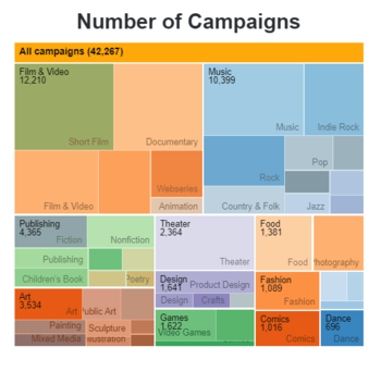
The first visualization that we are going with is the “Drill-down Tree-map” with the size being the number of campaigns and the color being the category. The visualization showcases all the Main-Categories and Sub-Categories with their respective size being the number of campaigns. The main category is stated at the top left corner with the number while the sub-categories are faded in the background. The visualization contains the data of campaigns between 2015 and 2018 – which indicates the recent trends on the Kickstarter platform. |
|
|
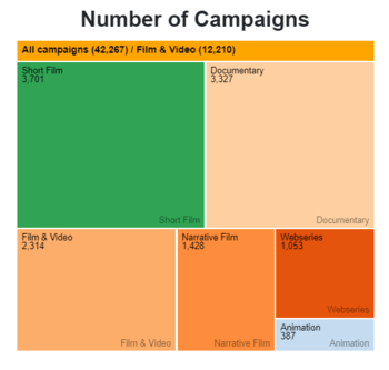
This example visualization showcases the number of campaigns for each of the sub-categories of the “Film & Video”. From here we can see that under “Film & Video”, “Short Film” and “Documentary” are the most popular. We can interact with the tree-map and have the same exploration with other main categories as well such as “Music”, “Publishing”, “Theater” … |
|
|
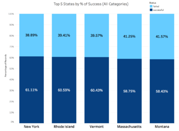
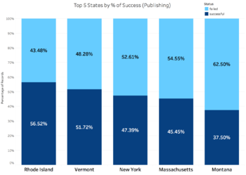
In the stacked bar graph, we use the data across all categories from the year 2015 -2018. We calculate the percentage of successful projects and failed projects for each of the state. The states are then sorted based on the percentage of success in a descending order. From the visualization above we can see that the top 5 states with the highest percentage of successful projects are “New York”, “Rhode Island”, “Vermont”, “Massachusetts” and “Montana”. |
|
|
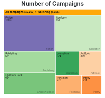
The interactivity of the visualization comes in when we interact with the tree-map. After every selection of main- category or sub-category of the tree-map, the bar-graph visualization would be filtered based on the selection. From the visualization above we can see that even though across all categories, “New York” has the highest percentage of successful projects, however, if we zoom into “Publishing” category, “West Virginia” is a better place to launch the campaign as compared to “California” as it has a higher percentage of successful projects specifically for the “Publishing” category. The above is just one example of the interactivity of the visualization. The user would be able to do the same thing and view the top 5 states with the highest percentage of success for any main-category or sub-category that they select on the tree-map. |
|
|
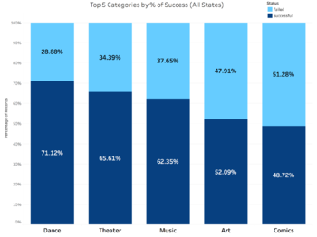
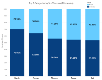
From this visualization, we can see that “Dance”, “Theater” and “Music” have the highest percentage of success if we look at the overall data across all the states. However, if the user selects “Minnesota” as the state that they are interested in, they would get the following: |
|
|
From this, we can see that unlike other states, Minnesota is more popular with “Music” and “Comics”. From the user perspective who are thinking about their project idea to launch in Minnesota, a possible insight from this is that they should take a look at the category of “Music” and “Comics” since these two have relatively high percentage of success. |
|
|
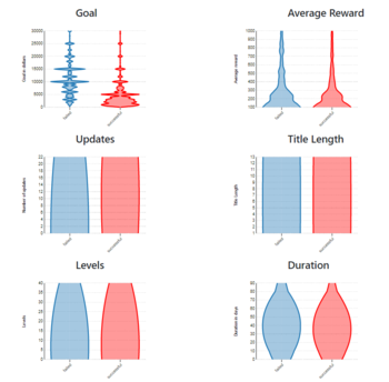
The metrics of the campaign would include: 1. Goal: What financial target goal should the startup set for the crowd-funding campaign? 2. Number of Award Levels: For each project, the creator of the campaign would be able to set the reward level (e.g. $25, $100, $1000…) for the backers. The question we would want to answer is: How many award levels should the founders set for their project? 3. Average Reward Amount: Similar to metric (2), the founders would be able to set the value of the reward. The question here that we would want to address is: What should the reward amount be? 4. Number of Updates: For every project on Kickstarter, the founders would be giving constant updates to the backers about the progress of the project. We would want to see: How many updates are most common for the campaigns on Kickstarter? 5. Title Length: Other than the image of the campaign, the first impression of the user to the campaign would be the title. Having a concise while at the same time meaningful has proven to be a challenge for many campaign creators. Hence, we would want to see: What is the most common length of the project title? 6. Campaign’s Duration: Last but not least, one crucial determinant of whether the project is successful or not is actually the duration of the campaign. Longer duration gives the investors more time to review the project. However, too long duration would discourage investors as there is no sense of urgency. Hence, the question that we would want to address is: What is the best duration for the campaign?
|
|
|
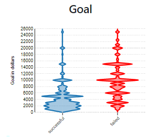
In-order to visualize the successful and unsuccessful campaigns vs the goal amount set among the startups, we use a Bean plot across all the categories. Irrespective of all categories, when the goal amount set is from $1000 - $5000 then, the startups have high chances of being successful. Therefore, for small projects this is a great insight to notice and invest in their respective categories. When the goal amount set is higher than $10,000 then the startups are more likely being unsuccessful in raising the funds.
|
|
|
Using a interactive drill down Tree-map and when we observe the interactive bean plot for Category (Music) has the second highest number of campaigns in total. Here, a strong insight has been found. Startups whose goal amount set to $10,000 have very high chances of failing to raise the money. So, we conclude in Music category, it is recommended to set below $10,000 to avoid failure. |
|
|
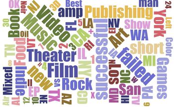
Future Work: Can utilize word cloud to find interesting insights of this massive word data and try to build a visualization effectively to classify successful and un-successful campaigns. |
| SURVEY OF RELATED WORK |
|---|
| Related Work | Points to Consider |
|---|---|
|
The inforgraphic has presented various ideas to explore in terms of what kinds of visualizations to create. The inforgraphic mostly presented numbers and not an in depth visualization.
| |
| This chart shows another point to consider which is how the number of backers affect the success rate of a project. The use of pie chart however, may not be what the group will use. | |
| <insert> | <insert> |
| TECHNICAL CHALLENGES |
|---|
| Technical Challenge | Solution |
|---|---|
| Group is not that experienced and familiar with visualization softwares |
|
| Crawling Certain information such as the city or state of the campaign and the description of the campaign have to be obtained by crawling |
|
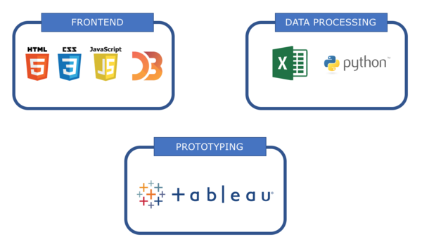
| No experience with javascript and D3 |
|
| IDEAS BRAINSTORMING |
|---|

