Difference between revisions of "IS428 Team wiki: Group12(CJS) Proposal"
Sjnevin.2015 (talk | contribs) |
Knchaw.2015 (talk | contribs) |
||
| (40 intermediate revisions by 2 users not shown) | |||
| Line 1: | Line 1: | ||
<!--Logo--> | <!--Logo--> | ||
[[File:CJSlogo.png|center|260px]] | [[File:CJSlogo.png|center|260px]] | ||
| + | '''<center>[[Project Groups|Back to Project Groups]]</center>''' | ||
<!--/Logo--> | <!--/Logo--> | ||
| Line 31: | Line 32: | ||
<!--/Header--> | <!--/Header--> | ||
| − | </ | + | <!--Sub Header--> |
| + | {| style="background-color:white; text-transform: uppercase; font-size:85%; text-align:center; padding: 5px 0 0 0;" width="100%" height=50px cellspacing="0" cellpadding="0" valign="top" border="0" | | ||
| + | |||
| + | <!-- Current Page --> | ||
| + | | style="vertical-align:top;width:33.3%;" | <div style="padding: 3px; line-height: wrap_content; border-bottom:1px dashed#1B2631; font-family:Century Gothic"> [[IS428 Team wiki: Group12(CJS) Proposal Previous |<font color =#1B2631><b>Previous</b></font>]] | ||
| + | |||
| + | | style="vertical-align:top;width:33.3%;" | <div style="padding: 3px; line-height: wrap_content; border-bottom: 5px solid #138D75; font-family:Century Gothic"> [[IS428 Team wiki: Group12(CJS) Proposal Revise | <font color =#138D75>Revise</font>]] | ||
| + | |||
| + | |} | ||
| + | <!--Sub Header--> | ||
| + | |||
| + | |||
<div style="background: #138D75; padding: 15px; font-weight: bold; line-height: 0.3em; text-indent: 15px;letter-spacing:-0.08em;font-size:20px"><font color=#fbfcfd face="Century Gothic">PROBLEM & MOTIVATION</font></div> | <div style="background: #138D75; padding: 15px; font-weight: bold; line-height: 0.3em; text-indent: 15px;letter-spacing:-0.08em;font-size:20px"><font color=#fbfcfd face="Century Gothic">PROBLEM & MOTIVATION</font></div> | ||
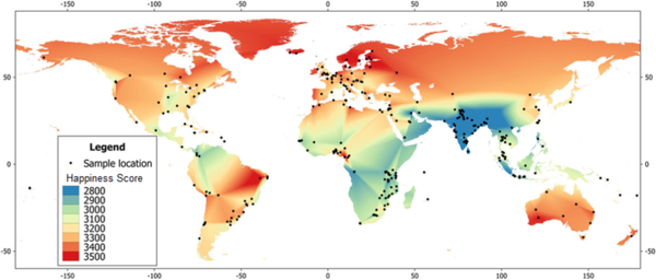
| − | + | Since 2012, the United Nations Sustainable Development Solutions Network (SDSN) has been publishing a world happiness report that presents the happiness levels of 156 countries. | |
| + | 6 factors that include GDP, Social Support, Trust (in government), Generosity, Freedom to Make Life Decisions and Healthy Life Expectancy are used to estimate these final happiness levels. | ||
| + | Thus, this visualization explores trends with regards to these 6 factors to understand what exactly makes a "happier" country as per UN's standards. | ||
| + | |||
| + | <div style="background: #138D75; padding: 15px; font-weight: bold; line-height: 0.3em; text-indent: 15px;letter-spacing:-0.08em;font-size:20px"><font color=#fbfcfd face="Century Gothic">OBJECTIVES</font></div> | ||
| + | # Identify the overall trends of happiness ranking index of different countries over the years from 2015 to 2018.</br> | ||
| + | # Identify the rankings of the each of 6 parameters that make up the happiness index of countries.</br> | ||
| + | # Compare the 6 parameters between the selected countries and see how they fare in relation to their final happiness index rankings from the years 2015 to 2018.</br> | ||
| + | # Compare different countries by geographic locations to find out the happiness pattern in different regions.</br> | ||
| − | |||
| − | |||
| − | |||
| − | |||
| − | |||
| − | |||
| − | |||
<div style="background: #138D75; padding: 15px; font-weight: bold; line-height: 0.3em; text-indent: 15px;letter-spacing:-0.08em;font-size:20px"><font color=#fbfcfd face="Century Gothic">DATA DESCRIPTION</font></div> | <div style="background: #138D75; padding: 15px; font-weight: bold; line-height: 0.3em; text-indent: 15px;letter-spacing:-0.08em;font-size:20px"><font color=#fbfcfd face="Century Gothic">DATA DESCRIPTION</font></div> | ||
| − | + | {| class="wikitable" style="background-color:#FFFFFF;" width="100%" | |
| + | |- | ||
| + | ! style="font-weight: bold;background: #138D75;color:#fbfcfd;width: 50%;" | Dataset/ Source | ||
| + | ! style="font-weight: bold;background: #138D75;color:#fbfcfd;" | Data Attributes | ||
| + | ! style="font-weight: bold;background: #138D75;color:#fbfcfd;" | Rationale of Usage | ||
| + | |- | ||
| + | | | ||
| + | World Happiness Report Data 2015-2018<br> | ||
| + | https://s3.amazonaws.com/happiness-report/2018/WHR2018Chapter2OnlineData.xls<br> | ||
| + | table2.1 | ||
| + | || | ||
| + | * County | ||
| + | * Year | ||
| + | * Life Ladder | ||
| + | * Log GDP per capita | ||
| + | * Social Support | ||
| + | * Healthy life expectancy at birth | ||
| + | * Freedom to make life choices | ||
| + | * Generosity | ||
| + | * Perceptions of corruption | ||
| + | * Positive affect | ||
| + | * Negative affect | ||
| + | * Confidence in national government | ||
| + | * Democratic Quality | ||
| + | * Delivery Quality | ||
| + | * Standard deviation of ladder by country-year | ||
| + | * Stand deviation/ Mean of ladder by country-year | ||
| + | * GINI index (World Bank estimate) | ||
| + | * GINI index (World Bank estimate), average 2000-15 | ||
| + | * GINI of household income reported in Gallup, by wp5-year | ||
| + | || | ||
| + | See the overall performance of each individual country changes from year 2006 onwards | ||
| + | |- | ||
| + | | World Happiness Report Data 2017<br> | ||
| + | https://s3.amazonaws.com/happiness-report/2018/WHR2018Chapter2OnlineData.xls<br> | ||
| + | Figure2.2 | ||
| + | || | ||
| + | * Country | ||
| + | * Happiness score | ||
| + | * Whisker-high | ||
| + | * Whisker-low | ||
| + | * Dystopia + residual | ||
| + | * GDP Per capita | ||
| + | * Social support | ||
| + | * Healthy life expectancy | ||
| + | * Freedom to make life choices | ||
| + | * Generosity | ||
| + | * Corruption | ||
| + | || | ||
| + | Show data of one particular year(2017), its overall score and thus can analyze how the final happiness score is calculated | ||
| + | |- | ||
| + | |- | ||
| + | | | ||
| + | Happiness rank and scores by country<br> | ||
| + | https://www.kaggle.com/unsdsn/world-happiness<br> | ||
| + | 2015.csv | ||
| + | || | ||
| + | * CountryName of the country. | ||
| + | * RegionRegion the country belongs to. | ||
| + | * Happiness RankRank of the country based on the Happiness Score. | ||
| + | * Happiness ScoreA metric measured in 2015 by asking the sampled people the question: "How would you rate your happiness on a scale of 0 to 10 where 10 is the happiest." | ||
| + | * Standard ErrorThe standard error of the happiness score. | ||
| + | * Economy (GDP per Capita)The extent to which GDP contributes to the calculation of the Happiness Score. | ||
| + | * FamilyThe extent to which Family contributes to the calculation of the Happiness Score | ||
| + | * Health (Life Expectancy)The extent to which Life expectancy contributed to the calculation of the Happiness Score | ||
| + | * FreedomThe extent to which Freedom contributed to the calculation of the Happiness Score. | ||
| + | * Trust (Government Corruption)The extent to which Perception of Corruption contributes to Happiness Score. | ||
| + | * GenerosityThe extent to which Generosity contributed to the calculation of the Happiness Score. | ||
| + | * Dystopia ResidualThe extent to which Dystopia Residual contributed to the calculation of the Happiness Score. | ||
| + | || | ||
| + | Data with explanation behind if needed | ||
| + | |- | ||
| + | | | ||
| + | Happiness rank and scores by country<br> | ||
| + | https://www.kaggle.com/unsdsn/world-happiness<br> | ||
| + | 2016.csv | ||
| + | || | ||
| + | * CountryName of the country | ||
| + | * RegionRegion the country belongs to | ||
| + | * Happiness RankRank of the country based on the Happiness Score. | ||
| + | * Happiness ScoreA metric measured in 2016 by asking the sampled people the question: "How would you rate your happiness on a scale of 0 to 10 where 10 is the happiest" | ||
| + | * Lower Confidence IntervalLower Confidence Interval of the Happiness Score | ||
| + | * Upper Confidence IntervalUpper Confidence Interval of the Happiness Score | ||
| + | * Economy (GDP per Capita)The extent to which GDP contributes to the calculation of the Happiness Score. | ||
| + | * FamilyThe extent to which Family contributes to the calculation of the Happiness Score | ||
| + | * Health (Life Expectancy)The extent to which Life expectancy contributed to the calculation of the Happiness Score | ||
| + | * FreedomThe extent to which Freedom contributed to the calculation of the Happiness Score | ||
| + | * Trust (Government Corruption)The extent to which Perception of Corruption contributes to Happiness Score | ||
| + | * GenerosityThe extent to which Generosity contributed to the calculation of the Happiness Score | ||
| + | * Dystopia ResidualThe extent to which Dystopia Residual contributed to the calculation of the Happiness Score. | ||
| + | || | ||
| + | Data with explanation behind if needed | ||
| + | |- | ||
| + | | | ||
| + | Happiness rank and scores by country<br> | ||
| + | https://www.kaggle.com/unsdsn/world-happiness<br> | ||
| + | 2017.csv | ||
| + | || | ||
| + | * Country | ||
| + | * Happiness.Rank | ||
| + | * Happiness.ScoreA metric measured in 2016 by asking the sampled people the question: "How would you rate your happiness on a scale of 0 to 10 where 10 is the happiest" | ||
| + | * Whisker.high | ||
| + | * Whisker.low | ||
| + | * Economy..GDP.per.Capita. | ||
| + | * Family | ||
| + | * Health..Life.Expectancy. | ||
| + | * Freedom | ||
| + | * Generosity | ||
| + | * Trust..Government.Corruption. | ||
| + | * Dystopia.Residual | ||
| + | || | ||
| + | Data with explanation behind if needed | ||
| + | |- | ||
| + | |||
| + | |} | ||
<div style="background: #138D75; padding: 15px; font-weight: bold; line-height: 0.3em; text-indent: 15px;letter-spacing:-0.08em;font-size:20px"><font color=#fbfcfd face="Century Gothic">SURVEY OF RELATED WORK</font></div> | <div style="background: #138D75; padding: 15px; font-weight: bold; line-height: 0.3em; text-indent: 15px;letter-spacing:-0.08em;font-size:20px"><font color=#fbfcfd face="Century Gothic">SURVEY OF RELATED WORK</font></div> | ||
Our visualization are inspired by the following works: | Our visualization are inspired by the following works: | ||
| Line 57: | Line 184: | ||
<p><center>'''Source''': http://shiny.rstudio.com/gallery/superzip-example.html </center></p> | <p><center>'''Source''': http://shiny.rstudio.com/gallery/superzip-example.html </center></p> | ||
|| | || | ||
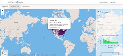
| − | * It | + | *It can be seen in this visualization that 2 different colours are used - one to represent "yes" and one to represent "no". A similar design could be used in our visualization where two different colors of different intensity can be used to show the happiness index of different countries. One colour would be used to categorise the more "happier" countries while the other colour would categorise the less "happier" countries. This would be complemented with different hue intensities to represent the magnitude of the various happiness scores. |
| − | * | + | *Upon clicking each of the states, a tooltip is shown that gives a brief information overview of that particular area. This could be useful in our visualization as we provide more information on the happiness index than just the happiness scores. Perhaps, scores of the 6 factors can be shown in the tooltip of our visualization. |
|- | |- | ||
| Line 65: | Line 192: | ||
<p><center>'''Source''': https://www.gapminder.org/tools/#$chart-type=barrank</center></p> | <p><center>'''Source''': https://www.gapminder.org/tools/#$chart-type=barrank</center></p> | ||
|| | || | ||
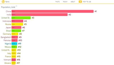
| − | * | + | * This bar chart presents a slider that allows the users to view the changes in data in a very interactive manner. |
| − | * | + | * The ranking are also featured on the side of the graph to help identify which countries are highly ranked from year to year. This could be useful in observing changes in happiness index over the years. |
| − | + | * The different countries are colour-coded based on the regions they are in. For example, Asian countries are in pink while countries in yellow are in Europe. | |
| + | * Overall, the bar chart visualization makes it easy to distinguish the magnitudes of scores between the different countries and thus, is something that could help add value to the exploration of the happiness index. | ||
|- | |- | ||
| <p><center>''' Parallel Coordinates Plot''' </center></p> | | <p><center>''' Parallel Coordinates Plot''' </center></p> | ||
| Line 73: | Line 201: | ||
<p><center>'''Source''': https://bl.ocks.org/jasondavies/1341281</center></p> | <p><center>'''Source''': https://bl.ocks.org/jasondavies/1341281</center></p> | ||
|| | || | ||
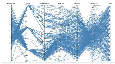
| − | * | + | *As taught in class, this parallel coordinates visualization provides a more consolidated view as the user can observe how the 6 factors link together for each country. Furthermore, users can click to highlight each of the individual countries. |
| − | * | + | * |
| + | |- | ||
| + | |} | ||
| + | <div style="background: #138D75; padding: 15px; font-weight: bold; line-height: 0.3em; text-indent: 15px;letter-spacing:-0.08em;font-size:20px"><font color=#fbfcfd face="Century Gothic">OUR APPROACH</font></div> | ||
| + | |||
| + | {| class="wikitable" style="background-color:#FFFFFF;" width="100%" | ||
| + | |- | ||
| + | ! style="font-weight: bold;background: #138D75;color:#fbfcfd;width: 50%;" | Work Flow | ||
| + | ! style="font-weight: bold;background: #138D75;color:#fbfcfd;" | Remark | ||
| + | |- | ||
| + | | | ||
| + | [[File:CJSApproach_1.png|600px|center]] | ||
| + | || | ||
| + | * Draw box-plots for different factors to see the how important these factors are in contributing to the overall happiness score | ||
| + | * Display Choropleth Maps based on the happiness ranking to observe different regions' happiness status | ||
| + | * Display ranking of different countries based on individual parameters and see their position in the overall happiness score ranking | ||
| + | * As the 6 factors are given in different scales, normalization of data ((x - min(x)) / (max(x) - min(x))) was conducted for the 6 factors. After normalization, they were presented in a radar chart and compared to see the strenghs and weaknesses between countries. | ||
|- | |- | ||
|} | |} | ||
<div style="background: #138D75; padding: 15px; font-weight: bold; line-height: 0.3em; text-indent: 15px;letter-spacing:-0.08em;font-size:20px"><font color=#fbfcfd face="Century Gothic">PROPOSED STORYBOARD</font></div> | <div style="background: #138D75; padding: 15px; font-weight: bold; line-height: 0.3em; text-indent: 15px;letter-spacing:-0.08em;font-size:20px"><font color=#fbfcfd face="Century Gothic">PROPOSED STORYBOARD</font></div> | ||
| − | + | ||
| − | + | {| class="wikitable" style="background-color:#FFFFFF;" width="100%" | |
| − | '' | + | |- |
| + | ! style="font-weight: bold;background: #138D75;color:#fbfcfd;width: 50%;" | Visualization | ||
| + | ! style="font-weight: bold;background: #138D75;color:#fbfcfd;" | Description | ||
| + | |- | ||
| + | | <p><center>'''Main Visualisation: Choropleth Map''' </center></p> | ||
| + | [[File:CJStory1_1.jpg|600px|center]] | ||
| + | || | ||
| + | '''Purpose:''' | ||
| + | To show the geographical distribution of the happiness index and the 6 parameters for selected years using a choropleth map. Similar to the survey of related work, this helps the user identify trends between regions. For example, users could see if, for example, Asian countries are “happier” than African countries. | ||
| + | <br><br>'''Features to be included:''' | ||
| + | * 2 Different colours of varying intensity would be used to represent the varying values of each factors. | ||
| + | * Filter for user to observe data by individual years and happiness index factors. | ||
| + | * A tooltip which shows the happiness scores of the different countries will display upon hovering over the different regions on the map. | ||
| + | |- | ||
| + | | <p><center>'''Main Visualisation: Bar chart''' </center></p> | ||
| + | [[File:CJStory2.jpg|600px|center]] | ||
| + | || | ||
| + | '''Purpose:''' | ||
| + | To identify any correlation between the 6 sub-factors and the happiness index. Users can see, for example, what the happiness index rankings are for countries with just the highest GDP. | ||
| + | <br><br>'''Features to be included:''' | ||
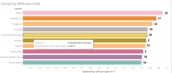
| + | * The bar length would be used to visualise the magnitude of the selected parameters while the number to the side of the bar chart would refer to the happiness index rank of the country. | ||
| + | * There would be a slider below the chart that would allow users to scroll through and see the bar chart visualisations for the different years. | ||
| + | * A filter so that the user can select the various parameter to analyse. | ||
| + | |- | ||
| + | |- | ||
| + | | <p><center>'''Main Visualisation: Parallel Coordinates with Boxplot''' </center></p> | ||
| + | [[File:CJStory3.jpg|600px|cener]] | ||
| + | || | ||
| + | '''Purpose:''' | ||
| + | To help identify trends between the 6 parameters among the different countries. In our visualization, each of the axes would represent the 6 different parameters that make up the happiness index, and each of the different lines will represent the different countries. Thus, the user can compare all the parameters instantly and identify relationships between them. | ||
| + | <br><br>'''Features to be included:''' | ||
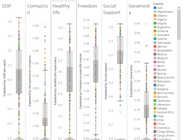
| + | * Boxplot on each of the axis to enable the user to see the distribution for each of the parameter. | ||
| + | * Brushing feature for users to select a range values in the chart. | ||
| + | * Filter for people to select the year. | ||
| + | |- | ||
| + | |} | ||
<div style="background: #138D75; padding: 15px; font-weight: bold; line-height: 0.3em; text-indent: 15px;letter-spacing:-0.08em;font-size:20px"><font color=#fbfcfd face="Century Gothic">KEY CHALLENGES</font></div> | <div style="background: #138D75; padding: 15px; font-weight: bold; line-height: 0.3em; text-indent: 15px;letter-spacing:-0.08em;font-size:20px"><font color=#fbfcfd face="Century Gothic">KEY CHALLENGES</font></div> | ||
| − | ' | + | {| class="wikitable" style="background-color:#FFFFFF;" width="100%" |
| + | |- | ||
| + | ! style="font-weight: bold;background: #138D75;color:#fbfcfd;width: 50%;" | Key Technical Challenges | ||
| + | ! style="font-weight: bold;background: #138D75;color:#fbfcfd;" | Proposed Solution | ||
| + | |- | ||
| + | | | ||
| + | No centralized data. Data are all divided year by year. | ||
| + | || | ||
| + | * Gather all data and join all sets together. | ||
| + | * Clean and transform the data. | ||
| + | * Make sure data follow the Codd's 3rd normal form | ||
| + | |- | ||
| + | | Unfamiliar with Visualization Tools | ||
| + | || | ||
| + | * Research on how to use these tools properly. | ||
| + | * Consultation with professor to get help. | ||
| + | * Use familiar development environment for application devloping | ||
| + | |- | ||
| + | | Unfamiliar programming language | ||
| + | || | ||
| + | * Learn respective programming language individually. | ||
| + | * Incorporate Transformed html page with Javascript & JQuery to give smooth and user-friendly interface. | ||
| + | |- | ||
| + | |} | ||
| + | <div style="background: #138D75; padding: 15px; font-weight: bold; line-height: 0.3em; text-indent: 15px;letter-spacing:-0.08em;font-size:20px"><font color=#fbfcfd face="Century Gothic">ARCHITECTURE</font></div> | ||
| + | {| class="wikitable" style="background-color:#FFFFFF;" width="100%" | ||
| + | |- | ||
| + | ! style="font-weight: bold;background: #138D75;color:#fbfcfd;width: 50%;" | Tools & Technologies Used | ||
| + | ! style="font-weight: bold;background: #138D75;color:#fbfcfd;" | System Architecture | ||
| + | |- | ||
| + | | | ||
| + | [[File:CJSTools.png|center|500px]] | ||
| + | || | ||
| + | [[File:CJSSystem.png|center|600px]] | ||
| + | |||
| + | |- | ||
| + | |} | ||
<div style="background: #138D75; padding: 15px; font-weight: bold; line-height: 0.3em; text-indent: 15px;letter-spacing:-0.08em;font-size:20px"><font color=#fbfcfd face="Century Gothic">VISUALIZATION SKETCH</font></div> | <div style="background: #138D75; padding: 15px; font-weight: bold; line-height: 0.3em; text-indent: 15px;letter-spacing:-0.08em;font-size:20px"><font color=#fbfcfd face="Century Gothic">VISUALIZATION SKETCH</font></div> | ||
| − | Please check out our visualization sketch to better understand the process. | + | Please check out our visualization sketch to better understand the process. Overall, all these graphs will be tied together on a web-page categorised by different tabs. First tab would feature the choropleth map while the second and third tabs would feature the bar chart and the box plot respectively. |
[[File:CJSthinkingProcess.png|center|800px]] | [[File:CJSthinkingProcess.png|center|800px]] | ||
| − | For section 1(left side of the above image), users would be greeted with a general view of the data from | + | For section 1(left side of the above image), users would be greeted with a general view of the data from 2015 to 2018 through the geographical distribution visualisation. This section aims to fulfill objective 4 where we want to observe trends in the specific regions which are more happy than others. Users can hover over the map and see the 6 parameters that make up the happiness index of the country in the specific year. User need to select the year for Choropleth map. In here, 2 colours will be used to represent the diverging attributes from the world happiness ranking – happier countries and least happier countries.The line graph will serve objective 1 where we aim to identify overall trends in the change of happiness ranking from 2015 to 2018.<br> |
| − | + | ||
| − | + | Section 2 (top right of the image) presents a more drilled down view as trends specifically related to the 6 parameters that make up the final happiness index can be seen here after the user selects the parameter and year. Tentatively, user would only need to select any one of the 6 parameters and the chart will change dynamically according to the year. This section aims to fulfill objective 2 where the goal is to identify the rankings of each of the 6 factors.<br> | |
| − | + | ||
| − | Section 2(top right of the image) presents a more drilled down view as trends specifically related to the | + | For the section 3(bottom right of the image), the different y-axes represent the different parameters and lines are plotted for all the different countries.This section aims to fulfill objective 3 where we would like to identify distribution of countries for the 6 different factors.<br> |
| − | |||
| − | |||
| − | For the section 3(bottom right of the image), the | ||
| − | |||
| − | |||
<div style="background: #138D75; padding: 15px; font-weight: bold; line-height: 0.3em; text-indent: 15px;letter-spacing:-0.08em;font-size:20px"><font color=#fbfcfd face="Century Gothic">MILESTONES AND TASK DESCRIPTIONS</font></div> | <div style="background: #138D75; padding: 15px; font-weight: bold; line-height: 0.3em; text-indent: 15px;letter-spacing:-0.08em;font-size:20px"><font color=#fbfcfd face="Century Gothic">MILESTONES AND TASK DESCRIPTIONS</font></div> | ||
Milestones are indicated with the star. | Milestones are indicated with the star. | ||
[[File:CJSProjTimeline.png|center|1000px]] | [[File:CJSProjTimeline.png|center|1000px]] | ||
| − | <div style="background: #138D75; padding: 15px; font-weight: bold; line-height: 0.3em; text-indent: 15px;letter-spacing:-0.08em;font-size:20px"><font color=#fbfcfd face="Century Gothic"> | + | <div style="background: #138D75; padding: 15px; font-weight: bold; line-height: 0.3em; text-indent: 15px;letter-spacing:-0.08em;font-size:20px"><font color=#fbfcfd face="Century Gothic">REFERENCES</font></div> |
| − | Please provide | + | # https://s3.amazonaws.com/happiness-report/2018/WHR2018Chapter2OnlineData.xls |
| + | # https://s3.amazonaws.com/happiness-report/2018/WHR2018Chapter2OnlineData.xls | ||
| + | # http://shiny.rstudio.com/gallery/superzip-example.html | ||
| + | # https://www.gapminder.org/tools/#$chart-type=barrank | ||
| + | # https://bl.ocks.org/jasondavies/1341281 | ||
| + | <div style="background: #138D75; padding: 15px; font-weight: bold; line-height: 0.3em; text-indent: 15px;letter-spacing:-0.08em;font-size:20px"><font color=#fbfcfd face="Century Gothic">ADDITION</font></div> | ||
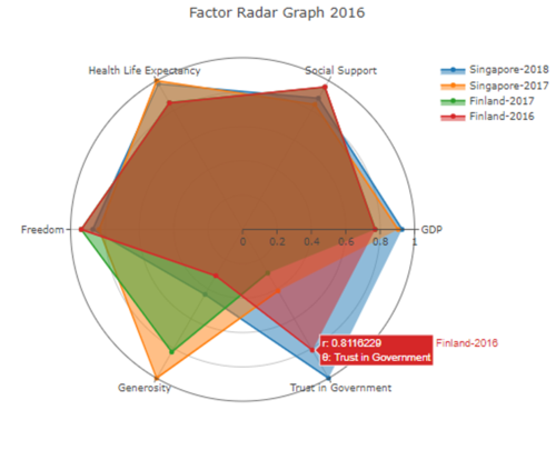
| + | We have added a radar graph visualization that compare between the parameters on a same scale. The user can select between different countries and different years. | ||
| + | [[File:CJSProjRadar.png|center|500px]] | ||
| + | <div style="background: #138D75; padding: 15px; font-weight: bold; line-height: 0.3em; text-indent: 15px;letter-spacing:-0.08em;font-size:20px"><font color=#fbfcfd face="Century Gothic">COMMENT</font></div> | ||
| + | Please provide some comments. | ||
Latest revision as of 22:18, 25 November 2018
Since 2012, the United Nations Sustainable Development Solutions Network (SDSN) has been publishing a world happiness report that presents the happiness levels of 156 countries. 6 factors that include GDP, Social Support, Trust (in government), Generosity, Freedom to Make Life Decisions and Healthy Life Expectancy are used to estimate these final happiness levels. Thus, this visualization explores trends with regards to these 6 factors to understand what exactly makes a "happier" country as per UN's standards.
- Identify the overall trends of happiness ranking index of different countries over the years from 2015 to 2018.
- Identify the rankings of the each of 6 parameters that make up the happiness index of countries.
- Compare the 6 parameters between the selected countries and see how they fare in relation to their final happiness index rankings from the years 2015 to 2018.
- Compare different countries by geographic locations to find out the happiness pattern in different regions.
| Dataset/ Source | Data Attributes | Rationale of Usage |
|---|---|---|
|
World Happiness Report Data 2015-2018 |
|
See the overall performance of each individual country changes from year 2006 onwards |
| World Happiness Report Data 2017 https://s3.amazonaws.com/happiness-report/2018/WHR2018Chapter2OnlineData.xls |
|
Show data of one particular year(2017), its overall score and thus can analyze how the final happiness score is calculated |
|
Happiness rank and scores by country |
|
Data with explanation behind if needed |
|
Happiness rank and scores by country |
|
Data with explanation behind if needed |
|
Happiness rank and scores by country |
|
Data with explanation behind if needed |
Our visualization are inspired by the following works:
| Reference Visualization Work | Our Team's Take-away |
|---|---|
| |
| |
|
| Work Flow | Remark |
|---|---|
|
| Visualization | Description |
|---|---|
|
Purpose:
To show the geographical distribution of the happiness index and the 6 parameters for selected years using a choropleth map. Similar to the survey of related work, this helps the user identify trends between regions. For example, users could see if, for example, Asian countries are “happier” than African countries.
| |
|
Purpose:
To identify any correlation between the 6 sub-factors and the happiness index. Users can see, for example, what the happiness index rankings are for countries with just the highest GDP.
| |
|
Purpose:
To help identify trends between the 6 parameters among the different countries. In our visualization, each of the axes would represent the 6 different parameters that make up the happiness index, and each of the different lines will represent the different countries. Thus, the user can compare all the parameters instantly and identify relationships between them.
|
| Key Technical Challenges | Proposed Solution |
|---|---|
|
No centralized data. Data are all divided year by year. |
|
| Unfamiliar with Visualization Tools |
|
| Unfamiliar programming language |
|
| Tools & Technologies Used | System Architecture |
|---|---|
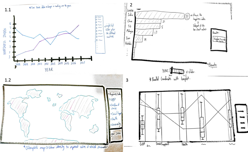
Please check out our visualization sketch to better understand the process. Overall, all these graphs will be tied together on a web-page categorised by different tabs. First tab would feature the choropleth map while the second and third tabs would feature the bar chart and the box plot respectively.
For section 1(left side of the above image), users would be greeted with a general view of the data from 2015 to 2018 through the geographical distribution visualisation. This section aims to fulfill objective 4 where we want to observe trends in the specific regions which are more happy than others. Users can hover over the map and see the 6 parameters that make up the happiness index of the country in the specific year. User need to select the year for Choropleth map. In here, 2 colours will be used to represent the diverging attributes from the world happiness ranking – happier countries and least happier countries.The line graph will serve objective 1 where we aim to identify overall trends in the change of happiness ranking from 2015 to 2018.
Section 2 (top right of the image) presents a more drilled down view as trends specifically related to the 6 parameters that make up the final happiness index can be seen here after the user selects the parameter and year. Tentatively, user would only need to select any one of the 6 parameters and the chart will change dynamically according to the year. This section aims to fulfill objective 2 where the goal is to identify the rankings of each of the 6 factors.
For the section 3(bottom right of the image), the different y-axes represent the different parameters and lines are plotted for all the different countries.This section aims to fulfill objective 3 where we would like to identify distribution of countries for the 6 different factors.
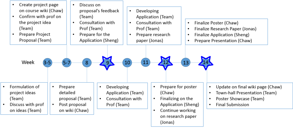
Milestones are indicated with the star.
- https://s3.amazonaws.com/happiness-report/2018/WHR2018Chapter2OnlineData.xls
- https://s3.amazonaws.com/happiness-report/2018/WHR2018Chapter2OnlineData.xls
- http://shiny.rstudio.com/gallery/superzip-example.html
- https://www.gapminder.org/tools/#$chart-type=barrank
- https://bl.ocks.org/jasondavies/1341281
We have added a radar graph visualization that compare between the parameters on a same scale. The user can select between different countries and different years.
Please provide some comments.

