Difference between revisions of "Sixes: Proposal Version 1"
m |
|||
| Line 38: | Line 38: | ||
! style="font-weight: bold;background: #8FCB99;color:#fbfcfd;" | What We Can Learn | ! style="font-weight: bold;background: #8FCB99;color:#fbfcfd;" | What We Can Learn | ||
|- | |- | ||
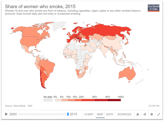
| − | + | | <center> Annual prevalence of use of drugs </center> | | |
| + | https://dataunodc.un.org/drugs/prevalence_map | ||
| + | [[File:Related Work.png|550px]] | ||
| + | | | ||
| + | * Heatmap is an explicit way to show the goegraphical distribution of data. | ||
| + | * The breakdowns shown upon hover give further details without distracting the audience at the first glance. | ||
| + | |- | ||
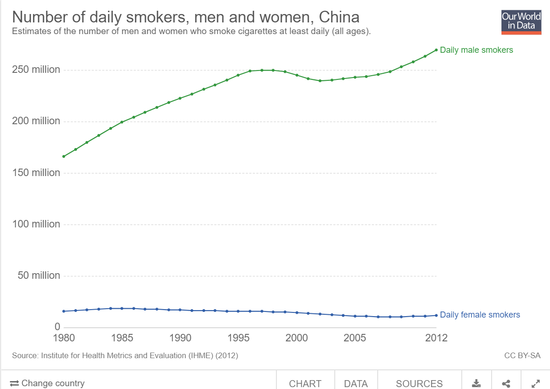
| + | | <center> Map of annual seizures </center> | ||
| + | https://dataunodc.un.org/drugs/seizures_map| | ||
| + | [[File:Related2.png|550px]] | ||
| + | | | ||
| + | * Filter is essential to hide unnecessary data when only a group of data is focused. | ||
|} | |} | ||
</div> | </div> | ||
Revision as of 17:54, 14 October 2018
About 275 million people worldwide, which is roughly 5.6 per cent of the global population aged 15-64 years, used drugs at least once during 2016. Some 31 million of people who use drugs suffer from drug use disorders, meaning that their drug use is harmful to the point where they may need treatment. The consequences of illicit drug use are widespread, causing permanent physical and emotional damage to users and negatively impacting their families, coworkers, and many others with whom they have contact. Our aim is that users can do better drug use prevention, treatment and care with visual analytics on the use of drug.
In this project, we are interested to create a visualisation that helps users perform the following:
- View the geographical distribution of drug use in 2016
- Identify which drug types that people are most addicted
- The distribution of drug users' age groups
Datasets are retrieved from https://data.unodc.org/#state:1
The data set describes the annual prevalence of use of drug in 2016:
There are many charts and visualisations available which illustrates the various trends of house prices and index. We have selected a few of these to study and learn before we begin developing our own visualizations.
| Related Works | What We Can Learn |
|---|---|
| |
|
| Proposed Layout | How Analyst Can Conduct Analysis |
|---|
The following are some of the key technical challenges that we may face throughout the course of the project:
| Key Technical Challenges | How We Propose To Resolve |
|---|---|
| |
| |
|
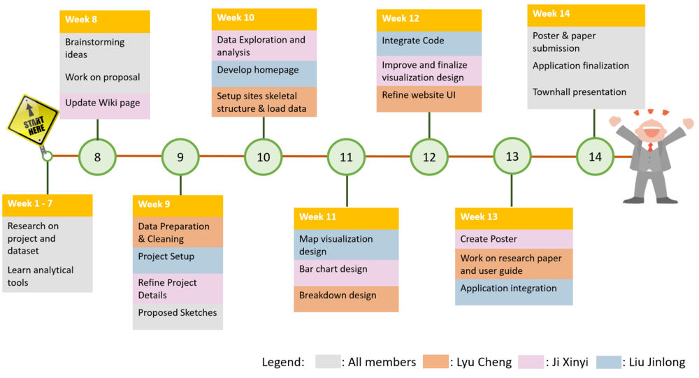
The following shows our project timeline for the completion of this project:
The following are some of the tools/technologies that we will be utilizing during the project:
- Excel
- Github
- Tableau
- R
WIP
WIP
Feel free to comment here :)


