Difference between revisions of "Homviz Homies: Proposal Version 1"
| Line 179: | Line 179: | ||
|- | |- | ||
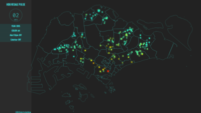
| − | | <p><center>'''Title : | + | | <p><center>'''Title : Geospatial Heatmap ''' </center></p> |
| − | [[File:Related Works | + | [[File:Related Works Geospatial Heatmap.jpg|400px|center]] |
| − | <p><center>'''Source''': | + | <p><center>'''Source''':.....</center></p> |
|| | || | ||
| − | * | + | * Geospatial heat map allows us to quickly see which area has more HDB flats of which type. |
| − | + | * We can also understand that there are new areas and drawing of boundary changes across the years | |
| − | * | + | * There is also the information at a glance at the side for the users to view |
|} | |} | ||
Revision as of 03:49, 4 October 2018
Proposal Version 1
Problem In the recent years, housing prices have been on the rise making it difficult for Singaporeans to own a house. In the National Day Rally 2018, PM Mr. Lee Hsien Loong addressed to the issue of housing to Singaporean. He stated the importance of the 99-year lease of Home Ownership as compared to Singaporean renting a house. However, several older estates were built within short periods such as Marine Parade, Ang Mo Kio and Bedok when their 99-year lease has expired they will all expire at the same time and the flats will be returned to the state. The government has also been progressively taking back flats over the years for redevelopment.
Motivation There is a need to relocate residents for redevelopment such as getting another flat to live in. In response to growing demand for housing, there is a need to analyze housing supply and housing prices to gain insights on how much is enough supply of housing and how much is enough payback price for citizens to afford a new housing.
In this project, we are interested to create a visualization that helps analysts perform the following:
- Identify the lease term of the HDB and highlight those that are going to reach their due year.
- Identify the number of units and the number of households in the HDB that will be affected by the relocation
- Identify the buyback price that will enable affected households to have enough lump sum to buy a new house after buyback
- Identify how much housing should be supplied based on the household’s affected by buyback
The dataset for analysis will be retrieved from multiple databases, as elaborated below:
| Dataset/Source | Data Attributes | Rationale Of Usage |
|---|---|---|
(https://data.gov.sg/dataset/hdb-property-information) |
FY(1 April - 31 March) |
|
(https://data.gov.sg/dataset/resale-flat-prices) |
|
|
(https://www.hdb.gov.sg/cs/infoweb/residential/buying-a-flat/resale/resale-statistics) |
|
|
(https://data.gov.sg/dataset/price-range-of-hdb-flats-offered) |
|
|
(https://data.gov.sg/dataset/number-of-units-of-hdb-developments-by-status?view_id=2f0e2460-4d87-464d-bd1f-aafa17fac75a&resource_id=ff97dd96-6db5-4eb7-ba79-ad8d4840a3aa) |
|
|
Some of these visualizations that we draw inspiration from, are as follows:
| Reference of Other Interactive Visualization | What We Can Learn |
|---|---|
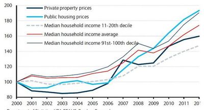
| |
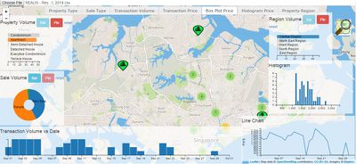
| |
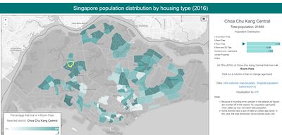
| |
|
Our group has proposed the following storyboard to assist analysts in the use of our visual application:
- Challenge 1
- Challenge 2
The following are some of the key technical challenges that we may face throughout the course of the project:
- Challenge 1
- Challenge 2
The following shows our project timeline for the completion of this project:
- Insert Timeline Here
The following are some of the tools/technologies that we will be utilizing during the project:
- D3.js
- Chart.js
- Visual Studio Code
- Microsoft Powerpoint
- Point 1
- Point 2
- Point 3
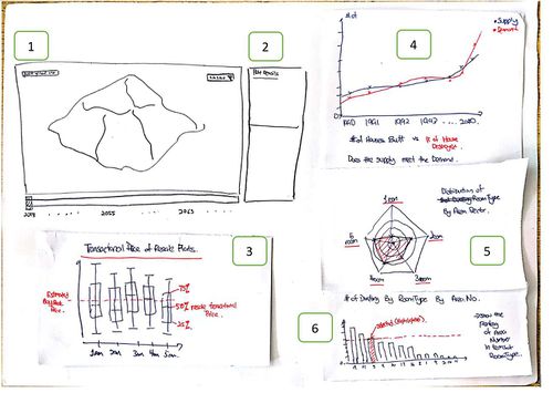
The following are some of the proposed storyboard that we designed during our brainstorming sessions:
- [1] Map of Singapore that the users are able to choose to filter by subzones or by individual dwellings. There will also be a timeline slider at the bottom of the Map. This will enable the users to pick a particular year. The map will change to show which dwelling's lease year is going to hit it's expiry mark
- [2] This will contain information at a glance of the dwellings of the user's choice such as number of households, number of units, the subzone etc.
- [3] The box plot will contain the transactional price of resale flats of each room type (1 room, 2 room, 3 room etc) in the dwelling. This will be based on what the user has clicked in the map.
- [4] A line graph of the number of houses supplied vs the number of houses reclaimed over the years.
- [5] A radar chart to show the distribution of the number of room types by the chosen area sector.
- [6] A bar chart of the number of dwelling by room type and area number.
Feel free to comment on our project

