Difference between revisions of "IS428 AY2018-19T1 Chua Sing Rue"
Srchua.2015 (talk | contribs) |
Srchua.2015 (talk | contribs) |
||
| (54 intermediate revisions by the same user not shown) | |||
| Line 1: | Line 1: | ||
== Problem and Motivation == | == Problem and Motivation == | ||
| + | Air pollution is an important risk factor for health in Europe and worldwide. A recent review of the global burden of disease showed that it is one of the top ten risk factors for health globally. Worldwide an estimated 7 million people died prematurely because of pollution; in the European Union (EU) 400,000 people suffer a premature death. The Organisation for Economic Cooperation and Development (OECD) predicts that in 2050 outdoor air pollution will be the top cause of environmentally related deaths worldwide. In addition, air pollution has also been classified as the leading environmental cause of cancer. | ||
| + | |||
| + | Air quality in Bulgaria is a big concern: measurements show that citizens all over the country breathe in air that is considered harmful to health. For example, concentrations of PM2.5 and PM10 are much higher than what the EU and the World Health Organization (WHO) have set to protect health. | ||
| + | |||
| + | Bulgaria had the highest PM2.5 concentrations of all EU-28 member states in urban areas over a three-year average. For PM10, Bulgaria is also leading on the top polluted countries with 77 μg/m3on the daily mean concentration (EU limit value is 50 μg/m3). | ||
| + | |||
| + | According to the WHO, 60 percent of the urban population in Bulgaria is exposed to dangerous (unhealthy) levels of particulate matter (PM10). | ||
| + | |||
| + | This assignment aims to use visual analytics to reveal spatio-temporal patterns of air quality in Sofia City and to identify issues of concern. | ||
== Task 1: Spatio-temporal Analysis of Official Air Quality == | == Task 1: Spatio-temporal Analysis of Official Air Quality == | ||
| Line 95: | Line 104: | ||
1. Calendar Heatmap: Within-day trend of Average Hourly PM10 by Month | 1. Calendar Heatmap: Within-day trend of Average Hourly PM10 by Month | ||
<p> [[File:Calendar Heatmap for Within-day trend.jpg|500px|center]] </p> | <p> [[File:Calendar Heatmap for Within-day trend.jpg|500px|center]] </p> | ||
| + | |||
| + | === Findings === | ||
| + | |||
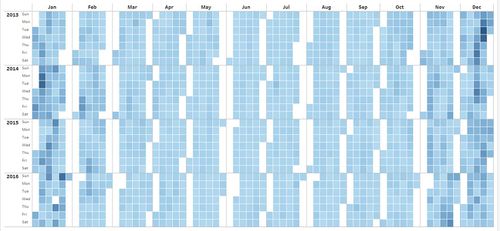
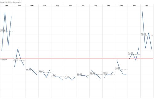
| + | <p> For most months of the year, in the period of 2013 to 2018, daily average PM10 values are generally below the EU limit of 50μg/m3. However, for December and January, daily average PM10 values generally experience a steep increase. This steep increase was most significant in 2013 and 2015. </p> | ||
| + | |||
| + | <p> One of Bulgaria's main sources of PM10 is electricity production by burning coals through industrial processes [https://unmaskmycity.org/project/sofia/]. Since December and January are winter season for Sofia City, households and businesses will likely increase their electricity consumption to keep warm. Producers respond to the seasonal increase in demand for electricity and increase electricity production, thus resulting in higher emissions and PM10 values. </p> | ||
| + | |||
| + | <p> In terms of within-day hourly trend, mornings from 8:00AM to 12:00PM and evenings from 5:00PM til 12:00AM recorded relatively higher values of PM10 across all months, compared to afternoons from 12:00PM to 5:00PM. Similarly, this observed pattern could be due to household electricity consumption patterns, which peaks as people wake to get ready for work or school and when they return home at the end of the workday or school day. </p> | ||
== Task 2: Spatio-temporal Analysis of Citizen Science Air Quality Measurements == | == Task 2: Spatio-temporal Analysis of Citizen Science Air Quality Measurements == | ||
| Line 110: | Line 127: | ||
<p>'''Issue 4:''' After connecting the merged file to Tableau, it is clear that the data available covers beyond Sofia City. As such, the dataset must be filtered to include only information from Sofia City. </p> | <p>'''Issue 4:''' After connecting the merged file to Tableau, it is clear that the data available covers beyond Sofia City. As such, the dataset must be filtered to include only information from Sofia City. </p> | ||
| − | <p> [[File:Citizen Air Quality Stations v2.jpg| | + | <p> [[File:Citizen Air Quality Stations v2.jpg|500px|center]] </p> |
<p>'''Solution:''' Use the lasso tool in Tableau to select all data points within Sofia City, then include them as members in a set while excluding all other data points. </p> | <p>'''Solution:''' Use the lasso tool in Tableau to select all data points within Sofia City, then include them as members in a set while excluding all other data points. </p> | ||
| − | <p> [[File:Stations within Sofia City v3.jpg| | + | <p> [[File:Stations within Sofia City v3.jpg|500px|center]] </p> |
=== Sensor Coverage === | === Sensor Coverage === | ||
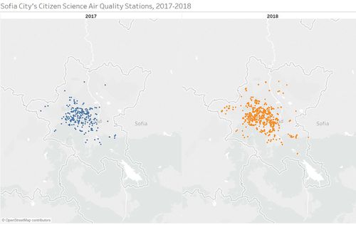
As observed, there are fewer sensors closer to the city boundary. On the other hand, there are more sensors closer to the city centre. As such, the sensors appear to be clustered near the city centre, and are not evenly distributed across the entire city. This distribution pattern is similar across 2017 and 2018. | As observed, there are fewer sensors closer to the city boundary. On the other hand, there are more sensors closer to the city centre. As such, the sensors appear to be clustered near the city centre, and are not evenly distributed across the entire city. This distribution pattern is similar across 2017 and 2018. | ||
| − | <p> [[File:Sensor coverage v2.jpg| | + | <p> [[File:Sensor coverage v2.jpg|500px|center]] </p> |
As such, readings from sensors may not be representative of Sofia City as a whole. Additionally, the clustering of sensors near the city centre may lead to a upward bias in pollution measures, especially since traffic is typically heavier closer to the city centre. | As such, readings from sensors may not be representative of Sofia City as a whole. Additionally, the clustering of sensors near the city centre may lead to a upward bias in pollution measures, especially since traffic is typically heavier closer to the city centre. | ||
=== Sensor Performance === | === Sensor Performance === | ||
| − | 1. Time trend of total number of recorded measurements | + | '''1. Time trend of total number of recorded measurements''' |
<p> [[File:No. of Recorded Measurements.jpg|500px|center]] </p> | <p> [[File:No. of Recorded Measurements.jpg|500px|center]] </p> | ||
| Line 131: | Line 148: | ||
These anomalies suggest that not all sensors work at all times. In other words, there are instances when some sensors fail. | These anomalies suggest that not all sensors work at all times. In other words, there are instances when some sensors fail. | ||
| − | 2. Time trend of the rate of change in total number of recorded measurements | + | '''2. Time trend of the rate of change in total number of recorded measurements''' |
<p> [[File:Rate of change of number of recorded measurements.jpg|500px|center]] </p> | <p> [[File:Rate of change of number of recorded measurements.jpg|500px|center]] </p> | ||
| Line 139: | Line 156: | ||
It is unlikely that dramatic changes were caused by new sensors being installed. A more probable explanation could be that the sensors were taken off the grid for maintenance, or there was an incident of power outage that affected a cluster of sensors. | It is unlikely that dramatic changes were caused by new sensors being installed. A more probable explanation could be that the sensors were taken off the grid for maintenance, or there was an incident of power outage that affected a cluster of sensors. | ||
| − | === Air | + | === Spatial Distribution of Citizen Science Air Quality Measures === |
| − | Using a scatter plot matrix, pair relationships among the five measures can be easily observed, particularly if there is some form of linear relationship or correlation between either two of the | + | '''Exploratory Data Analysis''' |
| + | <p> Using a scatter plot matrix, pair relationships among the five measures can be easily observed, particularly if there is some form of linear relationship or correlation between either two of the measures. </p> | ||
| + | |||
| + | <p> [[File:Scatter plot w outliers v2.png|500px|center]] </p> | ||
| + | |||
| + | <p> From the scatter plot matrix, outlier records are easily observed, as labelled in the image above. These outlier points will be excluded from the analysis. Additionally, records with measurement value of zero for all measures except temperature will also be excluded, as these may be due to issues with sensor performance instead of representing a true measure.</p> | ||
| + | |||
| + | <p> In order to effectively compare the readings across different parts of Sofia City, all readings for the five measures were converted to percentile. </p> | ||
| + | |||
| + | '''1. P1''' | ||
| + | |||
| + | [[File:P1 v5.png|500px|center]] | ||
| + | |||
| + | By filtering for P1 values that are ranked at least at the 90th percentile, it can be seen that relatively higher measures of P1 are recorded closer to the city centre. Additionally, there are a few records of high P1 values near the outskirts of the city. Generally, high P1 values appear to be organised along a diagonal band from the north-west to south-east of Sofia City. | ||
| + | |||
| + | However, this pattern of distribution of high P1 values is not consistent over time, as seen by animating their spatial distribution over time. For instance, high P1 values recorded near the outskirts of the city are not always located at same region of the city. The degree of dispersion of high P1 values also varies according to months. During the period April, May, and June, records of high P1 values are less dispersed and clustered together near the city centre. On the other hand, for November and December, higher values of P1 values are more dispersed. | ||
| − | + | '''2. P2''' | |
| − | + | [[File:P2 v3.png|500px|center]] | |
| + | |||
| + | Similarly, after filtering for P2 values at least at the 90th percentile, it can be seen that relatively higher measures of P2 are recorded closer to the city centre, with a few records of high P2 values near the outskirts of the city. High P2 values also appear to be organised in a diagonal band across the north-west to south-east of Sofia City. | ||
| + | |||
| + | However, unlike P1, the degree of dispersion for high P2 values appear relatively consistent over time. | ||
| + | |||
| + | '''3. Pressure''' | ||
| + | |||
| + | [[File:Pressure v2.png|500px|center]] | ||
| + | |||
| + | Relatively higher values of pressure are recorded above the diagonal across the north-west and south-east of Sofia City. This suggests a possibility of topographical features causing this systematic difference. For instance, areas below the diagonal might be higher in altitude, which would lead to relatively lower measurements of pressure. More investigation is needed into the topographical features of Sofia City to validate this theory. | ||
| + | |||
| + | This pattern is consistent over time. | ||
| + | |||
| + | '''4. Temperature''' | ||
| + | |||
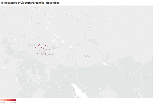
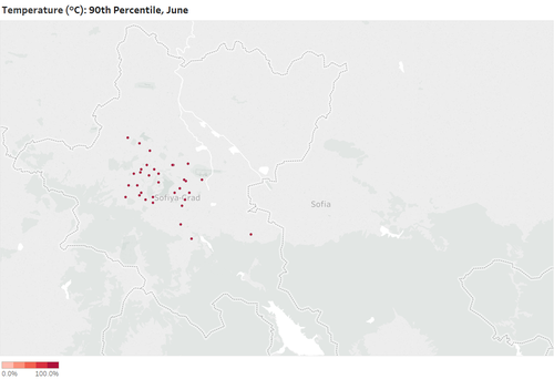
| + | Relatively higher temperatures are recorded along the same diagonal band as mentioned above. | ||
| + | |||
| + | [[File:Temp Nov.png|500px|center]] | ||
| + | [[File:Temp Jun.png|500px|center]] | ||
| + | |||
| + | The differences are time-dependent as records of high temperatures are less dispersed in November and December, but more dispersed in other months such as June and July. | ||
| + | |||
| + | '''5. Humidity''' | ||
| + | |||
| + | [[File:Humidity v2.png|500px|center]] | ||
| + | |||
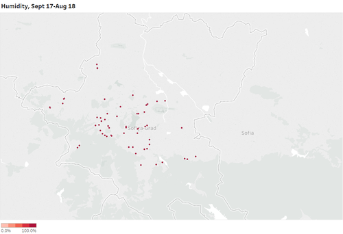
| + | In general, relatively higher values of humidity appear to be evenly distributed across Sofia City. This degree of dispersion appear consistent across time. | ||
| + | |||
| + | However, the number of records of high humidity measurements is time-dependent and varies according to months. In the months March, April, and May, more records of high humidity were observed, as compared to November and December. | ||
== Task 3 == | == Task 3 == | ||
| + | |||
| + | === Data Preparation: METEO-data === | ||
| + | |||
| + | <p>'''Issue 1:''' All values for PRCPMAX and PRCPMIN are missing. </p> | ||
| + | <p>'''Solution:''' Drop PRCPMAX and PRCPMIN before reading in the data into Tableau. </p> | ||
| + | |||
| + | === Interactions between local meteorological characteristics === | ||
| + | |||
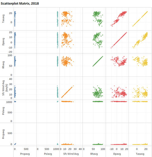
| + | 1. Scatter plot matrix by year | ||
| + | |||
| + | [[File:Scattermeteo.png|500px|center]] | ||
| + | |||
| + | 2. Line graph by year | ||
| + | |||
| + | [[File:Linegraph.png|500px|center]] | ||
| + | |||
| + | |||
| + | === Interactions between local topography characteristics === | ||
| + | |||
| + | == Interactive Visualisation == | ||
| + | https://public.tableau.com/profile/sing.rue.chua#!/vizhome/IS428_Individual_ChuaSingRue/OfficialPresent | ||
| + | |||
| + | <p> '''Past air quality measurements by official air quality stations''' </p> | ||
| + | [[File:Official Past.jpg|600px|center]] | ||
| + | |||
| + | <p> '''Recent air quality measurements by official air quality stations''' </p> | ||
| + | [[File:Official Present.jpg|600px|center]] | ||
| + | |||
| + | <p> '''Recent air quality measurements by citizen science air quality stations''' </p> | ||
| + | [[File:Citizen.jpg|600px|center]] | ||
| + | |||
| + | <p> '''Meteorological measures of Sofia City''' </p> | ||
| + | [[File:Meteo v2.jpg|600px|center]] | ||
== References == | == References == | ||
| + | [https://unmaskmycity.org/project/sofia/ [1<nowiki>]</nowiki> https://unmaskmycity.org/project/sofia/] | ||
== Comments == | == Comments == | ||
Latest revision as of 06:03, 15 November 2018
Contents
Problem and Motivation
Air pollution is an important risk factor for health in Europe and worldwide. A recent review of the global burden of disease showed that it is one of the top ten risk factors for health globally. Worldwide an estimated 7 million people died prematurely because of pollution; in the European Union (EU) 400,000 people suffer a premature death. The Organisation for Economic Cooperation and Development (OECD) predicts that in 2050 outdoor air pollution will be the top cause of environmentally related deaths worldwide. In addition, air pollution has also been classified as the leading environmental cause of cancer.
Air quality in Bulgaria is a big concern: measurements show that citizens all over the country breathe in air that is considered harmful to health. For example, concentrations of PM2.5 and PM10 are much higher than what the EU and the World Health Organization (WHO) have set to protect health.
Bulgaria had the highest PM2.5 concentrations of all EU-28 member states in urban areas over a three-year average. For PM10, Bulgaria is also leading on the top polluted countries with 77 μg/m3on the daily mean concentration (EU limit value is 50 μg/m3).
According to the WHO, 60 percent of the urban population in Bulgaria is exposed to dangerous (unhealthy) levels of particulate matter (PM10).
This assignment aims to use visual analytics to reveal spatio-temporal patterns of air quality in Sofia City and to identify issues of concern.
Task 1: Spatio-temporal Analysis of Official Air Quality
Data Preparation: EEA Dataset
| Name of Air Quality Station | Local ID | Data available |
|---|---|---|
| ||
| ||
| ||
| ||
| ||
|
Issue 1: The official air quality measurements in the EEA Data folder contains PM10 measurements from air quality stations in Sofia city for the years 2013 to 2018. However, the dataset is not complete. Air quality station Mladost has only 2018 data available. Additionally, air quality station Orlov Most is missing data for the years 2016, 2017 and 2018.
Solution: For the purposes of comparison, air quality station Mladost and Orlov Most will be excluded.
Issue 2: PM10 measurements are reported as an averaged daily value for the years 2013 to 2016, but reported as an averaged hourly value for the years 2017 to 2018.
Solution: When comparing across the periods 2013 to 2016 and 2017 to 2018, the hourly PM10 average values will be recalculated as a daily average in order to get a common basis for comparison. At the same time, averaged hourly PM10 values will still be used to drill down into within-day trends for the more recent information.
Issue 3: For 2017 data, PM10 values for 1 Jan 2017 to 26 Nov 2017 are missing. Additionally, 2018 data is recorded up til September 14 only.
Solution: 2017 and 2018 data should not be used for yearly trends.
Overall trend in Daily Average PM10
1. Time series for Daily Average PM10, 2013 - 2016
2. Time series for Daily Average PM10, Nov 2017 - Sept 2018
Seasonal trend in Daily Average PM10
1. Calendar Heatmap
2. Cycle Plot
Intra-day trend in Hourly Average PM10
1. Calendar Heatmap: Within-day trend of Average Hourly PM10 by Month
Findings
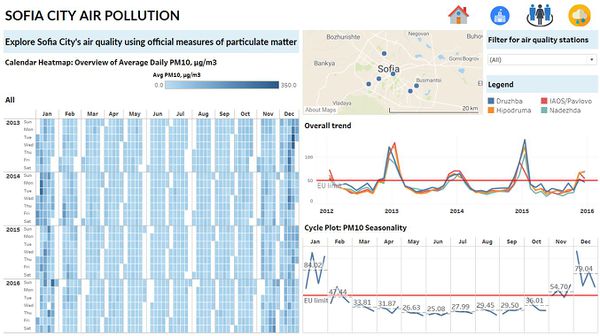
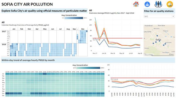
For most months of the year, in the period of 2013 to 2018, daily average PM10 values are generally below the EU limit of 50μg/m3. However, for December and January, daily average PM10 values generally experience a steep increase. This steep increase was most significant in 2013 and 2015.
One of Bulgaria's main sources of PM10 is electricity production by burning coals through industrial processes [1]. Since December and January are winter season for Sofia City, households and businesses will likely increase their electricity consumption to keep warm. Producers respond to the seasonal increase in demand for electricity and increase electricity production, thus resulting in higher emissions and PM10 values.
In terms of within-day hourly trend, mornings from 8:00AM to 12:00PM and evenings from 5:00PM til 12:00AM recorded relatively higher values of PM10 across all months, compared to afternoons from 12:00PM to 5:00PM. Similarly, this observed pattern could be due to household electricity consumption patterns, which peaks as people wake to get ready for work or school and when they return home at the end of the workday or school day.
Task 2: Spatio-temporal Analysis of Citizen Science Air Quality Measurements
Data preparation: Air Tube Dataset
Issue 1: The citizen science air quality measurements in the Air Tube Data folder are mapped to unique geohash numbers. However, geohash is not supported by Tableau currently.
Solution: Reverse geocoding to get the longitude and latitude of these stations must be done. Use R package, geohash to decode geohashes into latitude/longitude pairs.
Issue 2: Latitude/longitude pairs through reverse geocoding is simply a reference point, and as such, is not representative as a point location.
Solution: Techniques such as hexagon binning should be used to better represent the stations.
Issue 3: Due to the large number of records, data for 2017 and 2018 are stored in separate files. Additionally, it is not possible to explore the data using Excel as not all records will load.
Solution: Use Python package, pandas to merge both 2017 and 2018 csv files into one.
Issue 4: After connecting the merged file to Tableau, it is clear that the data available covers beyond Sofia City. As such, the dataset must be filtered to include only information from Sofia City.
Solution: Use the lasso tool in Tableau to select all data points within Sofia City, then include them as members in a set while excluding all other data points.
Sensor Coverage
As observed, there are fewer sensors closer to the city boundary. On the other hand, there are more sensors closer to the city centre. As such, the sensors appear to be clustered near the city centre, and are not evenly distributed across the entire city. This distribution pattern is similar across 2017 and 2018.
As such, readings from sensors may not be representative of Sofia City as a whole. Additionally, the clustering of sensors near the city centre may lead to a upward bias in pollution measures, especially since traffic is typically heavier closer to the city centre.
Sensor Performance
1. Time trend of total number of recorded measurements
From the above line graph, it can be observed that there is a general upward trend in terms of the total number of recorded air quality measurements. However, several notable points stand out, recording significant dips that go against the prevailing upward trend. These points are labelled in red.
These anomalies suggest that not all sensors work at all times. In other words, there are instances when some sensors fail.
2. Time trend of the rate of change in total number of recorded measurements
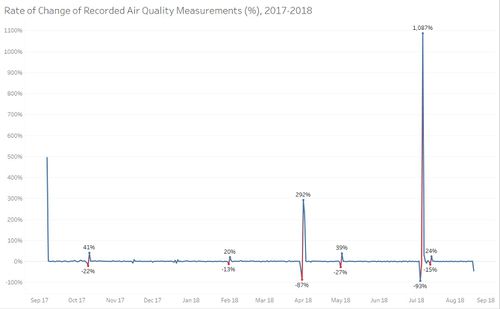
The visualisation of percentage change in total number of recorded measurements over time similarly reveal anomalies in the data. Generally, rate of change in total number of recorded measurements from one day to the next is fairly constant and stable. However, several instances in the data show a drastic change from one interval to the next, with the most significant change being a 1087% increase in total number of recorded measurements in July 2018.
It is unlikely that dramatic changes were caused by new sensors being installed. A more probable explanation could be that the sensors were taken off the grid for maintenance, or there was an incident of power outage that affected a cluster of sensors.
Spatial Distribution of Citizen Science Air Quality Measures
Exploratory Data Analysis
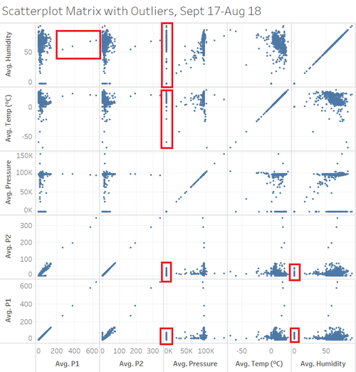
Using a scatter plot matrix, pair relationships among the five measures can be easily observed, particularly if there is some form of linear relationship or correlation between either two of the measures.
From the scatter plot matrix, outlier records are easily observed, as labelled in the image above. These outlier points will be excluded from the analysis. Additionally, records with measurement value of zero for all measures except temperature will also be excluded, as these may be due to issues with sensor performance instead of representing a true measure.
In order to effectively compare the readings across different parts of Sofia City, all readings for the five measures were converted to percentile.
1. P1
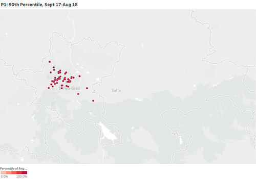
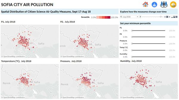
By filtering for P1 values that are ranked at least at the 90th percentile, it can be seen that relatively higher measures of P1 are recorded closer to the city centre. Additionally, there are a few records of high P1 values near the outskirts of the city. Generally, high P1 values appear to be organised along a diagonal band from the north-west to south-east of Sofia City.
However, this pattern of distribution of high P1 values is not consistent over time, as seen by animating their spatial distribution over time. For instance, high P1 values recorded near the outskirts of the city are not always located at same region of the city. The degree of dispersion of high P1 values also varies according to months. During the period April, May, and June, records of high P1 values are less dispersed and clustered together near the city centre. On the other hand, for November and December, higher values of P1 values are more dispersed.
2. P2
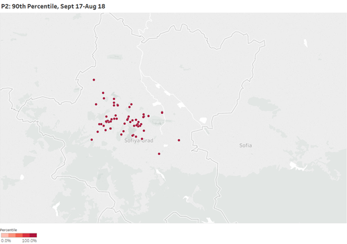
Similarly, after filtering for P2 values at least at the 90th percentile, it can be seen that relatively higher measures of P2 are recorded closer to the city centre, with a few records of high P2 values near the outskirts of the city. High P2 values also appear to be organised in a diagonal band across the north-west to south-east of Sofia City.
However, unlike P1, the degree of dispersion for high P2 values appear relatively consistent over time.
3. Pressure
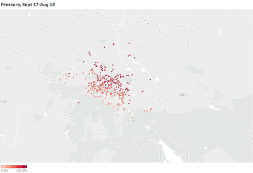
Relatively higher values of pressure are recorded above the diagonal across the north-west and south-east of Sofia City. This suggests a possibility of topographical features causing this systematic difference. For instance, areas below the diagonal might be higher in altitude, which would lead to relatively lower measurements of pressure. More investigation is needed into the topographical features of Sofia City to validate this theory.
This pattern is consistent over time.
4. Temperature
Relatively higher temperatures are recorded along the same diagonal band as mentioned above.
The differences are time-dependent as records of high temperatures are less dispersed in November and December, but more dispersed in other months such as June and July.
5. Humidity
In general, relatively higher values of humidity appear to be evenly distributed across Sofia City. This degree of dispersion appear consistent across time.
However, the number of records of high humidity measurements is time-dependent and varies according to months. In the months March, April, and May, more records of high humidity were observed, as compared to November and December.
Task 3
Data Preparation: METEO-data
Issue 1: All values for PRCPMAX and PRCPMIN are missing.
Solution: Drop PRCPMAX and PRCPMIN before reading in the data into Tableau.
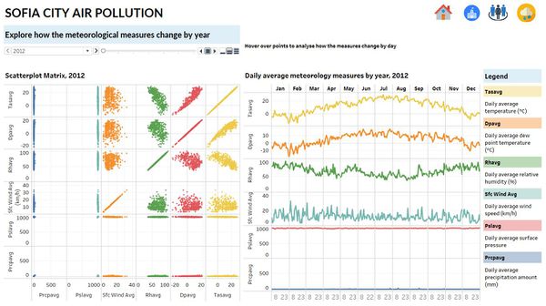
Interactions between local meteorological characteristics
1. Scatter plot matrix by year
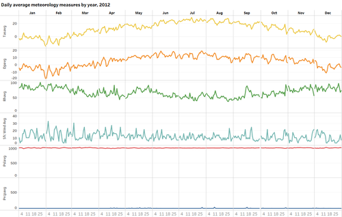
2. Line graph by year
Interactions between local topography characteristics
Interactive Visualisation
Past air quality measurements by official air quality stations
Recent air quality measurements by official air quality stations
Recent air quality measurements by citizen science air quality stations
Meteorological measures of Sofia City
References
[1] https://unmaskmycity.org/project/sofia/


