Difference between revisions of "IS428 AY2018-19T1 Ng Wei En"
(Created page with "<font size="5">'''To be a Visual Detective'''</font> == Preamble == Air pollution is an important risk factor for health in Europe and worldwide. A recent review of the global...") |
|||
| (4 intermediate revisions by the same user not shown) | |||
| Line 25: | Line 25: | ||
== Dataset Analysis & Transformation Process == | == Dataset Analysis & Transformation Process == | ||
| + | As with any given dataset, there is a need to scrutinise the format and attributes of each column in each dataset. The necessary data transformation and data preparation steps would need to be taken to aid the importing of dataset for data visualisation to be based on. Elaboration on the data transformation process for each dataset will be set out below: | ||
| + | |||
| + | '''Official air quality measurements (5 stations in the city, EEA Data.zip)''' | ||
| + | '''Issue 1: Incomplete dataset''' | ||
| + | '''Description''': | ||
| + | The files contained in EEA Data.zip file can be categorised below: | ||
| + | |||
| + | |||
| + | |||
| + | SPO-BG0040A | ||
| + | * BG_5_9642_2013_timeseries.csv | ||
| + | * BG_5_9642_2014_timeseries.csv | ||
| + | * BG_5_9642_2015_timeseries.csv | ||
| + | * BG_5_9642_2016_timeseries.csv | ||
| + | * BG_5_9642_2017_timeseries.csv | ||
| + | * BG_5_9642_2018_timeseries.csv | ||
| + | |||
| + | |||
| + | SPO-BG0050A | ||
| + | * BG_5_9572_2013_timeseries.csv | ||
| + | * BG_5_9572_2014_timeseries.csv | ||
| + | * BG_5_9572_2015_timeseries.csv | ||
| + | * BG_5_9572_2016_timeseries.csv | ||
| + | * BG_5_9572_2017_timeseries.csv | ||
| + | * BG_5_9572_2017_timeseries.csv | ||
| + | * BG_5_9572_2018_timeseries.csv | ||
| + | |||
| + | SPO-BG0052A | ||
| + | * BG_5_9421_2013_timeseries.csv | ||
| + | * BG_5_9421_2014_timeseries.csv | ||
| + | * BG_5_9421_2015_timeseries.csv | ||
| + | * BG_5_9421_2016_timeseries.csv | ||
| + | * BG_5_9421_2017_timeseries.csv | ||
| + | * BG_5_9421_2017_timeseries.csv | ||
| + | * BG_5_9421_2018_timeseries.csv | ||
| + | |||
| + | SPO-BG0054A | ||
| + | * '''BG_5_9484_2013_timeseries.csv''' | ||
| + | * '''BG_5_9484_2014_timeseris.csv''' | ||
| + | * '''BG_5_9484_2015_timeseries.csv''' | ||
| + | |||
| + | SPO-BG0073A | ||
| + | * BG_5_9616_2013_timeseries.csv | ||
| + | * BG_5_9616_2014_timeseries.csv | ||
| + | * BG_5_9616_2015_timeseries.csv | ||
| + | * BG_5_9616_2016_timeseries.csv | ||
| + | * BG_5_9616_2017_timeseries.csv | ||
| + | * BG_5_9616_2017_timeseries.csv | ||
| + | * BG_5_9616_2018_timeseries.csv | ||
| + | |||
| + | SPO-BG0079A | ||
| + | * '''BG_5_60881_2018_timeseries.csv''' | ||
| + | |||
| + | '''Solution''': Files names highlighted in bold are incomplete and will thus be omitted from the dataset in order to make an accurate comparison across air quality stations. Thus, only data from 4 out of 6 air quality stations will be used. | ||
| + | |||
| + | '''Issue 2: Combining CSV files''' | ||
| + | |||
| + | '''Description:''' Having to import multiple CSV files into Tableau and joining them can be quite a hassle. | ||
| + | |||
| + | '''Solution:''' Merging of CSV files was done via Terminal on OSX instead. Running the code “cat *.csv >merged.csv” will merge all CSV files within the enclosing folder. There will be now be a single CSV file for each Air Quality station. This will then be merged again to form a single CSV file containing air quality data from 4 air quality stations between 2013 to 2018. | ||
| + | |||
| + | |||
| + | '''Issue 3: Inner-joining Metadata file with BG Datafile''' | ||
| + | |||
| + | '''Description:''' Detailed information about each air quality station is set out in metadata.xsls This information can be inner-joined with the BG data through a common field, AirQualityStationEolCode. | ||
| + | |||
| + | |||
| + | |||
| + | |||
| + | '''Solution:''' Perform inner-join in Data Source tab of Tableau. | ||
| + | |||
| + | [[File:Innerjoin table.png|thumb]] | ||
| + | Data Source> Inner-join Tables in Tableau. | ||
| + | |||
| + | '''Citizen science air quality measurements (Air Tube.zip)''' | ||
| + | |||
| + | This dataset contains air quality measurements including temperature, humidity, pressure as well as measurements of airborne particulate matter(PM), specifically PM10(denoted by P1) and PM2.5(denoted by P2) across many stations. The location of these stations are also represented by its geohash, which is an alphanumeric string of a set of latitude and longitude. There are a total of 2 dataset files in this zip file, each containing hourly data in 2017 and 2018. | ||
| + | |||
| + | The following issues were identified in either or both of the datsets and data transformation was performed to address them: | ||
| + | |||
| + | '''Issue 1:Missing geohash values''' | ||
| + | |||
| + | '''Description:''' There were missing geohash values in 4 rows of data in the data_bg_2018.csv file. | ||
| + | |||
| + | [[File:Missing geohash.png|thumb]]<br> | ||
| + | |||
| + | |||
| + | '''Solution:''' These 4 rows of data were meaningless because the geohash which serves as the unique identifier of the station that records the data is missing. As such, they are removed from the dataset. | ||
| + | |||
| + | |||
| + | '''Issue 2: Decoding geohash values into latitude and longitude''' | ||
| + | |||
| + | Description: In order for data visualisation softwares to make sense of location information, the geohash has to be decoded into latitude and longitude. This could be done either in R or Python. | ||
| + | |||
| + | Solution: Using the pandas library in Python, the tabular data in both data_bg_2017.csv and data_bg_2018.csv were imported to the Jupyter Notebook app. The pandas library is for managing tabular data while the pygeohash library is for the purpose of decoding geohash into latitude and longitude. | ||
| + | |||
| + | [[File:Pygeohash.png|thumbnail|Screenshot of data import to Jupyter Python and import pandas and pygeohash library.]]<br> | ||
| + | |||
| + | |||
| + | With reference to the pygeohash library, the function for decoding of geohash is used but is met with an error, KeyError: ‘- ‘. This was later narrowed down to an erroneous geohash value which contains a dash. Geohashes should only contain alphanumeric characters and a geohash value containing hash cannot be decoded as such. That entire row is removed due to the erroneous geohash value. The decode geohash function can now be successfully executed. | ||
| + | |||
| + | '''Issue 3: Reverse geocoding of geohash values to retrieve location names of air quality stations as unique identifiers | ||
| + | ''' | ||
| + | '''Description:''' Using the latitude/longitude data or the geohash data as the unique identifier is technically possible but does not make much sense as it is not human readable and one cannot possibly tell where the location of the sensor is just by looking at it. | ||
| + | |||
| + | '''Solution:''' Reverse geocoding is used to retrieve the location names of the corresponding latitude/longitude data by using the geopy library in Python. | ||
| + | |||
| + | However, it was discovered that running the reverse geocode function for too many times consecutively would trigger a “GeocoderTimedOut” error. A workaround would be to use a recursive function and if this exception is triggered, it will be run again so that the function will not be stopped at the first occurrence of a “GeocoderTimedOut” error. | ||
| + | |||
| + | [[File:Geocoder function.png|thumb]] | ||
| + | |||
| + | However, this would be too time-consuming(estimated to take about 3 hours for entire dataset in data_bg_2018.csv). In order to reduce the complexity, only unique geohashes are retrieved(1114 rows) from the whole dataset and its corresponding location data are reverse-geocoded. | ||
| + | |||
| + | [[File:Reverse geocode.png|thumb]] | ||
| + | |||
| + | The “Lookup” function will then be used to retrieve the corresponding location names for the geohashes in both data_bg_2018.csv and data_bg_2018.csv. To simplify the process of analysis, both data files are combined into one single file. | ||
| + | |||
| + | '''Issue 4: Combining CSV files''' | ||
| + | |||
| + | '''Description:''' By copying and pasting the dataset from data_bg_2018.csv and appending it to data_bg_2018.csv will cause the error "The information cannot be pasted because the copy area and the paste area are not the same size and shape." | ||
| + | |||
| + | '''Solution:''' Merging of CSV files was done via Terminal on OSX instead. Running the code “cat *.csv >merged.csv” will merge all CSV files within the enclosing folder. | ||
| + | |||
| + | |||
| + | Meteorological measurements (1 station, METEO-data.zip) | ||
| + | |||
| + | There was no single datetime value. Excel was used to concatenate day with month with year to form a single date value and new column is added to store this datevalue for each row. | ||
| + | |||
| + | Topography data (TOPO-DATA) | ||
| + | No significant data transformation was performed for this dataset. | ||
| + | |||
| + | |||
| + | {| class="wikitable" | ||
| + | |- | ||
| + | ! Interactive Technique !! Explanation !! Steps Involved | ||
| + | |- | ||
| + | | Date range slider | ||
| + | [[File:Daterangeslider.png|frame]] | ||
| + | || To provide the user with the ease of setting a date range to limit visualisation information that they wish to analyse. A date range slider is preferred over manually keying in a start date to end date. || 1) Time field must be converted to Data Type, “Date”. | ||
| + | 2) Set Filter to “Range of Date” and Show Filter | ||
| + | |||
| + | |- | ||
| + | | Filter Action | ||
| + | [[File:Filter action.png|frameless]] | ||
| + | ||To apply selection filter on Sensor Map Overview on all other charts in the dashboard. This will enable user to select a range of locations on the map to study. || 1) Go to “Dashboard” > “Actions”> “Add Action”. | ||
| + | 2) Select Source Sheet where selection will apply the filter from , set Run Action on “Select”. | ||
| + | 3) Select Target Sheets where filter will be applied to. | ||
| + | |||
| + | |- | ||
| + | |Transversing through daily time series by clicking on arrows | ||
| + | [[File:Pages slider.png|frameless]] | ||
| + | || To determine trends in PM2.5 which is colour coded in heatmap of sensor overview. If dots turn yellow/red over time, it is an indication of worsening PM2.5 readings. || 1) Drag Date/Time field to Pages Shelf | ||
| + | 2) Change field to “DAY” to enable animation on daily basis | ||
| + | |} | ||
| + | |||
| + | |||
| + | |||
| + | |||
| + | |||
| + | |||
| + | |||
| + | |||
| + | |||
| + | |||
| + | == Task 1: Spatio-temporal Analysis of Official Air Quality == | ||
| + | |||
| + | ===Characterize the past and most recent situation with respect to air quality measures in Sofia City. What does a typical day look like for Sofia city? Do you see any trends of possible interest in this investigation? What anomalies do you find in the official air quality dataset? How do these affect your analysis of potential problems to the environment? Your submission for this questions should contain no more than 10 images and 1000 words.=== | ||
| + | |||
| + | [[File:Pm10 particles.png|frameless]]<br> | ||
| + | |||
| + | Source: What is the Daily Air Index , UK Air Information Resource(2018) | ||
| + | |||
| + | Based on band descriptors set out by UK Air Information Resource, concentration readings can be categorised into 10 bandings. The bands will be grouped into 2 primary colours of varying intensity. The last 4 index from 7 to 10 is in red to represent that concentration levels are considered high and is a great cause for concern. | ||
| + | |||
| + | [[File:Colour matrix.png|thumb|none]]<br> | ||
| + | [[File:Calender heatmap.png|frameless]] | ||
| + | |||
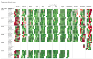
| + | As can be seen from March to October, a typical day in Sofia can be said to be “normal”, with the concentration levels under 55um/g. However, as the year end approaches, air quality begins to deteriorate, with days in November falling under “Elevated” concentration levels. In December and January, a mix of days with “Normal”, “Elevated” and “High” levels of concentration can be seen. Higher levels of air pollution is noticed in December because of the holiday season. | ||
| + | |||
| + | During this period, increased road traffic contributes to higher levels of concentration. As this is also the winter season, more solid and liquid fuels are burnt since people need to keep warm and more electricity is consumed when people stay indoors during this period. While not everyone in Bulgaria can afford modern central heating, some of the poorer people turn to burning plastics, wood and all kinds of waste to generate heat. Some of these “fuels” contribute to harmful air pollutants that is in the air. | ||
| + | |||
| + | Outdated thermal plants which produce high levels of dust particles and sulphur dioxide also contribute to high concentration levels. | ||
| + | |||
| + | Over the years, the European Court of Justice has issued warnings and put tremendous pressure on Bulgaria about breaching limits for air pollutants. Bulgaria’s Environment Ministry has also spoken out in a statement that the use of wood and coal for heating as well as large number of old cars caused the air pollution in EU’s poorest member state. This Ministry added that “It is necessary to mobilize the efforts of all parties concerned and the active support of the people” | ||
| + | |||
| + | By looking at the concentration levels in the month of December over the years, there is clearly an improvement in air quality. This could be a testament to the efforts of the Bulgarian people to cut down on air pollution. | ||
| + | |||
| + | |||
| + | |||
| + | == Task 2: Spatio-temporal Analysis of Citizen Science Air Quality Measurements == | ||
| + | Based on data captured by citizen science air quality measurements, the following are some observations about the dataset provided: | ||
| + | |||
| + | ===Characterize the sensors’ coverage, performance and operation. Are they well distributed over the entire city? Are they all working properly at all times? Can you detect any unexpected behaviours of the sensors through analysing the readings they capture? Limit your response to no more than 4 images and 600 words.=== | ||
| + | |||
| + | |||
| + | '''1. Performance and operation of sensors''' | ||
| + | |||
| + | * Anomalies in data points | ||
| + | While most data points relating to temperature tend to fall between -148 to 60 degrees Celsius as represented by the blue blocks near the 0K mark, there are obvious outliers in the territories of 300-400+ degrees Celsius on the top end and negative 5000 degrees celcius on the bottom end. This is unlikely to be an accurate representation of the actual temperature and these values could be erroneous due to malfunctioning of the sensors. | ||
| + | |||
| + | While daily average pressure has been relatively stable throughout all the data points, there was a sudden drop to 0 on March 31, 2018. A further investigation into pressure data points on March 31,2018 revealed that pressure field was 0 for all locations across 24 hours. <br> | ||
| + | |||
| + | [[File:Daily pressure.jpg|frameless]]<br> | ||
| + | Daily Avg Pressure chart from Dashboard: Citizen Science Air Quality | ||
| + | |||
| + | Upon further investigation, it was noticed that all sensors did not record any data on March 31, 2018 as the number of data points recorded on that day fell drastically to zero. | ||
| + | |||
| + | [[File:Sensor performance.png|frameless|Sensor Performance, Citizen Science Air Quality ]]<br> | ||
| + | |||
| + | |||
| + | b. Missing values | ||
| + | Missing values could be found in most measurement values such as temperature, PM10, PM2.5 values and pressure as previously mentioned.. These values are “0” and could be found over multiple locations. Locations who have a missing measurement values such as temperature, P1, P2 , pressure or humidity tend to have missing measurements for some other values. | ||
| + | |||
| + | Missing values could be due to downtime of the sensor as a result of maintenance works being carried out or sensor was not turned on. | ||
| + | |||
| + | '''2. Coverage of sensors''' | ||
| + | |||
| + | |||
| + | By looking at the following map, we can see the location of all the sensors being distributed all across Bulgaria. There is at least one sensor in almost every state in Bulgaria. One can observe a strong presence of sensors in the Sofia City region with the dots overlapping one another. | ||
| + | |||
| + | [[File:Location dots.png|frameless]]<br> | ||
| + | |||
| + | To better observe the density of sensors in Bulgaria, a density map is preferred. One can observe the yellow and red circular dot in the heart of Sofia City, therefore showing a higher than normal density of sensors present in the Sofia City as compared to other regions of Bulgaria. | ||
| + | |||
| + | [[File:Location heatmap.png|frameless]]<br> | ||
| + | |||
| + | |||
| + | ===Now turn your attention to the air pollution measurements themselves. Which part of the city shows relatively higher readings than others? Are these differences time dependent? Limit your response to no more than 6 images and 800 words.=== | ||
| + | |||
| + | |||
| + | The most relevant measurements of air pollution are namely PM2.5 and PM10 reading of airborne particulate matter. The sensors that recorded the highest levels of of PM2.5 and PM10 are displayed in the “Top 10 Highest PM2.5 Daily Mean” and “Top 10 Highest PM10 Daily Mean” graph. | ||
| + | More often than not, majority of the sensors that picked up the Top 10 highest readings of PM2.5 and PM10 fall under Sofia City. There are only a small handful of other sensors outside of Sofia City that picked up relatively higher readings than others. | ||
| + | |||
| + | [[File:Top10 polluting countries.jpg|frameless]]<br> | ||
| + | |||
| + | By looking at the above pattern it can be seen that the air quality begin to worsen outside of Sofia City right around the end of 2017 and early 2018. By end Mar 2018, the air quality began to see improvements in most parts of the country. In order to determine the extent of pollution, we need to dive deeper into the PM2.5 and PM10 figures. | ||
| + | The Top 10 Highest PM10 Daily Mean chart includes a reference band in green to demarcate the PM10 24H Mean Guideline as set out by the World Health Organisation(WHO). Any levels of PM10 or PM2.5 readings within the green band would mean that levels of particulate matter is deemed to be safe for humans. | ||
| + | As can be seen from the locations that record the top 10 highest PM10 and PM2.5 readings, the readings were consistently way above the 24H Mean Guideline. | ||
| + | The orange reference line represent the average 24H Mean over the duration specified by the time range filter. The average reading is substantially above the WHO Guideline, both for the PM10 and PM2.5 readings. | ||
| + | |||
| + | [[File:Top10 daily mean.png|frameless|Snapshot of Top 10 Highest PM2.5 Daily Mean[left], Top 10 Highest PM10 Daily Mean[right]]]<br> | ||
| + | |||
| + | The large spikes in PM readings represent the time of year whereby the location is likely to record high PM readings. As can be seen ,the average line is well below the peak of the readings recorded. Therefore, these relatively higher readings are time dependent. | ||
| + | |||
| + | |||
| + | |||
| + | ==Task 3== | ||
| + | |||
| + | Urban air pollution is a complex issue. There are many factors affecting the air quality of a city. Some of the possible causes are: Local energy sources. For example, according to Unmask My City, a global initiative by doctors, nurses, public health practitioners, and allied health professionals dedicated to improving air quality and reducing emissions in our cities, Bulgaria’s main sources of PM10, and fine particle pollution PM2.5 (particles 2.5 microns or smaller) are household burning of fossil fuels or biomass, and transport. Local meteorology such as temperature, pressure, rainfall, humidity, wind etc | ||
| + | Local topography. Complex interactions between local topography and meteorological characteristics. Transboundary pollution for example the haze that intruded into Singapore from our neighbours. In this third task, you are required to reveal the relationships between the factors mentioned above and the air quality measure detected in Task 1 and Task 2. Limit your response to no more than 5 images and 600 words. | ||
| + | |||
| + | |||
| + | '''Local Energy Sources''' | ||
| + | As mentioned in Task 1, burning of energy sources such as coal in outdated thermal plants and together with the household burning of fossil fuels or biomass are correlated to elevated concentration levels in the month of December and January. This is because of the winter season whereby people require electricity to generate heat and keep warm. As more people are indoors during this period, there tend to be increased levels of electricity consumption. Since electricity consumption and burning of energy sources are directly correlated, it can be explained why air quality is worsened during the winter season from December to January. | ||
| + | |||
| + | [[File:Avg concentration lvls.png|frameless]]<br> | ||
| + | |||
| + | '''Local Meteorology''' | ||
| + | |||
| + | No noticeable effects of meteorology factors such as pressure, humidity levels from Citizen Science Air Quality dataset. Wind levels and rainfall levels from meteorological station had no significant impact on air pollution as well. | ||
| + | The single most obvious parameter of meteorological data that has a direct correlation with air pollution is temperature. The Tasavg field(average temperature) is plotted against time and a noticeable trend in temperature is noticed. Temperatures rise from the start of the year before peaking around June/July. Temperatures then gradually fall as it reaches the winter season towards the year end. | ||
| + | |||
| + | Rainfall also have a correlation with temperature levels, whereby rainfall increases when temperature falls, presumably because when temperature falls as the winter season approaches, snowfall is contributes towards rainfall. Rainfall levels are generally U-shaped while temperature levels are inverted U-shaped. | ||
| + | [[File:Avg temp lvls.png|frameless]]<br> | ||
| + | [[File:Avg rainfall lvls.png|frameless]]<br> | ||
| + | |||
| + | |||
| + | '''Local Topography''' | ||
| + | |||
| + | [[File:Heatmap topography.jpg|frameless]]<br> | ||
| + | |||
| + | By comparing the heatmap whereby the colour intensity denotes higher levels of air pollution, it can be see that sensors which picked up higher levels of pollution tend to be locations with lower elevation. This could be due to the fact that at higher elevations, the sensors are less likely to pick up the air pollutants that is directly emitted from the sources as they get dissipated when the airborne particles rises into the air. | ||
| + | |||
| + | |||
| − | |||
| − | |||
| − | |||
== Reference == | == Reference == | ||
| + | |||
| + | [https://www.novinite.com/articles/184957/According+to+an+Inspection+there+is+Increased+Pollution+Levels+in+8+Bulgarian+Cities Novinite, Increased Pollution Levels in 8 Bulgarian Cities[2017<nowiki>]</nowiki>] | ||
| + | [https://uk-air.defra.gov.uk/air-pollution/daqi?view=more-info&pollutant=pm10 What is the daily air quality index, UK Air Information Resource.] | ||
| + | |||
== Feedbacks == | == Feedbacks == | ||
Latest revision as of 00:24, 12 November 2018
To be a Visual Detective
Contents
- 1 Preamble
- 2 Problem & Motivation
- 3 Dataset Analysis & Transformation Process
- 4 Task 1: Spatio-temporal Analysis of Official Air Quality
- 5 Task 2: Spatio-temporal Analysis of Citizen Science Air Quality Measurements
- 5.1 Characterize the sensors’ coverage, performance and operation. Are they well distributed over the entire city? Are they all working properly at all times? Can you detect any unexpected behaviours of the sensors through analysing the readings they capture? Limit your response to no more than 4 images and 600 words.
- 5.2 Now turn your attention to the air pollution measurements themselves. Which part of the city shows relatively higher readings than others? Are these differences time dependent? Limit your response to no more than 6 images and 800 words.
- 6 Task 3
- 7 Reference
- 8 Feedbacks
Preamble
Air pollution is an important risk factor for health in Europe and worldwide. A recent review of the global burden of disease showed that it is one of the top ten risk factors for health globally. Worldwide an estimated 7 million people died prematurely because of pollution; in the European Union (EU) 400,000 people suffer a premature death. The Organisation for Economic Cooperation and Development (OECD) predicts that in 2050 outdoor air pollution will be the top cause of environmentally related deaths worldwide. In addition, air pollution has also been classified as the leading environmental cause of cancer.
Air quality in Bulgaria is a big concern: measurements show that citizens all over the country breathe in air that is considered harmful to health. For example, concentrations of PM2.5 and PM10 are much higher than what the EU and the World Health Organization (WHO) have set to protect health.
Bulgaria had the highest PM2.5 concentrations of all EU-28 member states in urban areas over a three-year average. For PM10, Bulgaria is also leading on the top polluted countries with 77 μg/m3on the daily mean concentration (EU limit value is 50 μg/m3).
According to the WHO, 60 percent of the urban population in Bulgaria is exposed to dangerous (unhealthy) levels of particulate matter (PM10).
Problem & Motivation
Measurements of airborne particulate matter(PM) can be divided into PM2.5 and PM10. PM2.5 and PM10 refers to airborne particulate matter that have a diameter of less than 2.5 micrometres and 10 micrometres respectively.
It is without a doubt that the poor air quality Bulgaria is a great cause for concern, with measurements of PM2.5 and PM10 collected from air quality stations indicating that they are at much higher levels above the thresholds stipulated by the EU and World Health Organisation(WHO) to protect health.
Bulgaria had the highest PM2.5 concentrations of all EU-28 member states in urban areas over a three-year average. For PM10, Bulgaria is also leading on the top polluted countries with 77 μg/m3on the daily mean concentration (EU limit value is 50 μg/m3).
With the huge amount of data collected from air quality monitoring systems and weather stations all across Bulgaria including Sofia City, there is a need to make sense of these data by building an interactive data visualisation tool to better identify the patterns and trends in measurements collected over a period of time. This is crucial in helping identify the distribution of air pollution in Bulgaria and the tracking down the main sources of air pollution which contribute to the worsening air quality. It would be useful to find out correlation between air quality and other metrological data such as temperature, humidity as well as topographical data like elevation.
With such a huge amount of dataset, there is a pressing need to further investigate the source of air pollution, any noticeable patterns or trends in air quality as well as uncover the possible causes relating to metreologoy or topography.
Dataset Analysis & Transformation Process
As with any given dataset, there is a need to scrutinise the format and attributes of each column in each dataset. The necessary data transformation and data preparation steps would need to be taken to aid the importing of dataset for data visualisation to be based on. Elaboration on the data transformation process for each dataset will be set out below:
Official air quality measurements (5 stations in the city, EEA Data.zip) Issue 1: Incomplete dataset Description: The files contained in EEA Data.zip file can be categorised below:
SPO-BG0040A
- BG_5_9642_2013_timeseries.csv
- BG_5_9642_2014_timeseries.csv
- BG_5_9642_2015_timeseries.csv
- BG_5_9642_2016_timeseries.csv
- BG_5_9642_2017_timeseries.csv
- BG_5_9642_2018_timeseries.csv
SPO-BG0050A
- BG_5_9572_2013_timeseries.csv
- BG_5_9572_2014_timeseries.csv
- BG_5_9572_2015_timeseries.csv
- BG_5_9572_2016_timeseries.csv
- BG_5_9572_2017_timeseries.csv
- BG_5_9572_2017_timeseries.csv
- BG_5_9572_2018_timeseries.csv
SPO-BG0052A
- BG_5_9421_2013_timeseries.csv
- BG_5_9421_2014_timeseries.csv
- BG_5_9421_2015_timeseries.csv
- BG_5_9421_2016_timeseries.csv
- BG_5_9421_2017_timeseries.csv
- BG_5_9421_2017_timeseries.csv
- BG_5_9421_2018_timeseries.csv
SPO-BG0054A
- BG_5_9484_2013_timeseries.csv
- BG_5_9484_2014_timeseris.csv
- BG_5_9484_2015_timeseries.csv
SPO-BG0073A
- BG_5_9616_2013_timeseries.csv
- BG_5_9616_2014_timeseries.csv
- BG_5_9616_2015_timeseries.csv
- BG_5_9616_2016_timeseries.csv
- BG_5_9616_2017_timeseries.csv
- BG_5_9616_2017_timeseries.csv
- BG_5_9616_2018_timeseries.csv
SPO-BG0079A
- BG_5_60881_2018_timeseries.csv
Solution: Files names highlighted in bold are incomplete and will thus be omitted from the dataset in order to make an accurate comparison across air quality stations. Thus, only data from 4 out of 6 air quality stations will be used.
Issue 2: Combining CSV files
Description: Having to import multiple CSV files into Tableau and joining them can be quite a hassle.
Solution: Merging of CSV files was done via Terminal on OSX instead. Running the code “cat *.csv >merged.csv” will merge all CSV files within the enclosing folder. There will be now be a single CSV file for each Air Quality station. This will then be merged again to form a single CSV file containing air quality data from 4 air quality stations between 2013 to 2018.
Issue 3: Inner-joining Metadata file with BG Datafile
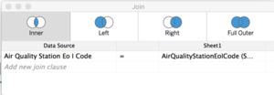
Description: Detailed information about each air quality station is set out in metadata.xsls This information can be inner-joined with the BG data through a common field, AirQualityStationEolCode.
Solution: Perform inner-join in Data Source tab of Tableau.
Data Source> Inner-join Tables in Tableau.
Citizen science air quality measurements (Air Tube.zip)
This dataset contains air quality measurements including temperature, humidity, pressure as well as measurements of airborne particulate matter(PM), specifically PM10(denoted by P1) and PM2.5(denoted by P2) across many stations. The location of these stations are also represented by its geohash, which is an alphanumeric string of a set of latitude and longitude. There are a total of 2 dataset files in this zip file, each containing hourly data in 2017 and 2018.
The following issues were identified in either or both of the datsets and data transformation was performed to address them:
Issue 1:Missing geohash values
Description: There were missing geohash values in 4 rows of data in the data_bg_2018.csv file.
Solution: These 4 rows of data were meaningless because the geohash which serves as the unique identifier of the station that records the data is missing. As such, they are removed from the dataset.
Issue 2: Decoding geohash values into latitude and longitude
Description: In order for data visualisation softwares to make sense of location information, the geohash has to be decoded into latitude and longitude. This could be done either in R or Python.
Solution: Using the pandas library in Python, the tabular data in both data_bg_2017.csv and data_bg_2018.csv were imported to the Jupyter Notebook app. The pandas library is for managing tabular data while the pygeohash library is for the purpose of decoding geohash into latitude and longitude.
With reference to the pygeohash library, the function for decoding of geohash is used but is met with an error, KeyError: ‘- ‘. This was later narrowed down to an erroneous geohash value which contains a dash. Geohashes should only contain alphanumeric characters and a geohash value containing hash cannot be decoded as such. That entire row is removed due to the erroneous geohash value. The decode geohash function can now be successfully executed.
Issue 3: Reverse geocoding of geohash values to retrieve location names of air quality stations as unique identifiers Description: Using the latitude/longitude data or the geohash data as the unique identifier is technically possible but does not make much sense as it is not human readable and one cannot possibly tell where the location of the sensor is just by looking at it.
Solution: Reverse geocoding is used to retrieve the location names of the corresponding latitude/longitude data by using the geopy library in Python.
However, it was discovered that running the reverse geocode function for too many times consecutively would trigger a “GeocoderTimedOut” error. A workaround would be to use a recursive function and if this exception is triggered, it will be run again so that the function will not be stopped at the first occurrence of a “GeocoderTimedOut” error.
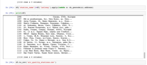
However, this would be too time-consuming(estimated to take about 3 hours for entire dataset in data_bg_2018.csv). In order to reduce the complexity, only unique geohashes are retrieved(1114 rows) from the whole dataset and its corresponding location data are reverse-geocoded.
The “Lookup” function will then be used to retrieve the corresponding location names for the geohashes in both data_bg_2018.csv and data_bg_2018.csv. To simplify the process of analysis, both data files are combined into one single file.
Issue 4: Combining CSV files
Description: By copying and pasting the dataset from data_bg_2018.csv and appending it to data_bg_2018.csv will cause the error "The information cannot be pasted because the copy area and the paste area are not the same size and shape."
Solution: Merging of CSV files was done via Terminal on OSX instead. Running the code “cat *.csv >merged.csv” will merge all CSV files within the enclosing folder.
Meteorological measurements (1 station, METEO-data.zip)
There was no single datetime value. Excel was used to concatenate day with month with year to form a single date value and new column is added to store this datevalue for each row.
Topography data (TOPO-DATA) No significant data transformation was performed for this dataset.
| Interactive Technique | Explanation | Steps Involved |
|---|---|---|
| Date range slider | To provide the user with the ease of setting a date range to limit visualisation information that they wish to analyse. A date range slider is preferred over manually keying in a start date to end date. | 1) Time field must be converted to Data Type, “Date”.
2) Set Filter to “Range of Date” and Show Filter |
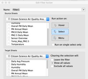
| Filter Action | To apply selection filter on Sensor Map Overview on all other charts in the dashboard. This will enable user to select a range of locations on the map to study. | 1) Go to “Dashboard” > “Actions”> “Add Action”.
2) Select Source Sheet where selection will apply the filter from , set Run Action on “Select”. 3) Select Target Sheets where filter will be applied to. |
| Transversing through daily time series by clicking on arrows | To determine trends in PM2.5 which is colour coded in heatmap of sensor overview. If dots turn yellow/red over time, it is an indication of worsening PM2.5 readings. | 1) Drag Date/Time field to Pages Shelf
2) Change field to “DAY” to enable animation on daily basis |
Task 1: Spatio-temporal Analysis of Official Air Quality
Characterize the past and most recent situation with respect to air quality measures in Sofia City. What does a typical day look like for Sofia city? Do you see any trends of possible interest in this investigation? What anomalies do you find in the official air quality dataset? How do these affect your analysis of potential problems to the environment? Your submission for this questions should contain no more than 10 images and 1000 words.
Source: What is the Daily Air Index , UK Air Information Resource(2018)
Based on band descriptors set out by UK Air Information Resource, concentration readings can be categorised into 10 bandings. The bands will be grouped into 2 primary colours of varying intensity. The last 4 index from 7 to 10 is in red to represent that concentration levels are considered high and is a great cause for concern.
As can be seen from March to October, a typical day in Sofia can be said to be “normal”, with the concentration levels under 55um/g. However, as the year end approaches, air quality begins to deteriorate, with days in November falling under “Elevated” concentration levels. In December and January, a mix of days with “Normal”, “Elevated” and “High” levels of concentration can be seen. Higher levels of air pollution is noticed in December because of the holiday season.
During this period, increased road traffic contributes to higher levels of concentration. As this is also the winter season, more solid and liquid fuels are burnt since people need to keep warm and more electricity is consumed when people stay indoors during this period. While not everyone in Bulgaria can afford modern central heating, some of the poorer people turn to burning plastics, wood and all kinds of waste to generate heat. Some of these “fuels” contribute to harmful air pollutants that is in the air.
Outdated thermal plants which produce high levels of dust particles and sulphur dioxide also contribute to high concentration levels.
Over the years, the European Court of Justice has issued warnings and put tremendous pressure on Bulgaria about breaching limits for air pollutants. Bulgaria’s Environment Ministry has also spoken out in a statement that the use of wood and coal for heating as well as large number of old cars caused the air pollution in EU’s poorest member state. This Ministry added that “It is necessary to mobilize the efforts of all parties concerned and the active support of the people”
By looking at the concentration levels in the month of December over the years, there is clearly an improvement in air quality. This could be a testament to the efforts of the Bulgarian people to cut down on air pollution.
Task 2: Spatio-temporal Analysis of Citizen Science Air Quality Measurements
Based on data captured by citizen science air quality measurements, the following are some observations about the dataset provided:
Characterize the sensors’ coverage, performance and operation. Are they well distributed over the entire city? Are they all working properly at all times? Can you detect any unexpected behaviours of the sensors through analysing the readings they capture? Limit your response to no more than 4 images and 600 words.
1. Performance and operation of sensors
- Anomalies in data points
While most data points relating to temperature tend to fall between -148 to 60 degrees Celsius as represented by the blue blocks near the 0K mark, there are obvious outliers in the territories of 300-400+ degrees Celsius on the top end and negative 5000 degrees celcius on the bottom end. This is unlikely to be an accurate representation of the actual temperature and these values could be erroneous due to malfunctioning of the sensors.
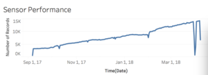
While daily average pressure has been relatively stable throughout all the data points, there was a sudden drop to 0 on March 31, 2018. A further investigation into pressure data points on March 31,2018 revealed that pressure field was 0 for all locations across 24 hours.

Daily Avg Pressure chart from Dashboard: Citizen Science Air Quality
Upon further investigation, it was noticed that all sensors did not record any data on March 31, 2018 as the number of data points recorded on that day fell drastically to zero.
b. Missing values
Missing values could be found in most measurement values such as temperature, PM10, PM2.5 values and pressure as previously mentioned.. These values are “0” and could be found over multiple locations. Locations who have a missing measurement values such as temperature, P1, P2 , pressure or humidity tend to have missing measurements for some other values.
Missing values could be due to downtime of the sensor as a result of maintenance works being carried out or sensor was not turned on.
2. Coverage of sensors
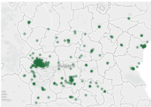
By looking at the following map, we can see the location of all the sensors being distributed all across Bulgaria. There is at least one sensor in almost every state in Bulgaria. One can observe a strong presence of sensors in the Sofia City region with the dots overlapping one another.
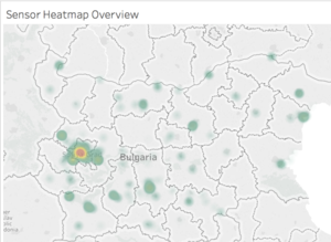
To better observe the density of sensors in Bulgaria, a density map is preferred. One can observe the yellow and red circular dot in the heart of Sofia City, therefore showing a higher than normal density of sensors present in the Sofia City as compared to other regions of Bulgaria.
Now turn your attention to the air pollution measurements themselves. Which part of the city shows relatively higher readings than others? Are these differences time dependent? Limit your response to no more than 6 images and 800 words.
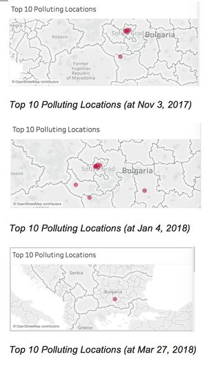
The most relevant measurements of air pollution are namely PM2.5 and PM10 reading of airborne particulate matter. The sensors that recorded the highest levels of of PM2.5 and PM10 are displayed in the “Top 10 Highest PM2.5 Daily Mean” and “Top 10 Highest PM10 Daily Mean” graph. More often than not, majority of the sensors that picked up the Top 10 highest readings of PM2.5 and PM10 fall under Sofia City. There are only a small handful of other sensors outside of Sofia City that picked up relatively higher readings than others.
By looking at the above pattern it can be seen that the air quality begin to worsen outside of Sofia City right around the end of 2017 and early 2018. By end Mar 2018, the air quality began to see improvements in most parts of the country. In order to determine the extent of pollution, we need to dive deeper into the PM2.5 and PM10 figures. The Top 10 Highest PM10 Daily Mean chart includes a reference band in green to demarcate the PM10 24H Mean Guideline as set out by the World Health Organisation(WHO). Any levels of PM10 or PM2.5 readings within the green band would mean that levels of particulate matter is deemed to be safe for humans. As can be seen from the locations that record the top 10 highest PM10 and PM2.5 readings, the readings were consistently way above the 24H Mean Guideline. The orange reference line represent the average 24H Mean over the duration specified by the time range filter. The average reading is substantially above the WHO Guideline, both for the PM10 and PM2.5 readings.
The large spikes in PM readings represent the time of year whereby the location is likely to record high PM readings. As can be seen ,the average line is well below the peak of the readings recorded. Therefore, these relatively higher readings are time dependent.
Task 3
Urban air pollution is a complex issue. There are many factors affecting the air quality of a city. Some of the possible causes are: Local energy sources. For example, according to Unmask My City, a global initiative by doctors, nurses, public health practitioners, and allied health professionals dedicated to improving air quality and reducing emissions in our cities, Bulgaria’s main sources of PM10, and fine particle pollution PM2.5 (particles 2.5 microns or smaller) are household burning of fossil fuels or biomass, and transport. Local meteorology such as temperature, pressure, rainfall, humidity, wind etc Local topography. Complex interactions between local topography and meteorological characteristics. Transboundary pollution for example the haze that intruded into Singapore from our neighbours. In this third task, you are required to reveal the relationships between the factors mentioned above and the air quality measure detected in Task 1 and Task 2. Limit your response to no more than 5 images and 600 words.
Local Energy Sources
As mentioned in Task 1, burning of energy sources such as coal in outdated thermal plants and together with the household burning of fossil fuels or biomass are correlated to elevated concentration levels in the month of December and January. This is because of the winter season whereby people require electricity to generate heat and keep warm. As more people are indoors during this period, there tend to be increased levels of electricity consumption. Since electricity consumption and burning of energy sources are directly correlated, it can be explained why air quality is worsened during the winter season from December to January.
Local Meteorology
No noticeable effects of meteorology factors such as pressure, humidity levels from Citizen Science Air Quality dataset. Wind levels and rainfall levels from meteorological station had no significant impact on air pollution as well. The single most obvious parameter of meteorological data that has a direct correlation with air pollution is temperature. The Tasavg field(average temperature) is plotted against time and a noticeable trend in temperature is noticed. Temperatures rise from the start of the year before peaking around June/July. Temperatures then gradually fall as it reaches the winter season towards the year end.
Rainfall also have a correlation with temperature levels, whereby rainfall increases when temperature falls, presumably because when temperature falls as the winter season approaches, snowfall is contributes towards rainfall. Rainfall levels are generally U-shaped while temperature levels are inverted U-shaped.


Local Topography
By comparing the heatmap whereby the colour intensity denotes higher levels of air pollution, it can be see that sensors which picked up higher levels of pollution tend to be locations with lower elevation. This could be due to the fact that at higher elevations, the sensors are less likely to pick up the air pollutants that is directly emitted from the sources as they get dissipated when the airborne particles rises into the air.
Reference
Novinite, Increased Pollution Levels in 8 Bulgarian Cities[2017] What is the daily air quality index, UK Air Information Resource.





![Snapshot of Top 10 Highest PM2.5 Daily Mean[left], Top 10 Highest PM10 Daily Mean[right]](/18191is428g1/img_auth.php/thumb/b/b3/Top10_daily_mean.png/300px-Top10_daily_mean.png)

