Difference between revisions of "IS428 AY2018-19T1 Rainean Young Calubad"
| Line 473: | Line 473: | ||
# Inspiration from Le Van Tuan Long's Workbooks | # Inspiration from Le Van Tuan Long's Workbooks | ||
# Assignment Datasets | # Assignment Datasets | ||
| − | |||
| − | |||
== <br/><div style="background: #2B547E; padding: 15px; font-weight: bold; line-height: 0.3em; text-indent: 15px;letter-spacing:-0.08em;font-size:20px"><font color=#fbfcfd face="Century Gothic">Feedbacks </font></div> == | == <br/><div style="background: #2B547E; padding: 15px; font-weight: bold; line-height: 0.3em; text-indent: 15px;letter-spacing:-0.08em;font-size:20px"><font color=#fbfcfd face="Century Gothic">Feedbacks </font></div> == | ||
Please feel free to provide your feedback. Thank you. | Please feel free to provide your feedback. Thank you. | ||
| − | |||
| − | |||
Revision as of 00:24, 12 November 2018
To be a Visual Detective
Contents
Overview
Air pollution is an important risk factor for health in Europe and worldwide. A recent review of the global burden of disease showed that it is one of the top ten risk factors for health globally. Worldwide an estimated 7 million people died prematurely because of pollution; in the European Union (EU) 400,000 people suffer a premature death. The Organisation for Economic Cooperation and Development (OECD) predicts that in 2050 outdoor air pollution will be the top cause of environmentally related deaths worldwide. In addition, air pollution has also been classified as the leading environmental cause of cancer.
Air quality in Bulgaria is a big concern: measurements show that citizens all over the country breathe in air that is considered harmful to health. For example, concentrations of PM2.5 and PM10 are much higher than what the EU and the World Health Organization (WHO) have set to protect health.
Bulgaria had the highest PM2.5 concentrations of all EU-28 member states in urban areas over a three-year average. For PM10, Bulgaria is also leading on the top polluted countries with 77 μg/m3on the daily mean concentration (EU limit value is 50 μg/m3).
According to the WHO, 60 percent of the urban population in Bulgaria is exposed to dangerous (unhealthy) levels of particulate matter (PM10).
Task 1: Spatio-temporal Analysis of Official Air Quality
Questions:
Characterize the past and most recent situation with respect to air quality measures in Sofia City. What does a typical day look like for Sofia city? Do you see any trends of possible interest in this investigation? What anomalies do you find in the official air quality dataset? How do these affect your analysis of potential problems to the environment?
Data Cleaning & Transformation:
To investigate the above problems, we need to clean the data and then visualise the dataset. The cleaning process involves:
- Combining all the datasets across the years into one excel file
- Linking the dataset with the metadata to retrieve the longitude and latitude of the air quality station
Dashboard 1:
Tableau Public Link: https://public.tableau.com/profile/rainean.calubad3471#!/vizhome/IS428_2018-19_T1_AssignmentTask1Dashboard1_RaineanCaluabd/Task12013-2016Dashboard?publish=yes
This dashboard uses data from 2013 to 2017 containing the daily readings of the air quality at different stations
This dashboard allows the users to:
- See the daily air pollutant fluctuations
- Drill-down and filter the data by Year and by Air Quality Station
Visualisation 1:
Image:
Description:
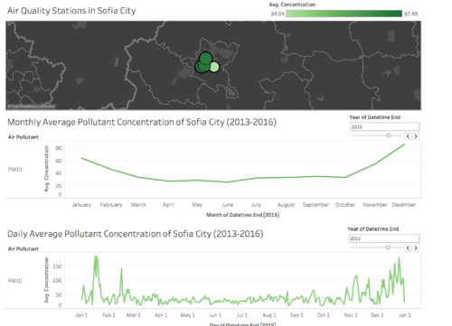
This visualisation shows Sofia city map and the location of the air quality station.
The colour and the size indicate the average pollutants level of that station. The user would be able to select the station to filter visualisation 2 and 3 below.
Insights:
The station with the worst air quality is station 73A as compared to station 52A with the lowest average pollutant readings, but station 73A's air quality is similar to 40A and 50A.
Visualisation 2:
Image:
Description:
This visualisation shows the monthly average air quality of Sofia city
The user would be able to filter by year and observe the trends on how air quality changes over the months in the selected year
Insights:
From the visualisation, we can observe the trend that air quality is the worst at the start and at the end of the year from the month of December to January and almost at the same level for April to October
Visualisation 3:
Image:
Description:
This visualisation shows the daily average air quality of Sofia city
The user would be able to filter by year and observe the air quality trends throughout the days in a year.
Insights:
From this visualisation we can see that the daily average greatly fluctuates daily. However, the air pollutant concentration is very high at the end and the start of the year from the months of December and January
Dashboard 2:
Tableau Public Link: https://public.tableau.com/profile/rainean.calubad3471#!/vizhome/IS428_2018-19_T1_AssignmentTask1Dashboard2_RaineanCaluabd/Task12018Dashboard?publish=yes
This dashboard uses data in 2018 which contains the hourly readings of air quality
This dashboard allows the users to:
- See the fluctuations in the air pollutants hourly and day of the month
- Compare the average air pollutant concentration readings across the various stations
Visualisation 1:
Image:
Description:
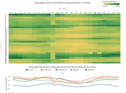
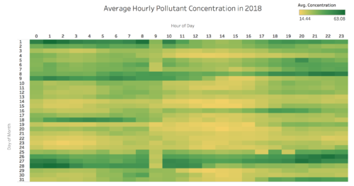
This visualisation shows the heat-map of the average hourly pollutant concentration in 2018 with the x-axis being the hour of the day and the y-axis being the day of the month
The user would be able to:
- Compare the pollutant concentration across the days in a month
- Compare the pollutant concentration across the hours in a day
This would allow us to answer the question of how is the air quality like in a typical day of Sofia city
Insights:
From the visualisation, we have the following conclusions:
- For some days (e.g. day 14), the air quality is consistently low throughout relative to other days
- Some other days (e.g. day 26, 27), the air quality is consistently high throughout
- Some days (e.g. day 16, 18), the air quality fluctuates greatly throughout the days with either morning or evening having worse air quality than the other
Visualisation 2:
Image:
Description:
This visualisation shows the line graph of hourly average pollutant concentration for each of the stations in 2018
The user would be able to:
- Compare the hourly average pollutant concentration across different stations
This would allow us to answer the question of how is the air quality for a typical day in Sofia city with respect to where the station is located
Insights:
From the visualisation, we have the following conclusions:
- Looking at all the stations, station Druzhba is observed to have significantly lower PM10 level which indicates that the air quality at the area of Druzhba station is better than other stations
- The other four stations have relatively the same average pollutant concentrations throughout the day.
Task 2: Spatio-temporal Analysis of Citizen Science Air Quality Measurements
Questions:
Characterize the sensors’ coverage, performance and operation. Are they well distributed over the entire city? Are they all working properly at all times? Can you detect any unexpected behaviors of the sensors through analyzing the readings they capture?
Now turn your attention to the air pollution measurements themselves. Which part of the city shows relatively higher readings than others? Are these differences time dependent?
Data Cleaning & Transformation:
To investigate the above problems, we need to clean the data and then visualise the dataset. The cleaning process involves:
- Combining all the datasets across the years into one excel file
- Linking the dataset with the metadata to retrieve the longitude and latitude of the air quality station
- Filter to only get data from Sofia City.
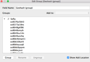
The filtering process to only show data from Sofia City was done through the use of the Lasso tool in Tableau to group the geohashes for Sofia City. Afterwards, I used the group created to only show values for Sofia city and removed the records for neighboring cities.
Dashboard 1:
Tableau Public Link: https://public.tableau.com/profile/rainean.calubad3471#!/vizhome/IS428_2018-19_T1_AssignmentTask2Dashboard1_RaineanCalubad/Part1?publish=yes
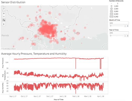
This dashboard uses data from 2017 to 2018 to show the P1 and P2 measurements for the various parts of Sofia City in Bulgaria.
This dashboard allows the users to:
- See which parts of Sofia City are the sensors located
- See which sensors record the most and the least amount of data
- See how the sensors are performing by looking at their average pressure, temperature and humidity readings
Visualisation 1:
Image:
Description:
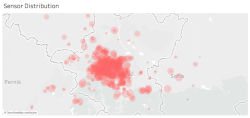
This visualization is a symbol map that shows the distribution of sensors all over Sofia City and the number of records measured by each sensor. The circles denote a presence of a sensor in that part of the city, and the size of the circle denotes how many measurements were recorded by the sensor.
The user would be able to:
- Locate at which part(s) of Sofia City are most sensors located
- Compare the number of measurements recorded by each of the sensors in Sofia City
This would allow us to answer the question of what is the coverage of the sensors in Sofia City and how well each is operating.
Insights:
From the visualisation, we have the following insights:
- Most sensors are located at the center of Sofia City
- There are a few sensors located at the edges of Sofia City
- Zooming in further, we can see that more than half of the sensors have recorded a lot of data, and relatively the same amounts of data. However, there are also a lot of sensors that did not record that many data.
- It is interesting to note that the sensors that only have a few records of data are at the same place as those that recorded a lot of data. It can be speculated that the sensors with few data have malfunctioned or broken down and were replaced.
Visualisation 2:
Image:
Description:
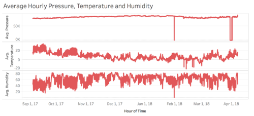
This visualization shows three line graphs that shows the average pressure, temperature and humidity through time, 2017 to 2018, in Sofia City.
The user would be able to:
- Compare the average measurements for pressure, temperature and humidty through time.
This would allow us to answer the question of what is the performance of the sensors in Sofia City and how well each is operating.
Insights:
From the visualisation, we have the following insights:
- For the month of February, the sensors have failed to take measurements for temperature, pressure and humidity for one day.
- The sensors failed again to take measurements for pressure from March 30 to April 1. However, it's unexpected because it was able to take measurements for temperature and humidity on the same day.
- Filtering the visualization by month, we can see a trend where the average temperature and average humidity always go in opposite directions. When average temperature rise, average humidity drops and vice versa.
Dashboard 2: Tableau Public Link: https://public.tableau.com/profile/rainean.calubad3471#!/vizhome/IS428_2018-19_T1_AssignmentTask2Dashboard2_RaineanCalubad/Part2?publish=yes
This dashboard uses data from 2017 to 2018 to show the P1 and P2 measurements for the various parts of Sofia City in Bulgaria.
This dashboard allows the users to:
- See the pollutant concentrations in the different parts of Sofia City
- See how the pollutant concentrations in the different parts of Sofia City change with respect to the day of the month
Visualisation 1:
Image:
Description:
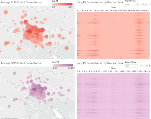
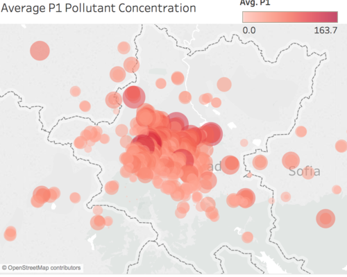
This visualization is a symbol map that shows the concentration of P1 in the various parts of Sofia City. The average concentration of P1 is denoted by the color and size of the symbol(circle).
The user would be able to:
- Determine which parts of Sofia city have high P1 concentration
- Filter by year and hour to see how time affects the P1 concentration
This would allow us to answer the question on which parts of Sofia city have high concentrations of P1.
Insights:
From the visualisation, we have the following insights:
- Most concentrations of P1 are half of the biggest average value, which is around 50.
- The center part of Sofia City is the only area with high P1 concentrations (>100) along with the upper right edge of Sofia City.
Visualisation 2:
Image:
Description:
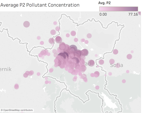
This visualization is a symbol map that shows the concentration of P2 in the various parts of Sofia City. The average concentration of P2 is denoted by the color and size of the symbol(circle).
The user would be able to:
- Determine which parts of Sofia city have high P2 concentration
- Filter by year and hour to see how time affects the P2 concentration
This would allow us to answer the question on which parts of Sofia city have high concentrations of P2.
Insights:
From the visualisation, we have the following insights:
- Most concentrations of P2 are in half of the biggest average value, which is around 30.
- The center part of Sofia City is the only area with high P2 concentrations (>70).
- The parts of Sofia City with high P2 concentrations are the same parts of Sofia City with high P1 concentrations.
Visualisation 3:
Image:
Description:
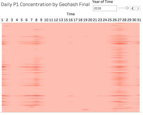
This visualization is a heatmap of each of the sensor in Sofia city and how their P1 concentration changes by the day of the month.
The user would be able to:
- Determine which day(s) of the month have the highest P1 concentration and which days have the lowest
- See if there is any relationship between the differences in P1 concentration in the parts of Sofia city and time.
- See if time changes the concentration of P1 for the different parts of Sofia City.
This would allow us to answer the question on whether the differences in P1 concentrations in Sofia City are time dependent.
Insights:
From the visualisation, we have the following insights:
- The differences that we see in terms of P1 concentrations are time dependent because not all days have high concentrations of P1, and in most days the columns show only one single color which means that there is no difference in terms of P1 concentration for all parts of Sofia city.
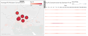
- Selecting some of the sensors with highest average P1 concentration shows that it does have high P1 concentrations on the same days of the month, 8th and 26th. The image below shows this.
Visualisation 4:
Image:
Description:
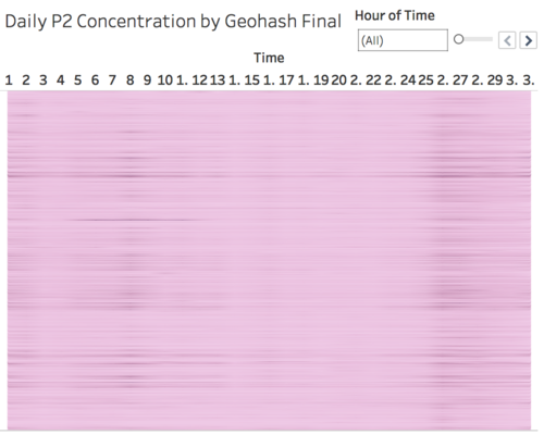
This visualization is a heatmap of each of the sensor in Sofia city and how their P2 concentration changes by the day of the month.
The user would be able to:
- Determine which day(s) of the month have the highest P2 concentration and which days have the lowest
- See if there is any relationship between the differences in P2 concentration in the parts of Sofia city and time.
- See if time changes the concentration of P1 for the different parts of Sofia City.
This would allow us to answer the question on whether the differences in P2 concentrations in Sofia City are time dependent.
Insights:
From the visualisation, we have the following insights:
- The differences that we see in terms of P2 concentrations are time dependent because not all days have high concentrations of P2, and in most days the columns show only one single color which means that there is no difference in terms of P2 concentration for all parts of Sofia city.
- There are days where concentration of p2 is high in all parts of Sofia city as evidenced by the dark color for the whole column on day 26
Task 3: Air Quality Measure Analysis
Questions:
Urban air pollution is a complex issue. There are many factors affecting the air quality of a city. Some of the possible causes are:
- Local energy sources. For example, according to Unmask My City, a global initiative by doctors, nurses, public health practitioners, and allied health professionals dedicated to improving air quality and reducing emissions in our cities, Bulgaria’s main sources of PM10, and fine particle pollution PM2.5 (particles 2.5 microns or smaller) are household burning of fossil fuels or biomass, and transport.
- Local meteorology such as temperature, pressure, rainfall, humidity, wind etc
- Local topography
- Complex interactions between local topography and meteorological characteristics.
- Transboundary pollution for example the haze that intruded into Singapore from our neighbours.
In this third task, you are required to reveal the relationships between the factors mentioned above and the air quality measure detected in Task 1 and Task 2. Limit your response to no more than 5 images and 600 words.
Data Cleaning & Transformation:
Refer to the cleaning and preparation of task 2. For task 3 we are using the same dataset.
In order to study the topology of the area, we downloaded and topology map of the country. Credits to the topology map found here: [[1]]
Dashboard 1:
Tableau Public Link: https://public.tableau.com/profile/rainean.calubad3471#!/vizhome/IS428_2018-19_T1_AssignmentTask3Dashboard1_RaineanCalubad/Dashboard1?publish=yes
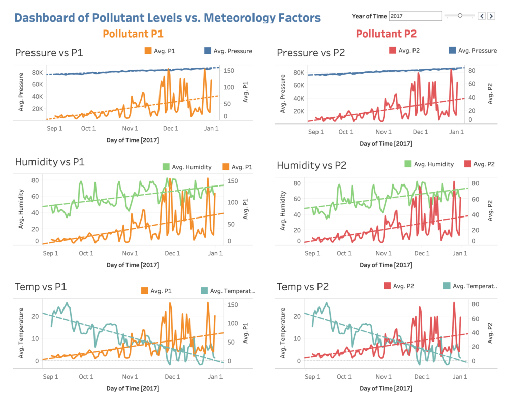
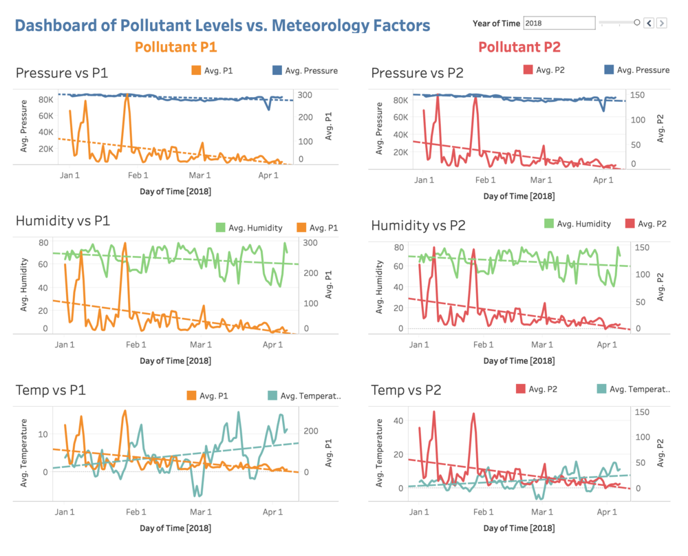
This dashboard aims to show the relationship between the pollutants level and the meteorology factors such as: pressure, humidity and temperature.
The dataset can be filtered for year 2017 and year 2018
- YEAR 2017
- YEAR 2018
Visualisation 1:
Image:
- 2017:
- 2018:
Description:
I have created the dual plot for daily average pressure and daily average P1 and daily average P2
With this chart user can see the trends across the days for pressure and P1, any correlation and pattern between the two would be identified by looking at the chart
Visualisation 2:
Image:
- 2017:
- 2018:
Description:
I have created the dual plot for daily humidity and daily average P1 and daily average P2
With this chart user can see the trends across the days for humidity level and P1, any correlation and pattern between the two would be identified by looking at the chart
Visualisation 3:
Image:
- 2017:
- 2018:
Description:
I have created the dual plot for temperature and daily average P1 and daily average P2
With this chart user can see the trends across the days for temperature and P1, any correlation and pattern between the two would be identified by looking at the chart
Combined Insights for 3 visualisations:
From the visualisations above, we have the following conclusions: In 2017:
- We can see that there is an upward trends for both pressure and humidity with the pollutants level P1 and P2
- For temperature, there is a reversed trend with the pollutants level P1 and P2
In 2018:
- We can see that there is a downward trends for both pressure and humidity with the pollutants level P1 and P2
- For temperature, again, we see a reversed trend with the pollutants level P1 and P2
We can conclude that the pollutants level positively correlates with pressure and humidity while negatively correlates with temperature
Dashboard 2:
Tableau Public Link: https://public.tableau.com/profile/rainean.calubad3471#!/vizhome/IS428_2018-19_T1_AssignmentTask3Dashboard2_RaineanCalubad/Dashboard2?publish=yes
Description:
There is only one visualisation here for this dashboard whereby we look at the relationship between the topology and the pollutants level readings from the stations
Insights
From the visualisation, we can see that at the bottom left corner Sofia city, there is higher elevation indicated by the green pasture and the contour. Looking at the readings of the stations around that area, it appears that the levels of pollutants are much lower as compared to the rest of the city.
At the far up right corner of the city, the stations give much worse readings as indicated by the dark red colour of the circle.
Hence, we can conclude that there might be a correlation between the elevation of the ground and the pollutants level. It might be that near the mountain, there is less pollution
Reference
- Inspiration from Le Van Tuan Long's Workbooks
- Assignment Datasets
Feedbacks
Please feel free to provide your feedback. Thank you.
