Difference between revisions of "IS428 AY2018-19T1 Le Thanh An"
| (33 intermediate revisions by the same user not shown) | |||
| Line 1: | Line 1: | ||
| − | <font size=" | + | <div style="font-family:Helvetica, Open Sans, Arial, sans-serif;font-size:15px"> |
| + | <div style="background: #BC3A3C; padding:15px; padding-left: 30%; margin-bottom:15px; line-height: 1em; text-indent: 10px; font-size:20px; font-family:Helvetica, Open Sans, Arial, sans-serif;"><font color= #ffffff> ► '''To Be a Visual Detective: Sofia Air Pollution''' ◄ </font></div> | ||
| − | = Problem & Motivation = | + | =<div style="background: #BC3A3C; padding: 15px; line-height: 0.3em; text-indent: 10px; font-size:18px; font-family:Helvetica, Open Sans, Arial, sans-serif;"><font color= #ffffff> '''► Problem & Motivation'''</font></div>= |
Air pollution is an important risk factor for health in Europe and worldwide. A recent review of the global burden of disease showed that it is one of the top ten risk factors for health globally. Worldwide an estimated 7 million people died prematurely because of pollution; in the European Union (EU) 400,000 people suffer a premature death. The Organisation for Economic Cooperation and Development (OECD) predicts that in 2050 outdoor air pollution will be the top cause of environmentally related deaths worldwide. In addition, air pollution has also been classified as the leading environmental cause of cancer. | Air pollution is an important risk factor for health in Europe and worldwide. A recent review of the global burden of disease showed that it is one of the top ten risk factors for health globally. Worldwide an estimated 7 million people died prematurely because of pollution; in the European Union (EU) 400,000 people suffer a premature death. The Organisation for Economic Cooperation and Development (OECD) predicts that in 2050 outdoor air pollution will be the top cause of environmentally related deaths worldwide. In addition, air pollution has also been classified as the leading environmental cause of cancer. | ||
| Line 11: | Line 12: | ||
According to the WHO, 60 percent of the urban population in Bulgaria is exposed to dangerous (unhealthy) levels of particulate matter (PM10). | According to the WHO, 60 percent of the urban population in Bulgaria is exposed to dangerous (unhealthy) levels of particulate matter (PM10). | ||
| − | = Exploratory Data Analysis & Data Transformation = | + | =<div style="background: #BC3A3C; padding: 15px; line-height: 0.3em; text-indent: 10px; font-size:18px; font-family:Helvetica, Open Sans, Arial, sans-serif;"><font color= #ffffff> '''► Exploratory Data Analysis & Data Transformation'''</font></div>= |
| − | '''EEA Data''' | + | === '''EEA Data''' === |
| + | |||
| + | We are given 27 csv files, along with 1 metadata xlsx file. Below are the columns present in the 27 csv files and their descriptions. | ||
| + | |||
| + | [[File:Screenshot 2018-11-11 at 4.37.53 AM.png|800px|center]] | ||
| + | |||
| + | Since there are 27 files, we will have to combine them. I used Tableau's in-built Union function as shown below | ||
| + | |||
| + | [[File:union.png|800px|center]] | ||
| + | |||
| + | And below are the columns present in the metadata and their descriptions. | ||
| + | |||
| + | [[File:metadata_columns.png|800px|center]] | ||
| + | |||
| + | We will need to combine the data in the csv files with the metadata. We will do this by Inner Joining '''AirQualityStationEolCode''' in Tableau | ||
| + | |||
| + | [[File:innerjoin.png|800px|center]] | ||
{| class="wikitable" | {| class="wikitable" | ||
| Line 19: | Line 36: | ||
! Problem #1 !! | ! Problem #1 !! | ||
|- | |- | ||
| − | | '''Issue''' || There are missing data from Jan 2017 to | + | | '''Issue''' || There are missing data from Jan 2017 to Nov 2017. In addition, '''Orlov''' station doesn't have any data from year 2016-2018, and within 2012-2015 for '''Orlov''' there are missing data between July 2013 to September 2013 as well as Feb 12 2015 to Feb 24 2015. '''Mladost''' station only have data in 2018. |
|- | |- | ||
| − | | '''Solution''' || | + | | '''Solution''' || Since the data all follow the same pattern, Average Concentration is not affected. I have tried using Average Concentration as well as excluding the data for the 2 cities, and the result is the same. |
|} | |} | ||
| − | '''Air Tube Data''' | + | === '''Air Tube Data''' === |
| + | |||
| + | We are given 2 csv files, with one being 2017 data and the other being 2018 data. The columns of the files are as follow: | ||
| + | |||
| + | [[File:Airtubecolumns.png|800px|center]] | ||
{| class="wikitable" | {| class="wikitable" | ||
| + | |- | ||
| + | ! Problem #1 !! | ||
| + | |- | ||
| + | | '''Issue''' || Tableau does not recognise geohash as geospatial data. Air Tube data uses geohashes to locate its sensors. We would need to transform the geohashes into latitude and longitude for further visualisation | ||
| + | |- | ||
| + | | '''Solution''' || I use a python library geohash2 to perform geodecoding. I then add an additional column called lat and lng to the dataset. The code snippet for the geodecoding is as below | ||
| + | [[File:geodecode.jpg|500px|center]] | ||
|- | |- | ||
! Problem #2 !! | ! Problem #2 !! | ||
|- | |- | ||
| − | | '''Issue''' || | + | | '''Issue''' || There were invalid geohashes during geodecode |
|- | |- | ||
| − | | '''Solution''' || | + | | '''Solution''' || I decided to check the geohashes to see where "m-2105171" location is before deciding whether to remove the place. It turns out to have latitude of 44.99296188354492 and longitude of 57.792205810546875. However, Google Map returns an invalid place based on the coordinates, so I decided that the geohash is invalid and the row will be ignored in further analysis |
|} | |} | ||
| + | |||
| + | === '''METEO Data''' === | ||
| + | We are given 1 csv file about the meteorological measurements in Sofia from 2012 to 2018. The columns are as follow: | ||
| + | |||
| + | [[File:METEO data columns.png|800px|center]] | ||
| + | |||
| + | For Task 3, I wanted to combine it with Air Tube data for meaningful analysis. I realised that both can be connected by time. However, Air Tube data are collected by the hours while METEO Data are collected by days. Thus, I would take the average by day of the Air Tube data, and add a new field called "time" in the METEO Data. | ||
| + | |||
| + | [[File:Timeparse.png|600px|center]] | ||
| + | |||
| + | Then I inner join by the DateTrunc of Air Tube Data | ||
| + | |||
| + | [[File:joinjoin.png|800px|center]] | ||
| + | </div> | ||
| + | |||
| + | =<div style="background: #BC3A3C; padding: 15px; line-height: 0.3em; text-indent: 10px; font-size:18px; font-family:Helvetica, Open Sans, Arial, sans-serif;"><font color= #ffffff> ► '''Task 1: Spatio-temporal Analysis of Official Air Quality''' </font></div>= | ||
| + | |||
| + | <h3>A typical day in Sofia</h3> | ||
| + | |||
| + | [[File:Sofia calendar heatmap.png|800px|center]] | ||
| + | |||
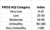
| + | <div> In order to see a typical day in Sofia, I have decided to plot a calendar heatmap of average concentration, divided by year, week day and over the months in a year. The values are organised into bins as per the PM10 CAQI breakpoints, which has been adopted by European countries. | ||
| + | |||
| + | [[File:AQI Index.jpg|200px|center]] | ||
| + | |||
| + | As shown on the heatmap, 2nd week of October, November, December, January and February are generally unhealthy (with some days go up to very unhealthy level) while a normal day in other months are at low level of concentration. There is seemingly no correlation between the day of the week and the PM10 concentration level. | ||
| + | |||
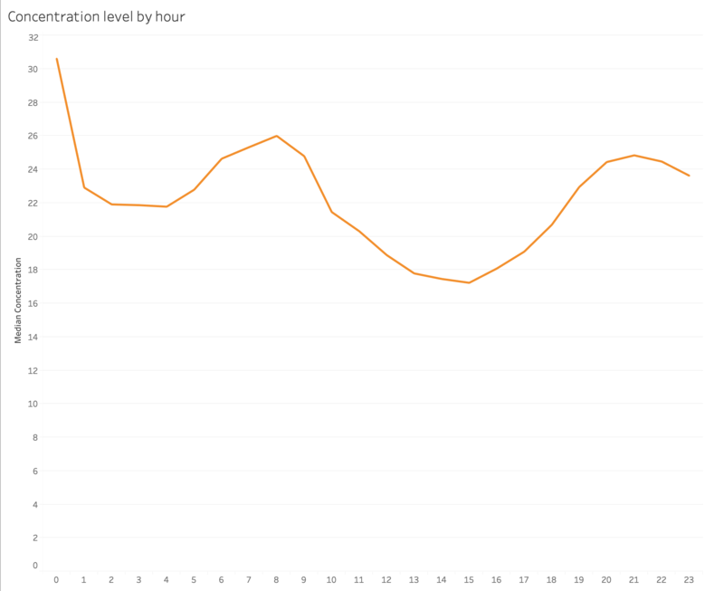
| + | In order to see a daily concentration trend in Sofia, I have decided to plot a line graph of the concentration level against the hours in a day. | ||
| + | |||
| + | [[File:DailyTrend.png|800px|center]] | ||
| + | |||
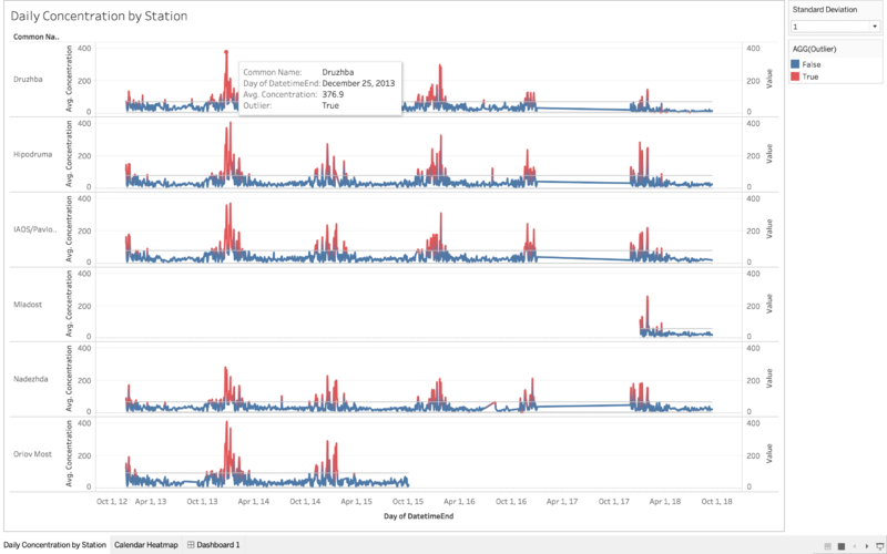
| + | In order to see the yearly trend in concentration level, I plot a line chart of concentration level against day for all 5 stations. | ||
| + | |||
| + | [[File:Linegraph sofia.png|800px|center]] | ||
| + | |||
| + | As shown on the line chart, there are no anomalous sequence in the different stations. Other than the missing 2017 data and stations that have impartial data, there are recurring outliers every year (hovering on the point would reveal the exact day of the outlier). One of the outliers fall on December 25th, which is Christmas day. This might be due to Bulgarian's tradition of keeping a fireplace lit in a hearth, burning long enough to last through Christmas and into the day. Other peaks of the graph includes New Year period (1st week of January) and end of January. | ||
| + | |||
| + | |||
| + | Over the year, we can see that there is a general decreasing trend of the peaks, indicating that air pollution in Sofia is getting better. This is in tandem with the trend observed in the Calendar Heatmap. In addition, there are less peak points at the end of the year (with 2014 includes points in February while subsequent years the same day/period do not have any peak). | ||
| + | |||
| + | |||
| + | In conclusion, it seems that in Sofia, the average day is of moderate level of PM10 concentration. Start and end of year seems to have worst air quality, and the worst days happen on holidays. However, over the years, the PM10 concentration has been steadily decreasing. | ||
| + | |||
| + | |||
| + | The final dashboard for this task: | ||
| + | |||
| + | [[File:Q1 final dashboard.png|800px|center]] | ||
| + | </div> | ||
| + | |||
| + | =<div style="background: #BC3A3C; padding: 15px; line-height: 0.3em; text-indent: 10px; font-size:18px; font-family:Helvetica, Open Sans, Arial, sans-serif;"><font color= #ffffff> ► '''Task 2: Spatio-temporal Analysis of Citizen Science Air Quality Measurements'''</font></div>= | ||
| + | |||
| + | '''<h3>Sensors performance</h3>''' | ||
| + | <h4>► Sensors placements around Sofia</h4> | ||
| + | |||
| + | First, I plot the locations of the sensors on a map using the latitude and longitude generated earlier. The resulting density map (which is a new feature in the latest Tableau version) has sensors that are placed outside of Sofia, but for this exercise I decided to exclude those and only focus on the ones that are in Sofia city. The resulting density map is as follow: | ||
| + | |||
| + | <center>2017</center> | ||
| + | [[File:Densitymapspread2017.png|2017 sensors|800px|center]] | ||
| + | |||
| + | <center>2018</center> | ||
| + | [[File:Densitymapspread2018.png|2017 sensors|800px|center]] | ||
| + | |||
| + | As seen on the above maps, there are more sensors in 2018 than in 2017. However, for both years, the sensors are very concentrated in the middle of the city. There are little sensors nearer to the border of the city. | ||
| + | |||
| + | <h4>► Are the sensors working properly at all times?</h4> | ||
| + | |||
| + | In order to find out whether the sensors are working properly, I plot the number of records against the Hours to see if there are any hour that there are an unusual number of records. The result is as follow: | ||
| + | |||
| + | [[File:NumRecordsPerHour.png|2018 sensors|800px|center]] | ||
| + | |||
| + | There are multiple dips in the chart and 1 time where the number of records went abnormally high, indicating that there were times where the sensors were not working properly (by suddenly not taking as many records as it is supposed to be, or suddenly malfunction and take a lot more than usual). However, a closer look at the data shows that the dips only started happening in 2018. This could be due to the new sensors that are added in 2018. | ||
| + | |||
| + | <h4>► Are there any unexpected behaviours?</h4> | ||
| + | |||
| + | In order to find out unexpected behaviour in the sensors, I plot a series of boxplots of maximum and minimum temperature, humidity and pressure recorded for the data collected to check for outliers. Since the hottest temperature ever recorded in Bulgaria was 45.6 Celcius and the coldest ever was -38.3, I set those as my limits. Any temperature outside that range would be considered as outliers. Humidity is recorded in percentage, thus I deemed any humidity recorded below 0 and above 100 to be outliers. For pressure data, outliers are deemed as data lying outside the quartiles. The result is as follow: | ||
| + | |||
| + | [[File:Boxplot.png|2018 sensors|800px|center]] | ||
| + | |||
| + | As shown in the diagram, there is a significant number of outliers in temperature, humidity and pressure being recorded. Thus, I suspect that the sensors might not be working as expected, or are put in places that have additional heat source, pressure and humidity sources, leading to different readings. | ||
| + | |||
| + | <h3>► Which part in the city has higher readings than others?</h3> | ||
| + | |||
| + | Since the number of sensors in 2017 and 2018 are different, it only makes sense to take a look at 2017 and 2018 separately and see any commonalities/differences. For this task, I have plot a density map with the median of total PM2.5 and PM10 concentration (P1 + P2). I will be looking at 3 different timing for each year, namely midnight-early morning (12am-8am), working hours (8am-6pm) and after hours (6pm-12am). The result is as follow | ||
| + | |||
| + | <center> '''2017''' </center> | ||
| + | |||
| + | [[File:2017-morning.png|800px|center]] | ||
| + | <center> Morning </center> | ||
| + | |||
| + | |||
| + | [[File:2017-midday.png|800px|center]] | ||
| + | <center> Working </center> | ||
| + | |||
| + | |||
| + | [[File:2017-after-hour.png|800px|center]] | ||
| + | <center> After Hours </center> | ||
| + | |||
| + | As you can see, the identified spots shown in the diagrams above have varying pollution concentration level across the time periods. During working hours, the identified spots have the same pollution levels as other spots. Let's see if the same spots appear in 2018, or are there any new spots in 2018? | ||
| + | |||
| + | <center> '''2018''' </center> | ||
| + | |||
| + | [[File:2018-morning.png|800px|center]] | ||
| + | <center> Morning </center> | ||
| + | |||
| + | |||
| + | [[File:2018-midday.png|800px|center]] | ||
| + | <center> Working </center> | ||
| + | |||
| + | |||
| + | [[File:2018-after-hour.png|800px|center]] | ||
| + | <center> After Hours </center> | ||
| + | |||
| + | There seems to be 3 new spots in 2018 as compared to 2017. 2 of the 3 new spots seem to have high pollution throughout the day. | ||
| + | |||
| + | =<div style="background: #BC3A3C; padding: 15px; line-height: 0.3em; text-indent: 10px; font-size:18px; font-family:Helvetica, Open Sans, Arial, sans-serif;"><font color= #ffffff> '''► Task 3: Causes of pollution'''</font></div>= | ||
| + | |||
| + | In order to see the correlation between the variables, I decided to plot a correlation matrix of the total pollution (P1 + P2 in Air Tube Data) with meteorological measurements. The reason why I combined P1 and P2 is because they both have very similar trends across time, so correlation to one would most likely lead to a correlation in other. The data used was Air Tube data combined with METEO Data. The detailed data transformation process is shown above in the EDA segment. | ||
| + | |||
| + | The correlation matrix is as follow: | ||
| + | |||
| + | [[File:Correlation Matrix.png|800px|center]] | ||
| + | |||
| + | From the correlation matrix, it seems that there is a slight inverse relationship between wind speed and air pollution level. This is likely due to transboundary pollution, as Belgium's neighbouring countries (e.g Italy) also suffer from air pollution issues. There is also a slight inverse correlation between pollution and temperature as well. In addition, there is a weak correlation between humidity and air pollution, as well as precipitation and air pollution. | ||
| + | |||
| + | =<div style="background: #BC3A3C; padding: 15px; line-height: 0.3em; text-indent: 10px; font-size:18px; font-family:Helvetica, Open Sans, Arial, sans-serif;"><font color= #ffffff> '''► Tableau Public'''</font></div>= | ||
| + | |||
| + | Here is the link to the Tableau Public Storyboard: https://public.tableau.com/profile/an7150#!/vizhome/StoryBoard_11/SofiaAirPollutionAnalysis?publish=yes | ||
| + | |||
| + | =<div style="background: #BC3A3C; padding: 15px; line-height: 0.3em; text-indent: 10px; font-size:18px; font-family:Helvetica, Open Sans, Arial, sans-serif;"><font color= #ffffff> '''► Conclusion'''</font></div>= | ||
| + | |||
| + | It was a very challenging but interesting assignment. I enjoyed working with my friends and exploring different data visualisation techniques and evaluating them. There were many missing details and roundabouts due to my inexperience in data cleaning and data visualisation techniques, but it was a good learning experience. If I were to do the project again, I would spend more time to conduct more extensive Exploratory Data Analysis. I was unable to use TOPO Data in my visualisations, and I am sure that there are many patterns that I was unable to uncover. | ||
| + | |||
| + | =<div style="background: #BC3A3C; padding: 15px; line-height: 0.3em; text-indent: 10px; font-size:18px; font-family:Helvetica, Open Sans, Arial, sans-serif;"><font color= #ffffff> '''► Reference'''</font></div>= | ||
| + | |||
| + | Common Air Quality Index (CAQI): http://www.airqualitynow.eu/about_indices_definition.php | ||
| + | |||
| + | Bulgaria Christmas Tradition: https://www.novinite.com/articles/135151/Bulgaria+Celebrates+with+Christmas+Eve+Traditions | ||
| + | |||
| + | Highest and Lowest Temperature recorded in Sofia: http://pantonov.com/weather/record.htm | ||
Latest revision as of 00:19, 12 November 2018
Contents
► Problem & Motivation
Air pollution is an important risk factor for health in Europe and worldwide. A recent review of the global burden of disease showed that it is one of the top ten risk factors for health globally. Worldwide an estimated 7 million people died prematurely because of pollution; in the European Union (EU) 400,000 people suffer a premature death. The Organisation for Economic Cooperation and Development (OECD) predicts that in 2050 outdoor air pollution will be the top cause of environmentally related deaths worldwide. In addition, air pollution has also been classified as the leading environmental cause of cancer.
Air quality in Bulgaria is a big concern: measurements show that citizens all over the country breathe in air that is considered harmful to health. For example, concentrations of PM2.5 and PM10 are much higher than what the EU and the World Health Organization (WHO) have set to protect health.
Bulgaria had the highest PM2.5 concentrations of all EU-28 member states in urban areas over a three-year average. For PM10, Bulgaria is also leading on the top polluted countries with 77 μg/m3on the daily mean concentration (EU limit value is 50 μg/m3).
According to the WHO, 60 percent of the urban population in Bulgaria is exposed to dangerous (unhealthy) levels of particulate matter (PM10).
► Exploratory Data Analysis & Data Transformation
EEA Data
We are given 27 csv files, along with 1 metadata xlsx file. Below are the columns present in the 27 csv files and their descriptions.
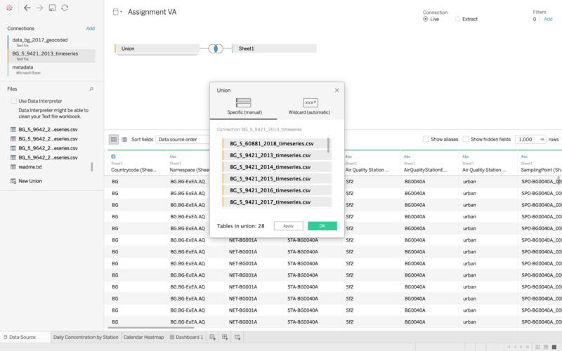
Since there are 27 files, we will have to combine them. I used Tableau's in-built Union function as shown below
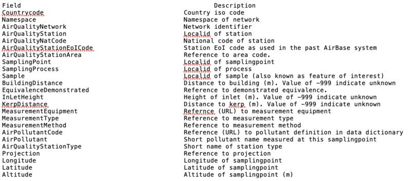
And below are the columns present in the metadata and their descriptions.
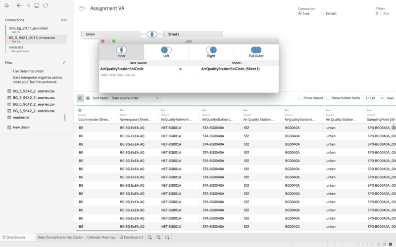
We will need to combine the data in the csv files with the metadata. We will do this by Inner Joining AirQualityStationEolCode in Tableau
| Problem #1 | |
|---|---|
| Issue | There are missing data from Jan 2017 to Nov 2017. In addition, Orlov station doesn't have any data from year 2016-2018, and within 2012-2015 for Orlov there are missing data between July 2013 to September 2013 as well as Feb 12 2015 to Feb 24 2015. Mladost station only have data in 2018. |
| Solution | Since the data all follow the same pattern, Average Concentration is not affected. I have tried using Average Concentration as well as excluding the data for the 2 cities, and the result is the same. |
Air Tube Data
We are given 2 csv files, with one being 2017 data and the other being 2018 data. The columns of the files are as follow:
| Problem #1 | |
|---|---|
| Issue | Tableau does not recognise geohash as geospatial data. Air Tube data uses geohashes to locate its sensors. We would need to transform the geohashes into latitude and longitude for further visualisation |
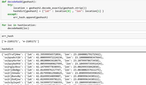
| Solution | I use a python library geohash2 to perform geodecoding. I then add an additional column called lat and lng to the dataset. The code snippet for the geodecoding is as below |
| Problem #2 | |
| Issue | There were invalid geohashes during geodecode |
| Solution | I decided to check the geohashes to see where "m-2105171" location is before deciding whether to remove the place. It turns out to have latitude of 44.99296188354492 and longitude of 57.792205810546875. However, Google Map returns an invalid place based on the coordinates, so I decided that the geohash is invalid and the row will be ignored in further analysis |
METEO Data
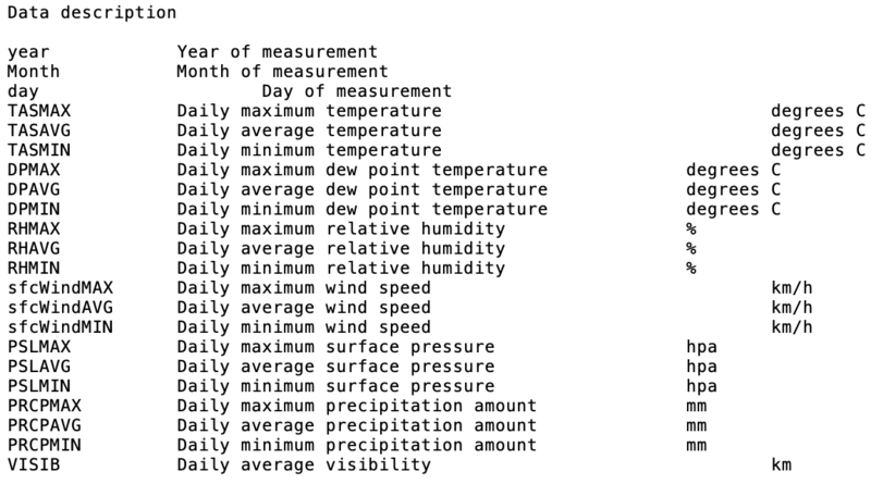
We are given 1 csv file about the meteorological measurements in Sofia from 2012 to 2018. The columns are as follow:
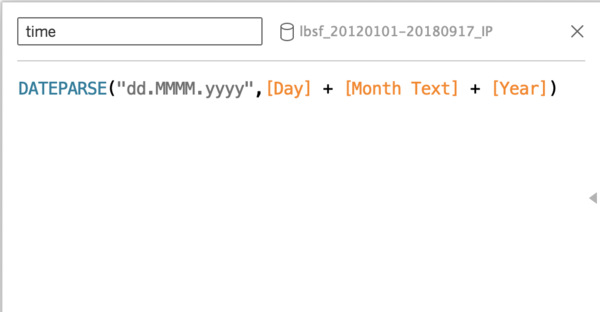
For Task 3, I wanted to combine it with Air Tube data for meaningful analysis. I realised that both can be connected by time. However, Air Tube data are collected by the hours while METEO Data are collected by days. Thus, I would take the average by day of the Air Tube data, and add a new field called "time" in the METEO Data.
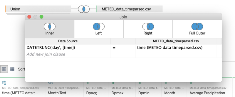
Then I inner join by the DateTrunc of Air Tube Data
► Task 1: Spatio-temporal Analysis of Official Air Quality
A typical day in Sofia
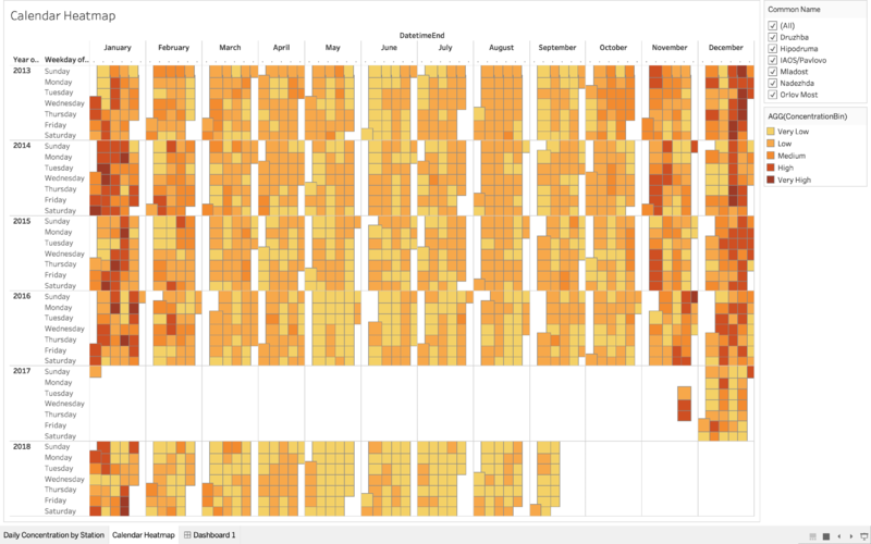
As shown on the heatmap, 2nd week of October, November, December, January and February are generally unhealthy (with some days go up to very unhealthy level) while a normal day in other months are at low level of concentration. There is seemingly no correlation between the day of the week and the PM10 concentration level.
In order to see a daily concentration trend in Sofia, I have decided to plot a line graph of the concentration level against the hours in a day.
In order to see the yearly trend in concentration level, I plot a line chart of concentration level against day for all 5 stations.
As shown on the line chart, there are no anomalous sequence in the different stations. Other than the missing 2017 data and stations that have impartial data, there are recurring outliers every year (hovering on the point would reveal the exact day of the outlier). One of the outliers fall on December 25th, which is Christmas day. This might be due to Bulgarian's tradition of keeping a fireplace lit in a hearth, burning long enough to last through Christmas and into the day. Other peaks of the graph includes New Year period (1st week of January) and end of January.
Over the year, we can see that there is a general decreasing trend of the peaks, indicating that air pollution in Sofia is getting better. This is in tandem with the trend observed in the Calendar Heatmap. In addition, there are less peak points at the end of the year (with 2014 includes points in February while subsequent years the same day/period do not have any peak).
In conclusion, it seems that in Sofia, the average day is of moderate level of PM10 concentration. Start and end of year seems to have worst air quality, and the worst days happen on holidays. However, over the years, the PM10 concentration has been steadily decreasing.
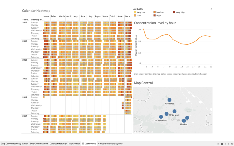
The final dashboard for this task:
► Task 2: Spatio-temporal Analysis of Citizen Science Air Quality Measurements
Sensors performance
► Sensors placements around Sofia
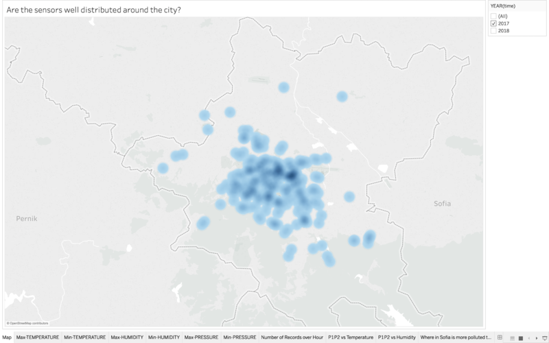
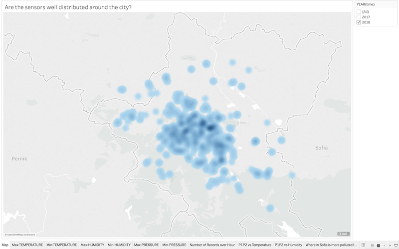
First, I plot the locations of the sensors on a map using the latitude and longitude generated earlier. The resulting density map (which is a new feature in the latest Tableau version) has sensors that are placed outside of Sofia, but for this exercise I decided to exclude those and only focus on the ones that are in Sofia city. The resulting density map is as follow:
As seen on the above maps, there are more sensors in 2018 than in 2017. However, for both years, the sensors are very concentrated in the middle of the city. There are little sensors nearer to the border of the city.
► Are the sensors working properly at all times?
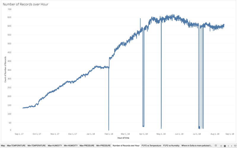
In order to find out whether the sensors are working properly, I plot the number of records against the Hours to see if there are any hour that there are an unusual number of records. The result is as follow:
There are multiple dips in the chart and 1 time where the number of records went abnormally high, indicating that there were times where the sensors were not working properly (by suddenly not taking as many records as it is supposed to be, or suddenly malfunction and take a lot more than usual). However, a closer look at the data shows that the dips only started happening in 2018. This could be due to the new sensors that are added in 2018.
► Are there any unexpected behaviours?
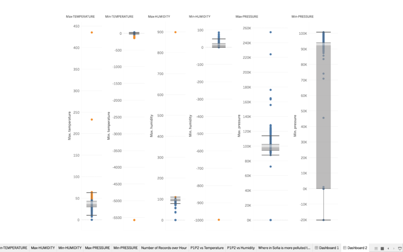
In order to find out unexpected behaviour in the sensors, I plot a series of boxplots of maximum and minimum temperature, humidity and pressure recorded for the data collected to check for outliers. Since the hottest temperature ever recorded in Bulgaria was 45.6 Celcius and the coldest ever was -38.3, I set those as my limits. Any temperature outside that range would be considered as outliers. Humidity is recorded in percentage, thus I deemed any humidity recorded below 0 and above 100 to be outliers. For pressure data, outliers are deemed as data lying outside the quartiles. The result is as follow:
As shown in the diagram, there is a significant number of outliers in temperature, humidity and pressure being recorded. Thus, I suspect that the sensors might not be working as expected, or are put in places that have additional heat source, pressure and humidity sources, leading to different readings.
► Which part in the city has higher readings than others?
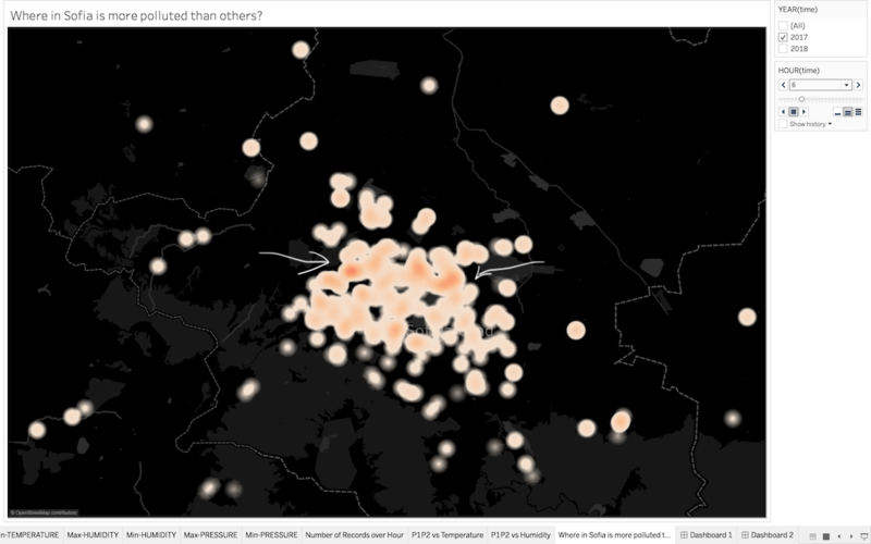
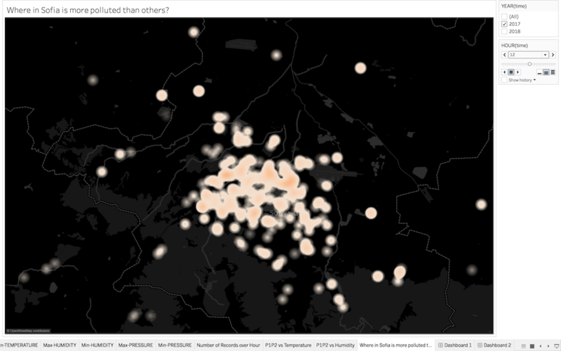
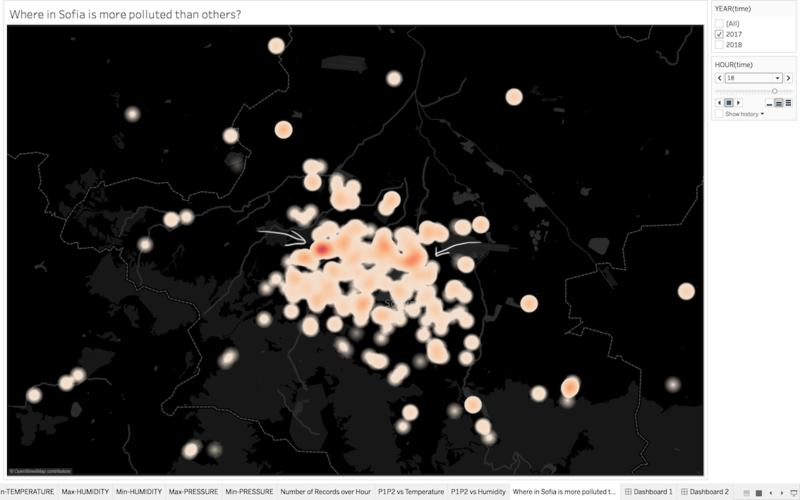
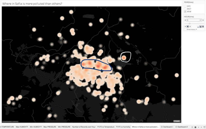
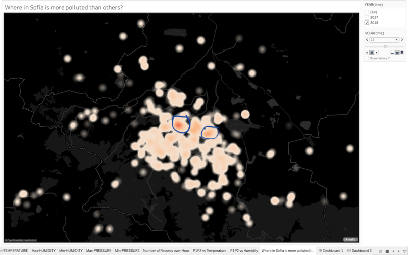
Since the number of sensors in 2017 and 2018 are different, it only makes sense to take a look at 2017 and 2018 separately and see any commonalities/differences. For this task, I have plot a density map with the median of total PM2.5 and PM10 concentration (P1 + P2). I will be looking at 3 different timing for each year, namely midnight-early morning (12am-8am), working hours (8am-6pm) and after hours (6pm-12am). The result is as follow
As you can see, the identified spots shown in the diagrams above have varying pollution concentration level across the time periods. During working hours, the identified spots have the same pollution levels as other spots. Let's see if the same spots appear in 2018, or are there any new spots in 2018?
There seems to be 3 new spots in 2018 as compared to 2017. 2 of the 3 new spots seem to have high pollution throughout the day.
► Task 3: Causes of pollution
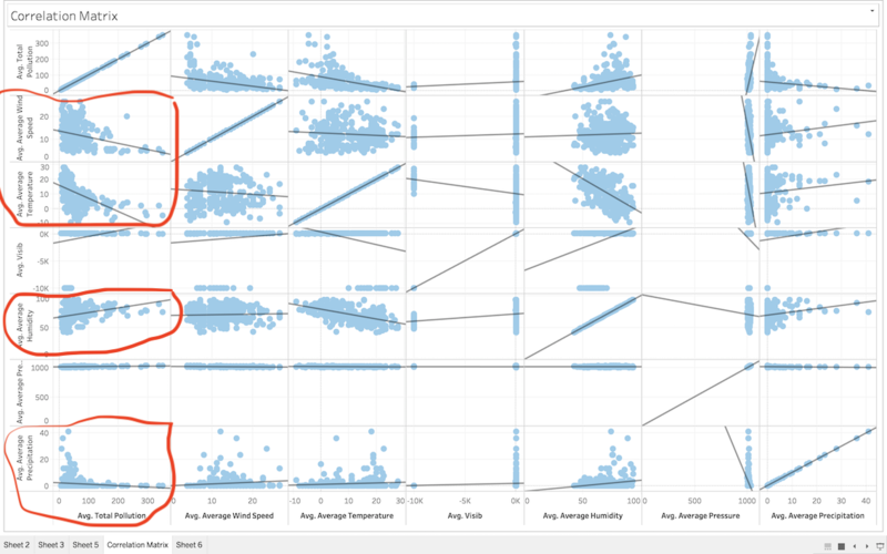
In order to see the correlation between the variables, I decided to plot a correlation matrix of the total pollution (P1 + P2 in Air Tube Data) with meteorological measurements. The reason why I combined P1 and P2 is because they both have very similar trends across time, so correlation to one would most likely lead to a correlation in other. The data used was Air Tube data combined with METEO Data. The detailed data transformation process is shown above in the EDA segment.
The correlation matrix is as follow:
From the correlation matrix, it seems that there is a slight inverse relationship between wind speed and air pollution level. This is likely due to transboundary pollution, as Belgium's neighbouring countries (e.g Italy) also suffer from air pollution issues. There is also a slight inverse correlation between pollution and temperature as well. In addition, there is a weak correlation between humidity and air pollution, as well as precipitation and air pollution.
► Tableau Public
Here is the link to the Tableau Public Storyboard: https://public.tableau.com/profile/an7150#!/vizhome/StoryBoard_11/SofiaAirPollutionAnalysis?publish=yes
► Conclusion
It was a very challenging but interesting assignment. I enjoyed working with my friends and exploring different data visualisation techniques and evaluating them. There were many missing details and roundabouts due to my inexperience in data cleaning and data visualisation techniques, but it was a good learning experience. If I were to do the project again, I would spend more time to conduct more extensive Exploratory Data Analysis. I was unable to use TOPO Data in my visualisations, and I am sure that there are many patterns that I was unable to uncover.
► Reference
Common Air Quality Index (CAQI): http://www.airqualitynow.eu/about_indices_definition.php
Bulgaria Christmas Tradition: https://www.novinite.com/articles/135151/Bulgaria+Celebrates+with+Christmas+Eve+Traditions
Highest and Lowest Temperature recorded in Sofia: http://pantonov.com/weather/record.htm

