Difference between revisions of "IS428 AY2018-19T1 Chaw Khin Nyein"
Knchaw.2015 (talk | contribs) |
Knchaw.2015 (talk | contribs) |
||
| (22 intermediate revisions by the same user not shown) | |||
| Line 26: | Line 26: | ||
* Characterize the sensors’ coverage, performance and operation. Are they well distributed over the entire city? Are they all working properly at all times? Can you detect any unexpected behaviors of the sensors through analyzing the readings they capture? Limit your response to no more than 4 images and 600 words. | * Characterize the sensors’ coverage, performance and operation. Are they well distributed over the entire city? Are they all working properly at all times? Can you detect any unexpected behaviors of the sensors through analyzing the readings they capture? Limit your response to no more than 4 images and 600 words. | ||
| − | * Now turn your attention to the air pollution measurements themselves. Which part of the city shows relatively higher readings than others? Are these differences time dependent? Limit your response to no more than 6 images and 800 words. | + | * Now turn your attention to the air pollution measurements themselves. Which part of the city shows relatively higher readings than others? Are these differences time dependent? Limit your response to no more than 6 images and 800 words. |
| − | ==Task 3== | + | ==Task 3: Relationships== |
Urban air pollution is a complex issue. There are many factors affecting the air quality of a city. Some of the possible causes are: | Urban air pollution is a complex issue. There are many factors affecting the air quality of a city. Some of the possible causes are: | ||
| Line 38: | Line 38: | ||
* Transboundary pollution for example the haze that intruded into Singapore from our neighbours. | * Transboundary pollution for example the haze that intruded into Singapore from our neighbours. | ||
| − | In this third task, you are required to reveal the relationships between the factors mentioned above and the air quality measure detected in Task 1 and Task 2. Limit your response to no more than 5 images and 600 words. | + | In this third task, you are required to reveal the relationships between the factors mentioned above and the air quality measure detected in Task 1 and Task 2. Limit your response to no more than 5 images and 600 words. |
=The Data Sets= | =The Data Sets= | ||
| Line 51: | Line 51: | ||
They can be download by click on this [https://storage.cloud.google.com/global-datathon-2018/sofia-air/air-sofia.zip link]. | They can be download by click on this [https://storage.cloud.google.com/global-datathon-2018/sofia-air/air-sofia.zip link]. | ||
| − | = | + | =Data Prepration= |
| + | '''Data Compiling''' | ||
| + | <br>EEA data sets are complied into one excel file for the convenience access of data which will result in better visualization. As there is the concern on the join statement of tableau (for example, improper usage of join statement in tableau could result in data incompleteness), data set are compiled outside of tableau by using window command. Firstly, window command is used to compile all the data. Secondly, remove duplicate row(i.e headers) by using excel built-in function. | ||
| + | [[File:ChawCompiler.png|center|400px]] | ||
| − | =Data | + | <br>'''Geo-coding of Air-tube data''' |
| + | <br>Geohash address are decoded into latitude and longitude by using python. Python language is selected due to familiarity which will lead to easy checking of the result data. However, the following python code cannot handle '-' in geohash and throw an error for the outlier geocode that has '-' in it. Luckily, there is only one geohash with '-'. To rectify it, geohash convertor online is used for the outlier geocode. (source: http://geohash.co/) | ||
| + | [[File:ChawGeocode.png|center|600px]] | ||
| + | |||
| + | '''Data Cleaning''' | ||
| + | <br>As the data from EEA is not tab-delimited, instead comma-delimited, it is hard to read for human eyes. Even though tableau have the ability to clean the data by comma, it is difficult to check. Hence, the data is clean using excel built-in function. | ||
| + | [[File:ChawDataClean.png|center|600px]] | ||
| + | |||
| + | '''Data Background Information''' | ||
| + | <br>In EEA Data set, there are total of 5 stations and 1 station is recently established in 2018. Averaging time is different for some stations and data set do not cover for all the averaging times, i.e some of the station have 'day' as averaging time and some station have 'hour' as averaging time. | ||
| + | |||
| + | =Data Analysis= | ||
| + | '''Task 1'''<br> | ||
| + | Air quality data(concentration) are grouped as follows: | ||
| + | [[File:ChawAQ.png|center|600px]] | ||
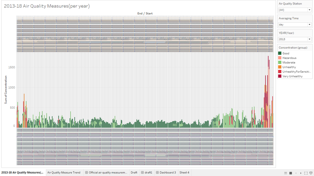
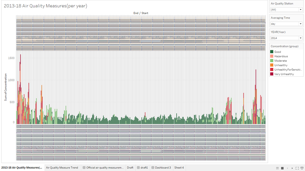
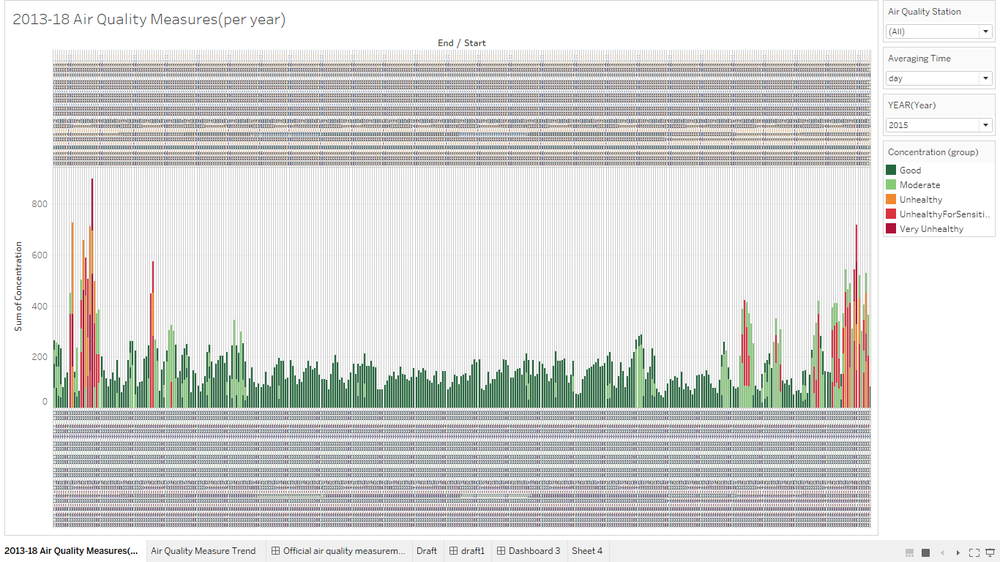
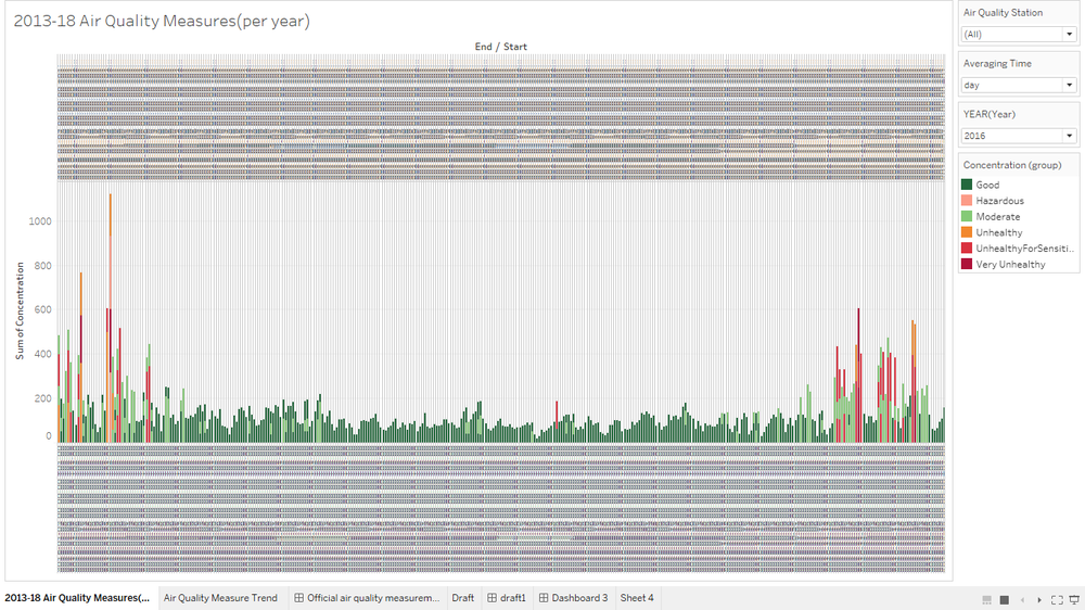
| + | According to the data visualization, each year, air pollution have been increasing specifically near to the end from the year 2013-2017. In 2017, 'hour' averaging time is introduced and 'day' averaging time is absent. In 2018, new station 'day' is introduced and the station used 'day' as an averaging time and 'hour' averaging time is present for 2018. Data anomalies exists in the sense that it is hard to see the overview when two different measures(day,hour) is used. Time-series data is effected as we cant say pollution has been increased judging from this visualization alone as new station is added in 2018 which effect the overall trend. </br> | ||
| + | [[File:ChawDataClean13.png|center|1000px|Air pollution concentrations 2013 measured in days]] | ||
| + | <br><center>Air pollution concentrations 2013 measured in days</center></br> | ||
| + | [[File:ChawDataClean14.png|center|1000px|Air pollution concentrations 2014 measured in days]] | ||
| + | <br><center>Air pollution concentrations 2014 measured in days</center></br> | ||
| + | [[File:ChawDataClean15.png|center|1000px|Air pollution concentrations 2015 measured in days]] | ||
| + | <br><center>Air pollution concentrations 2015 measured in days</center></br> | ||
| + | [[File:ChawDataClean16.png|center|1000px|Air pollution concentrations 2016 measured in days]] | ||
| + | <br><center>Air pollution concentrations 2016 measured in days</center></br> | ||
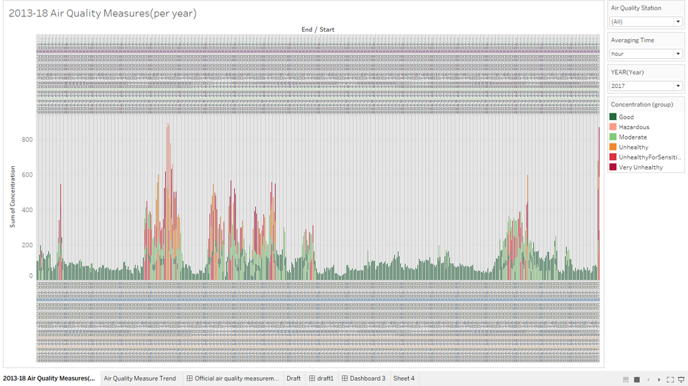
| + | [[File:ChawDataClean17.png|center|1000px|Air pollution concentrations 2017 measured in hours]] | ||
| + | <br><center>Air pollution concentrations 2017 measured in hours</center></br> | ||
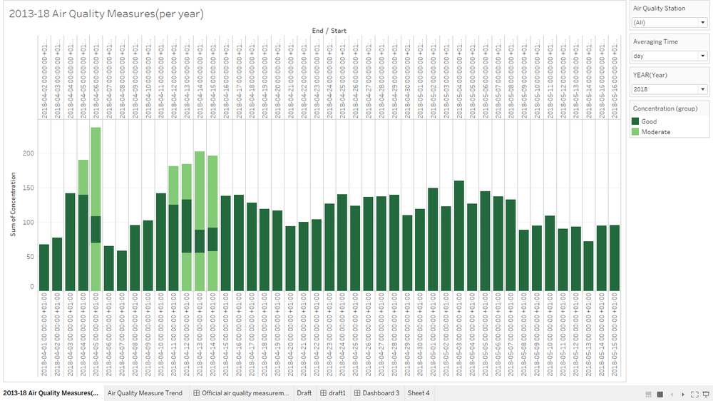
| + | [[File:ChawDataClean18Days.png|center|1000px|Air pollution concentrations 2018 measured in days]] | ||
| + | <br><center>Air pollution concentrations 2018 measured in days</center></br> | ||
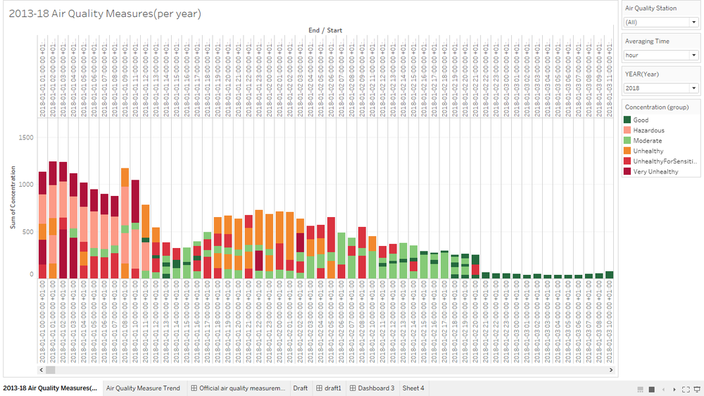
| + | [[File:ChawDataClean18hours.png|center|1000px|Air pollution concentrations 2018 measured in hours]] | ||
| + | <br><center>Air pollution concentrations 2018 measured in hours</center></br> | ||
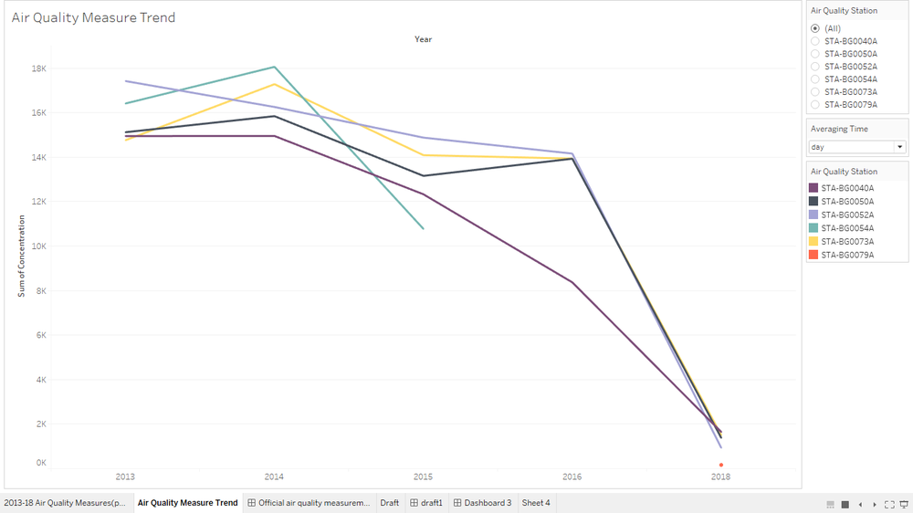
| + | [[File:Chawtrenddays.png|center|1000px|Air pollution concentrations Trends in days]] | ||
| + | <br><center>Air pollution concentrations Trends in days</center></br> | ||
| + | [[File:Chawtrendhours.png|center|1000px|Air pollution concentrations Trends in hours]] | ||
| + | <br><center>Air pollution concentrations Trends in hours</center></br> | ||
| + | |||
| + | '''Task 2'''<br> | ||
| + | '''2017''' | ||
| + | Sensors covered are too dense in the center of the Sofia City and sensors reading has been steady through out the year. There are some specific area (latitude, longtitude) where P1 and P2 are significantly higher than the rest of the location. | ||
| + | [[File:Chaw2017Sensors.png|center|1000px|2017 Sensors Coverage and Particles Measures]]</br> | ||
| + | <br><center>2017 Sensors Coverage and Particles Measures</center> | ||
| + | |||
| + | '''2018'''<br> | ||
| + | In 2018, there are some outliers in sensors readings. Coverage is about the same as 2017 sensors coverage. There are some specific area (latitude, longtitude) where P1 and P2 are significantly higher than the rest of the location. | ||
| + | [[File:Chaw2018Sensors.png|center|1000px|2018 Sensors Coverage and Particles Measures]]</br> | ||
| + | <br><center>2018 Sensors Coverage and Particles Measures</center> | ||
| + | |||
| + | '''Task3'''<br> | ||
| + | The visualization below is to identify the relation between meteo-data and air -pollution trend by relating back to the EEA data as they both have the similar time-period. It could be studied that approximately, while air-pollution is in constant-increase, other factors are in constant decrease. | ||
| + | [[File:ChawRelatedFactors.png|center|1000px|Air Pollutions and Related Factors]]</br> | ||
| + | <br><center>Air Pollutions and Related Factors</center> | ||
| + | |||
| + | =Software/Tools Used= | ||
| + | Tableau - visualization<br> | ||
| + | Jypter - geocoding (Python) <br> | ||
| + | Cmd prompt - csv compiling (window commands) <br> | ||
| + | Excel - Excel built-in functions to clean data | ||
| + | Chrome - platform to access published visualization | ||
| + | |||
| + | =Reference= | ||
| + | https://www.thinglink.com/scene/573136403714539522<br> | ||
| + | https://www.thedataschool.co.uk/tom-pilgrem/navigate-dashboards-tableau/ | ||
Latest revision as of 00:00, 12 November 2018
To be a Visual Detective
Contents
Overview
Air pollution is an important risk factor for health in Europe and worldwide. A recent review of the global burden of disease showed that it is one of the top ten risk factors for health globally. Worldwide an estimated 7 million people died prematurely because of pollution; in the European Union (EU) 400,000 people suffer a premature death. The Organisation for Economic Cooperation and Development (OECD) predicts that in 2050 outdoor air pollution will be the top cause of environmentally related deaths worldwide. In addition, air pollution has also been classified as the leading environmental cause of cancer.
Air quality in Bulgaria is a big concern: measurements show that citizens all over the country breathe in air that is considered harmful to health. For example, concentrations of PM2.5 and PM10 are much higher than what the EU and the World Health Organization (WHO) have set to protect health.
Bulgaria had the highest PM2.5 concentrations of all EU-28 member states in urban areas over a three-year average. For PM10, Bulgaria is also leading on the top polluted countries with 77 μg/m3on the daily mean concentration (EU limit value is 50 μg/m3).
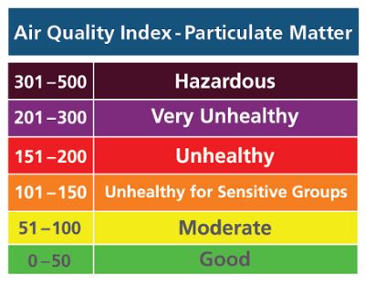
According to the WHO, 60 percent of the urban population in Bulgaria is exposed to dangerous (unhealthy) levels of particulate matter (PM10).
The Task
In this assignment, you are required to use visual analytics approach to reveal spatio-temporal patterns of air quality in Sofia City and to identify issues of concern.
Task 1: Spatio-temporal Analysis of Official Air Quality
Characterize the past and most recent situation with respect to air quality measures in Sofia City. What does a typical day look like for Sofia city? Do you see any trends of possible interest in this investigation? What anomalies do you find in the official air quality dataset? How do these affect your analysis of potential problems to the environment?
Your submission for this questions should contain no more than 10 images and 1000 words.
Task 2: Spatio-temporal Analysis of Citizen Science Air Quality Measurements
Using appropriate data visualisation, you are required will be asked to answer the following types of questions:
- Characterize the sensors’ coverage, performance and operation. Are they well distributed over the entire city? Are they all working properly at all times? Can you detect any unexpected behaviors of the sensors through analyzing the readings they capture? Limit your response to no more than 4 images and 600 words.
- Now turn your attention to the air pollution measurements themselves. Which part of the city shows relatively higher readings than others? Are these differences time dependent? Limit your response to no more than 6 images and 800 words.
Task 3: Relationships
Urban air pollution is a complex issue. There are many factors affecting the air quality of a city. Some of the possible causes are:
- Local energy sources. For example, according to Unmask My City, a global initiative by doctors, nurses, public health practitioners, and allied health professionals dedicated to improving air quality and reducing emissions in our cities, Bulgaria’s main sources of PM10, and fine particle pollution PM2.5 (particles 2.5 microns or smaller) are household burning of fossil fuels or biomass, and transport.
- Local meteorology such as temperature, pressure, rainfall, humidity, wind etc
- Local topography
- Complex interactions between local topography and meteorological characteristics.
- Transboundary pollution for example the haze that intruded into Singapore from our neighbours.
In this third task, you are required to reveal the relationships between the factors mentioned above and the air quality measure detected in Task 1 and Task 2. Limit your response to no more than 5 images and 600 words.
The Data Sets
Four major data sets in zipped file format are provided for this assignment, they are:
- Official air quality measurements (5 stations in the city)(EEA Data.zip) – as per EU guidelines on air quality monitoring see the data description HERE…
- Citizen science air quality measurements (Air Tube.zip) , incl. temperature, humidity and pressure (many stations) and topography (gridded data).
- Meteorological measurements (1 station)(METEO-data.zip): Temperature; Humidity; Wind speed; Pressure; Rainfall; Visibility
- Topography data (TOPO-DATA)
They can be download by click on this link.
Data Prepration
Data Compiling
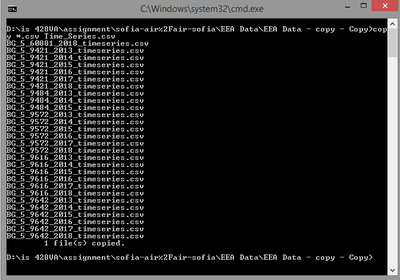
EEA data sets are complied into one excel file for the convenience access of data which will result in better visualization. As there is the concern on the join statement of tableau (for example, improper usage of join statement in tableau could result in data incompleteness), data set are compiled outside of tableau by using window command. Firstly, window command is used to compile all the data. Secondly, remove duplicate row(i.e headers) by using excel built-in function.
Geo-coding of Air-tube data
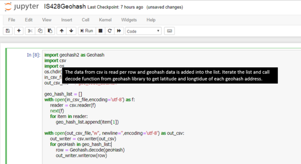
Geohash address are decoded into latitude and longitude by using python. Python language is selected due to familiarity which will lead to easy checking of the result data. However, the following python code cannot handle '-' in geohash and throw an error for the outlier geocode that has '-' in it. Luckily, there is only one geohash with '-'. To rectify it, geohash convertor online is used for the outlier geocode. (source: http://geohash.co/)
Data Cleaning
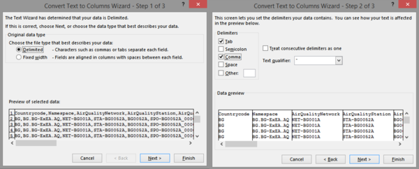
As the data from EEA is not tab-delimited, instead comma-delimited, it is hard to read for human eyes. Even though tableau have the ability to clean the data by comma, it is difficult to check. Hence, the data is clean using excel built-in function.
Data Background Information
In EEA Data set, there are total of 5 stations and 1 station is recently established in 2018. Averaging time is different for some stations and data set do not cover for all the averaging times, i.e some of the station have 'day' as averaging time and some station have 'hour' as averaging time.
Data Analysis
Task 1
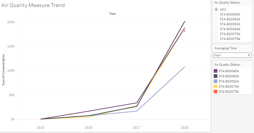
Air quality data(concentration) are grouped as follows:
According to the data visualization, each year, air pollution have been increasing specifically near to the end from the year 2013-2017. In 2017, 'hour' averaging time is introduced and 'day' averaging time is absent. In 2018, new station 'day' is introduced and the station used 'day' as an averaging time and 'hour' averaging time is present for 2018. Data anomalies exists in the sense that it is hard to see the overview when two different measures(day,hour) is used. Time-series data is effected as we cant say pollution has been increased judging from this visualization alone as new station is added in 2018 which effect the overall trend.
Task 2
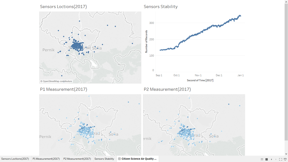
2017
Sensors covered are too dense in the center of the Sofia City and sensors reading has been steady through out the year. There are some specific area (latitude, longtitude) where P1 and P2 are significantly higher than the rest of the location.
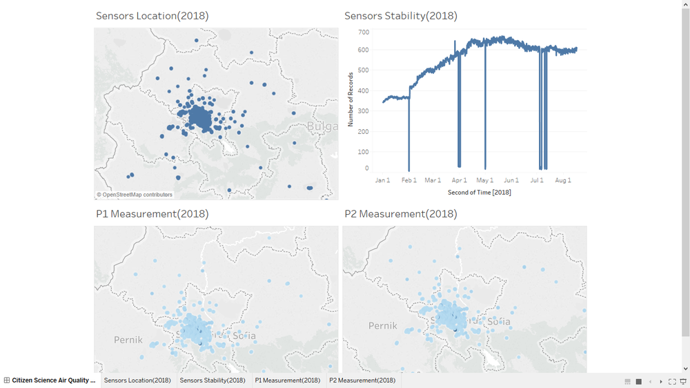
2018
In 2018, there are some outliers in sensors readings. Coverage is about the same as 2017 sensors coverage. There are some specific area (latitude, longtitude) where P1 and P2 are significantly higher than the rest of the location.
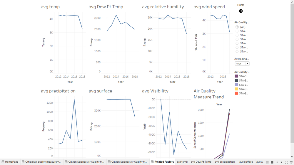
Task3
The visualization below is to identify the relation between meteo-data and air -pollution trend by relating back to the EEA data as they both have the similar time-period. It could be studied that approximately, while air-pollution is in constant-increase, other factors are in constant decrease.
Software/Tools Used
Tableau - visualization
Jypter - geocoding (Python)
Cmd prompt - csv compiling (window commands)
Excel - Excel built-in functions to clean data
Chrome - platform to access published visualization
Reference
https://www.thinglink.com/scene/573136403714539522
https://www.thedataschool.co.uk/tom-pilgrem/navigate-dashboards-tableau/
