Difference between revisions of "IS428 AY2018-19T1 Chew Yuxi"
| (3 intermediate revisions by the same user not shown) | |||
| Line 71: | Line 71: | ||
| '''Solution''' || The python library [https://pypi.org/project/python-geohash/ python-geohash] was used to decode geohash to longitude and latitude respectively. | | '''Solution''' || The python library [https://pypi.org/project/python-geohash/ python-geohash] was used to decode geohash to longitude and latitude respectively. | ||
| − | [[File:Yx dataclean 6.png| | + | [[File:Yx dataclean 6.png|700px|center]] |
An example of the conversion is shown below: | An example of the conversion is shown below: | ||
| Line 83: | Line 83: | ||
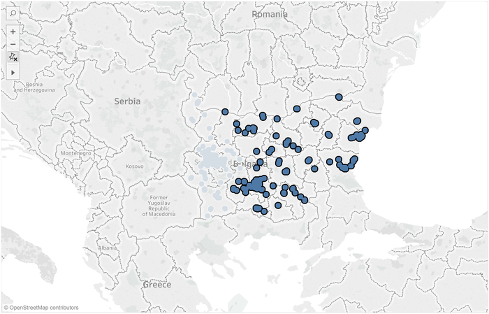
Some of the irrelevant data points are highlighted below: | Some of the irrelevant data points are highlighted below: | ||
| − | [[File:Yx dataclean 8.png| | + | [[File:Yx dataclean 8.png|700px|center]] |
|- | |- | ||
| Line 94: | Line 94: | ||
=Interactive Visualization= | =Interactive Visualization= | ||
| − | The interactive visualisation can be assessed from this link: [https://public.tableau.com/profile/yuxi7903#!/vizhome/VA_Assignment_Chew_Yuxi/Home | + | The interactive visualisation can be assessed from this link: [https://public.tableau.com/profile/yuxi7903#!/vizhome/VA_Assignment_Chew_Yuxi/Home https://public.tableau.com/profile/yuxi7903#!/vizhome/VA_Assignment_Chew_Yuxi/Home] |
| + | |||
| + | '''Home''' | ||
| + | |||
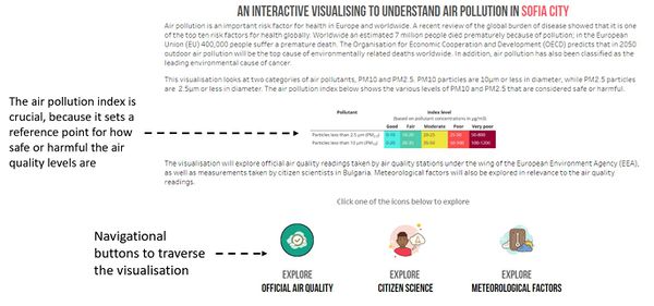
| + | The homepage describes the purpose of the visualisation, and the various components. The navigation buttons split the dashboard into 3 components - official air quality, citizen science and meteorological factors. An important portion of the homepage is the inclusion of the air quality index, which shows the boundaries of safe and hazardous levels of air pollutants for PM10 and PM2.5. | ||
| + | |||
| + | [[File:Yx viz 1.JPG|600px|center]] | ||
| + | |||
| + | |||
| + | '''Official Air Quality Overview''' | ||
| + | |||
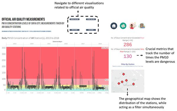
| + | The overview is essentially a time-series that shows the measurements of PM10, allowing the user to effectively see the trends of PM10 levels over the years. Metrics are also displayed for the user to easily grasp the gravity of the situation by seeing how many readings exceed unhealthy levels. A filter is also provided in the form of a geographical map, allowing the user to select the particular station they want to focus on. | ||
| + | |||
| + | [[File:Yx viz 2.JPG|600px|center]] | ||
| + | |||
| + | |||
| + | '''Official Air Quality by Station''' | ||
| + | |||
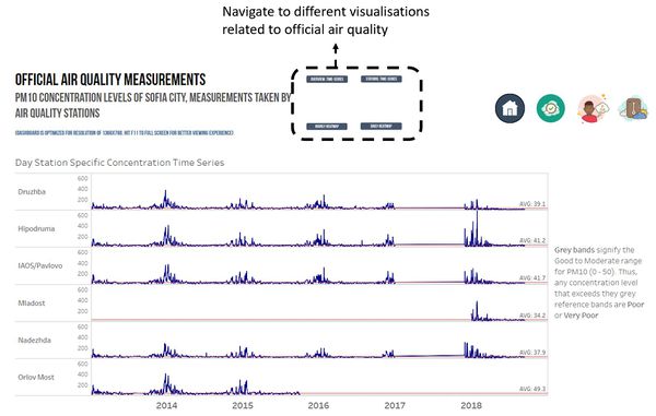
| + | This dashboard allows the user to understand the consistency of operations of each station, and assess whether there are any anomalies when it comes to their performance over time. A reference band is included which displays the Good to Moderate range, allowing the reader to see how often the PM10 concentration exceed the healthy levels. | ||
| + | |||
| + | [[File:Yx viz 3.JPG|600px|center]] | ||
| + | |||
| + | |||
| + | '''Official Air Quality Hourly HeatMap''' | ||
| + | |||
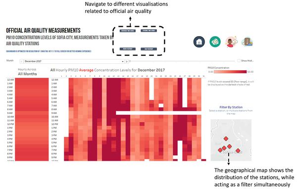
| + | The heatmap shows the hourly concentration levels of Sofia City. The chart on the left shows the average concentration level across all time periods, but the chart on the right allows the user to drill down more into the hourly levels of each day of the month and year. | ||
| + | |||
| + | [[File:Yx viz 4.JPG|600px|center]] | ||
| + | |||
| + | |||
| + | '''Official Air Quality Calendar View''' | ||
| + | |||
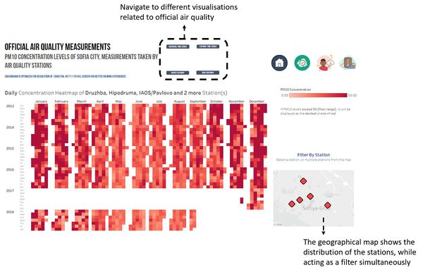
| + | The calendar view effectively shows the ''daily'' concentration levels of PM10 across all the years at once. This view shows seasonality more clearly than the time-series due to the large number of readings. | ||
| + | |||
| + | [[File:Yx viz 5.JPG|600px|center]] | ||
| + | |||
| + | |||
| + | '''Citizen Science Coverage and Performance''' | ||
| + | |||
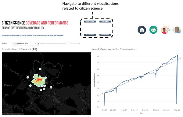
| + | To understand the distribution of the citizen science sensors across Sofia City a density plot is used to visualise the data points. The number of readings is also shown via the time-series on the right to assess the consistency of performance over time. | ||
| + | |||
| + | [[File:Yx viz 6.JPG|600px|center]] | ||
| + | |||
| + | |||
| + | '''Citizen Science Individual Measurements and Anomalies''' | ||
| + | |||
| + | It is common for citizen science instruments to have errors. This dashboard shows every single reading of PM10, allowing the user to analyse whether there are anomalies. The dot plot interacts with the geographical map on the right, to allow the user to review where the stations with anomalies are situated. | ||
| + | |||
| + | [[File:Yx viz 7.JPG|600px|center]] | ||
| + | |||
| + | |||
| + | '''Citizen Science PM10 Measurements Analysis''' | ||
| + | |||
| + | The hexgrid map shows the distribution of PM10 levels across Sofia City by averaging nearby citizen science measurements together. The hourly heatmap allows the reader to immediately drill into how the PM10 levels changed across the month, while the time-series shows the overall trend across the timeframe. | ||
| + | |||
| + | [[File:Yx viz 9.JPG|600px|center]] | ||
| + | |||
| + | |||
| + | '''Citizen Science PM2.5 Measurements Analysis''' | ||
| + | |||
| + | The hexgrid map shows the distribution of PM2.5 levels across Sofia City by averaging nearby citizen science measurements together. The hourly heatmap allows the reader to immediately drill into how the PM2.5 levels changed across the month, while the time-series shows the overall trend across the timeframe. | ||
| + | |||
| + | [[File:Yx viz 10.JPG|600px|center]] | ||
| + | |||
| + | |||
| + | '''Citizen Science Meteorological Factors''' | ||
| + | |||
| + | The scatter plots on the left allows the user to investigate correlation between the many meteorological factors with each other, while the area chart on the right allows the user to dynamically compare various factors and aggregations (average, min, max) over various time frames. | ||
| + | |||
| + | [[File:Yx viz 11.JPG|600px|center]] | ||
=Task 1: Spatio-temporal Analysis of Official Air Quality= | =Task 1: Spatio-temporal Analysis of Official Air Quality= | ||
| Line 274: | Line 343: | ||
=References= | =References= | ||
| + | * https://www.tableau.com/about/blog/2016/7/how-create-density-maps-using-hexbins-tableau-56511 | ||
| + | * http://airindex.eea.europa.eu/ | ||
Latest revision as of 23:58, 11 November 2018
Contents
Overview
Air pollution is an important risk factor for health in Europe and worldwide. A recent review of the global burden of disease showed that it is one of the top ten risk factors for health globally. Worldwide an estimated 7 million people died prematurely because of pollution; in the European Union (EU) 400,000 people suffer a premature death. The Organisation for Economic Cooperation and Development (OECD) predicts that in 2050 outdoor air pollution will be the top cause of environmentally related deaths worldwide. In addition, air pollution has also been classified as the leading environmental cause of cancer.
Air quality in Bulgaria is a big concern: measurements show that citizens all over the country breathe in air that is considered harmful to health. For example, concentrations of PM2.5 and PM10 are much higher than what the EU and the World Health Organization (WHO) have set to protect health.
Bulgaria had the highest PM2.5 concentrations of all EU-28 member states in urban areas over a three-year average. For PM10, Bulgaria is also leading on the top polluted countries with 77 μg/m3on the daily mean concentration (EU limit value is 50 μg/m3).
According to the WHO, 60 percent of the urban population in Bulgaria is exposed to dangerous (unhealthy) levels of particulate matter (PM10).
Dataset and Transforming
Official Air Quality Measurements
There are 5 stations in Sofia City that measure air quality. The details of each station can be summarised as such:
| Issue | The 5 stations have varying formats of datetime |
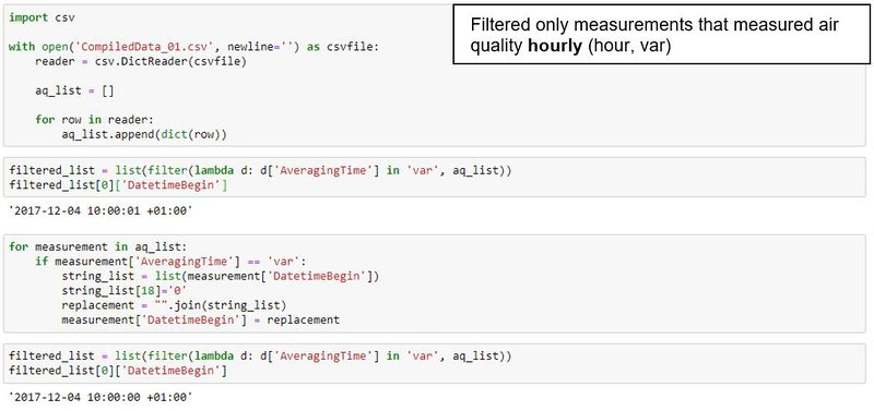
| Solution | Changed measurements with “DatetimeBegin” as such:
Using python to clean the data: |
| Issue | Time intervals of measurements differ between stations and years. |
| Solution | There are three options for “AveragingTime”: day, hour and var. Measurements categorised under var were corrected in the previous step and are now synonymous with hour. Thus, filter only measurements that measured air quality hourly |
At this point, there are 3 data files to analyse:
- Metadata – information of the 5 stations, such as name, measurement instruments and geographical locations
- Hourly Measurements – measurements of official air quality on an hourly basis. This includes data that have the variable “AveragingTime” as “hour” or “var”
- Daily Measurements – measurements of official air quality on a daily basis. This includes data that has the variable “AveragingTime” as “day”
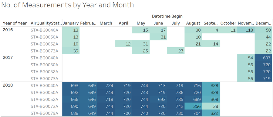
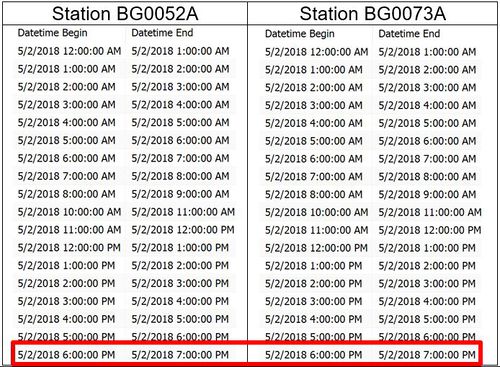
| Issue | Missing data in the hourly measurement dataset. Preliminary investigation was done on the hourly dataset. The initial findings are that missing data is extremely prevalent, as shown in the table below.
Data collection for 2016 is sparse, and therefore, too inconsistent to perform an hourly analysis of the measurements. In 2017, hourly data collection only began in late November, resulting in a large portion of data missing for the month of November. In 2018, data collection was mostly comprehensive, except for station BG0073A in August. Data collection is also not complete from September onwards. The are also chunks of time where data is not collected. For example, in the table shown below, we can see that there are certain days in February 2018 where the number of measurements is not 24. After further investigation, it was found that there are common timings across station where measurements were not taken. This is likely due to a common daily or weekly maintenance procedures for the stations or tracking software. Therefore, it can be seen that most of the data is missing not at random. Missing data is an issue because there is a factor of seasonality that will be difficult to account for if data for certain months or years are not available. A typical day in Sofia city in January can be vastly different to a day in December. |
| Solution | Only data for November and December 2017, and the rest of 2018 is considered during the analysis of hourly data. |
Citizen Science Air Quality Measurements
Citizen science is an open-source air pollution monitoring movement in Bulgaria. Air quality measurements are taken by citizens in Bulgaria, using tools.
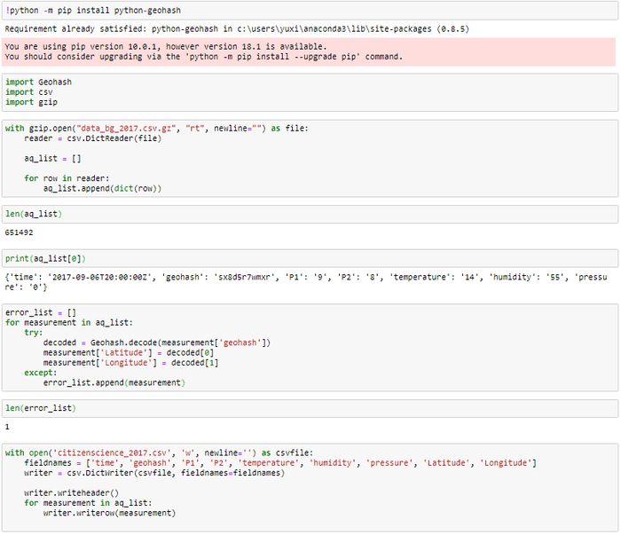
| Issue | Geohash cannot be interpreted by Tableau |
| Solution | The python library python-geohash was used to decode geohash to longitude and latitude respectively.
An example of the conversion is shown below: |
| Issue | Data includes citizen science sensors from places outside of Sofia City, which overloads the visualisation, causing Tableau to load slowly, and showing information that is fundamentally irrelevant to the scope of the tasks.
Some of the irrelevant data points are highlighted below: |
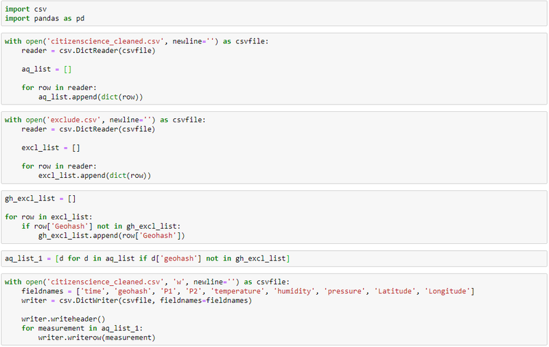
| Solution | Remove all measurements outside of Sofia City by selecting points outside of Sofia City in Tableau and extracting them by running a python script in Jupyter notebook.
The remaining data points are of citizen science measurement devices only in Sofia City. |
Interactive Visualization
The interactive visualisation can be assessed from this link: https://public.tableau.com/profile/yuxi7903#!/vizhome/VA_Assignment_Chew_Yuxi/Home
Home
The homepage describes the purpose of the visualisation, and the various components. The navigation buttons split the dashboard into 3 components - official air quality, citizen science and meteorological factors. An important portion of the homepage is the inclusion of the air quality index, which shows the boundaries of safe and hazardous levels of air pollutants for PM10 and PM2.5.
Official Air Quality Overview
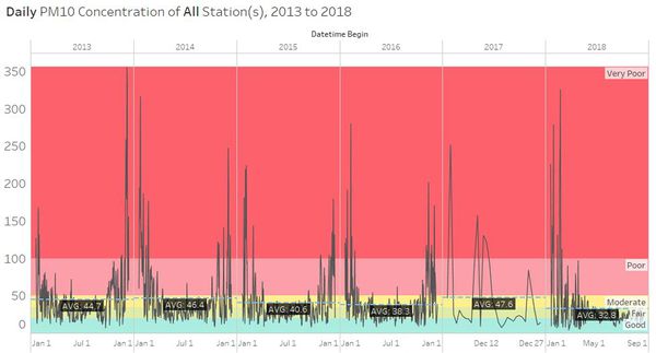
The overview is essentially a time-series that shows the measurements of PM10, allowing the user to effectively see the trends of PM10 levels over the years. Metrics are also displayed for the user to easily grasp the gravity of the situation by seeing how many readings exceed unhealthy levels. A filter is also provided in the form of a geographical map, allowing the user to select the particular station they want to focus on.
Official Air Quality by Station
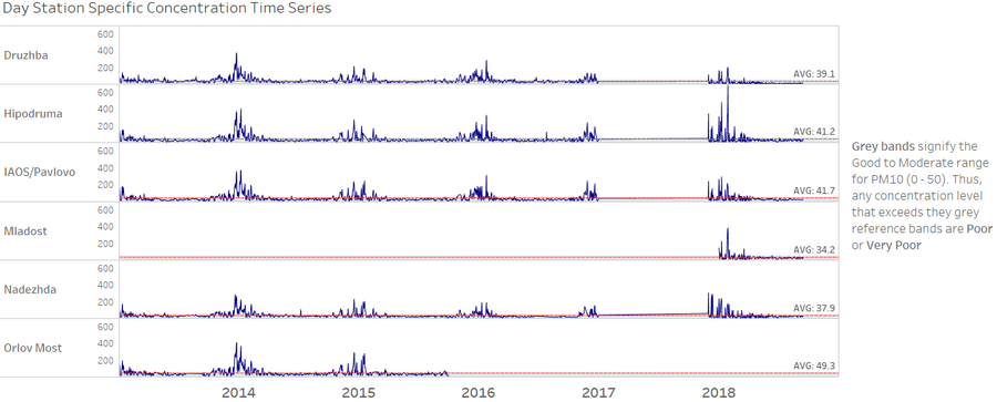
This dashboard allows the user to understand the consistency of operations of each station, and assess whether there are any anomalies when it comes to their performance over time. A reference band is included which displays the Good to Moderate range, allowing the reader to see how often the PM10 concentration exceed the healthy levels.
Official Air Quality Hourly HeatMap
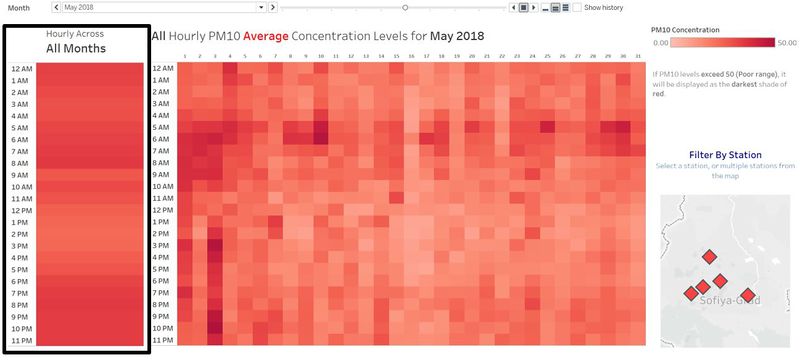
The heatmap shows the hourly concentration levels of Sofia City. The chart on the left shows the average concentration level across all time periods, but the chart on the right allows the user to drill down more into the hourly levels of each day of the month and year.
Official Air Quality Calendar View
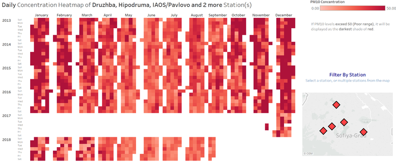
The calendar view effectively shows the daily concentration levels of PM10 across all the years at once. This view shows seasonality more clearly than the time-series due to the large number of readings.
Citizen Science Coverage and Performance
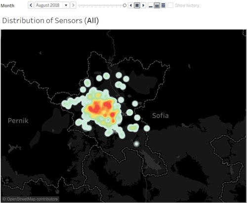
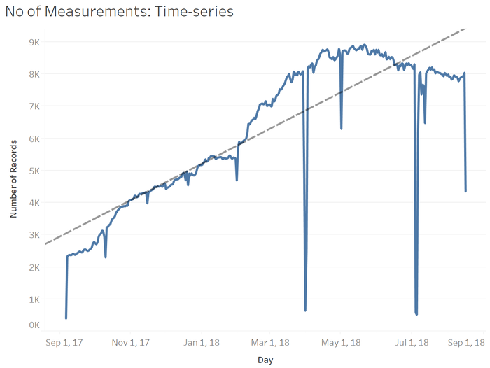
To understand the distribution of the citizen science sensors across Sofia City a density plot is used to visualise the data points. The number of readings is also shown via the time-series on the right to assess the consistency of performance over time.
Citizen Science Individual Measurements and Anomalies
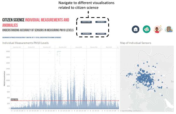
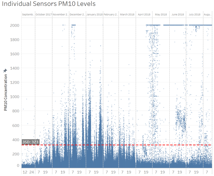
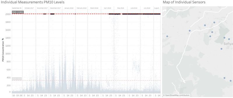
It is common for citizen science instruments to have errors. This dashboard shows every single reading of PM10, allowing the user to analyse whether there are anomalies. The dot plot interacts with the geographical map on the right, to allow the user to review where the stations with anomalies are situated.
Citizen Science PM10 Measurements Analysis
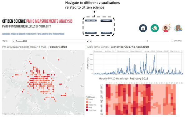
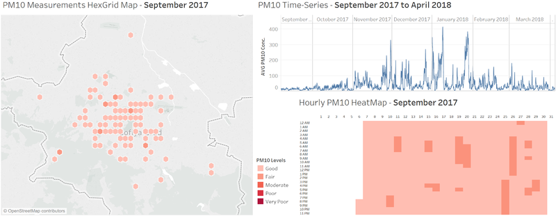
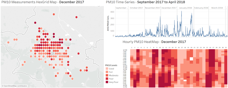
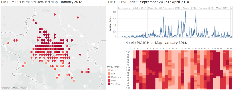
The hexgrid map shows the distribution of PM10 levels across Sofia City by averaging nearby citizen science measurements together. The hourly heatmap allows the reader to immediately drill into how the PM10 levels changed across the month, while the time-series shows the overall trend across the timeframe.
Citizen Science PM2.5 Measurements Analysis
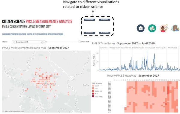
The hexgrid map shows the distribution of PM2.5 levels across Sofia City by averaging nearby citizen science measurements together. The hourly heatmap allows the reader to immediately drill into how the PM2.5 levels changed across the month, while the time-series shows the overall trend across the timeframe.
Citizen Science Meteorological Factors
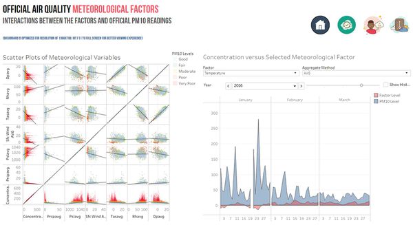
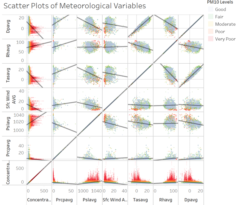
The scatter plots on the left allows the user to investigate correlation between the many meteorological factors with each other, while the area chart on the right allows the user to dynamically compare various factors and aggregations (average, min, max) over various time frames.
Task 1: Spatio-temporal Analysis of Official Air Quality
| Characterize the past and most recent situation with respect to air quality measures in Sofia City. |
|---|
|
As seen in the time-series above, the average PM10 concentration has fallen over the years, ranging around the 40+ range in 2013 to 2015 compared to the 30+ range in 2016 to 2018. (2017 is excluded from consideration due to the lack of data points) It can also be observed that from 2013 to 2014 are more days in the years where the PM10 concentration exceeds the Moderate range than for 2015 to 2016. From the time-series above, it can also be seen that seasonality of concentration levels is relatively constant. PM10 levels tend to rise at the start and end of each year, and this trend can be observed throughout all the years. |
| What does a typical day look like for Sofia city? |
|---|
|
Based on the average hourly heatmap across all months, the typical day of Sofia City can be described as such:
However, it must be noted that these trends are not consistent throughout every month, as some months see massive spikes of PM10 levels while others have consistently low levels. This will be discussed in the next section. |
| Do you see any trends of possible interest in this investigation? |
|---|
|
As seen in the calendar view heatmap above, a “typical day” in Sofia is difficult to characterise due to the vast variations between the months. Seasonality is an obvious factor, as the months November, December and January have particularly high levels of concentration compared to the rest of the months. Thus, it will be useful to investigate whether the wind conditions, or temperatures in Sofia City are different during these months. It can also be observed that spikes in concentration levels often occur for several days or even weeks at a time. This could also be possibly attributed to weather conditions.
|
| What anomalies do you find in the official air quality dataset? |
|---|
|
Hourly data is available only for late 2017 and 2018. Hourly data is more representative of the concentration levels, as the PM10 concentration levels can change drastically throughout the day, as shown in the heatmap above. From 2013 to 2016, only daily concentration levels are available, which is a single data point, and is therefore, highly dependent on the time of day that the measurement is taken. Another issue is the inconsistencies across stations when it comes to operation times. The time-series above shows that 2017 has a massive lack of data across all 6 stations. Whereas the station Mladost has only recently become operational in 2018. The station Orlov Most has stopped data collection since late 2015. |
| How do these affect your analysis of potential problems to the environment? |
|---|
|
Hourly data is only available in 2017 and 2018, which poses an issue because it will be more effective to consider the maximum PM10 concentration levels that have been reached each day, rather than a measurement that has been taken at an arbitrary timing, which is the case for data from 2013 to 2016. The lack of data for 2017 makes it difficult to ascertain whether there has been effective change in PM10 concentration levels over the years. The hypothesis made in the first question in regard to the average levels of PM10 concentration falling over the years could be erroneous due to the missing consideration of 2017. |
Task 2: Spatio-temporal Analysis of Citizen Science Air Quality Measurements
| Characterize the sensors’ coverage, performance and operation. Are they well distributed over the entire city? Are they all working properly at all times? |
|---|
|
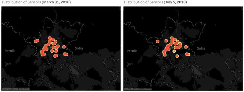
Coverage and Distribution As observed in the density plot above, the coverage of the citizen science sensors as of August 2018 is concentrated in the center of Sofia City, with a small number of sensors spread throughout the outskirts of Sofia city. However, the North-Eastern and extreme South-Eastern parts of Sofia City have no coverage. Incidentally, the six air quality stations explored in the official air quality visualisations are situated in the center of Sofia City as well. Performance and Operation The time series above shows the number of measurements over time and displays an obvious increase in the number of citizen science sensors from September 2017 to August 2018. There are certain days where measurements are missing, as seen by the massive downward spikes. These sudden drop in measurements seem to occur at the end and start of the month (eg. MAR 29, MAY 1, JUL 4). Upon further investigation, it can be seen that the same sensors remain functional on days with extreme falls in coverage and performance (March 31 2018 and July 5 2018). Thus, it can be deduced that these sensors are maintained and operated by a different group of citizens (on perhaps a different platform) than the other sensors. |
| Can you detect any unexpected behaviours of the sensors through analysing the readings they capture? |
|---|
|
The instruments used by citizen scientists are not professional measuring devices. Thus, errors are expected to occur. The captured readings for citizen science range between 0 to 2000, which is much larger than the official air quality measurements of 0 to 690. Therefore, it can be deduced that the citizen science instruments are very inaccurate in comparison to the official air quality stations. Upon filtering PM10 concentration levels of 2000 in the dot plot, it can be seen that a small number of sensors are highlighted in the map on the right. Thus, it can be deduced that these stations are persistently malfunctioning and providing erroneous results. Data collected from these stations should be disregarded or halted from collection until these sensors have been corrected. |
Sensor readings exceeding 1000 are highly unlikely, based on the specifications of the instruments. As such, the remaining analysis is based on data that excludes any readings above the PM10 levels of 1000.
| Which part of the city shows relatively higher readings than others? Are these differences time dependent? |
|---|
|
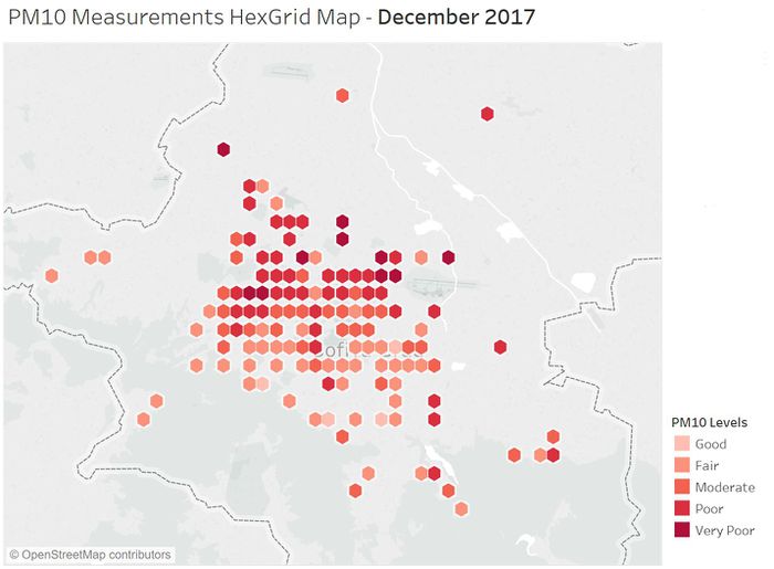
As seen in the hexgrid map, the northern part of the city has relatively higher readings than the southern portion of the city. However, these differences are time dependent. The timeframe shown above covers only that of December 2017. Below, we will discuss how various months, days and hours have vastly differing spreads of PM10 concentration levels. Monthly Effect on Concentration Levels The time series shows an obvious difference in the average levels of PM10 across the months. September 2017 and October 2017 have relatively low concentration levels (fair to good), but PM10 starts to rise in November 2017 and peaks in January 2018. Many readings in November, December and January 2018 hit the poor and very poor levels, with some days hitting outrageous levels. These few months are particularly hazardous to the public of Sofia City. The levels continue to range between moderate and very poor levels for the remaining months. Hourly and Daily Basis We will investigate how hourly and daily timings affect the PM10 readings for 3 months: September 2017, which has a large proportion of Fair to Good PM10 levels; December 2017, which has a good mix of Fair to Very Poor PM10 levels; and January 2018, which has the largest proportion of Very Poor readings. September 2017 As can be observed from the Hexgrid map, there is very little difference in the readings across all the regions of Sofia City. From the time-series, we can see that the PM10 levels were relatively consistent in this month. The hourly heatmap shows that the levels also do not differ much on an hourly basis. December 2017 The dashboard above shows a more comprehensive picture of the spread of PM10 readings in December 2018. As mentioned previously, the northern part of Sofia City has levels of PM10 that are higher than the southern portion. From the time-series, it can also be seen that the measurements have much larger variations then September 2018. As seen in the heatmap, on days where the concentration levels are Very Poor on average, the early part of the day (12am to 10am) and the later part of the day (3pm to 11pm) have Very Poor levels, while mid-day (11am to 2pm) levels tend to decrease to Moderate or Poor levels. January 2018 January 2018 is particularly interesting because it has the heaviest proportion of Very Poor levels. Again, the northern part of Sofia City seems to have more readings with Very Poor levels compared to the southern part of the city, which has lower readings. The time-series shows that the variations for January 2018 are the most volatile, and readings reach the most extreme levels in this month. Thus, the readings in this month have the largest differences. The heatmap also shows that on days with Very Poor levels of PM10, the readings can fall to Fair levels. |
Task 3: Exploring possible factors that could affect Air Quality
| Meteorological Factors in Relation to Official Air Quality PM10 levels |
|---|
|
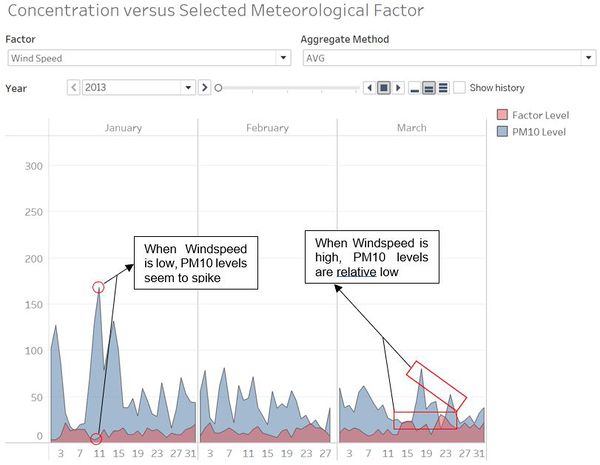
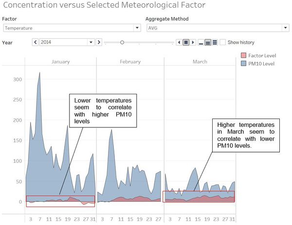
Due to the inherent inaccuracies in citizen science measurements, the focus of this section will be on Official Air Quality, where readings are more reliable. Using the sample time-frame of January to March 2014, which has a good spread of concentration levels, we will investigate the effects of windspeed and temperature. The findings above can be explained as such. When windspeed is high, the winds carry the pollutant particles away from Sofia City. When windspeed is low, pollutant particles remain stagnant in the city. As seen above, when the average temperature is relatively lower in January (ranging from -8 to 11), the PM10 levels are extremely high. In March, when the temperature is relatively higher for the entire month (ranging from 4 to 15), the PM10 levels are generally lower. This general trend can be observed in other months, showing that temperature has a negative correlation with PM10. One possible explanation is that colder air sinks, resulting in a thick layer of PM10 levels. However, more investigation must be conducted to ensure causation. |
| Relationship of Meteorological Factors to Each Other |
|---|
|
From the scatter plot above, it can be seen that certain variables are correlated. In this case, Dew Point Temperature and Temperature are positively correlated, which is unsurprising due to the nature of both measurements revolving around environmental temperature. Another interesting interaction is the significant negative correlation between humidity and both temperature and dew temperature. Lastly, the plot supports the hypothesis the temperature has a negative correlation with PM10 concentration levels for Official Air Quality readings. |

