Difference between revisions of "IS428 AY2018-19T1 Ye Min Oo"
(Created page with "<div style=background:#008080 border:#bfbaa3> <font size = 5; color="#FFFFFF"><center>IS428_2018-19_T1_YeMinOo Assignment Submission Page </center></font> </div> <br/> <font...") |
|||
| (39 intermediate revisions by the same user not shown) | |||
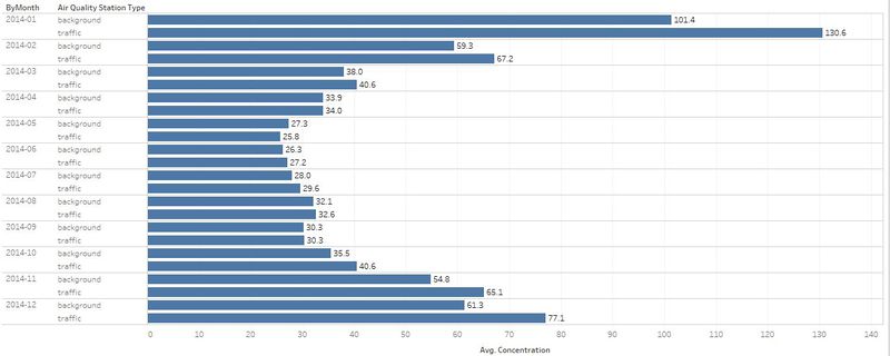
| Line 4: | Line 4: | ||
<br/> | <br/> | ||
| − | |||
<font size="5">'''To be a Visual Detective'''</font> | <font size="5">'''To be a Visual Detective'''</font> | ||
| − | The assignments require you to put the concepts, methods, and techniques you had learned in class to solve real-world problem using visual analytics techniques. Students should also use the assignments to gain hands-on experience in using the data visualization toolkits I had shared with you to complete the assignment. | + | The assignments require you to put the concepts, methods, and techniques you had learned in class to solve a real-world problem using visual analytics techniques. Students should also use the assignments to gain hands-on experience in using the data visualization toolkits I had shared with you to complete the assignment. |
| − | =Overview= | + | ==Overview== |
| − | Air pollution is an important risk factor for health in Europe and worldwide. A recent review of the global burden of disease showed that it is one of the top ten risk factors for health globally. Worldwide an estimated 7 million people died prematurely because of pollution; in the European Union (EU) 400,000 people suffer a premature death. The Organisation for Economic Cooperation and Development (OECD) predicts that in 2050 outdoor air pollution will be the top cause of environmentally related deaths worldwide. In addition, air pollution has also been classified as | + | Air pollution is an important risk factor for health in Europe and worldwide. A recent review of the global burden of disease showed that it is one of the top ten risk factors for health globally. Worldwide an estimated 7 million people died prematurely because of pollution; in the European Union (EU) 400,000 people suffer a premature death. The Organisation for Economic Cooperation and Development (OECD) predicts that in 2050 outdoor air pollution will be the top cause of environmentally related deaths worldwide. In addition, air pollution has also been classified as a leading environmental cause of cancer. |
Air quality in Bulgaria is a big concern: measurements show that citizens all over the country breathe in air that is considered harmful to health. For example, concentrations of PM2.5 and PM10 are much higher than what the EU and the World Health Organization (WHO) have set to protect health. | Air quality in Bulgaria is a big concern: measurements show that citizens all over the country breathe in air that is considered harmful to health. For example, concentrations of PM2.5 and PM10 are much higher than what the EU and the World Health Organization (WHO) have set to protect health. | ||
| Line 17: | Line 16: | ||
Bulgaria had the highest PM2.5 concentrations of all EU-28 member states in urban areas over a three-year average. For PM10, Bulgaria is also leading on the top polluted countries with 77 μg/m3on the daily mean concentration (EU limit value is 50 μg/m3). | Bulgaria had the highest PM2.5 concentrations of all EU-28 member states in urban areas over a three-year average. For PM10, Bulgaria is also leading on the top polluted countries with 77 μg/m3on the daily mean concentration (EU limit value is 50 μg/m3). | ||
| − | According to the WHO, 60 percent of the urban population in Bulgaria is exposed to dangerous (unhealthy) levels of particulate matter (PM10). | + | According to the WHO, 60 percent of the urban population in Bulgaria is exposed to dangerous (unhealthy) levels of particulate matter (PM10). |
| + | |||
| + | ==Data Preparation== | ||
| + | {| class="wikitable" | ||
| + | |- | ||
| + | ! No || Issues || Solution | ||
| + | |- | ||
| + | | #1 || Air Tube data and EEA data show date and time as one data. So, it is hard to visualize the data based on year, month, or date. || Using “LEFT” and “RIGHT” formulas from tableau, separated the date and time data into three different categories (“By Date”, “By Hour”, and “By Year”) for better visualization. | ||
| + | For combined.csv | ||
| − | + | LEFT(RIGHT([Datetime End],15),8) - Hour, | |
| + | LEFT([Datetime End],7) - Month, | ||
| + | LEFT([Datetime End],10) - Date, | ||
| + | LEFT([Datetime End],4) - Year | ||
| − | + | For AirTube.csv | |
| + | LEft(RIGHT([Time],9),8) - Hour, | ||
| + | LEFT([Time],4) - Year | ||
| + | |- | ||
| + | | #2 || EEA data.zip has timeseries data from 2013 to 2018 for 5 stations. However, the files are not consolidated. Each file represents a time series data of a particular year for a station. [[Image:timeseries.PNG|400px|center]]|| Using R Studio, combined all the csv files into “combine.csv” which now contains 5 years of data for 5 stations. Moreover, the 5 stations data for each year is also grouped by year for better understanding of data. (Example: 2013 data will be grouped into “combined2013.csv”). | ||
| + | [[Image:timeseries_combined.PNG|800px|center]] | ||
| + | |- | ||
| + | | #3 || Air Tube data has two files and each of them has a geohash data column. It was difficult to plot the location on Tableau. || Using R Studio, “geohash” data is geocoded and converted to latitude and longitude data. | ||
| + | [[Image:Geohash.PNG|400px|center]] | ||
| + | |- | ||
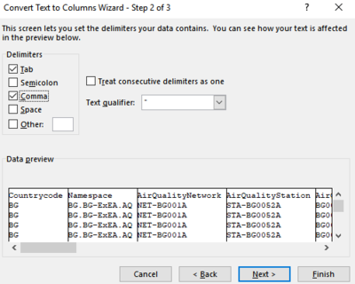
| + | | #4 || All given data files are in csv format and each column value is separated by comma. Although the data are organized and prepared, it will be difficult when plotting certain charts or graphs. [[Image:beforeComma.PNG|400px|center]] || Using Excel, all commas were delimited by comma for better analysis and understanding of data. | ||
| + | [[Image:Comma.PNG|400px|center]] | ||
| + | |- | ||
| + | |} | ||
==Task 1: Spatio-temporal Analysis of Official Air Quality== | ==Task 1: Spatio-temporal Analysis of Official Air Quality== | ||
| + | The following table consists of the findings from dataset. | ||
| + | {| class="wikitable" | ||
| + | |- | ||
| + | ! No || Description || Image | ||
| + | |- | ||
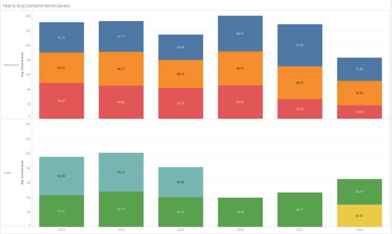
| + | | #1 || Comparison of air concentration levels from 2013 to 2018. || [[Image:yearlyAvgConcentrationLevels.PNG|800px|center]] | ||
| + | |- | ||
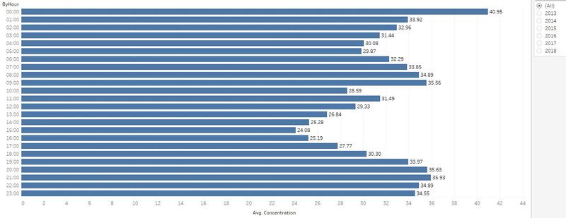
| + | | #2 || Typical Day air concentration level in the city. The concentration levels are withing the healthy range. || [[Image:hourlyAvgConcentration.PNG|800px|center]] | ||
| + | |- | ||
| + | | #3 || The air concentration levels are higher in the mornings and evenings and tends to go lower in the afternoons. || [[Image:anomaly.JPG|800px|center]] | ||
| + | |- | ||
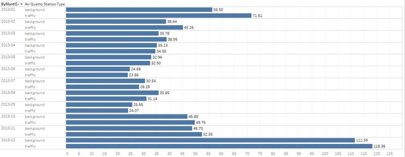
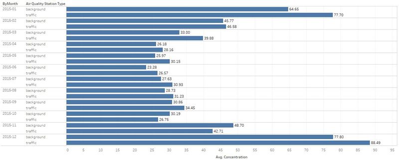
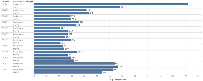
| + | | #4 || The air concentration levels are highest during Janurary, November and December. || [[Image:2013Min1.JPG|800px|center]] [[Image:2014Min1.JPG|800px|center]] [[Image:2015Min1.JPG|800px|center]] [[Image:2016Min1.JPG|800px|center]] [[Image:2017Min1.JPG|800px|center]] [[Image:2018Min1.JPG|800px|center]] | ||
| + | |- | ||
| + | |} | ||
| − | + | ==Task 1: Tableau Public Link== | |
| + | https://public.tableau.com/profile/ye.min.oo#!/vizhome/Task1-AirConcetrationLevelsDashboard/AirConcentrationLevelsfrom20132018?publish=yes | ||
| − | + | ==Task 2: Spatio-temporal Analysis of Citizen Science Air Quality Measurements == | |
| − | = | + | The following table consists of the findings for sensors. |
| + | {| class="wikitable" | ||
| + | |- | ||
| + | ! No || Description || Image | ||
| + | |- | ||
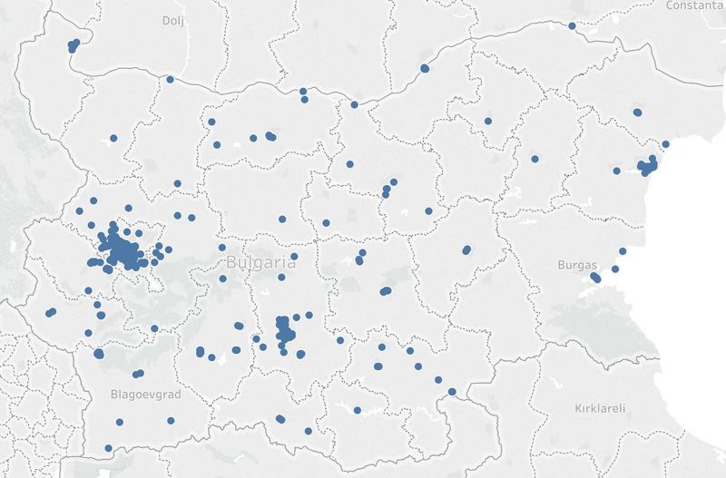
| + | | #1 || The sensors are spreaded out across Bulgaria, but most of the sensors are located in Sofia-Grad. || [[Image:sensorDistribution.JPG|800px|center]] | ||
| + | |- | ||
| + | | #2 || Not all sensors were working properly. BG0079A stopped working on 14/09/2018. BG0054A was either removed or stopped working from 2016 onwards. || BG0079A [[Image:BG0079A.JPG|800px|center]] BG0054A [[Image:stoppedWorking.JPG|800px|center]] | ||
| + | |- | ||
| + | |} | ||
| − | + | The following table consists of the findings for air pollution measurements. | |
| + | {| class="wikitable" | ||
| + | |- | ||
| + | ! No || Description || Image | ||
| + | |- | ||
| + | | #1 || In terms of P1 and P2 measurements, geohash location (sx2wmbyty1u - Blagoevgrad) has the highest measurement. || P1 Measurement [[Image:P1.JPG|800px|center]] P2 Measurement [[Image:P2.JPG|800px|center]] | ||
| + | |- | ||
| + | | #2 || In terms of time difference, the values are relatively higher in the mornings and evenings especially around 6 pm and tends to go lower during the afternoons. || [[Image:timePyramid.JPG|800px|center]] | ||
| + | |- | ||
| + | |} | ||
| − | + | ==Task 2 - Tableau Public Link== | |
| − | + | https://public.tableau.com/profile/ye.min.oo#!/vizhome/Task2-SensorsandP1VsP2Data/SensorsDistributionandP1P2Values?publish=yes | |
==Task 3== | ==Task 3== | ||
| − | + | The following table consists of the findings from dataset. | |
| − | + | {| class="wikitable" | |
| − | + | |- | |
| − | + | ! No || Description || Image | |
| − | + | |- | |
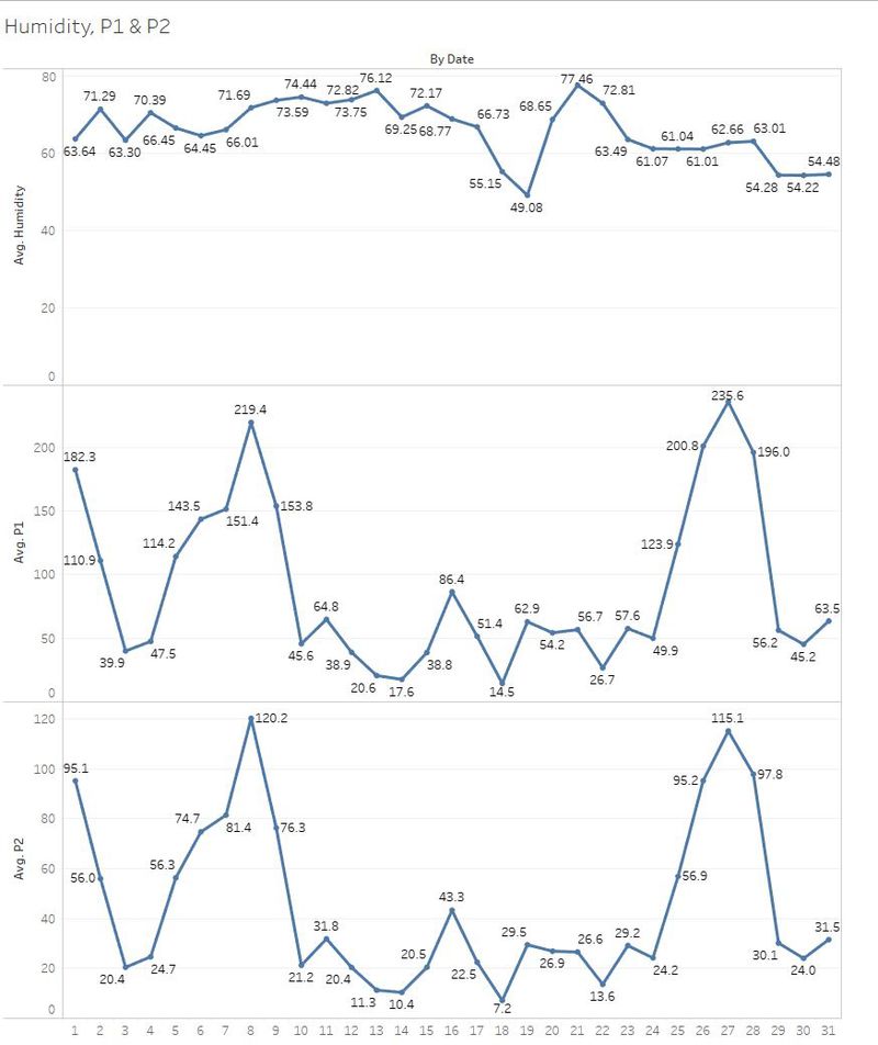
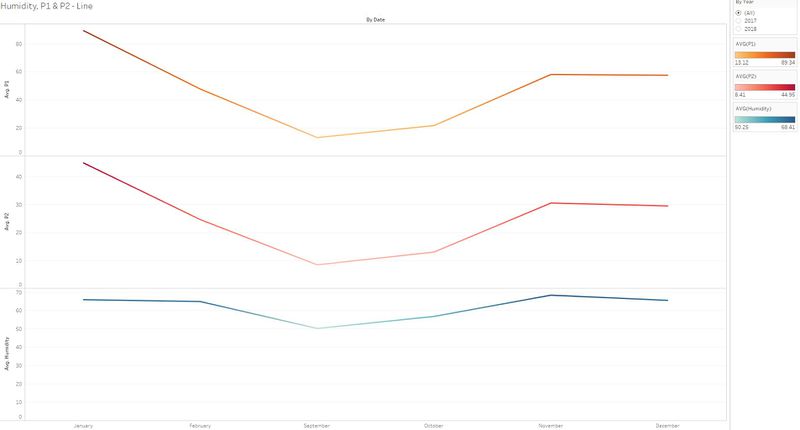
| − | + | | #1 || Based on the finding, although for some of the regions, higher humidity level leads to higher level of measurements for P1 and P2. However, in some of the regions with lesser humidity level, there is also a relatively high level of measurements for P1 and P2. || Based on the Days of the Month [[Image:humidity1.JPG|800px|center]] Based on the Months of the Year[[Image:line.JPG|800px|center]] | |
| + | |- | ||
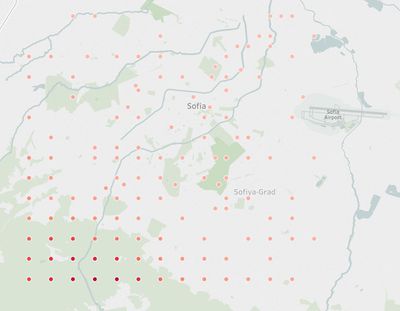
| + | | #2 || Based on Topology Map, Sofia-Grad is located at a middle range of the elevation level and has relatively high air concentration levels. This shows that the higher the elevation level, the lower the air concentration. || Elevation Map [[Image:Topology.JPG|400px|center]] Sofia-Grad Map [[Image:sofia.JPG|1000px|center]] | ||
| + | |- | ||
| + | | #3 || The air concentration levels in Sofia-Grad are high mainly due to the people's daily activities and the traffic which can be seen in the graph. || Sofia-Grad Map [[Image:sofia.JPG|1000px|center]] | ||
| + | |- | ||
| + | |} | ||
| − | + | ==Task3: Tableau Public Link== | |
| + | https://public.tableau.com/profile/ye.min.oo#!/vizhome/Task3-HumidityVsP1P2/Dashboard2?publish=yes | ||
| + | ==Further Improvements== | ||
| + | A more elaborate and insightful analysis could have been done with more timing and better knowledge of the dataset. | ||
| + | Furthermore, a more interactive and insightful dashboards could also be made based on it. | ||
| + | For example, finding out the realtionships between air concentration levels and other external factors could be useful and insightful for Sofia city. | ||
=The Data Sets= | =The Data Sets= | ||
| Line 55: | Line 122: | ||
* Official air quality measurements (5 stations in the city)(EEA Data.zip) – as per EU guidelines on air quality monitoring see the data description [https://drive.google.com/file/d/1v5yCL-LdriDwa65qXPbFL7b0tydylDlb/view HERE…] | * Official air quality measurements (5 stations in the city)(EEA Data.zip) – as per EU guidelines on air quality monitoring see the data description [https://drive.google.com/file/d/1v5yCL-LdriDwa65qXPbFL7b0tydylDlb/view HERE…] | ||
| − | * Citizen science air quality measurements (Air Tube.zip) , incl. temperature, humidity and pressure (many stations) and topography (gridded data). | + | * Citizen science air quality measurements (Air Tube.zip), incl. temperature, humidity, and pressure (many stations) and topography (gridded data). |
* Meteorological measurements (1 station)(METEO-data.zip): Temperature; Humidity; Wind speed; Pressure; Rainfall; Visibility | * Meteorological measurements (1 station)(METEO-data.zip): Temperature; Humidity; Wind speed; Pressure; Rainfall; Visibility | ||
* Topography data (TOPO-DATA) | * Topography data (TOPO-DATA) | ||
| − | They can be | + | They can be downloaded by clicking on this [https://storage.cloud.google.com/global-datathon-2018/sofia-air/air-sofia.zip link]. |
| + | ==Softwares Used== | ||
| − | |||
| − | |||
| − | |||
*Tableau | *Tableau | ||
| − | * | + | *Excel |
| − | * | + | *R Studio |
| − | |||
| − | |||
| − | |||
| − | |||
| − | |||
| − | |||
| − | |||
| − | |||
| − | |||
| − | |||
| − | |||
| − | |||
| − | |||
=Reference= | =Reference= | ||
| + | https://community.tableau.com/thread/129970 </br> | ||
| + | http://www.tomnash.eu/how-to-combine-multiple-csv-files-into-one-using-cmd/ | ||
| − | + | =Suggestions= | |
| − | |||
| − | |||
| − | |||
| − | |||
| − | = | ||
| − | + | Kindly help comment below for further improvements. | |
Latest revision as of 23:37, 11 November 2018
To be a Visual Detective
The assignments require you to put the concepts, methods, and techniques you had learned in class to solve a real-world problem using visual analytics techniques. Students should also use the assignments to gain hands-on experience in using the data visualization toolkits I had shared with you to complete the assignment.
Contents
- 1 Overview
- 2 Data Preparation
- 3 Task 1: Spatio-temporal Analysis of Official Air Quality
- 4 Task 1: Tableau Public Link
- 5 Task 2: Spatio-temporal Analysis of Citizen Science Air Quality Measurements
- 6 Task 2 - Tableau Public Link
- 7 Task 3
- 8 Task3: Tableau Public Link
- 9 Further Improvements
- 10 The Data Sets
- 11 Reference
- 12 Suggestions
Overview
Air pollution is an important risk factor for health in Europe and worldwide. A recent review of the global burden of disease showed that it is one of the top ten risk factors for health globally. Worldwide an estimated 7 million people died prematurely because of pollution; in the European Union (EU) 400,000 people suffer a premature death. The Organisation for Economic Cooperation and Development (OECD) predicts that in 2050 outdoor air pollution will be the top cause of environmentally related deaths worldwide. In addition, air pollution has also been classified as a leading environmental cause of cancer.
Air quality in Bulgaria is a big concern: measurements show that citizens all over the country breathe in air that is considered harmful to health. For example, concentrations of PM2.5 and PM10 are much higher than what the EU and the World Health Organization (WHO) have set to protect health.
Bulgaria had the highest PM2.5 concentrations of all EU-28 member states in urban areas over a three-year average. For PM10, Bulgaria is also leading on the top polluted countries with 77 μg/m3on the daily mean concentration (EU limit value is 50 μg/m3).
According to the WHO, 60 percent of the urban population in Bulgaria is exposed to dangerous (unhealthy) levels of particulate matter (PM10).
Data Preparation
| No | Issues | Solution |
|---|---|---|
| #1 | Air Tube data and EEA data show date and time as one data. So, it is hard to visualize the data based on year, month, or date. | Using “LEFT” and “RIGHT” formulas from tableau, separated the date and time data into three different categories (“By Date”, “By Hour”, and “By Year”) for better visualization.
For combined.csv LEFT(RIGHT([Datetime End],15),8) - Hour, LEFT([Datetime End],7) - Month, LEFT([Datetime End],10) - Date, LEFT([Datetime End],4) - Year For AirTube.csv LEft(RIGHT([Time],9),8) - Hour, LEFT([Time],4) - Year |
| #2 | EEA data.zip has timeseries data from 2013 to 2018 for 5 stations. However, the files are not consolidated. Each file represents a time series data of a particular year for a station. | Using R Studio, combined all the csv files into “combine.csv” which now contains 5 years of data for 5 stations. Moreover, the 5 stations data for each year is also grouped by year for better understanding of data. (Example: 2013 data will be grouped into “combined2013.csv”). |
| #3 | Air Tube data has two files and each of them has a geohash data column. It was difficult to plot the location on Tableau. | Using R Studio, “geohash” data is geocoded and converted to latitude and longitude data. |
| #4 | All given data files are in csv format and each column value is separated by comma. Although the data are organized and prepared, it will be difficult when plotting certain charts or graphs. | Using Excel, all commas were delimited by comma for better analysis and understanding of data. |
Task 1: Spatio-temporal Analysis of Official Air Quality
The following table consists of the findings from dataset.
| No | Description | Image |
|---|---|---|
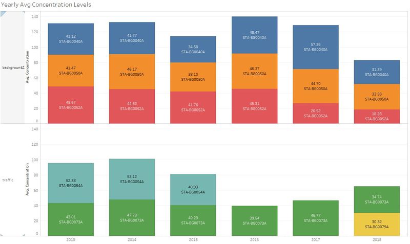
| #1 | Comparison of air concentration levels from 2013 to 2018. | |
| #2 | Typical Day air concentration level in the city. The concentration levels are withing the healthy range. | |
| #3 | The air concentration levels are higher in the mornings and evenings and tends to go lower in the afternoons. | |
| #4 | The air concentration levels are highest during Janurary, November and December. |
Task 1: Tableau Public Link
Task 2: Spatio-temporal Analysis of Citizen Science Air Quality Measurements
The following table consists of the findings for sensors.
| No | Description | Image |
|---|---|---|
| #1 | The sensors are spreaded out across Bulgaria, but most of the sensors are located in Sofia-Grad. | |
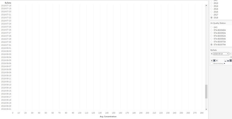
| #2 | Not all sensors were working properly. BG0079A stopped working on 14/09/2018. BG0054A was either removed or stopped working from 2016 onwards. | BG0079A BG0054A |
The following table consists of the findings for air pollution measurements.
| No | Description | Image |
|---|---|---|
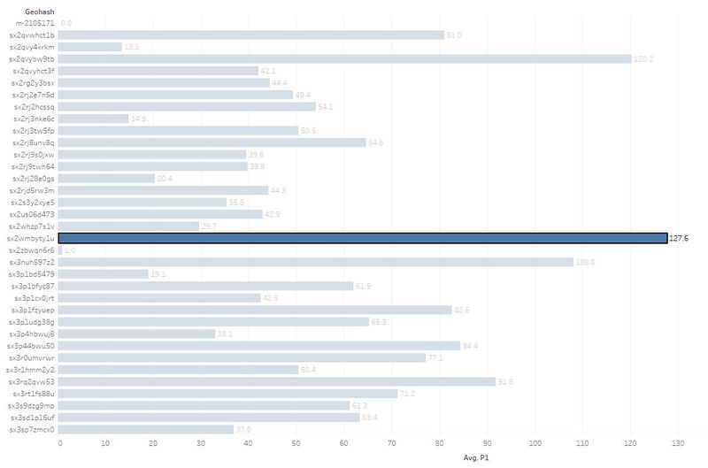
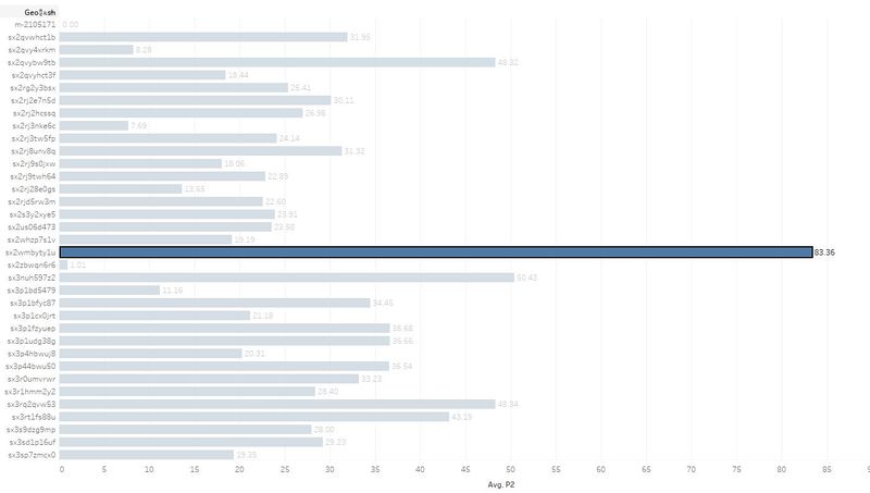
| #1 | In terms of P1 and P2 measurements, geohash location (sx2wmbyty1u - Blagoevgrad) has the highest measurement. | P1 Measurement P2 Measurement |
| #2 | In terms of time difference, the values are relatively higher in the mornings and evenings especially around 6 pm and tends to go lower during the afternoons. |
Task 2 - Tableau Public Link
Task 3
The following table consists of the findings from dataset.
| No | Description | Image |
|---|---|---|
| #1 | Based on the finding, although for some of the regions, higher humidity level leads to higher level of measurements for P1 and P2. However, in some of the regions with lesser humidity level, there is also a relatively high level of measurements for P1 and P2. | Based on the Days of the Month Based on the Months of the Year |
| #2 | Based on Topology Map, Sofia-Grad is located at a middle range of the elevation level and has relatively high air concentration levels. This shows that the higher the elevation level, the lower the air concentration. | Elevation Map Sofia-Grad Map |
| #3 | The air concentration levels in Sofia-Grad are high mainly due to the people's daily activities and the traffic which can be seen in the graph. | Sofia-Grad Map |
Task3: Tableau Public Link
https://public.tableau.com/profile/ye.min.oo#!/vizhome/Task3-HumidityVsP1P2/Dashboard2?publish=yes
Further Improvements
A more elaborate and insightful analysis could have been done with more timing and better knowledge of the dataset. Furthermore, a more interactive and insightful dashboards could also be made based on it. For example, finding out the realtionships between air concentration levels and other external factors could be useful and insightful for Sofia city.
The Data Sets
Four major data sets in zipped file format are provided for this assignment, they are:
- Official air quality measurements (5 stations in the city)(EEA Data.zip) – as per EU guidelines on air quality monitoring see the data description HERE…
- Citizen science air quality measurements (Air Tube.zip), incl. temperature, humidity, and pressure (many stations) and topography (gridded data).
- Meteorological measurements (1 station)(METEO-data.zip): Temperature; Humidity; Wind speed; Pressure; Rainfall; Visibility
- Topography data (TOPO-DATA)
They can be downloaded by clicking on this link.
Softwares Used
- Tableau
- Excel
- R Studio
Reference
https://community.tableau.com/thread/129970
http://www.tomnash.eu/how-to-combine-multiple-csv-files-into-one-using-cmd/
Suggestions
Kindly help comment below for further improvements.
