Difference between revisions of "IS428 AY2018-19T1 Chen Yuge"
Yg.chen.2015 (talk | contribs) |
Yg.chen.2015 (talk | contribs) |
||
| (3 intermediate revisions by the same user not shown) | |||
| Line 5: | Line 5: | ||
In this report, I will use 3 Air Quality indicators—Official Air Quality Concentration, PM2.5 and PM10 to analyze the air quality in Sofia city. PM2.5 is a pollutant stemming from fuel combustion, heating, transportation, waste incineration, agriculture and other anthropogenic sources. According to studies, it is highly correlated with cancer rate, with a 36% increase in lung cancer per 10 μg/m3 as it can penetrate deeper into the lungs[2]. Worldwide exposure to PM2.5 contributed to 4.1 million deaths from heart disease and stroke, lung cancer, chronic lung disease, and respiratory infections. PM10 is particulate matter 10 micrometers or less in diameter, which has slight larger dimension than PM2.5 but same level of danger. | In this report, I will use 3 Air Quality indicators—Official Air Quality Concentration, PM2.5 and PM10 to analyze the air quality in Sofia city. PM2.5 is a pollutant stemming from fuel combustion, heating, transportation, waste incineration, agriculture and other anthropogenic sources. According to studies, it is highly correlated with cancer rate, with a 36% increase in lung cancer per 10 μg/m3 as it can penetrate deeper into the lungs[2]. Worldwide exposure to PM2.5 contributed to 4.1 million deaths from heart disease and stroke, lung cancer, chronic lung disease, and respiratory infections. PM10 is particulate matter 10 micrometers or less in diameter, which has slight larger dimension than PM2.5 but same level of danger. | ||
<br><br> | <br><br> | ||
| − | By using the above-mentioned indicators, the goal is to visualize the air quality situation as well as the factors affecting the air quality. The factors | + | By using the above-mentioned indicators, the goal is to visualize the air quality situation as well as the factors affecting the air quality. The factors such as meteorology, topography and human behavior will be analyzed in this report. |
| − | |||
| − | |||
| − | |||
| − | |||
| − | |||
<br> | <br> | ||
<br> | <br> | ||
| Line 24: | Line 19: | ||
! style="font-weight: bold;background: #84def4;color:#fbfcfd;width: 40%" | Action | ! style="font-weight: bold;background: #84def4;color:#fbfcfd;width: 40%" | Action | ||
! style="font-weight: bold;background: #84def4;color:#fbfcfd;" | Screenshot | ! style="font-weight: bold;background: #84def4;color:#fbfcfd;" | Screenshot | ||
| + | |- | ||
| + | | <center>'''Geocoding''' <br/> | ||
| + | || Transform geohash to latitude and longtitude | ||
| + | || | ||
| + | [[File:Capture22.png|800px|thumb|center]] | ||
|- | |- | ||
| <center>'''Temperature''' <br/> | | <center>'''Temperature''' <br/> | ||
| Line 63: | Line 63: | ||
# Aggregate 5 sheets | # Aggregate 5 sheets | ||
| − | == Visualization == | + | == Visualization == |
| − | Tableau Link: | + | Tableau Link: unable to upload to tableau online because the data amount exceeds the limit. |
=== Home Page === | === Home Page === | ||
[[File:Capture10.png|800px|center]] | [[File:Capture10.png|800px|center]] | ||
| Line 108: | Line 108: | ||
|} | |} | ||
| − | === Official Air Quality === | + | === Official Air Quality === |
<br> | <br> | ||
| − | ====2013-2018 ==== | + | ==== Official Air Quality Timeseries 2013-2018 ==== |
[[File:Cap15.png|800px|center]]<br> | [[File:Cap15.png|800px|center]]<br> | ||
[[File:Cap16.png|500px|center]] | [[File:Cap16.png|500px|center]] | ||
| Line 134: | Line 134: | ||
<br> | <br> | ||
| − | ====2018 ==== | + | ==== Official Air Quality heatmap 2013-2018 ==== |
[[File:Cap17.png|800px|center]] | [[File:Cap17.png|800px|center]] | ||
{| class="wikitable" | {| class="wikitable" | ||
| Line 163: | Line 163: | ||
* The concentration in January and February is significantly higher than other months in each year. | * The concentration in January and February is significantly higher than other months in each year. | ||
| − | ===Citizen Science Air Quality=== | + | ===Citizen Science Air Quality=== |
====Sensor geographical Distribution==== | ====Sensor geographical Distribution==== | ||
Latest revision as of 22:58, 11 November 2018
Contents
Problem & Motivation
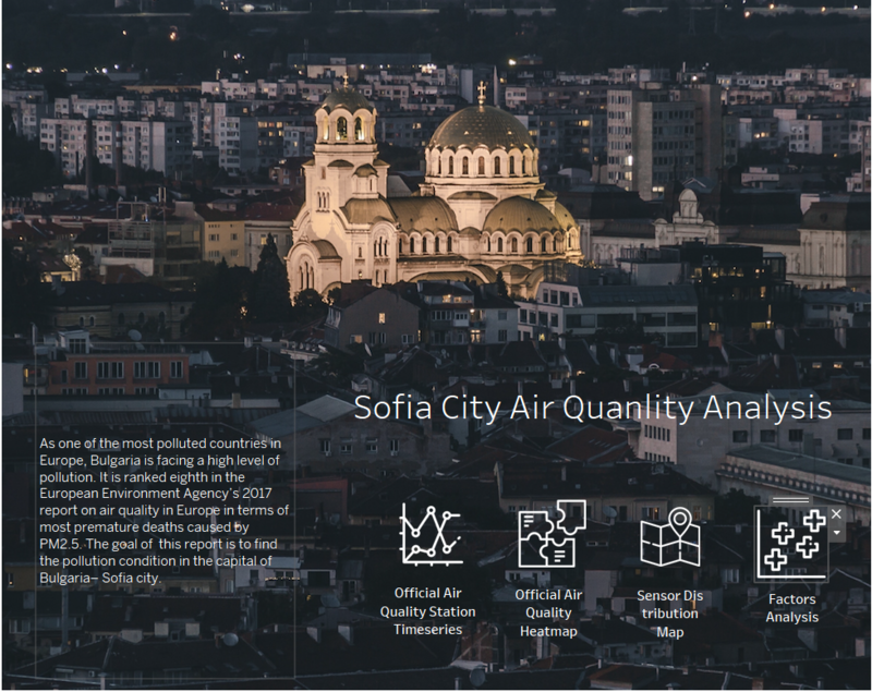
As one of the most polluted countries in Europe, Bulgaria is facing a high level of pollution. It is ranked eighth in the European Environment Agency’s 2017 report on air quality in Europe in terms of most premature deaths caused by PM2.5[1]. Our goal in this report is to find the pollution condition in the capital of Bulgaria– Sofia city.
In this report, I will use 3 Air Quality indicators—Official Air Quality Concentration, PM2.5 and PM10 to analyze the air quality in Sofia city. PM2.5 is a pollutant stemming from fuel combustion, heating, transportation, waste incineration, agriculture and other anthropogenic sources. According to studies, it is highly correlated with cancer rate, with a 36% increase in lung cancer per 10 μg/m3 as it can penetrate deeper into the lungs[2]. Worldwide exposure to PM2.5 contributed to 4.1 million deaths from heart disease and stroke, lung cancer, chronic lung disease, and respiratory infections. PM10 is particulate matter 10 micrometers or less in diameter, which has slight larger dimension than PM2.5 but same level of danger.
By using the above-mentioned indicators, the goal is to visualize the air quality situation as well as the factors affecting the air quality. The factors such as meteorology, topography and human behavior will be analyzed in this report.
Data Analysis & Transformation
Data Analysis and Cleaning
Air Tube data
After doing a quick plotting of the raw data, I found that there are outliers (or misreading) in the Air Tube Dataset:
Temperature: remove temperature less than -20 and larger than 50
| Column Name | Action | Screenshot |
|---|---|---|
| Transform geohash to latitude and longtitude | ||
| remove temperature less than -20 and larger than 50 | ||
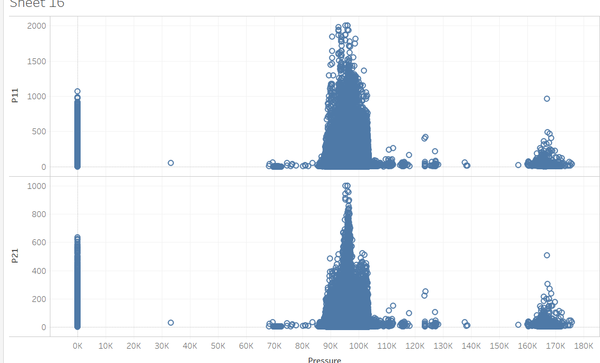
| remove pressures valued 0 |
Aggregation
EEA data
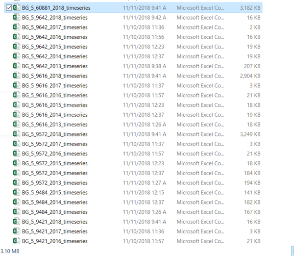
- Aggregate data from different years (2013-2018) into one sheet with “day” details:
Steps
- Aggregate average concentration by day in each data sheets from 2013-2018
- Combine sheets of different stations and years into 1 (2013-2018)
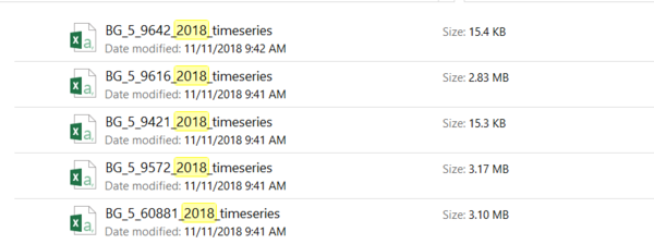
- Aggregate 2018 dataset into one sheet with “hour” details:
Steps
- Transform 2018 data time to local time & take average time
   * As I explored the dataset, I found the datetime format is UCT. I changed it to local time.
   * The time interval between "DatetimeBegin" column and "Datetime End" is always 1 hour, therefore I decided to take the middle time--0.5 hour late than "DatetimeBegin" as the time of the record.
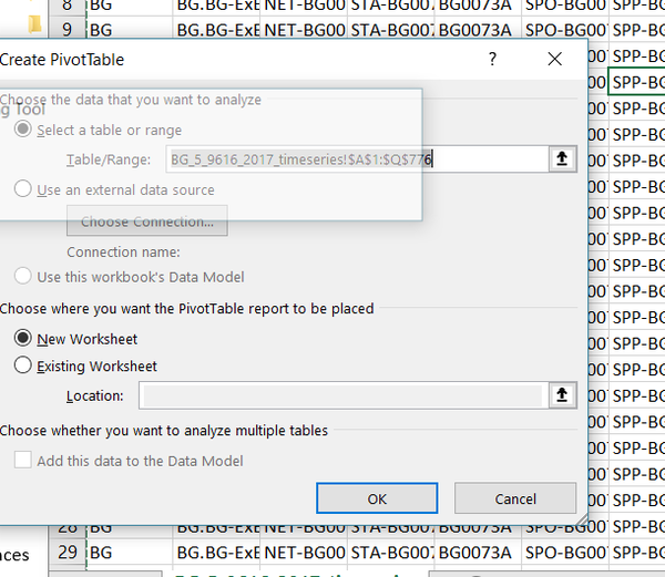
- Aggregate 5 sheets
Visualization
Tableau Link: unable to upload to tableau online because the data amount exceeds the limit.
Home Page
| Button | Description | icon |
|---|---|---|
|
||
|
||
|
||
|
Official Air Quality
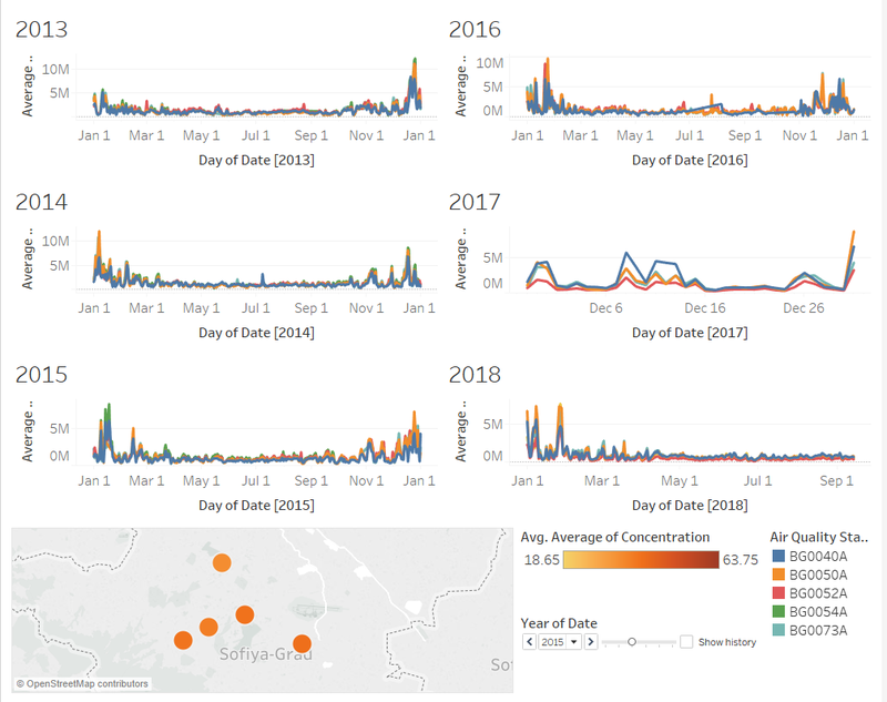
Official Air Quality Timeseries 2013-2018
| Feature | Description |
|---|---|
|
The 6 line charts put in parallel allows user to compare the data between years more easily. | |
|
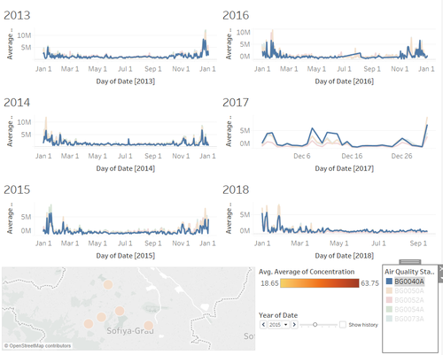
All lines of same station will be highlighted when click on one line. This provide user with more intuitive visualization of change across years within same location. | |
|
The orange color dots represents the location of stations, and the darker the color is, the higher concentration the location is. |
Official Air Quality heatmap 2013-2018
| Feature | Description |
|---|---|
|
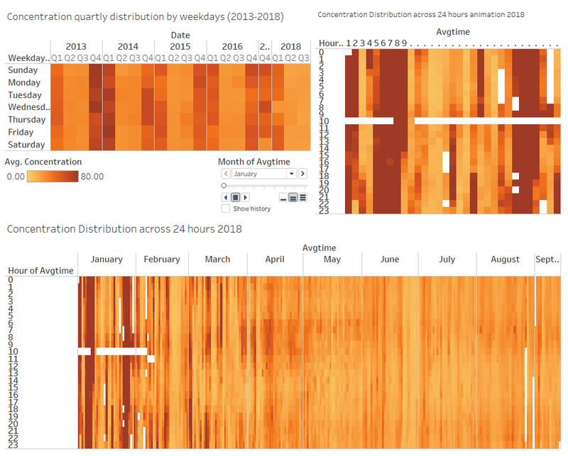
Considering weekdays as one of the potential influencing factors on air pollution, I drawed a headmap of concentration distribution by weekdays across years (2013-2017) to find our the partterns. | |
|
As part of incluencing factors, I drew the concentration timeseries breakdown by 24 hours. | |
|
Heatmap animaiton show the data transition between months more clearly |
Trends:
- Concentration is higher during night and morning time, lower at noon. This may be due to the traffic pollution during peak hours.
- The concentration is almost identical across different weekdays. This means weekdays is not a huge influencing factor on air quality.
- Generally speaking, Concentration is becoming lower from year of 2013 to today. This means the air pollution problem is being solved.
Anomalies
- Some of the data missing such as 2017 Jan to Oct. Might because of breakdown of devices
- The concentration in January and February is significantly higher than other months in each year.
Citizen Science Air Quality
Sensor geographical Distribution
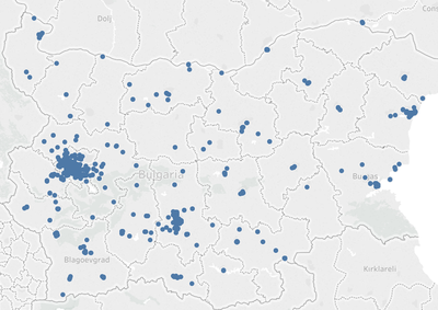
- Across Cities: Sensors are evenly spread out across cities except Sofia city and Polvdiv, which has more condensed sensor distribution.
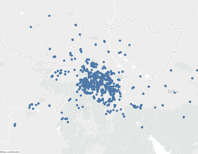
- Inside Sofia City: The sensors are more condensed in the middle of city. It is not evenly distributed in the entire city.
Sensing data statistics
| Feature | Description |
|---|---|
|
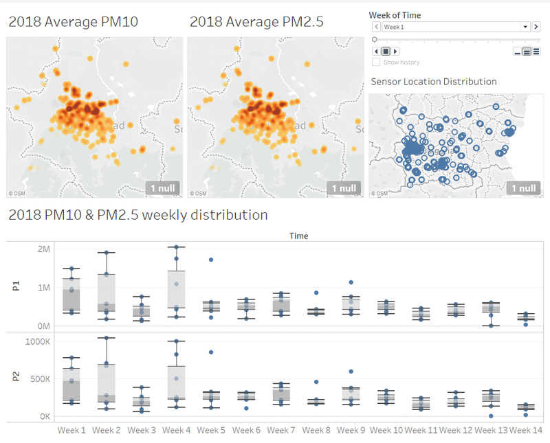
The animations shows intuitively the data distribution across years | |
|
Box plot shows not only the average, but also the spread of value, which helps user to identify the outliers and understand data distribution better. |
Observation:
- Week 1, 2 and 4 (1st, 2nd and 4th week of January 2018) has very high concentration, whereas the concentration in week 2 and the rest weeks are low.
- The high concentration points are located at the north part of Sofia city
- In boxplot week5, there is a high outlier of concentration. This means something abnormal happened in that week.
Factors influencing air quality
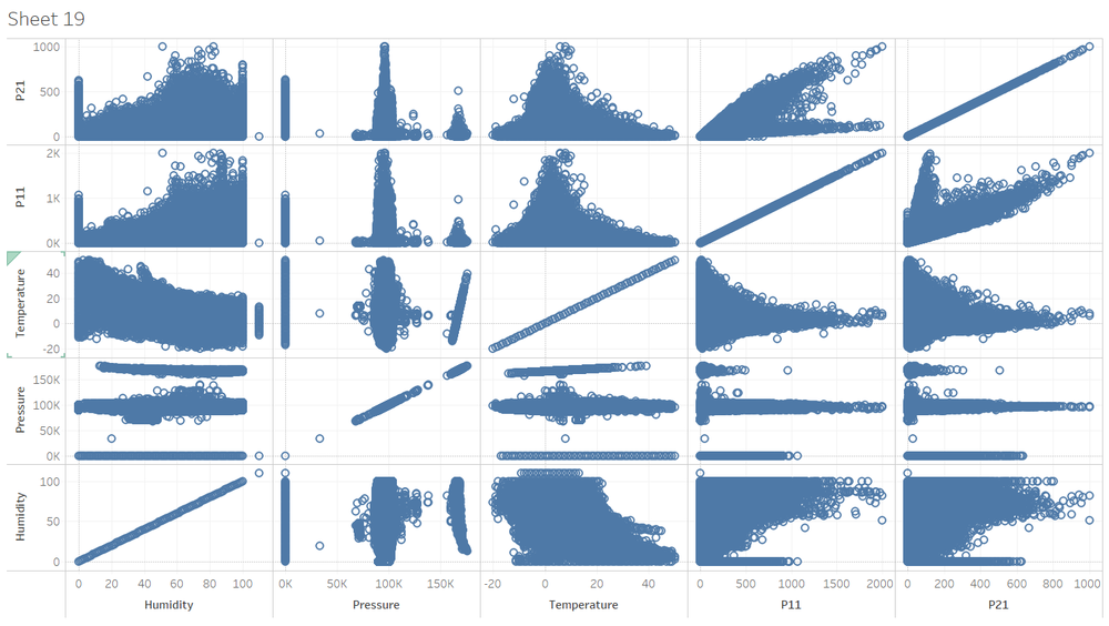
- Scatter plot
We can deduce the following information from the scatter plot:
- PM2.5 and PM10 are higher when pressure is around 1000k and 170k
- PM2.5 and PM10 are positive correlated. it’s possible to have high PM10 and low PM2.5, but when PM10 is low, PM2.5 must below
- PM2.5 and PM10 are higher when temperature is around 0 slowly reduce as temperature increase. It reaches near to 0 when temperature is close to 40
- The upper bond of PM2.5 & PM10 increases as humidity increase. But there is no linear relationship between humidity and PM2.5&10.
Reference
[1] https://zerowasteeurope.eu/2018/01/bulgaria-air-pollution/
[2] https://en.wikipedia.org/wiki/Particulates
Comments
Feel free to leave your comments here


