Difference between revisions of "IS428 AY2018-19T1 Siow Chun Yen Jodie"
Cysiow.2015 (talk | contribs) |
Cysiow.2015 (talk | contribs) |
||
| Line 94: | Line 94: | ||
==Interactive Visualisation== | ==Interactive Visualisation== | ||
| − | + | {| class="wikitable" | |
| + | |- | ||
| + | ! Interactive Technique || Rationale || Brief Implementation Steps | ||
| + | |- | ||
| + | | Highlighting Tool | ||
| + | || Allows for data to be interactive, where points when hovered over or selected will result in the highlighting and selection of other points. This allows users to focus on the few data points without having to filter. || 1. Navigate to Dashboard > Actions > select “highlight”. <br> 2. Configure the source and target sheets for the highlighting of charts in the dashboard. | ||
| + | |} | ||
=== EEA Data === | === EEA Data === | ||
| Line 144: | Line 150: | ||
== Task 1: Spatio-temporal Analysis of Official Air Quality == | == Task 1: Spatio-temporal Analysis of Official Air Quality == | ||
| + | |||
| + | |||
== Task 2: Spatio-temporal Analysis of Citizen Science Air Quality Measurements == | == Task 2: Spatio-temporal Analysis of Citizen Science Air Quality Measurements == | ||
Revision as of 13:03, 11 November 2018
Contents
Problem & Motivation
Air pollution is an important risk factor for health in Europe and worldwide. A recent review of the global burden of disease showed that it is one of the top ten risk factors for health globally. Worldwide an estimated 7 million people died prematurely because of pollution; in the European Union (EU) 400,000 people suffer a premature death. The Organisation for Economic Cooperation and Development (OECD) predicts that in 2050 outdoor air pollution will be the top cause of environmentally related deaths worldwide. In addition, air pollution has also been classified as the leading environmental cause of cancer.
Air quality in Bulgaria is a big concern: measurements show that citizens all over the country breathe in air that is considered harmful to health. For example, concentrations of PM2.5 and PM10 are much higher than what the EU and the World Health Organization (WHO) have set to protect health.
Bulgaria had the highest PM2.5 concentrations of all EU-28 member states in urban areas over a three-year average. For PM10, Bulgaria is also leading on the top polluted countries with 77 μg/m3on the daily mean concentration (EU limit value is 50 μg/m3).
According to the WHO, 60 percent of the urban population in Bulgaria is exposed to dangerous (unhealthy) levels of particulate matter (PM10).
Objectives
Vast amounts of data have been collected about Sofia City over the past 6 years from 2013 to 2018. However, this usability of this data will only be limited unless the data is effectively visualised, allowing users to glean insights from visuals. A clearer visualisation of the data will allow authorities to better understand the air conditions in Sofia City. The interactive visualisation will aim to help one have an overview of the spatio-temporal analysis of official air quality, spatio-temporal analysis of citizen science air quality measurements as well as main reasons behind the high concentrations of PM2.5 and PM10 in Sofia City.
Dataset Analysis & Transformation Process
4 main data sets were provided for this visualisation, namely EEA Data, Air Tube, METEO-data and TOPO-data which will be further discussed.
Official air quality measurements in 5 stations in the city (EEA Data)
| Problem #1 | Number of CSV Files |
|---|---|
| Issue | Air quality measurements taken over 5 years from 2013 to 2018 were provided in the EEA data set. The air quality data for 2013 to 2016 were recorded daily while the data for 2017 to 2018 were hourly data. However, the data for each year were stored in individual csv files, making it challenging for the data over time to be analysed together using one file. |
| Solution | We will merge the relevant csv files into one csv file for convenience and simplicity. In this case, the air quality from 2013 to 2016 will be merged into a csv file to examine daily data while the air quality data from 2017 to 2018 will be merged together to examine data over the different hours of a day in Sofia City. |
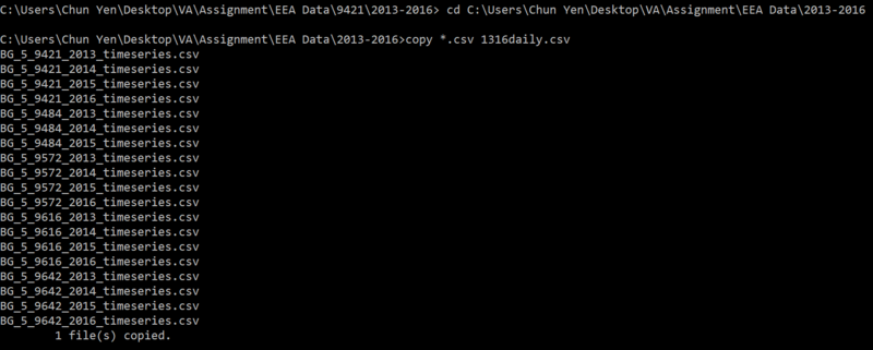
1. Firstly, all csv files to be merged must be stored in one folder first. In this case, we create a folder to store 2013-2016 daily data.
2. Using Command Prompt on your computer, we will locate the desired folder location before typing in the command of “copy *.csv 1316daily.csv” to merge all the csv files into one.
3. Returning to the folder location, we will then see a new csv file that is created and ready to be used.
4. Repeat this for the hourly data for 2017-2018.
| Problem #2 | Station Names |
|---|---|
| Issue | The station names were all in strings such as BG0052A as seen in the Air Quality Station EoI Code, making it difficult for users to easily differentiate the stations at a glance. |
| Solution | By tracing the Air Quality Station EoI Code from Tableau to the csv file titles, the individual stations can be easily renamed to the station numbers indicated on the csv file titles to facilitate readability of data. |
| Problem #3 | Incomplete Data for 5 Stations |
|---|---|
| Issue | The data provided the various stations covered a period from 2013 - 2016 with the exception of station 9484. This station's data ended abruptly in the middle of 2016, causing there to be a data break. |
| Solution | Since the task requires for us to comment on the general trend of air quality in Sofia City, the addition of station 9484 is not imperative. As such, this station's data will be filtered out after it is imported into Tableau. |
Citizen science air quality measurements (Air Tube Data)
| Problem #2 | Geohash in AirTube Data |
|---|---|
| Issue | The geographical location provided by the 2017 and 2018 Air Tube Data were in a geohash format. In order to analyse the geographical data on Tableau, it must be in a format that Tableau is able to analyse, such as using latitude and longitude of a location. |
| Solution | In order to decode the geohash, geohash and tidyverse packages in R Studio were employed to retrieve the latitude and longitude of a location in the data files. |
1. First, the required packages will need to be downloaded and installed first.
2. Next, the csv file will have to be imported into R Studio before it can be read and decoded.
3. Then, using the code in R Studio, the geohash tags will be decoded into latitude and longitude coordinates.
4. Following which, we will need to join the latitude and longitude data back into the original csv file before it can then be written back into the working directory.
5. This is to be done for both Air Tube Data in 2017 and 2018 before it can be used to analysis by Tableau.
6. Similarly, the csv files for 2017 Air Tube Data and 2018 Air Tube Data were combined for simplicity before being analysed in Tableau.
| Problem #2 | Geographical Data Points on Tableau |
|---|---|
| Issue | After decoding and importing the data into Tableau, I realised that the data points in the csv file covered geographical areas beyond Sofia City itself. |
| Solution | Since we are only focusing on Sofia City's air quality data, only the relevant data points belonging to Sofia City are kept. This is done by selecting data points in Sofia City region and choosing to keep only those points, successfully excluding other data points that are not necessary for this visualisation. |
Interactive Visualisation
| Interactive Technique | Rationale | Brief Implementation Steps |
|---|---|---|
| Highlighting Tool | Allows for data to be interactive, where points when hovered over or selected will result in the highlighting and selection of other points. This allows users to focus on the few data points without having to filter. | 1. Navigate to Dashboard > Actions > select “highlight”. 2. Configure the source and target sheets for the highlighting of charts in the dashboard. |
EEA Data
| Interactive Technique | Rationale | Brief Implementation Steps |
|---|---|---|
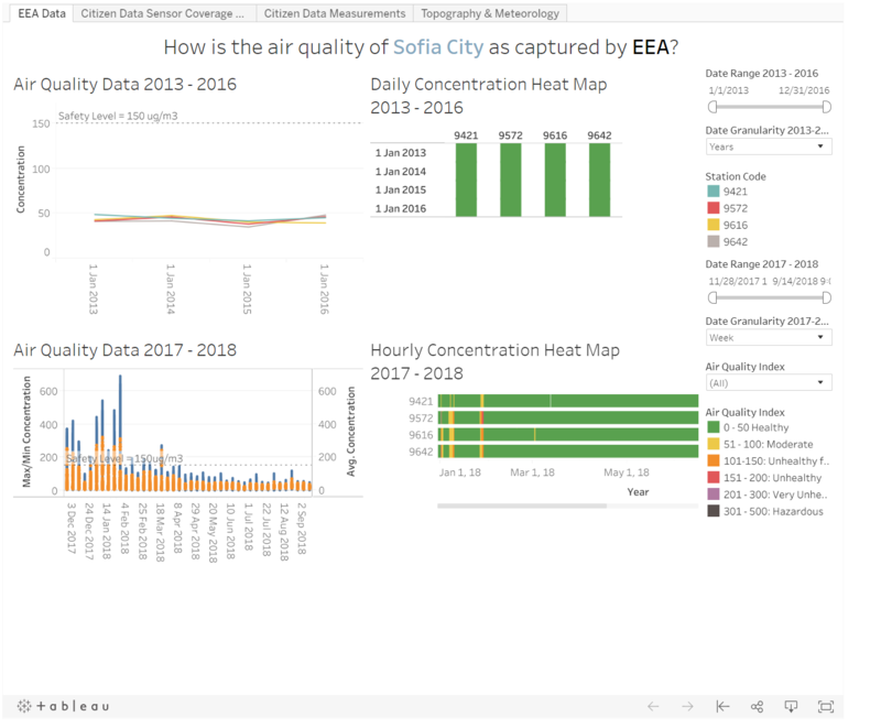
| Date Range Filter | The date range can be changed according to user's needs. This allows users to view the data from any time period that he or she desires between 2013-2016 for a more relevant view. | 1. Adding "Datetime begin" to filters. |
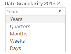
| Date Granularity | To increase the interactivity and dynamics of the visualisation, date granularity option was implemented for users to choose between the data granularity visualised. For the 2013-2016 data, data can be viewed by Years, Quarters, Months, Weeks and Days. For the 2017-2018 data, data can be viewed by Weeks, Days and Hours. | 1. Creating custom data fields for the various date granularity 2. Using parameter control as well as calculated fields to toggle between the available date granularity. |
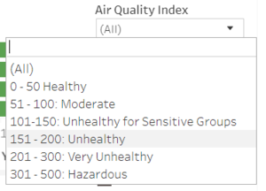
| Air Quality Index Filter | To increase the interactivity and dynamics of the visualisation, air quality index option was implemented for users to choose between the air quality index data to be visualised. | 1. Using calculated fields to give a color to each data point collected depending on the air quality index category. |
Official air quality measurements in 5 stations in the city (EEA Data)
| Interactive Technique | Rationale | Brief Implementation Steps |
|---|---|---|
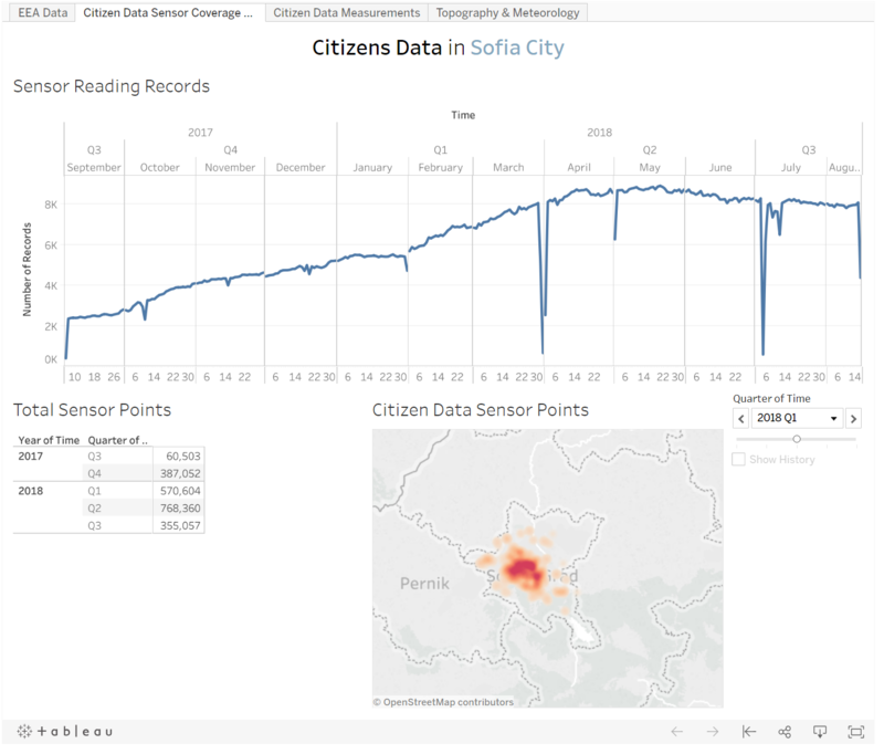
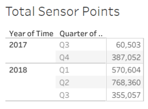
| Total Sensor Points Drill Down | The data regarding number of citizen data sensor points in Sofia City can be drilled down by clicking on the headers, allowing users to view the total data points by Year, Quarter, Month, Day and Hour. | 1. Done by Text Tables option on Tableau. |
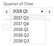
| Change in Sensor Data Points by Quarters | To see the changes in citizen data sensor points over time, to see if there was a growth or decline in data points as well as the concentration of citizen data points in Sofia City. | 1. Placing "Time" into pages and choosing to filter it by quarters. |
| Interactive Technique | Rationale | Brief Implementation Steps |
|---|---|---|
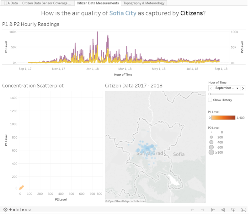
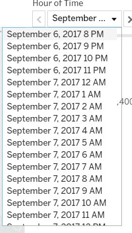
| Hour of Time Filter | User can choose the time period in visualising the concentration scatterplot and citizen data. This allows user to drill down to observe anormalies that can be observed from the line graph. | 1. Placing "Time" into pages and choosing to filter it by hours. |
