Difference between revisions of "UIUX: Proposal"
Jump to navigation
Jump to search
Feel free to comment on our project! 😁
m |
|||
| (8 intermediate revisions by the same user not shown) | |||
| Line 29: | Line 29: | ||
<center><div style="background:#FF6A00; padding: 15px; line-height: 0.3em; letter-spacing:0.5em;font-size:20px"><font color=#fbfcfd face="Agency FB">DATA SOURCES</font></div></center> | <center><div style="background:#FF6A00; padding: 15px; line-height: 0.3em; letter-spacing:0.5em;font-size:20px"><font color=#fbfcfd face="Agency FB">DATA SOURCES</font></div></center> | ||
| + | {| class="wikitable" width="100%" | ||
| + | |- | ||
| + | ! style="font-weight: bold;background:#F8F9FA;color:#000000;width: 40%;" | Data Set | ||
| + | ! style="font-weight: bold;background:#F8F9FA;color:#000000;width: 25%" | Data Attributes | ||
| + | ! style="font-weight: bold;background:#F8F9FA;color:#000000;width: 35%" | Purpose | ||
| + | |- | ||
| + | | <center>M450081 - Merchandise Imports By Country/Region, Monthly | ||
| + | http://www.tablebuilder.singstat.gov.sg/publicfacing/createDataTable.action?refId=15544</center> | ||
| + | |||
| + | || | ||
| + | *FY Jan 1976 - Aug 2018 | ||
| + | *119 Countries (inclusive of grouping by 6 Continents) | ||
| + | |||
| + | ||To understand the import figures distributed across all countries as well as grouped by continents. | ||
| + | |- | ||
| + | |||
| + | |- | ||
| + | | <center>M450081 - Merchandise Exports By Country/Region, Monthly http://www.tablebuilder.singstat.gov.sg/publicfacing/createDataTable.action?refId=15337/ </center> | ||
| + | |||
| + | || | ||
| + | *FY Jan 1976 - Aug 2018 | ||
| + | *119 Countries (inclusive of grouping by 6 Continents) | ||
| + | |||
| + | ||To understand the export figures distributed across all countries as well as grouped by continents. | ||
| + | |- | ||
| + | |||
| + | |- | ||
| + | | <center>M060251 - Trade In Services By Services Category, Annual | ||
| + | http://www.tablebuilder.singstat.gov.sg/publicfacing/createDataTable.action?refId=12396</center> | ||
| + | |||
| + | || | ||
| + | *FY2000 - FY2017 | ||
| + | *Total Trade In Services | ||
| + | *Export of Services / Import of Services | ||
| + | |||
| + | || | ||
| + | To identify trends and understand the distribution of services by category for both imports and exports. | ||
| + | |- | ||
| + | |||
| + | |- | ||
| + | | <center>ASEAN Trade Data <br> | ||
| + | https://data.aseanstats.org/trade</center> | ||
| + | |||
| + | || | ||
| + | *FY2004 - FY2017 | ||
| + | *HS 2-digit | ||
| + | *Reporter by Singapore | ||
| + | *Partner by the World | ||
| + | |||
| + | || | ||
| + | To identify trends and understand the distribution of services by category for both imports and exports within Singapore and may look into ASEAN Countries if applicable. | ||
| + | |- | ||
| + | |} | ||
| + | |||
| + | <center><div style="background:#FF6A00; padding: 15px; line-height: 0.3em; letter-spacing:0.5em;font-size:20px"><font color=#fbfcfd face="Agency FB">BACKGROUND SURVEY OF RELATED WORKS</font></div></center> | ||
| + | {| class="wikitable" width="100%" | ||
| + | |- | ||
| + | ! <div align="center">Visualisation</div> !! <div align="center">Learning Points</div> | ||
| + | |- | ||
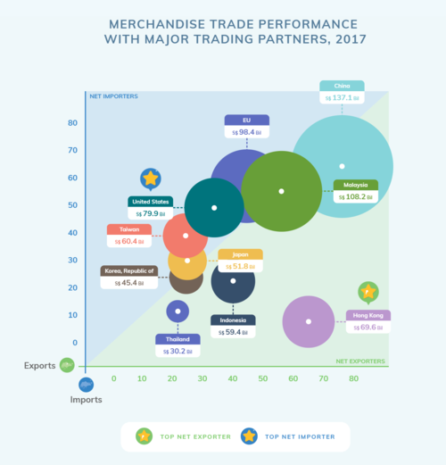
| + | |[[File:UIUXBS1.PNG|500px|frameless|center]] | ||
| + | |||
| + | Reference: https://www.singstat.gov.sg/modules/infographics/singapore-international-trade | ||
| + | |||
| + | || | ||
| + | * Use of varying data point sizes(size of circles) to represent the combined import and export value is messy in this diagram because the circles are overlapping each other, making it difficult to visualise.<br> | ||
| + | *Lack of interactivity to study previous years’ data; graph is static and only shows only 2017 data. <br> | ||
| + | *Graph shows the degree of trade between Singapore and its top trading partners in terms of its import and export trade volume as well as visually represent the net trade value by using identical axis for import and export, thereby dividing the graph area in 2 equal zones; Net Importers represented by blue area where imports > exports & Net Exporters represented by green area where imports < exports. | ||
| + | |- | ||
| + | |||
| + | |- | ||
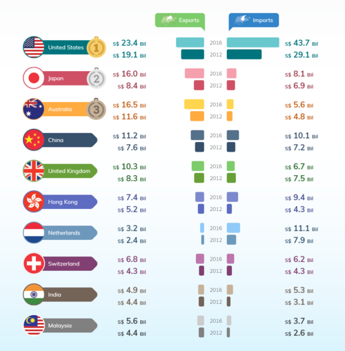
| + | |<center>Major Trading Partners For Trade in Services, 2016</center> | ||
| + | [[File:UIUXBS2.PNG|500px|frameless|center]] | ||
| + | |||
| + | Reference: https://www.singstat.gov.sg/modules/infographics/singapore-international-trade | ||
| + | |||
| + | || | ||
| + | * Diagram shows exports and imports for top trading partners in services but no information about net trade. | ||
| + | * Good to have information about change in ranking of top trading partners between current year and year in comparison (2012). | ||
| + | * Difficult to compare import and export across countries in a given year. | ||
| + | * Useful in showing change in import and export of trading partners between 2012 and 2016 only. Will be better if data visualisation is interactive and allow user to choose a given year to compare change in exports and imports. | ||
| + | |- | ||
| + | |||
| + | |- | ||
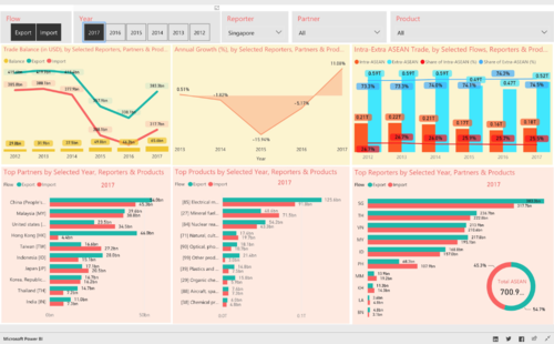
| + | |<center>ASEAN Trade in Goods(IMTS) Dashboard</center> | ||
| + | [[File:UIUXBS3.PNG|500px|frameless|center]] | ||
| + | Reference: https://data.aseanstats.org/dashboard/imts.hs2 | ||
| + | |||
| + | || | ||
| + | * Filters at top row do not apply to all graphs and can be misleading. (e.g Year filter only apply to bar graphs on 2nd row.) | ||
| + | * Ability to toggle import and export as well as showing both at the same time allow user to observe trend net trade balance with each country and see how exports with other countries fare compare vis-a-vis imports. | ||
| + | * Too much clutter with multiple data labels in the Intra-Extra ASEAN Trade bar chart. It could be better represented. | ||
| + | |||
| + | |- | ||
| + | |} | ||
<center><div style="background:#FF6A00; padding: 15px; line-height: 0.3em; letter-spacing:0.5em;font-size:20px"><font color=#fbfcfd face="Agency FB">VISUALISATION PLAN</font></div></center> | <center><div style="background:#FF6A00; padding: 15px; line-height: 0.3em; letter-spacing:0.5em;font-size:20px"><font color=#fbfcfd face="Agency FB">VISUALISATION PLAN</font></div></center> | ||
| − | {| class="wikitable" | + | |
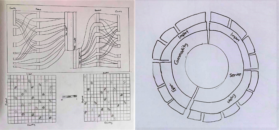
| + | [[File:UIUXSketch.png|900px|center]] | ||
| + | |||
| + | {| class="wikitable" width="100%" | ||
|- | |- | ||
! <div align="center">Type of Visualization</div> !! <div align="center">Detailed Description</div> | ! <div align="center">Type of Visualization</div> !! <div align="center">Detailed Description</div> | ||
| Line 42: | Line 139: | ||
Sample link: http://bl.ocks.org/d3noob/5028304 | Sample link: http://bl.ocks.org/d3noob/5028304 | ||
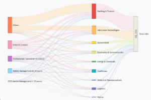
| − | || Sankey Diagrams display flows and their quantities in proportion to one another. The things being connected are called nodes and the connections are called links. It is best used to show a many-to-many mapping between two domains or multiple paths through a set of stages. Sankey is helpful in locating dominant contributions to an overall flow. | + | ||<center>Sankey Diagrams display flows and their quantities in proportion to one another. The things being connected are called nodes and the connections are called links. It is best used to show a many-to-many mapping between two domains or multiple paths through a set of stages. Sankey is helpful in locating dominant contributions to an overall flow.</center> |
|- | |- | ||
| − | | <center>Multiple Variable Association Grid Heatmap</center> | + | |<center>Multiple Variable Association Grid Heatmap</center> |
[[File:UIUXHeatmap.png|300px|frameless|center]] | [[File:UIUXHeatmap.png|300px|frameless|center]] | ||
| − | Sample link:http://bl.ocks.org/josiahdavis/7e488547a6381a365ac9 | + | Sample link: http://bl.ocks.org/josiahdavis/7e488547a6381a365ac9 |
| + | |||
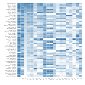
| + | ||<center>Heatmap is a graphical representation of data where the individual values in the matrix are represented using colors. It is useful for visualizing variance across multiple variables to display patterns in correlations. Each cell represents a correlation between one and another: one along the horizontal, the other along the vertical axis. The darker the shade of color, the larger the degree of correlation between the two axis.</center> | ||
| + | |- | ||
| + | | <center>Sunburst</center> | ||
| + | [[File:UIUXSunburst.jpg|300px|frameless|center]] | ||
| + | Sample link: https://beta.observablehq.com/@mbostock/d3-sunburst | ||
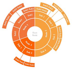
| − | || | + | || <center>Sunburst shows the hierarchy through a series of rings, that are sliced for each category node. Rings are sliced and divided based on their hierarchical relationship to the parent. Colour can be used to highlight hierarchal groupings or specific categories.</center> |
|} | |} | ||
| Line 59: | Line 162: | ||
<center><div style="background:#FF6A00; padding: 15px; line-height: 0.3em; letter-spacing:0.5em;font-size:20px"><font color=#fbfcfd face="Agency FB">TECHNICAL CHALLENGES</font></div></center> | <center><div style="background:#FF6A00; padding: 15px; line-height: 0.3em; letter-spacing:0.5em;font-size:20px"><font color=#fbfcfd face="Agency FB">TECHNICAL CHALLENGES</font></div></center> | ||
| − | + | ||
| − | {| class="wikitable" style="background-color:#FFFFFF;" width=" | + | {| class="wikitable" style="background-color:#FFFFFF;" width="100%" |
|- | |- | ||
| − | ! style="font-weight: bold;background:# | + | ! style="font-weight: bold;background:#F8F9FA;color:#000000;width: 45%;" | Challenges |
| − | ! style="font-weight: bold;background:# | + | ! style="font-weight: bold;background:#F8F9FA;color:#000000;width: 55%" | Mitigation Plan |
|- | |- | ||
| | | | ||
| Line 83: | Line 186: | ||
* Store in database and create cache to prevent slow loading | * Store in database and create cache to prevent slow loading | ||
|} | |} | ||
| − | + | ||
<center><div style="background:#FF6A00; padding: 15px; line-height: 0.3em; letter-spacing:0.5em;font-size:20px"><font color=#fbfcfd face="Agency FB">COMMENTS</font></div></center> | <center><div style="background:#FF6A00; padding: 15px; line-height: 0.3em; letter-spacing:0.5em;font-size:20px"><font color=#fbfcfd face="Agency FB">COMMENTS</font></div></center> | ||
<center><br>Feel free to comment on our project! 😁</center> | <center><br>Feel free to comment on our project! 😁</center> | ||
<!--Content End--> | <!--Content End--> | ||
Latest revision as of 23:29, 14 October 2018
PROBLEM & MOTIVATION
DATA SOURCES
| Data Set | Data Attributes | Purpose |
|---|---|---|
|
To understand the import figures distributed across all countries as well as grouped by continents. | |
|
To understand the export figures distributed across all countries as well as grouped by continents. | |
|
To identify trends and understand the distribution of services by category for both imports and exports. | |
https://data.aseanstats.org/trade |
|
To identify trends and understand the distribution of services by category for both imports and exports within Singapore and may look into ASEAN Countries if applicable. |
BACKGROUND SURVEY OF RELATED WORKS
Visualisation |
Learning Points
|
|---|---|
|
Reference: https://www.singstat.gov.sg/modules/infographics/singapore-international-trade |
|
Reference: https://www.singstat.gov.sg/modules/infographics/singapore-international-trade |
|
|
VISUALISATION PLAN
Type of Visualization |
Detailed Description
|
|---|---|
Sample link: http://bl.ocks.org/d3noob/5028304 |
|
Sample link: http://bl.ocks.org/josiahdavis/7e488547a6381a365ac9 |
|
Sample link: https://beta.observablehq.com/@mbostock/d3-sunburst |
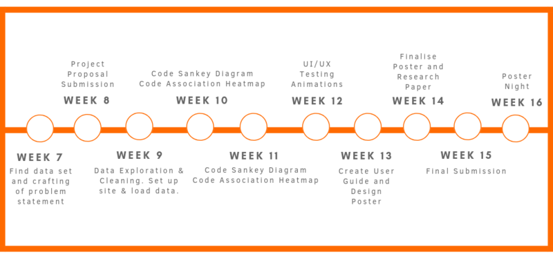
PROJECT TIMELINE
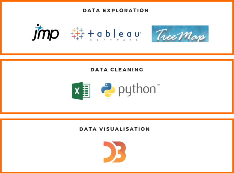
TECHNOLOGIES
TECHNICAL CHALLENGES
| Challenges | Mitigation Plan |
|---|---|
|
|
|
|
|
|
COMMENTS
Feel free to comment on our project! 😁

