Difference between revisions of "UIUX: Proposal"

From Visual Analytics for Business Intelligence
Jump to navigation Jump to search
m
Line 60: Line 60:
  
 
||
 
||
 +
*FY2000 - FY2017
 
*Total Trade In Services
 
*Total Trade In Services
 
*Export of Services / Import of Services
 
*Export of Services / Import of Services

Revision as of 18:24, 14 October 2018

UIUXBanner.png


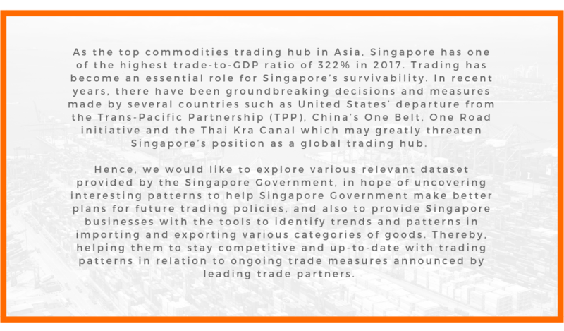
PROBLEM & MOTIVATION
UIUXMotivation.png
DATA SOURCES
Data Set Data Attributes Purpose
M450081 - Merchandise Imports By Country/Region, Monthly http://www.tablebuilder.singstat.gov.sg/publicfacing/createDataTable.action?refId=15544
  • FY Jan 1976 - Aug 2018
  • 119 Countries (inclusive of grouping by 6 Continents)
To understand the import figures distributed across all countries as well as grouped by continents.
M450081 - Merchandise Exports By Country/Region, Monthly http://www.tablebuilder.singstat.gov.sg/publicfacing/createDataTable.action?refId=15337/
  • FY Jan 1976 - Aug 2018
  • 119 Countries (inclusive of grouping by 6 Continents)
To understand the export figures distributed across all countries as well as grouped by continents.
M060251 - Trade In Services By Services Category, Annual http://www.tablebuilder.singstat.gov.sg/publicfacing/createDataTable.action?refId=12396
  • FY2000 - FY2017
  • Total Trade In Services
  • Export of Services / Import of Services

To identify trends and understand the distribution of services by category for both imports and exports.

VISUALISATION PLAN
Type of Visualization
Detailed Description
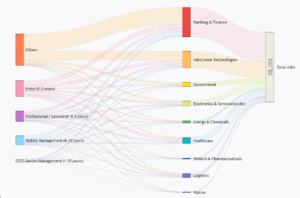
Sankey
UIUXsankey.PNG

Sample link: http://bl.ocks.org/d3noob/5028304

Sankey Diagrams display flows and their quantities in proportion to one another. The things being connected are called nodes and the connections are called links. It is best used to show a many-to-many mapping between two domains or multiple paths through a set of stages. Sankey is helpful in locating dominant contributions to an overall flow.
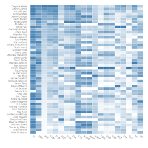
Multiple Variable Association Grid Heatmap
UIUXHeatmap.png

Sample link: http://bl.ocks.org/josiahdavis/7e488547a6381a365ac9

Heatmap is a graphical representation of data where the individual values in the matrix are represented using colors. It is useful for visualizing variance across multiple variables to display patterns in correlations. Each cell represents a correlation between one and another: one along the horizontal, the other along the vertical axis. The darker the shade of color, the larger the degree of correlation between the two axis.
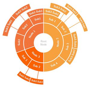
Sunburst
UIUXSunburst.jpg

Sample link: https://beta.observablehq.com/@mbostock/d3-sunburst

Sunburst shows the hierarchy through a series of rings, that are sliced for each category node. Rings are sliced and divided based on their hierarchical relationship to the parent. Colour can be used to highlight hierarchal groupings or specific categories.
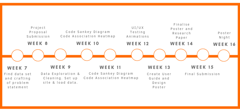
PROJECT TIMELINE


UIUXSchedule.png


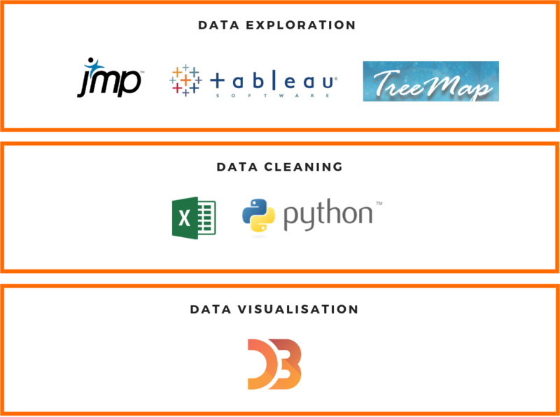
TECHNOLOGIES


UIUX Technologies.png


TECHNICAL CHALLENGES
Challenges Mitigation Plan
  • Team not proficient in Javascript, especially in D3 Libraries
  • Attend workshops on D3.js
  • Independent learning & self-research online
  • Peer Learning
  • Data Cleaning and Transformation
  • Plan the data cleaning steps properly and work closely as a group to ensure tidy data before coding out the visualisations.
  • Huge amount of data set causing slow rendering of web page
  • Research on ways of how to effectively render data
  • Store in database and create cache to prevent slow loading
COMMENTS

Feel free to comment on our project! 😁