ISSS608 2017-18 T3 Assign See Kwan Yen Visualization
Trends: Do you see any trends of possible interest in this investigation?
| Patterns | Visualization |
|---|---|
| 1. Overview of chemical tracking across the Years
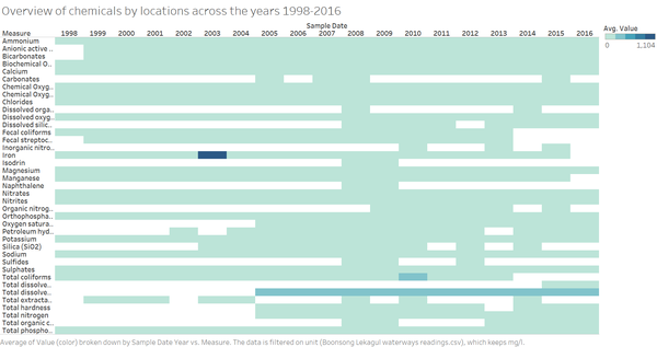
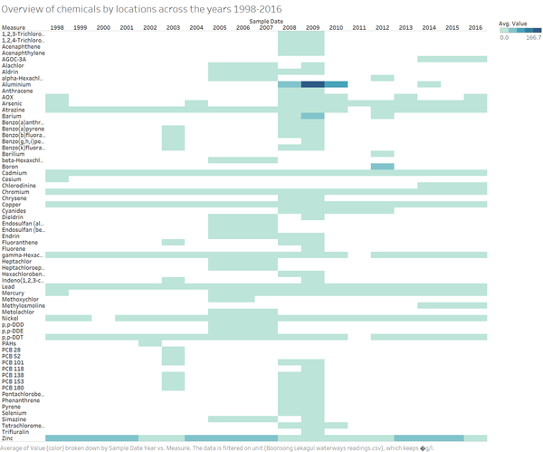
An overview of the water sensor readings across the years will give us a snapshot of the level of chemicals in the wwterway.
|
|
| 2. Chemicals by Locations
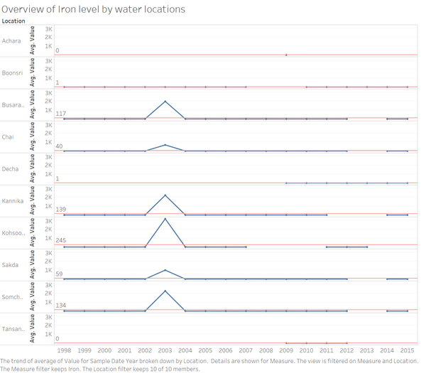
However, a spike in the value of Iron is observed among 6 of the locations as shown in chart. Investigating further on 2003 period shows that values Copper have also spiked during the same day for Kohsoom. While we do not know the cause, the correlation of such values seem to suggest a contamination incident around that period. |
|
| 3. Measure Insight - Increasing presence of Arsenic
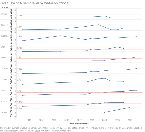
In figure 1.4, Arsenic has seen an increasing trend across many locations. Further investigation as to the possible cause of such continuous growth would be advised as to prevent the ecosystem of the waterways and the habitat from being contaminated further. |
|
| 4. Location Insight - Achara & Kohssom
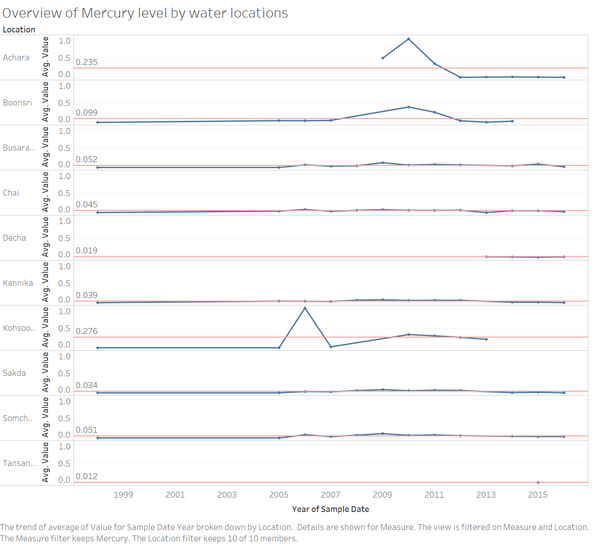
There is an elevated level of Mercury in Achara in 2010 to 2011. Prior to that, there is no data for Mercury in this location. Kohsoom also saw an increased level of mercury in 2006. |
|
Anomalies: What anomalies do you find in the waterway samples dataset? How do these affect your analysis of potential problems to the environment? Is the Hydrology Department collecting sufficient data to understand the comprehensive situation across the Preserve? What changes would you propose to make in the sampling approach to best understand the situation?
| Patterns | Visualization |
|---|---|
| 1. Missing data for specific years and locations
The figure 2.1 provides a clear view of missing samples of Sulphates and uneven sampling. This is a cause of major concern. We can clearly see that are missing values for samples in Achara, Decha and Tansanee. Plus a very low level of samples taken in those sites compared to the other locations. At the same time, we can appreciate a high level of samples in Boonsri, Chai, Kannika, Sakda specially in a range of years from 2002 to 2009. This scenario occurred for many other chemicals too. |
|
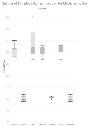
| 2.Methylosmoline count is limited
| |
| 3.Other chemicals have very uneven distributions in different locations
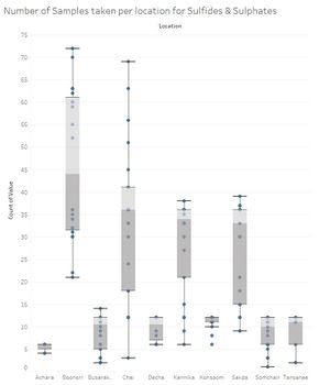
The figure shows Sulfides and Sulfates distributions of samples taken by location, as we can see they are very differently distributed with outliers clearly marked in locations like Chai or Boonsri |
