ISSS608 2017-18 T3 Assign Yu Zhecheng Visualization
|
|
|
|
|
Methodology
| Methodology | Description |
|---|---|
| 1.Time series analyze
|
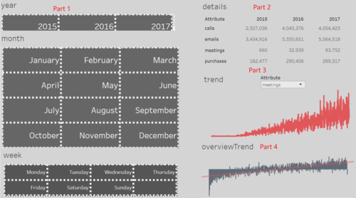
A line chart or line graph is a type of chart which displays information as a series of data points called 'markers' connected by straight line segments. According to the four large Kasios International data sets, combine the different sources to create a single picture of the company. The trend chart can help us to characterize changes in the company over time and find out that whether the company is growing. |
| 2. Network analyze
|
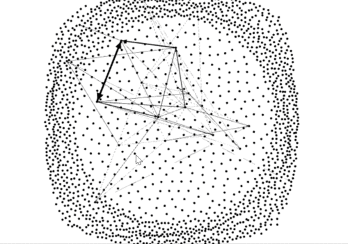
A social network is a social structure made up of a set of social actors (such as individuals or organizations), sets of dyadic ties, and other social interactions between actors.Combine the four data sources for group that the insider has identified as being suspicious and locate the group in the larger dataset. The network can help us to find out people who are closely associated with suspicious. |
| 3. Interactive dashboard
|
Dashboards often provide at-a-glance views of KPIs (key performance indicators) relevant to a particular objective or business process. In the other, "dashboard" has another name for "progress report" or "report." |
Visualization Design
| Description | Illustration |
|---|---|
| 1.Overview the development of the company
|
|
| 2.Network analyze
|
Dashboard Online
https://public.tableau.com/profile/yzcheng#!/vizhome/vizAssign1/overView?publish=yes
Sigma.js is uploaded to e-learn.


