ISSS608 2017-18 T3 Assign Kalai Selvi Methodology and Dashboard Design
Link to Tableau Public Profile: Link to tableau dashboard
The storyboard consists of 4 dashboards.
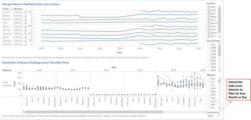
1st Dashboard
To identify the trends in the average chemical measure values and to analyse the distribution of the chemical measure values, by time and location. The filter options are Location, Year and Measure. Users can also further drill down at Year, Month or Day level for the line chart.

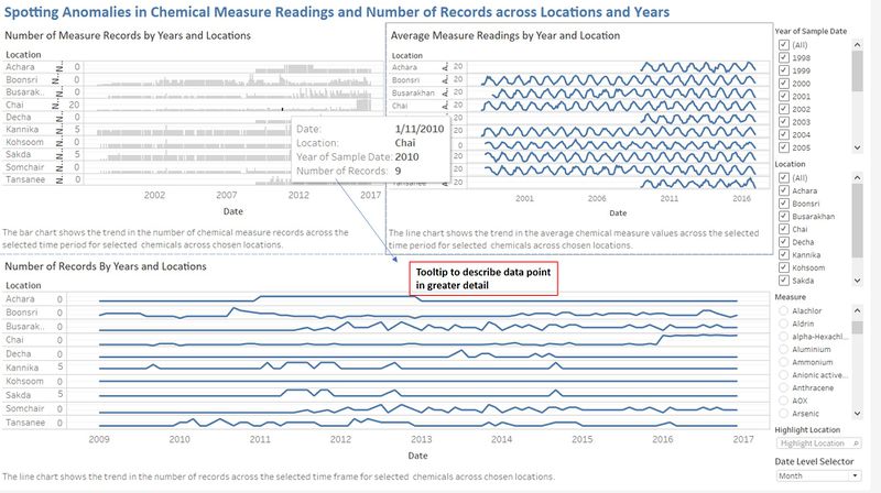
2nd Dashboard
To spot anomalies and unusual trends in the chemical measure values over time and across locations. The filter options are Location, Year and Measure. Users can also further drill down by Year, Month or Day level to analyse the average chemical measure values.

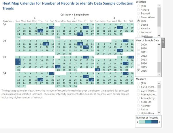
3rd Dashboard
The heatmap Calendar shows the number of records collected in each day across the years selected. The filter options are Location, Year and Measure.

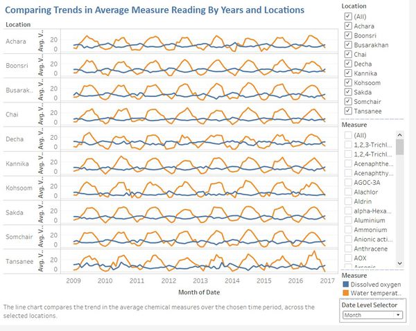
4th Dashboard
This dashboard allows users to compare the trends in Average Measure Readings across locations and by years. The filter options are Location, Year and Measure. Users can also further drill down by Year, Month or Day level to analyse the average chemical measure values.

