Fu Yi - Visualization
 VAST MINI CHALLENGE 3 - Find out the suspiciousness
|
|
|
|
|
|
Question 1
Contents
Is the company growing?
The tool to visualize the overall picture of the company growth is Tableau.
First, I bring in four data sources, the categories are: Calls, Emails, Meeting and Purchases, change the variable type accordingly, as we have the data from July 2015 to December 2017, it is appropriate to show the monthly changes within the company across the year. Then, I create sheet for each category by using cycle plot to compare the monthly changes across different year, because each month has different number of days, for certain month like February, the days are naturally less than other month, to eliminate the bias, it should compare the month to itself check what the pattern changes. Moreover, I add a reference line to display the average value for each month, so can refer the changes to this line, it gives a better picture.
For Calls and Emails, the changes follow the similar pattern. Overall even though we miss out the first 6 months data in 2015, we are still able to tell that in 2015, the communication volume is increasing, because all of the rest of months from July to December in 2015 display a steep increasing trend, there is no reason that the first 6 months would have opposite trend if the company was in same operation condition. On the other hand, when it comes to 2016 to 2017, the scenario changes. In general, the increasing trend becomes more flattened, some of the months even witnessed decreases, like February and December.

Purchase number is a strong indicate of a company whether its business was running good or not. For Purchases cycle plot, we can see from 2015 to 2016, all the 6 months from July to December exceed the average number of purchases, most of them they are above the reference line, so we can assume that in the first 6 months, the scenario for purchase was also increasing, the company was running good business in 2015~2016. However, the situation in 2016 to 2017 changed dramatically. All the increasing trend turned to be flattened, except July and September. Many months experienced an extreme decreasing trend line, which indicate that the company business experienced a down trend, not as good as its previous year.

For Meetings, the number of meetings present increasing, but it cannot indicate that the company operational perspective was doing well.

The full picture of the company operational scenario indicated by 4 types of activities. Based on the changes on Purchase, Calls and Emails in 2015 – 2016, the company ran a good business. However, the company witnessed a down trend in 2016 – 2017. Click here to view Tableau of the full picture
Question 2
Insider try to tell the suspicious purchase is?
After applied Fruchterman Reingold layout method to the suspicious dataset, edit Area = 10000, Gravity = 15. After that, I ran Betweenness Centrality and Eigenvector Centrality, rank the size and colour according to these 2 statistic measures. Betweenness Centrality is a measure of centrality in a graph based on shortest paths, represents the degree of which nodes stand between each other. Eigenvector Centrality represent the importance of the node. A high eigenvector score means that a node is connected to many nodes who themselves have high scores. The larger the circle, the higher the Betweenness Centrality value, the darker the colour, the higher the Eigenvector Centrality value.
The first picture shows the entire connection for all suspicious nodes from insider. The second one filter only show the purchase. We can see that Rosalia requested a purchase from Jenice.


Is anyone else appears to be closely associated with this group?
Above suspicious (Group A) people are marked with “SS_” in front of their name in the larger dataset to make them easier to identify, by joining with IDs that have association with this group, there are 1,640 IDs in total (include Group A), this group is Group B.
The rule for potential other suspicious IDs has to be “connect at least more than 1 IDs”, because if an IDs connects one ID only, this ID is not possible to be the messenger or head of mafia to spread out the information about any suspicious event. Based on that rule, I ran Average Degree to get the degree level. Filter down for “Degree = 1”, highlight those IDs and remove them. There are 66 Nodes/IDs left, but some Nodes also only connect 1 IDs as well, but they have 2 degrees (in & out degree), so manually select those Nodes, also remove them. After that, I filtered for “In Degree = 0”, because those people do not take in any information from suspicious group, their Betweenness and Closeness value are very low, the possible information sent out from them are from non-suspicious group, so they are not within the suspicious investigation range.

The remaining People are 35, excluded the number of IDs from Group A(suspicious people from insider), I name them Group C.
Group C

Question 3
What is the full picture of the organizational structure within the group
From the bad actors created in last question, the organizational structure within this group, I will demonstrate according to the centrality measures: Betweenness, Closeness and Eigenvector centrality. The meaning behind Centrality is to find very connected individuals, popular individuals, individuals who are likely to hold most information or individuals who can quickly connect with the wider network. For betweenness centrality, it measures which nodes act as ‘bridges’ between nodes in a network, it is to find the individuals who influence the flow around a system. The people who have high betweenness might hold authority over or control collaboration between disparate clusters in a network; For closeness centrality, it aims to find the individuals who are best placed to influence the entire network most quickly, the people who have high closeness value are good ‘broadcasters’, it would be to find influencers within a single cluster; For Eigenvector Centrality, it measures how well connected a node is, and how many links their connections have through the network.
In this case, I rank the size of the Nodes based on Betweenness value; colour of the Nodes based on Closeness value; size of the Label based on Eigenvector value. The initial layout is arranged according to Modularity classes, each separated cluster is one class, I used Force Atlas 2 layout, then manually adjust them together so can look clearer.
(Rules: The bigger the higher Betweenness value; The darker the red, the higher Closeness value; The name bigger the higher Eigenvector value.)
Overall: 
The Fig above shows the overall scenario of the organizational structure and communication channels. From the Fig we can see that Richard Fox has the highest value for all three measures, I assume his is the Head of the company.
Filter for highest Betweenness centrality. Those highlighted people are the “Bridges”, means the rest of suspicious people cannot connect to each other without those highlighted people’s existence.
High Betweenness:
Filter for highest Closeness centrality: Those highlighted people are “big mouth”, they can spread out the information most efficiently.
High Closeness: 
Does the group composition change during the course of their activities?
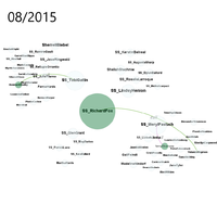
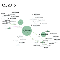
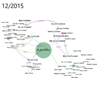
For the interaction changes overtime, I used In Degree and Out Degree to measure, captured monthly changes respectively. It is to compare how the communication flow between one and another for the same. The Red circle shows In-Degree, Green shows Out-Degree. The line between dots indicates the type of activities. The gif below shows communication changes in 2015, in general Richard had most communication with Tobi and Lindsy group, as most dots appear within those 2 groups. In November, the frequency of cross group communication activities is very high, especially through Emails and Calls.
2015
In Degree
200px


