ZL-Methodology
|
|
|
|
|
|
|
I made 4 dashboards then combine them together as a Story page.
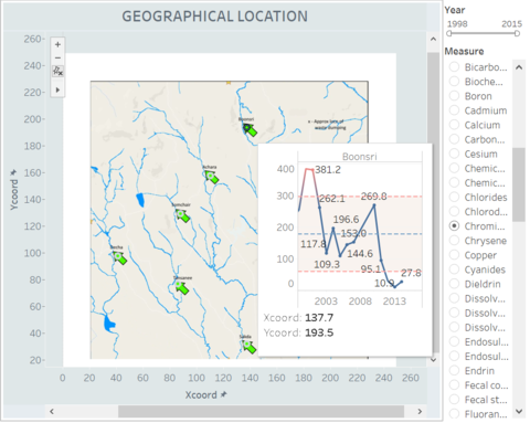
Page One: Geographical Location Map
In this dashboard, there is the geographical map of Boonsong Lekagul waterway. Each point was positioned by longitude and latitude, and each point represent a sampling site. You can check the Control Chart of each site by hovering over the point. The meaning of control chart and the role of reference line will be introduced in the following section.
Filters:
- Year: you can check any year and any range that you want from 1998 to 2016.
- Measure: The measure filter uses single list so that only one measure can be chosen every time.
Page Two: Yearly Trend of Each Measure
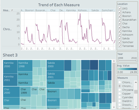
In the second dashboard, I use Line Chart to show the Current and Previous Trend of Each Measure by year and location. To find out the trend, I use the average value of each measure as the y axis. Just like the chart below, the line chart displays all the fluctuation ranges of a certain period. For an example, this chart shows the testing results of Chromium of each sampling site from 1998 to 2016. Obviously, no matter in which site, the trend of Chromium fluctuates violently and frequently, however, the year of rising and decreasing of each location is different.
To better display the testing result, I also use the Tree Map to strengthen my dashboard. I use colour to represent the average value of each measure, the darker the colour, the higher the average value. Then I use size to represent the sum value of measures, the bigger the rectangle is, the more pollutes accumulated.
Filters:
- Location: you can choose any one or more sampling sites.
- Year: you can check any year and any range that you want from 1998 to 2016
- Measure: The measure filter uses single list so that only one measure can be chosen every time.
Page Three and Four: Analysis of Water System
In the third and fourth page I display the Control Chart and Area Chart of two different water system: one is the Skada Water System which is composed of three sampling sites – Achara, Somchair and Sakda; the other one is the Kannika Water System which is composed of Busarakhan, Chai and Kannika. The reason why I choose these locations to made up to a water system is I want to check the watershed integrity, whether the water quality of upstream would have a direct affect on downstream.
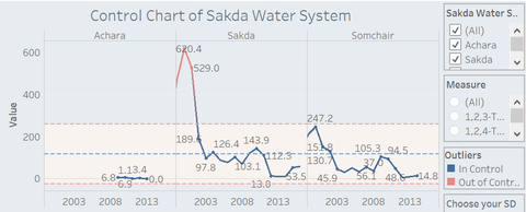
Using Control Chart is to detect how a process changes over time. A control chart has a central line for the average, an upper line for the upper control limit and a lower line for the lower control limit. Like the chart below, the blue line is the central line, and two red lines represent the Upper and Lower limit. If the point outside the control limits, I will regard this point as outlier, which means out of control and mark it red. The in-control point will be mark as blue.
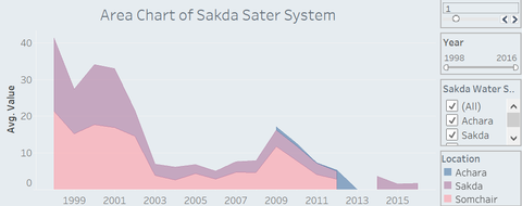
In addition, to find out the trends over time among related sampling site, I use Area Chart. I apply this chart to each water system and to compare with the area of the three different locations within their own water system. As following chart, purple area is the downstream, Sakda, blue and pink area are for upstreams which are Achara and Somchair, respectively.
Filters:
- Location: you can choose any one or more sampling sites.
- Year: you can check any year and any range that you want from 1998 to 2016
- Measure: The measure filter uses single list so that only one measure can be chosen every time.
- Choose your SD: you can choose any standard deviation you want so that the upper and lower limit will be changed correspondingly.


