ISSS608 2017-18 T3 Assign Lim Wee Kiong Dashboard Design
|
|
|
|
|
|
|
Contents
Joining the Data Sources
The first step is to join the 3 data sources into one and do some Exploratory Data Analysis:
Location and the Waterway data points will be joined as an inner join while the Waterway data points are joined with the units of measurements as a right outer join.
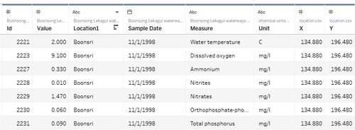
The sample joined data is shown here:
It contained:
- ID: ID of the Sample Reading
- Value: Value of the Sample Reading
- Location1: Location of the Reading
- Sample Date: Date of the Reading
- Measure: The measure of the Sample Reading
- Unit: Unit of the Sample Reading
- X / Y: X and Y coordinates of the Location
The challenge for this challenge is to find patterns or insights from 100+ measures which are of different natures and exhibit different behaviour. I designed a couple of interactive dashboards to sieve through the data. Here are brief introductions of how they are designed and what are their potential usage. The insights gathered are done through variations of the following 3 interactive dashboards:
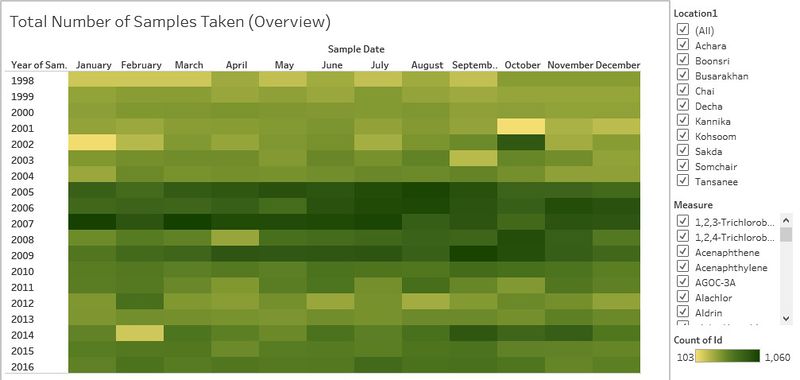
Dashboard 1: Calendar View of Sample Counts
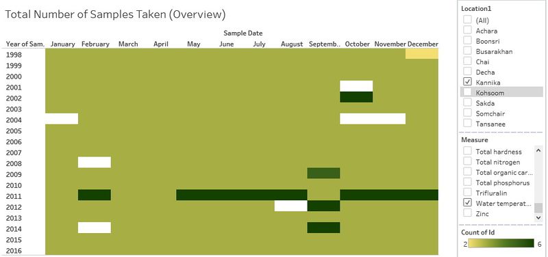
This is used to have an over-arching view of the number of sample readings taken for each measure and each location. We can then understand whether the data were obtained regularly or if there are some gaps in data-gathering.
Step 1. For Sample Dates, break down to Month in [Columns] and Year in [Rows]. This enables me to have a clear view of the data across the years (1998 to 2016) and over the months (Jan to Dec)
Step 2. Drag Id to [Details]. Change the [Measure] to [Count]. This is because I am interested in the number of readings taken for a period for individual locations.
Step 3. Measure and Location1 are added to the [Filters] as [Multiple Values(List)]. I can then filter the data based on location and measure
Step 4. Location1 and Measure are added to the [Tooltip] to provide more information.
Dashboard 2: Multi-Facet View of Measures using Row / Column Dividers
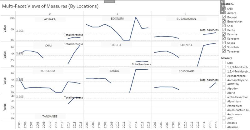
The Calendar view helps to see where the missing data are. But that is useful only to the number of records taken. To study the actual results and compare the measures across different location, or to get a view of all the measures in one location, I created Dashboard 2, the Multi-Facet view.
To create this view, I need to create 2 calculated fields. Both fields help to divide the entire view into equal portions based on the number of locations or measures I have filtered:
(i) Column Divider (formula):
(ii) Row Divider (formula):
For 2a, Multi-Facet View of One Measure (or More) across Different Location
Step 1. Drag Column Divider to [Columns] and Row Divider to [Rows]. Click on the inverted triangle on the right of the pill and select [Compute Using] > [Location1]
Step 2. Drag Sample Date (Year) to [Columns] and Sum(Value) to [Rows]
Step 3. Measure and Location1 are added to the [Filters] as [Multiple Values(List)]. I can then filter the data based on location and measure. For this view, we only try to filter based on Measure.
Step 4. In the [Marks pane], Location1 is dragged to [Details] and Measure is dragged to [Labels].
Step 5. I added an [Average Line] which is dotted and show the average value of the measure shown.
Step 6. Lastly, I added an [Annotation] by area for each location so that we can see the graph for each location clearly.
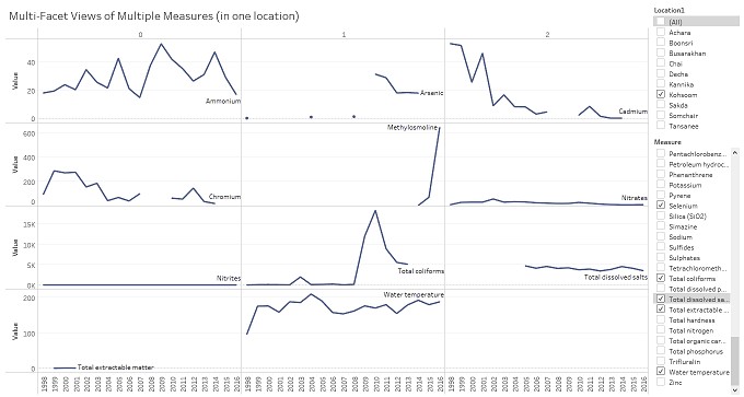
For 2b, Multi-Facet View of Multiple Measures in one location
Step 1. Drag Column Divider to [Columns] and Row Divider to [Rows]. Click on the inverted triangle on the right of the pill and select [Compute Using] > [Measures]
Step 2. Drag Sample Date (Year) to [Columns] and Sum(Value) to [Rows]
Step 3. Measure and Location1 are added to the [Filters] as [Multiple Values(List)]. I can then filter the data based on location and measure. For this view, we only try to filter based on Measure. The location should be fixed at one.
Step 4. In the [Marks pane], Location1 is dragged to [Details] and Measure is dragged to [Labels].
With the knowledge gathered from Dashboard 1, 2a and 2b, we know that there are quite a lot of missing data and it shows that probably line graph is not the best way to represent the data.
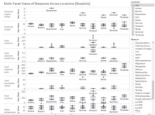
Therefore, there is a 3rd variation, Dashboard 2c, Boxplot version.
The steps to obtain this is like the previous 2 dashboards except that I did not use Row and Column Dividers, and everything is converted to Boxplot instead of line graph. Years of the Sample Date is also embedded in the details.
Dashboard 2c is an improvement over 2a and 2b as it takes away the inaccuracy of using line graphs, but there is still value in keeping 2a and 2b, as it gives us a good way to isolate data and filter items out.
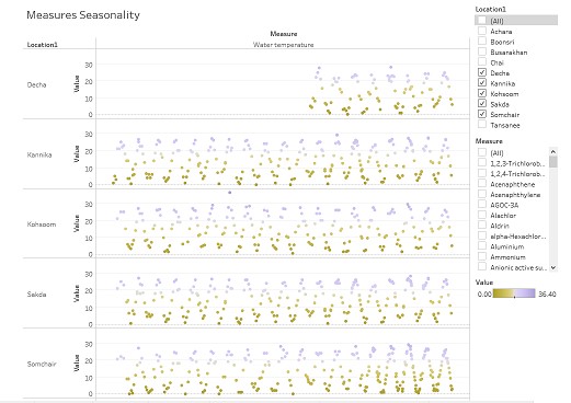
Dashboard 3: Dot-plots of Individual Measures for Seasonality
Dot-plots are useful when we want to zoom in to certain measures and explore the seasonality of the data. Not all data exhibit seasonality, but this is useful when we want to explore data that has regular records. One extremely useful measure for this will be Water Temperature. To obtain this dashboard:
Step 1. Drag Measure and Sample Date (break down to days) to [Columns]
Step 2. Drag Location1 and Value(Sum) to [Rows]
Step 3. Under [Marks], drag Value(Sum) to [Colors] and Id to [Details]. Choose a suitable color scheme to show the up and down of Sample Value.
Step 4. Measure and Location1 are added to the [Filters] as [Multiple Values(List)]. I can then filter the data based on location and measure. For this view, we only try to filter based on Measure and Location. The measure should be fixed at one.
This dashboard plots the seasonality beautifully and can help to identify unusual readings easily as dots that are exhibiting unusual patterns will show up.
Back to Dropbox Page


