ISSS608 2017-18 T3 Assign Alejandro Llorens Moreno Visualization
|
|
|
|
|
Insights and answers to questions
Trends: Do you see any trends of possible interest in this investigation?
| Patterns | Visualization |
|---|---|
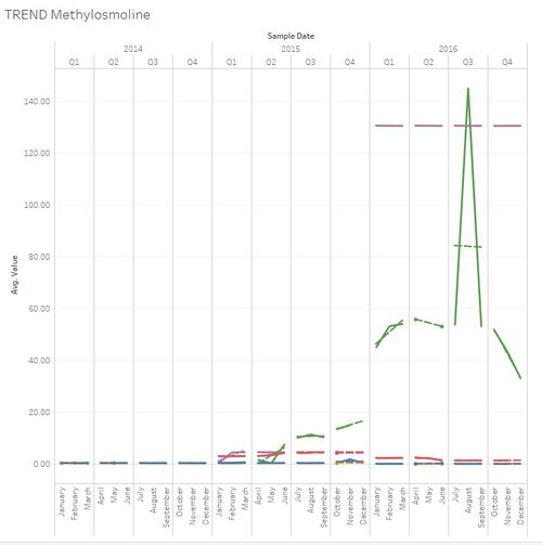
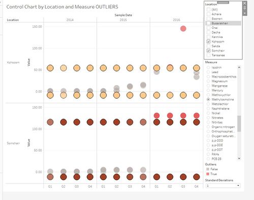
| 1. Hight levels of Methylosmoline detected ”
|
|
| 2.Water temperature has been increasing Water temperature is cyclical and warmer in the months from June to September (summer). However, in 2016 there’s a higher average water temperature in all locations. To be specific, in 1998 the average water temperature in all locations was 12.95 degrees. While in 2013 is 13.89, in 2014 is 14.79, in 2015 is 14.09 and in 2016 is 14.74 degrees. Global warming and other external causes can obviously affect this measurement, however, it’s worth exploring further.. |
|
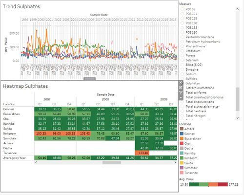
| 3.There's been drastic changes in Sulfates
|
|
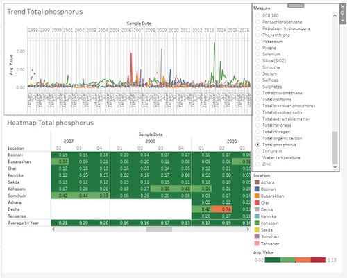
| 4.Other chemical changes
|
Anomalies: What anomalies do you find in the waterway samples dataset? How do these affect your analysis of potential problems to the environment? Is the Hydrology Department collecting sufficient data to understand the comprehensive situation across the Preserve? What changes would you propose to make in the sampling approach to best understand the situation?
| Patterns | Visualization |
|---|---|
| 1.Campers
Fig 7 provides the yearly visitor traffic calendar for the campers. The campers visited the reserve more often from May to Aug, possibly because this is the warm period of the year. The highest traffic of campers was observed in July 2015. There is a drastic drop in the campers, especially extended campers, from Q4 2015 onwards, which could be attributed to the colder weather. |
|
| 2. Rangers Trend
In Fig 8.2 we could see the rangers gathered at the rangerbase and gate 8 (which is in close proximity to the ranger base) on Thursdays 14pm. It could be an indication that the weekly ranger meetings were held on Thursdays 14pm at the rangerbase. |
|
| 3.Service Trucks
Fig 9 below shows the weekly movement pattern for service trucks at various gates. We noticed that there were a higher number of service trucks moved pass the “connecting path” on Thursdays, at two prominent timings: 1am and 16pm. This might be the scheduled delivery/pick up hours for the service trucks. |
|
| 4. Sightseeing coaches
-Fridays & Sundays 3am -Thursdays & Sundays 11am -Sundays 16pm -Mondays 22 pm |
Causes of concern: do any of your findings cause particular concern for the Pipit or other wildlife? Would you suggest any changes in the sampling strategy to better understand the waterways situation in the Preserve?
| Causes of Concern | Visualization |
|---|---|
|
| The figure below shows the outliers of 1 standard deviation of Methylosmoline in two locations: Kohsoom and Somchair |
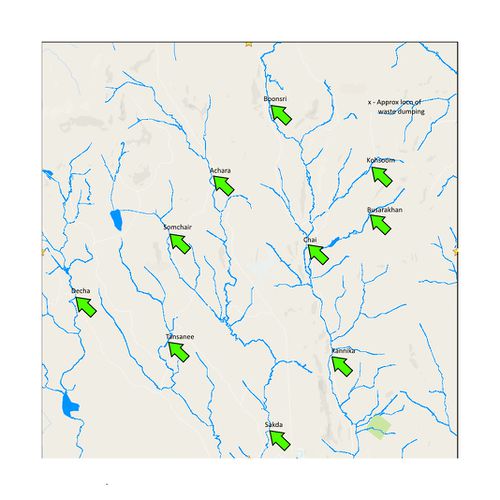
| Suggestions for sampling strategy: i suggest some changes in the sampling strategy: 1. More diligent sample taking in specific dates, for example every monday and thursday of the week (instead of random samples) 2. I suggest focusing on 3 groups: a main group comprising - Boonsri - Kohsoom - Busarakhan - Chai and Kannika. A second group comprising joined locations in the river like 1. Achara 2. Somchair 3. Sakda. A third group comprising: 1. Decha and 2. Tansanee. This way one could understand the impact of 1 contaminated location extending to other locations down the rivers. |
