ISSS608 2017-18 T3 Assign Yi Xiaoqin Insights
|
|
|
|
|
|
Insights and Analysis
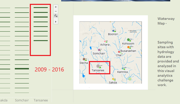
1. In terms of average values of all dates on which records have been taken, Tansanee has the highest value, and notably, this location only took measurements records from 2009 to 2016.
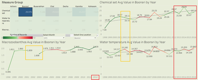
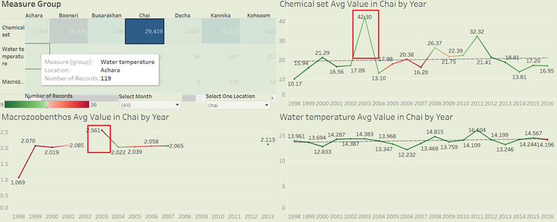
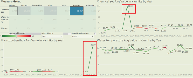
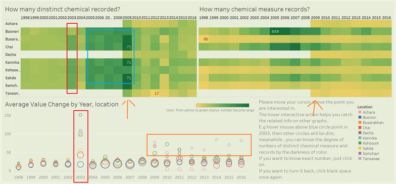
2. At a location level, four locations (Boonsri, Chai, Kannika, Sakda) have most records of chemicals, meanwhile, they have more water property and macrozoobethos observations than other locations. Then we can look into the trends of these 4 sites.
- At Boonsri, water temperature shows a slow increasing trend without an obvious change but chemicals average value has kept increasing by tree times. Besides, macrozoobethos record was missing in year 2002 while chemical value started to decrease from a peak.
- At Chai, general trend for chemical value and water temperature increased a bit but macrozoobethos records are missing for a few years. In 2003, there is a very high peak of chemical values with its macrozoobethos at the highest point. In most recent 3, 4 years, chemical value has declined.
- At Kannika, the highest chemical peak value appeared in 2003 as Chai and from 2003 to 2004, its Macrozoobethos increased sharply, nearly 18 times whining one year period. Then there are no records before or after this sudden growth and no special change of other measures. Similarly, Sakda has the special peaks as Kannika but its average chemical value is higher and has increased over recent years.
3. From the measure quantity understanding dashboard, we notice that in 2003, in most locations, there are more distinct chemicals that have been detected and the average values were fairly higher than before! In addition, since 2009, all the sampling sites have recorded several chemicals and some of them had higher value, particularly the “new comer” Tansanee almost have been recording highest values during the past 8 years. Another thing is in the 5 years until 2009, all the recorded locations had more new chemical or distinct chemicals but started to reduce later.
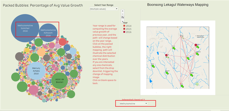
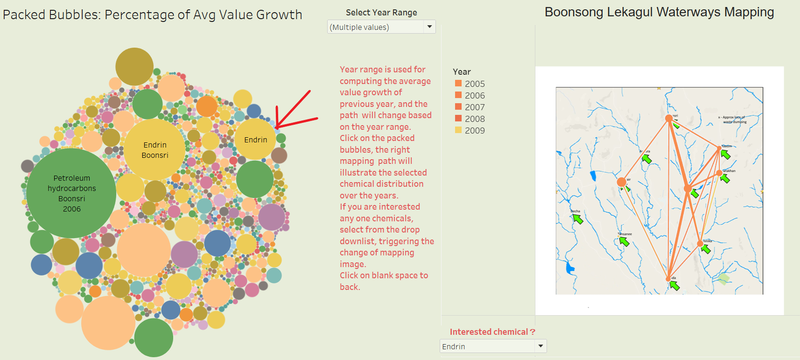
4. As we noticed in the previous dashboard, new locations with records since 2009 arouse our interest, in the chemical changing path dashboard, we can choose the year range from 2009 to 2016 (the most recent). It is obvious that in the left packed bubble plot, the chemical Methylosmoline that is he toxic manufacturing chemical in the suspected dumping has increased most in 2016 compared with previous year, especially in location Somchair and Kohsoom.Simultaneously the right mapping graph displays the entire related ID (records) as the line path, connecting all the locations in the preserve where they have detected such chemical contaminants once. Here we know this suspected toxic element has been taken to sampling since 2014 and mostly in the central to east part of the preserve.
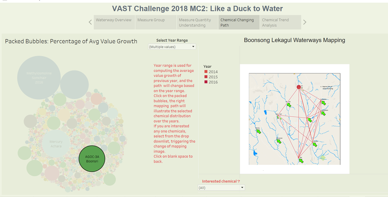
We can explore another chemical appeared in the plot: AGOC-3A. It has the largest growth of value in 2015 and only was recorded in the recent 3 years. It exists mostly in Boonsri, but it has a path similar to Methylosmoline, from the central to east part of the preserve.
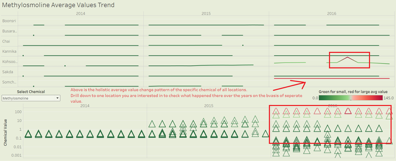
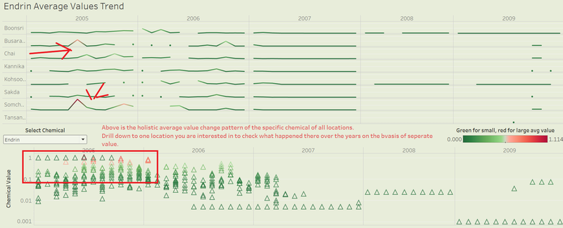
5. In the chemical trend analysis dashboard, we choose Methylosmoline to get the detail of the entire sampling data. As we have done in previous analysis, this suspicious toxic chemical value became higher in 2016 at 2 locations, in particular, Somchair has a very high value the whole year round. Below scatter plot displays every data point related to this chemical contaminant. It reflects that more Methylosmoline have been detected in 2016, which probably indicates the waterways with the soil has turned into bad situation.
If we recall the discovery in the quantity dashboard, we want to find what happened during 2005 to 2009 when there were most chemical records and distinct chemicals. Both Petroleum and Endrin, two increasing fastest chemicals, are pesticides that would cause damage to soil and water quality! Moreover, the thickness of the line in the right mapping graph suggests on the path among location Boonsri, Sakda and Chai have more Endrin records in the period.
The more elaborate Endrin value plots show that this kind of chemical were more concentrated in 2005 and from the end of 2006, it became less likely to find in the water.
With the dashboards built on given hydrology data, users are able to explore and discover what they are interested and curious. Use Interactive Viz

