ISSS608 2017-18 T3 Assign Yi Xiaoqin Visualization
|
|
|
|
|
|
Contents
Methodology
Group Measure
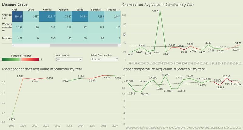
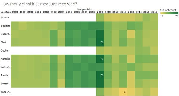
Measures contain both chemicals and water property, so according to unit and basic knowledge, divide them into 3 main groups: water temperature, macrozoobenthos and chemical sets including other chemicals of possible interest.The heat map implies that Boonsri, Chai, Kannika and Sakda have most observed chemicals. Meanwhile, their water temperature and Macrozoobethos records take up more proportion than other locations. This is reference for further analysis.

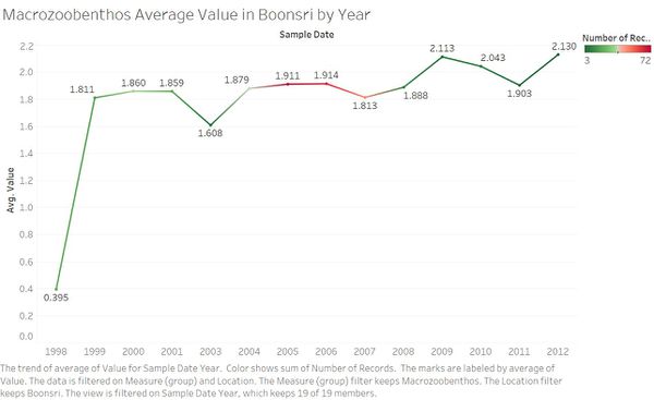
Assume number of measure records can represent the waterways situation to a certain extent: the more chemicals have been recorded, the more abnormal or serious condition the preserve site has. To clearly observe these 3 measure groups varying with each other, here we could use line charts for general average measure values’ changing pattern. Take this line chart as an example, at Boonsri, Macrozoobethos records had been taken from 1998 to 2012; the average value was increased sharply over the first year period and then slowly subsequently; from 2005 to 2007, records number where more than other years.
Chemical Measure Changing Analysis
Given a sequence of data across several years, we are interested in how the values of measures in this area change as time goes by and whether there are some unanticipated features.
Overall Change
Although Boonsong Lekagul Wildlife Preserve has a few sample sites, we want to get a general picture of waterway situation. The visualization designing includes summation of number of records and average measure value by year, representing each location’s situation.
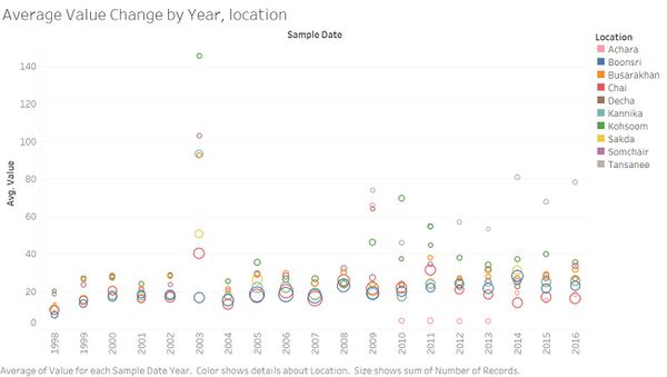
Chemical Change
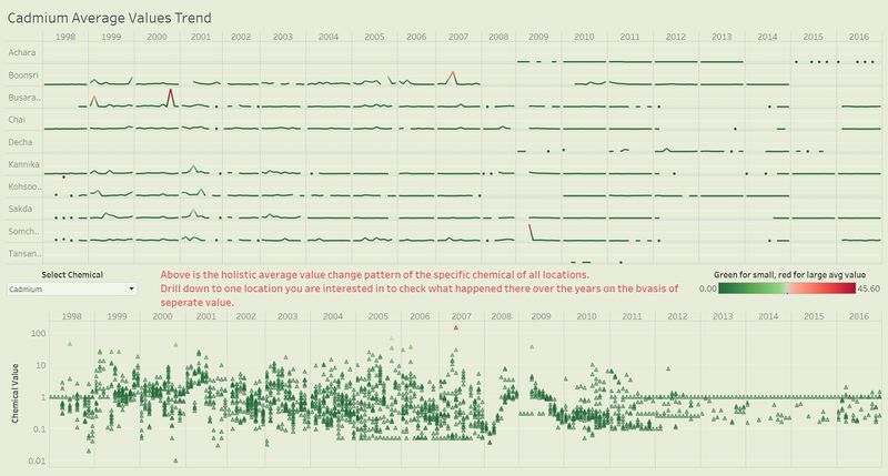
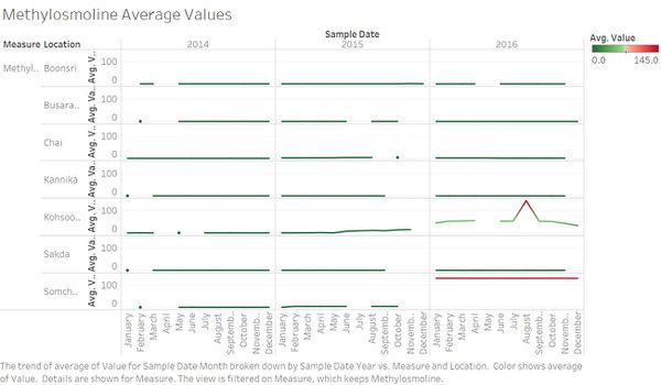
There are more than 100 chemicals provided even if quite a few measures have a very low value that are not obvious enough in a graph, we can build trellis line charts for average value against time in each location (having the record) to illustrate monthly changing patterns.
Concentration Analysis
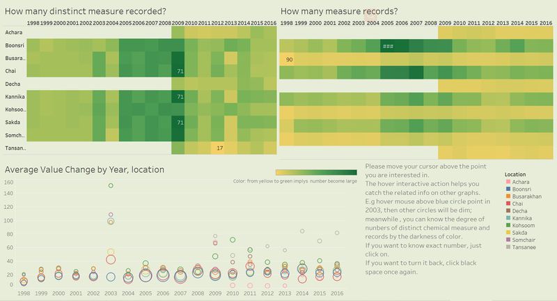
During the years, the number of different measures that could be detected and the number of measures that have been observed and recorded changed among locations and time period. We can understand it by comparing elements in heat maps. The darker the color is, the larger the number is.
Chemicals Path Analysis
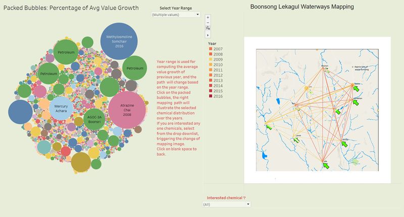
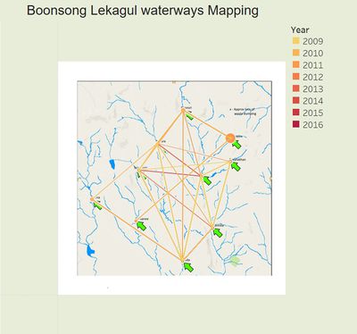
Using the waterways site map and ID with coordinates, we are able to do a mapping analysis. Only keep chemical value and set a few filters to build a rough path to connect different sites as the graph shows. The path color will darken as time goes by and size (thickness) implies the chemical value.
Yearly Growth Analysis
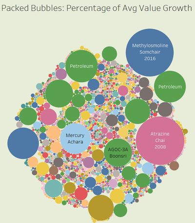
In addition to the absolute value changes, we should look at relative numbers as another perspective to understand comparison. Here we compute the percentage of average value change from previous year for each location. For visualization designing, use packed bubbles to display the dominant elements, with size representing calculation result and color implying measure.
For example, if we choose recent 3 years (2014, 2015, 2016), this graph would tell user that in Somchair and Kohsoom, chemical Methylosmolene has increased extremely a lot at year 2016 compared to 2015, while in Boonsri, AGOC-3A value grew most in year 2015 than other chemicals.
Dashboard Design
There are five dashboards constituting the story for chemical measurements to Waterways situation: VAST Challenge 2018 MC2: Like a Duck to Water. Armed with interactive techniques. Users can go through the dashboards at any sequence to understand how provided measures changes during the years and find the potential evidence of soil destruction in a simple way.
View the dashboard from the link:Xiaoqin:VAST Challenge 2018 MC2: Like a Duck to Water
Overview
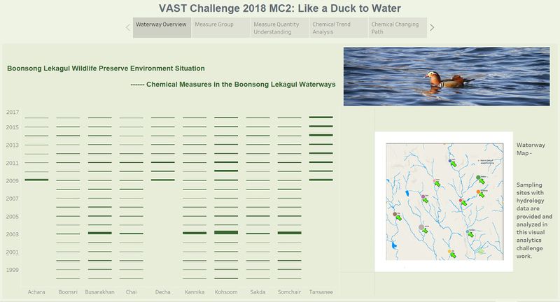
This is the first dashboard, the homepage, displaying all measures’ average value of each location in every year if any (no records causes blank in the Gantt chart). On the right side, there is a simple waterways map with 10 sampling sites denoted by colors. Two interactive techniques are used:
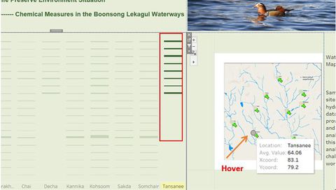
- Hover highlight action: when users hover the mouse above the site on the map, the solid circle on the map and Gantt bars related to that location would be highlighted together.
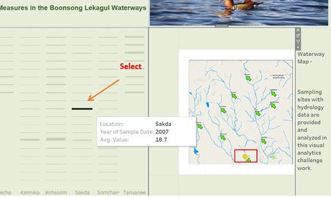
- Select Filter action: when users select any one bar in Gantt graph, others will be lighter and the corresponding location is filtered out and highlighted from the map. Clicking any black space will show all values again.
Measure Group Analysis
This dashboard helps users to generally understand waterways situation. Users can directly know how many records of each measure have been taken from the first table. Besides, putting 3 line charts together makes it easy for users to compare trends at year level with same month and focus on any part of measure group change by clicking the point on the chart.There are 4 main charts:
- Highlighted table shows total number of records of chemicals, water temperature and macrozoobenthos for each location over the whole date scope
- Chemical set line chart displays average value trend of all the recorded chemicals changing by year at only one location at one time
- Macrozoobenthos line chart displays its average values trend by year at only one location at one time
- Water temperature line chart displays the average temperature trend by year at only one location at one time
In addition, color legend is red-green diverging of which darker red means more records of the measure and darker green means less records. Two interactive filters are included: multiple value dropdown list to let user select a month at one time and single drop down list to let user select only one location they want to explore. Moreover, one highlight action allows users check any year values that would be highlighted in all line charts.
Chemical Quantity Understanding
This dashboard builds on chemical set (group) which excludes water temperature and macrozoobethos to show the overall chemical concentration in the area from a quantitative perspective. As we know, one waterway location may have many different chemical measures but have a few records of them, which has a chance that diversified chemicals result in natural destroy even if they have been detected only a few times. With two teat maps and one scatter plot, users are able to see average values of specified location or date under the chemicals records.
Chemical Changing Path Analysis
This dashboard interactively shows the dominant chemicals with their path or distribution on the preserve map. Packed bubble plot derives a few possible outstanding chemical contaminants because of the higher growth proportion as per year ranges, and the mapping plot could display the dominant chemical’s path by assigning ID. Filter select action is designed to achieve the function.
Chemical Trend Pattern Detection
This dashboard mainly focuses on overall chemicals average values changing pattern of different locations at once. With the filter interactive action, users can click on any data point in the trend line chart, and then below graph will display individual value for the chemical of the location users have specified. Additionally, hover highlight action allows user to move curser on below scatter plot to see related info in the holistic trend.

