 VAST Challenge 2018 MC2: Suspense at the Wildlife Preserve
Methodology & Dashboard Design
Dashboard Design
View the interactive Tableau dashboard here: [(insert link here) Link to tableau dashboard]
Methodology
| Description |
Illustration |
| 1. Symbol Map: Mapping out sensor readings by location
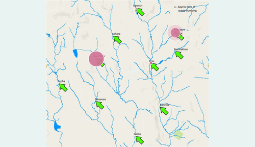
The sensor readings are plotted on the map of the preserve to give a visual overview about where readings are detected, the value of these readings and the number of readings. Each sensor reading for a selected measure is represented by a circle that is 80% transparent, and the size of the circle represents the value of the reading. Hence, if there are many readings of Methylosmoline that are high in concentration in a particular station, there would be large circles overlapping one another at that location which would then appear to be opaque.
Clicking on a particular reading will filter the rest of the charts by station location.
|
|
| 2. Control Chart: Setting limits for sensor readings
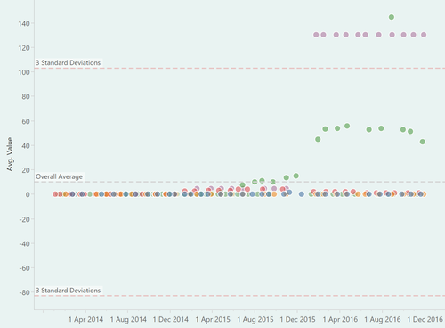
A control chart of sensor readings by station is created to visually alert the user when there is a statistically significant change to the reading of a selected measure. The dotted line on the chart represent the mean value, while the red lines represent upper and lower control limits which are three standard deviations from the mean. A sensor reading that exceeds the red lines would be a cause for concern.
Clicking on a reading on the control chart will highlight the reading on the other charts.
|
|
| 3. Boxplot: Distribution of sensor readings
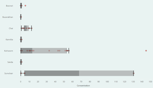
A boxplot showing the distribution of sensor readings by location is created in order to detect statistical outliers in the sensor readings. In this case, sensor readings that are outside of 1.5 times the inter-quartile range is considered an outlier and would be a cause for concern.
Clicking on a reading on the boxplot will highlight the reading on the other charts.
|
|
| 4. Filters
Users of the dashboard would be able to choose the date aggregation level (by day, week, month, quarter or year), select a date range during which the sensor readings were taken and select a particular chemical to monitor. The units of measurement for the selected chemical is also shown.
|
|

