ISSS608 2016-17 T3 Assign GAURAV MIGLANI DataPrep
Contents
Tools and Techniques Used
1. JMP
2. Tableau
3. Microsoft Excel
Dataset and Description
There are two datasets provided to us by VAST Challenge. The first dataset gives us the information about the locations and the readings taken over time in that location. The second dataset gives us information regarding the units of each of the measure recorded. The 5 important variables in the raw dataset have been summarized in the table below:
| Variable Name | Description |
|---|---|
| Id | Identification number for the record |
| Value | Measured value for the chemical or property in this record |
| Location | Name of the location sample was taken from. |
| Sample Date | Date sample was taken from the location |
| Measure | Chemicals (e.g., Sodium) or water properties (e.g., Water temperature) measured in the record |
Waterways Map
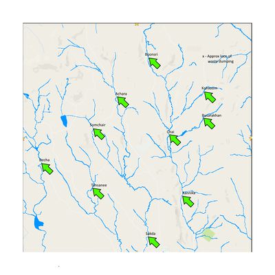
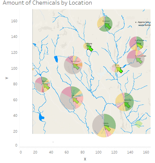
The map indicates the approximate location of the dumping site along with different location where water contamination might have occurred by Kasios due to release of some toxic chemicals.
Geospatial Data
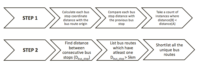
We prepared the Geo-spatial data by creating two additional columns in the dataset that was provided to us for the VAST Challenge. The columns created represents the coordinates of each of the location that can be plotted on a 200x200 grid. The flow chart below shows the data preparation and methodology used for preparing geospatial visualisation.
Joining the Datasets
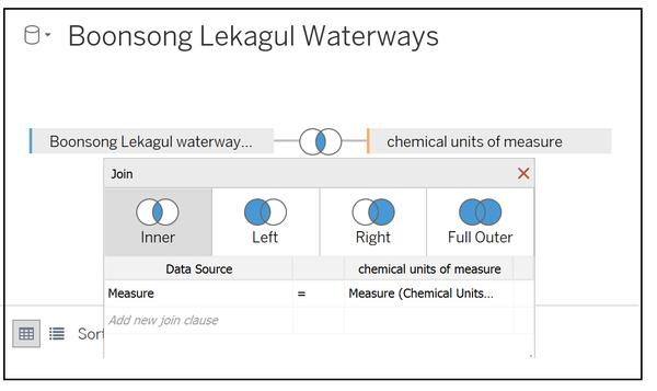
After the creating the coordinates column, it was necessary to join the two datasets so that it can be used in Tableau for visualisation.
The two datasets were imported in tableau and the inner join was performed to have one complete dataset for investigation. The inner join was done on measure variable as shown: -
Methodology and Visualisations
| Description | Illustration |
|---|---|
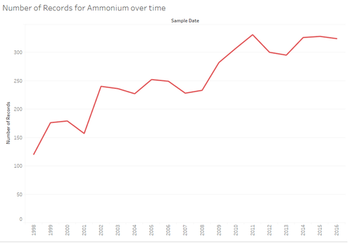
| 1.Line Graphs showing the change over time
|
|
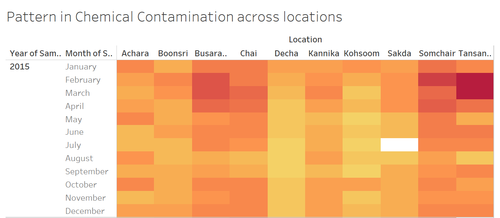
| 2.Heat Map showing the pattern in chemical contamination
|
|
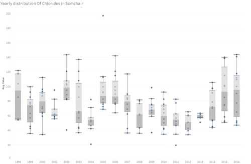
| 4.Anomolies using Box Plot
|
|
| 3.Waterways Map
|
