Group26 Report
|
|
|
|
|
|
Contents
Abstract
With the two largest economies, Unites States of America and China, imposing protective tariffs against each other, there is more and more deep analysis of international trade and trade war. The methodology of data visualization can be leveraged on this issue as well. Our research focuses on visualizing international trade data from 2001 to 2017 and using shiny dashboard to display the trade pattern hidden in the data, thereby to identify potential alternative countries and regions to absorb surplus production or stabilize importation value. The application we built demonstrates overall and category-level exportation and importation data in the period; it also provides the function of trade partner analysis of specific categories and a further sub-category-level analysis of selected trade partners. In particular, all the exploratory and explanatory research results are displayed using line graphs, facet charts, Sankey diagrams, slope graphs as well as treemaps.
Previous Visualization
International trade in goods and services in UK
The prototype of international trade in goods and services based on UN Comtrade data developed below gives a heat map to show the situations of international trade. A user is able to toggle among “Exports”, “Imports” and “Balance” tab, and the darkness of the color will change accordingly. There are other filter fields to change country, products and time.
Interactive Map: The Flow of International Trade, Max Galka, 2016
This is a visualization project using dynamic and interactive world map to show the data of international trade. Each country in this map can be clicked, which will guide users to the trade activities being performed.
What does trade within NAFTA look like? Thomson Reuters Labs
This project used bar chart in a good way to clear show the comparison between export and import. And hive plot can simplify three-parties’ relationship. It has basic user interaction design, however is very easy to understand.
Analysis Approach
Visual Design Framework

There are three steps in visual design framework, Raw Data transformation to Data Table, Visualization Structure & Representation, and User Interaction & Exploration.
First step is data transformation, which will be explained in detail in next section. The objectives of second step are visualization structure design and insights exploration and delivery. Last step is user task. User needs to explore the application and conduct interaction with it.
Visualization Structure & Framework
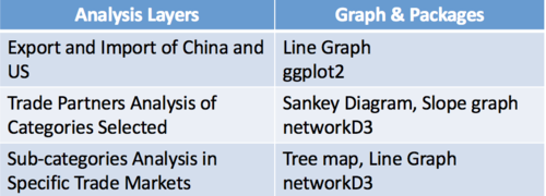
In our analysis, there are three layers in total.
The first level is line graphs that show overall and category level gap between exportation and importation value for both China and US. We use this layer to select those categories with outstanding features (ie: the category with the largest gap between export and import value).
The second layer is trade partner analysis. It shows the countries involved in trading a specific category, as well as the trade value respectively. Trade value of China-Third Country and Third Country-US can be easily compared. In this way, third-party countries with high market potential (import or export) can be located.
The third layer looks into sub-categories trading business in selected third-party countries from second layer. A detailed analysis of market potentials of those countries can be launched.
Data Transformation
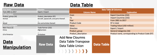
The data source for this project is ITC (International Trade Centre).
Since the focus of this project is on the trade relationship between the US and China and how it would influence the rest of the world, we would only download the data that is related to the US and China, meaning we have data of import to China/the US from the rest of the world and the data of export from China/the US to the rest of the world. We have used the trade data from 2001 to 2017 for 97 product types. Please find the detailed information in the table below.
For all 97 product types, each product type has an individual table and in each table each year’s data is in one column. Therefore, we use the gather function in dplr and transpose all the year columns into one column with its respective trade value. Then we use union function to combine all 97 tables. The detail of the dataset are in the table below.
Data Visualization Methodology
Layer1. Export and Import of China
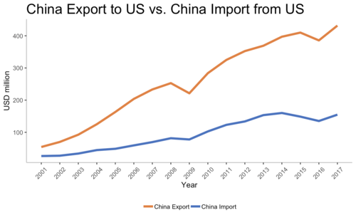
Line graph as well as facet line graph are used here to indicate the gap between export and import difference of China from 2001 to 2017.
From 2001 to 2017, the annual export volume from China to US has increased very fast, while the growth speed of import to US is slower.
The gap has been becoming larger and larger, which indicates that China is earning a trade surplus against US.
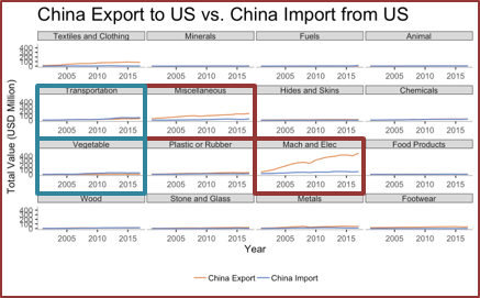
The diagram above shows trade balance of total categories with fixed y axis value. In this way, it is easy to see the absolute trade number, as well as the proportion of each individual category, takes in total trade value.
Breaking down into category-level, only the importation values of Transportation and Vegetable are larger; Mach and Elec and Miscellaneous are two categories with largest gap.
For the categories highlighted in blue, a critical reason for further exploration is that China needs to find alternative suppliers if it has to levy a protective tariff on those products against US.
For two categories highlighted in orange, they are worthy of more research because China has to approach potential buyers to absorb the volume of production.
The reasons above drive a deeper analysis in trade partners.
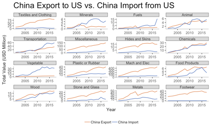
The diagram above used a dynamic y axis to illustrate each category trade gap isolatedly, from which it is clear to see the individual change trend in category level.
Layer2. Trade Partner Analysis
Visualization Tools: Sankey Diagram from networkD3 package, Slope Graph from ggplot2 package
In this layer, we used Sankey Diagram as well as slope graph to show the trade relationship among three different counterparties.
Sankey Diagrams are a specific type of flow diagram, in which each short bar indicates different nodes and the shadow between nodes is shown proportionally to the flow quantity. In this trade partner analysis, the diagrams should be interpreted from left to right. This direction means export.
In terms of the nodes, there can be two groups of nodes aligning on both side of a Sankey Diagram; it is also allowed to place multiple columns of node groups to show complicated connections. In our research, Sankey Diagram aggregates China, US and their top 10 buyers or sellers in three columns.
And comparing with other packages, networkD3 can provide interaction features (ie. highlight, drag and move).
Sankey diagram cannot display trade value trends of different countries. To make up this disadvantage, slope graphs are selected to indicate value change from 2010 to 2017 of each country involved in the previous Sankey Diagram.
1) Transportation
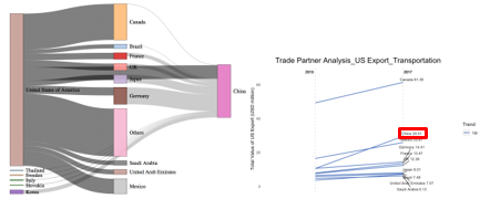
From 2010 to 2017, Canada is the largest buyer of US transportation products, followed by China and Mexico.
US exports a relatively large value to Europe countries in total, including France, UK and Germany.
Judging from slope graph, the product value US exporting to China has increased sharply.
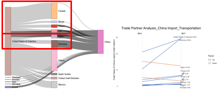
Germany is the largest country importing transportation products into China. And the increase rate from 2010 onwards is the highest.
Canada, Brazil, France and UK are importing from US more than exporting to China; while Japan and Germany are exporting to China more than importing from US.
Japan has been lowered its import value to China during 2010 to 2017.
2) Miscellaneous
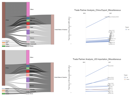
Miscellaneous products include furniture, bedding, toys, games and sports requisites as well as other miscellaneous products. Those are with low value added.
China is the largest exporter of this category, and has been providing more and more export value to US.
Except for China, US also imports large volume from Mexico and Canada.
3) Mach and Elec
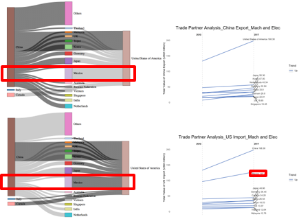
China is the largest exporter of Mach and Elec products to US.
Mexico is the second largest Mach and Elec products exporter to US, and the total export value has been increasing in recent 8 years.
China has export business with Mexico as well, however the value is relatively small. In this way, there is a chance that China can treat Mexico as a trade hub and sell indirectly to US.
4) Vegetable
Layer3. Sub-category Analysis: Mexico_Mach and Elec
Visualization Tools: Tree Map and Line Graph from ggplot2
In sub-category analysis, tree map is selected to display the export value of each category and sub-category from Mexico to US. The reason of using tree map is that it allows us to map size and color with total value of each sub-category.
However, tree map is only able to show data at a specific time point. We used line graph to supplementarily show the change and trend in years.
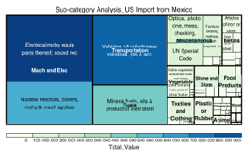
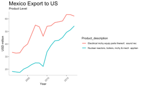
In last analysis layers, data shows that in Mach and Elec category, Mexico is a potential market for China to concentrate. Hereby we use Mexico as an example.
The tree map above shows the export value of each sub-category exported from Mexico to US in 2017, and the line graphs shows the trend from 2001 to 2017.
Mach and Elec is the category with highest value, and every Mexico exports more products to US markets. This implies that demands from US markets keep increasing.
Right now protective tariffs have been pushed abnormally higher, thus standing from both Chinese and Mexican point of view, the phenomenon is a potential opportunity to expand market shares and improve profitability.
Future Work
Research Methodology Re-use
This research methodology and logic can be applied in two aspects.
The first aspect is that the similar analysis can be used for invisible products in international trade. Our research only focused on visible products, but gave no consideration on services being traded in international commercial activities.
The second aspect is that except for looking into China and US trade relationship, this research framework can be applied on other trade relationship, for example, the relationship between China and ASEAN countries, or US with EU.
Dashboard Enhancement
there should be more User Interaction features and functions added into the dashboard, as it will help users to better understand how to use the dashboard.
Acknowledgement
Dr. KAM Tin Seong, the supervisor of this project, has given the patient mentorship and guidance over the process.
