Group12 Report
|
|
|
|
|
|
|
Report
Contents
Introduction
World Development Indicators (WDI) is the primary World Bank collection of development indicators, compiled from officially recognized international sources. It presents the most current and accurate global development data available including national, regional and global estimates. It covers more than 7 million data points collected over the span of 58 years. This statistical reference includes over 1500 indicators covering more than 200 economies. The annual publication is released in April of each year.
The massive amount of world development data has by far exceeds the ability for students, policymakers, analysts and officials to transform the data into proper visualization for analysing and gaining insight of the global developmental landscape. Thus, creating an adverse impact on the financial and technical assistance World Bank is providing to the developing countries around the world.
Through our visualizations, we seek to utilize existing data to derive meaningful insights over how various socioeconomic factors have had an impact on development of different nations and to tell their story of growth and downfall across years. This dashboard also helps decide on various areas the countries need help on and has the aid provided earlier has any effect or not. The Key objective is to deep dive in a countries development across 9 parameters.
Motivation and Objective
Our main objective is to utilize visual and graphical techniques in R for preparation of a user-friendly dashboard. Countries requiring aid from various organizations would receive benefit from this analysis by their performances being gauged over the years from which they first received assistance. Furthermore, analysts get the option to switch between different forms of visualization to allow them to make better financial and technical decision in helping the developing countries. This application should enable financial aid providers to decide on funding future aid or ROI on existing aid given.
Previous Works
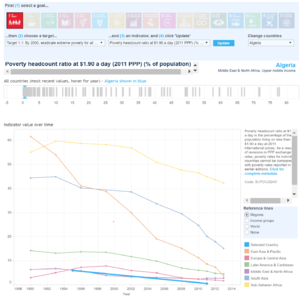
Sustainable Development Goals
- We use different tools for the visualization of the data. These include R Markdown, R Shiny, Tableau for now.
- We use the R tool to model the entire project. In R Shiny, we use the xts package for data manipulation and beneficiary in plotting time series chart. We also use ggplot2, plotly, lubridate for plotting visuals in R and manipulating the date structure. Following it, we use dynlm/ardl a tool for time series regression analysis. We have also planned to forecast the future values of the indicators for a country using the R package forecast.
- We also use the Tableau for the quick visualization of any data. The Tableau has more packages for making the visuals with much less effort. In Tableau there is a restriction to use a limited number of rows for visualization, hence we use only a certain specific rows for the visuals in Tableau.
Data Cleaning
- We have a lot of data to be cleaned for the proper data set for the analysis. The data cleaning is done using the SAS-JMP tool, removing the necessary rows and recoding the missing values. Besides, we also use Microsoft Excel 365 for small and quick cleaning.

