Group01 Report
LINK TO PROJECT GROUPS:
Please Click Here -> [1]
Cybersecurity
|
|
|
|
|
Contents
Introduction
One of the first broadly accepted formal definitions was introduced by Spitzner [1]: A honeypot is decoy computer resource whose value lies in being probed, attacked or compromised. As described by Amazon Web Service (AWS)[2], a honeypot is a security mechanism intended to lure and deflect an attempted attack. AWS’s honeypot is a trap point that one can insert into website to detect inbound requests from content scrapers and bad bots. The IP addresses are recorded if a source accesses the honeypot. The general objective of a honeypot is either to distract attackers from their actual target, or to gather information about the attackers and attack patterns, such as the set of popular target hosts and the frequency of requests responses
A. Background on Security Concepts Security concepts can be classified by the areas of operation which are prevention, detection, and reaction [3]. Prevention can be defined as any undertaking which (i) discourages intruders and (ii) makes breaches in the system infeasible. Detection is the process of identifying the presence of actions that harm the systems (i) confidentiality, (ii) integrity and (iii) availability. Reaction describes the execution of reactive measures after detecting harmful actions. Ideally, reaction reinforces prevention and improves future detections. Security concepts are designed to accomplish best results in their area of operation, which leads to inferior results in the remaining areas B. The role of Honeypots in cybersecurity Honeypots add little value directly to prevention as they do not protect against security breaches. At most, they inhibit attacks because attackers are concerned about wasting time and resources attacking honeypots instead of the actual target: production systems. If detection is concerned, honeypots add extensive value. It is very difficult to detect attacks on production systems because the attacks simply submerge in the vast amount of production activity. Honeypots can simplify the detection process. Since honeypots have no production activity, all connections to the honeypot are suspect by nature and therefore detect an unauthorized probe, scan, or attack with almost no false positives and negatives.[4] The reaction to attacks can be accelerated with the help of honeypots. The analysis of the attack is substantially easier, as attack data is not mingled with production activity data. Furthermore, in contrast to production systems, honeypots can be taken completely off-line for the analysis, which enables a proper and full forensic analysis. The insights can then be used to clean the production systems and understand the exploit, which is the first step to patch the corresponding vulnerabilities. In our research, we seek to visualize the data that has been captured by AWS Honeypot. The research culminates in an interactive application built on R Shiny that allows a casual user to explore, analyse and model data to derive insights. R is used as the tool of choice in creating the web application due to its rich library of packages for statistical analysis and data visualization. With the data visualizations and intuitive user interface in this application, the user can easily filter and transform the honeypot data to derive the insights he or she requires. R’s status as a free software environment for statistical computing and graphics allows for availability for use by many, which would further encourage the spread of such visual analytics initiatives across more fields. This paper provides information on our analytical development efforts for the application and consists of 8 sections. The introduction is followed by the motivation and objectives of this research. Section 3 provides a review on previous works in the field. Section 4 describes the dataset and its preparation for modelling. Section 5 describes the design framework as well as visualization methodologies whereas section 6 provides insights we have derived in the process of the development of the application. Future works are stated in section 7 and finally, an installation and user guide in section 8.
|
Objective and Motivations
Cyber-attacks are becoming increasingly sophisticated. Coupled with the growing amount of data being generated by individuals, corporations and governments, well-orchestrated attacks could potentially cause major disruptions to any country, such as gaining access to national defense systems. In 28th Feb 2018, the media reported that the Ministry of Defence was hacked, resulting in the stolen data of 850 national servicemen and employee. The cyberattack on SingHealth’s IT database in June, which resulted in 1.5 million SingHealth patients' records accessed and copied, including Prime Minister Lee Hsien Loong's, is the most serious breach of personal data in Singapore’s history. Regardless of the actual context, such news should really serve as alarm bells for extra efforts in the cyber security. According to David Koh, CEO of Singapore’s Cyber Security Agency, Singaporeans are largely aware of cybersecurity threats but do not take the necessary precautions, which may be due to complacency stemming from Singapore's reputation as a safe country. Hence, public education is still required to urge individuals into taking preventive measures. This project will contribute to that end by providing interactive and interesting visualisations of cyber-attacks that can engage members of the public. |
Previous Works
There are a few pieces of analysis which are done by various users of the data. One example can be found at Jacob, J [1]. The user did some exploratory work to find out the frequency of the hosts by day and then smooth out the frequency using a 7-day moving average. The author also looked into the type of destination ports in the dataset, coming up with his hypothesis of the discovery made on high frequency of hosts accessing certain ports. An interesting visualisation which the author did was the creation of a video to visualise the time series movement of the data points. To create the final video, the author created a blank plot and add each data element using the base graphics within R. Each point is added with points(), the bar charts on the each side are created with rect(), the labels are all text()elements and each frame of this video is created individually and sequentially numbered. Total of 8,134 frames were created.Once all of the images were created, the author used the avconv tool and generated an HD image to upload to youtube.http://datadrivensecurity.info/blog/posts/2014/Apr/marxvideo/ http://datadrivensecurity.info/blog/posts/2014/Apr/marxvideo/
|
Dataset and Data Preparation
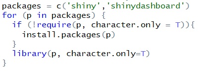
Package Validation and InstallationVarious libraries have been used to enable the research and visualization work. It is however unsure if a common user has installed the respective libraries for visualization. The code chunk below is therefore used to validate and install the relevant packages.
File ReadingsBy default, all datasets are stored under the sub-folder “data”. This allows an universal approach to read the data files, regardless where the master folder is stored. We then used read_csv to read all the relevant datasets. E.g. honeypot <- read_csv ("data/AWS_Honeypot_marx-geo.csv") where “honeypot” is the filename we refer to through the code chunks. To allow command of “read_csv”, either package of “tidyverse” or “readxl” needs to be installed in prior.
Data PreparationCreation of New Columns |
Design Framework and Visualization Methodologies
In designing our R Shiny application to visualise suspicious Honeypot activity, we consulted Stephen Few’s whitepaper on the common pitfalls of dashboard design[1]. We found that our initial wireframe suffered from some of the pitfalls, namely displaying excessive detail, arranging the data poorly and misusing colour. Thus, we went back to the drawing board and arrived at a new three-tiered design that avoided those pitfalls. Control ChartThe control chart is a graph used to study how a process changes over time. Data are plotted in time order. A control chart always has a central line for the average, an upper line for the upper control limit and a lower line for the lower control limit. These lines are determined from historical data. By comparing current data to these lines, we can observe whether the process variation is consistent or in unpredictable (caused by special causes of variation).
For our project, we use control chart to see if there is abnormal frequency of attempts made by IP address on the host server of Singapore that are in the data. We did the control chart using the qicharts2 package in R. The pattern of process variation from special cause is analysed and identified. We have noticed an interesting case when we are exploring the data.
User of the application can select different month period from our application to check through the pattern of underlying data. From the chart below, the month of May was selected. We can see that over the period of time on May 6 2013, the IP address from Iran attacked the Singapore server more than 400 times over a short period of few minutes. This is noteworthy as the average IP address generated around 6.6 connections per minute. The count of attack was almost 65 times greater than the average. On the technical note, the Singapore server needed to be filter out first via
filter (host == "groucho-singapore") %>%
then we create another filter function which allows user to select the month at the UI
filter (Month == input$controlchartbymonth) %>%
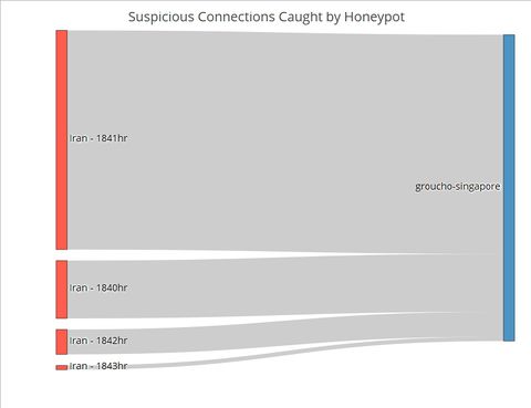
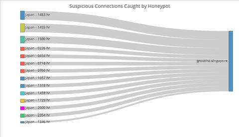
then we created below group_by commond to calculate the frequency of connection down to minutes. Note that it was developer’s choice to group down to Minute or Hour etc At last, the qic function was used to plot the graph. Network ChartPUT HERE Sankey ChartTo this point, the user has identified the day which has significant suspicious activities using the control chart, and the countries where the activities originate using the network graphs. The final step of this visualization journey is to find out the exact timing of the activities, which will allow cybersecurity experts to perform further investigations and take targeted measures. For instance, the experts could explore the data to see if the attackers were targeting certain TCP or UDP ports which by extension would suggest that certain applications running at those timings contained exploitable loopholes or backdoors. Fig. 1. The number of connections from Iran by the minute on 6 May Contrast the Sankey chart of connections from Iran to that of connections from Japan (Figure 2). While Japanese connections were more frequent (i.e. occurring at more timings across the day) than Iranian ones, there were less of them for each given minute. This stark contrast is further proof that the Iranian connections were indeed carried out as an attack. Fig. 2. The number of connections from Japan by the minute on 6 May |
Insights and Implications
It is impossible to tell if a single network connection is an attack or not. While the intent could be malicious, it could also be benign, for instance when a person makes a typo in the URL and thereby establishing a connection by mistake. |
Limitations and Future Work
The app in its current iteration is not designed for real-time monitoring. Future work would include adapting the code to ingest real-time data and create a loop to refresh the analysis periodically. The time taken to refresh the analysis would be shorter than the interval in which network traffic is analysed for suspicious activity. The app could be deployed within Big Data Architecture that use Apache Spark for analysis, which is a common solution, as the Spark engine comes with APIs for R. In fact, with enough data points, the dashboard could even be expanded to include a predictive module that anticipates where and when the next cyber-attack will take place. |
Conclusion
This project attempts to tackle the complexity of cybersecurity and visualise suspicious attacks that are highly likely to be actual attacks in a meaningful and intuitive manner. That is not an easy task given that cyber-attacks can take place at any time, from anywhere, at any intensity (e.g. number of connections) and in many different forms. Hence tools to aid cybersecurity experts in detecting and defending against cyber-attacks need to continually be refined and upgraded. This project is a first step in that direction. |
Acknowledgements
The authors wish to thank Dr. Kam Tin Seong, Associate Professor of Information Systems (Practice), at the School of Information Systems in Singapore Management University, for his patient mentorship and guidance in making this visualization project a resounding success. |
References
1. Jacob, J, “Inspecting Internet Traffic: Part 1”. Retrieved from: http://datadrivensecurity.info/blog/posts/2014/Jan/blander-part1/ on 1 July 2018.
2. L. Spitzner, “The honeynet project: Trapping the hackers,” IEEE Security and Privacy, vol. 1, no. 2, pp. 15–23, Mar. 2003. [Online]. Available: http://dx.doi.org/10.1109/MSECP. 2003.1193207
3. https://docs.aws.amazon.com/solutions/latest/aws-waf-security-automations/architecture.html
4. B. Schneier, Secrets & Lies: Digital Security in a Networked World, 1st ed. New York, NY, USA: John Wiley & Sons, Inc., 2000.
5. Marcin Nawrocki, “A survey on Honeypot Software and Data Analysis”,arXiv:1608.06249v1 [cs.CR] 22 Aug 2016
6. Few, S. (2006). Common Pitfalls in Dashboard Design. Retrieved from https://www.perceptualedge.com/articles/Whitepapers/Common_Pitfalls.pdf on 1 July 2018.
7. Few, S. (2008). Practical Rules for Using Color in Charts. Retrieved from http://www.perceptualedge.com/articles/visual_business_intelligence/rules_for_using_color.pdf on 1 July 2018.
8. Plotly. 2018. R Figure Reference. [ONLINE] Retrieved from https://plot.ly/r/reference/#scatter on 8 July 2018.
|


