Group11 Report
|
|
|
|
|
|
|
Contents
INTRODUCTION
Crime is an act punishable by law that has been timeless and has been committed practically since the start of time. Crime is prevalent in every society. Crime activities are monitored and recorded by law enforcement agencies for various purposes. One such purpose is crime analysis. Crime analysis involves systematic analysis for identifying and analyzing patterns and trends in crime and disorder. As crime data becomes increasingly available to the public, geo-spatial and temporal analysis of crime occurrence matures to provide better insights. This increased understanding will potentially contribute to enhanced law enforcement efforts and resource management.
In our research, we will be examining how geographic and date-time variables can be utilised along with crime type, vicinity and population data to better understand crime occurrences in the City of New York. Crime details were obtained from the New York Police Department (NYPD) complaint repository, along with the population data for the City of New York were obtained from the NYC Open Data Government repository for our analysis and visualizations. The research is propped in an interactive application built on R Shiny that allows users to explore, analyse and visualize data to derive insights. We have used R as the tool of choice in creating the web application due to its abundance of feature rich library of packages for statistical analysis and data visualization. With the data visualizations and user interface in this application, the user can easily filter, transform and visualize crime data to derive the insights. As a free software environment for statistical computing and graphics, R allows for availability for use by many, which would further encourage the spread of such visual analytics studies and initiatives across other fields.
OBJECTIVES AND MOTIVATION
The overall yearly crime numbers in NYC has seen a declining trend. However, in January 2017, The Public Advocate for the City of New York published an open letter to the Commissioner of the New York Police Department (NYPD) addressing the issue of high crime rates in certain neighbourhoods of NYC. It points out that the precincts associated with these neighbourhoods have shortage of detectives as compared to precincts in neighbourhoods with fewer crimes. It talks about an ongoing issue of poor resource allocation and deployment of police personnel with respect to crime numbers. For our crime analysis, we have used the NYPD crime data for the which spans crimes records across the 5 boroughs of NYC which consists of 77 precincts. We aim to provide a visual tool to observe the crime patterns with respect to time and location. On doing this, the rate of crime can be analyzed and hence forecasted for law enforcement agencies can estimate the right number of resources to deploy. Our research aims to incorporate geo-spatial and temporal analytics for better insights on crime occurrence modelled using the rich data of crime occurrences in New York City that may be replicated with increased availability of similar data in other cities across the world.
Through our analysis, we hope to address the following:
1. Provide a visual representation of crime statistics: Through our visual dashboard, we can provide a one stop view for the exploratory analysis of crime stats. The user will be able to view, compare and analyse crime stats based on type of crime, location, vicinity of crimes and time of day.
2. Forecast of crime numbers at Precinct Level: We aim to forecast and visualize the number of crimes and calculate crime rates at a Precinct level.
3. Crime Rate Calculation: Using Crime numbers and population data, we will be calculating the crime rates across each precinct.
PREVIOUS WORKS
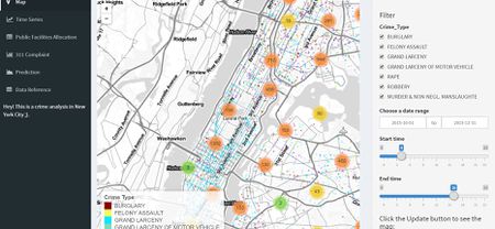
Due to the easy availability and extensive detail of these datasets, it was expected that apps and dashboards on Crime analysis in New York City and other cities and countries would be available. One such example of New York Crime Analysis is this (https://minghao.shinyapps.io/crime_analysis/).
Although this app shows the overall crime levels, it fails to visualize crime stats at a precinct level.
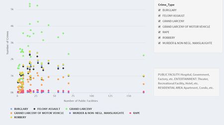
For crimes occurring at vicinity level, the app shows a scatter plot showing the number of crimes vs the number of facilities with each color representing a certain type of crime.
The vicinity is only two levels of detail i.e. Public facility and Residential Area. A break up of the type of vicinities would give the user a better representation of the type of crimes occurring at different vicinities.
While this app provides us with necessary visualizations at an overall level, our app provides visuals at a more granular level i.e. at Precinct level, which aims to provide more detailed analysis on crime locations, time periods and crime types. Our analysis also involves time series forecasting which uses ARIMA forecasting techniques to give high accuracy results for two years monthly data based on 10 years of monthly crime data at a Precinct level.
DATASET AND DATA PREPARATION
The NYPD complaint data, Precinct Data, and the NYC Population were obtained from the NYC OpenData Government site (https://opendata.cityofnewyork.us/)
NYPD Complaint Data
This full dataset consists of 5.6 million rows of crime occurrences from the year 2006 to 2016 with 23 variables (Full list of variables and descriptions are available in the Appendix). Each row consists of the date and timestamp the crime occurred. For our analysis, we are taking only few of these variables (final list of variables are present in Appendix). Time and Date formats had to be made in a uniform format, Certain categorical variables like Time of day, Type of Offence and Vicinity of Crime had to be categorized and grouped into a smaller list of categories.
Precinct Data
The Precinct level data contains information and shape files for each precinct in NYC. This data was analysis ready. (List of variables for both datasets are present in the appendix)
Crime statistics Data
The aim is to estimate the number of resources required by the NYPD based on the number of crimes (forecasted?). The datasets used for the same are the Crime Rate Dataset and the Num_Offc Dataset. The two tables are of the same format. They each contain 77 records corresponding to each of the precincts while the columns represent years from 2010 to 2018. The tables contain year wise aggregates of the Crime Rate and the Number of Officers required for deployment.
(The calculations and the data preparation for the same can be found in the appendix)
NYC Population Data
The Population data is the Precinct level population data for the year 2010. For our crime rate
analysis, we will estimate the population for the years with reference to the percentage increase
(List of variables for both datasets are present in the appendix).
DESIGN FRAMEWORK AND VISUALIZATION METHODOLOGY
Considering the best practises of visual analytics our analysis of the NYPD Crime dataset is done the following way:
1. A high-level view on the overall crime numbers and statistics.
2. Using the time-series data for an ARIMA forecasting.
3. Crime Statistics and Deployment of Resources.
The first level of analysis is an overview of the crimes and their corresponding features in the City of Newyork. The crimes are depicted at the 77 precincts present in the five boroughs of Bronx, Brooklyn, Manhattan, Queens and Staten Island.
For the high level analysis we are using the following plots:
Map
Geospatial Crime Plot and Choropleth
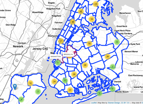
The geospatial map Plots the location of crimes on the map based on the precinct. It shows the aggregate number of crimes and also shows each crime plot on the map. The user has the option to select the types of crimes, Date (year, Month, and dayof the week) and Time Range selection option to see an overview of the distribution of the crime across the city. The map also has the precinct boundaries which can be seen when the user hovers over the map.
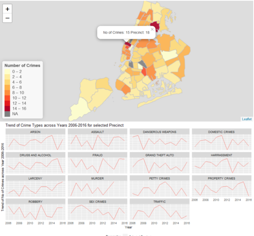
For the chloroplet map, the user has the option to select the type of crime and the date range (Calendar pop-up). The Choroplet shows the aggregate number of crimes per precinct. On selecting a precint from the map, the user can see the precinct number and the number of crimes for that precinct.
The crime numbers for all types of crimes across all the years for the selected precinct are shown in the form of facet line graphs below the choroplet. This is generated as the user clicks on the precinct
Geo Facet Plot
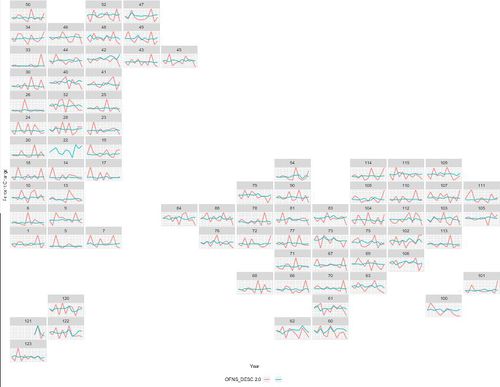
The geofacet package In R allows for visualizing data for different geographical regions by providing a ggplot2 function facet_geo(). The faceting of the plot results in arranging the grid within the geographical outline specified.The geo facet is used here for depicting percentage change of crime across the years 2006 to 2016.
For the data preparation we needed two tables. One was the input dataset and the other was the grid for the visualization. The input dataset was a table with number of crimes aggregated by Year, Precinct Number and Crime Type. From the number of crimes, we calculated the percentage change from year to year for each type of crime, to be depicted in the visualization.
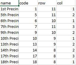
We also created a grid of New York City precincts using location data (latitude and longitude), for the geo facet. Using this we created the position data table. The position data set contains the name, the code, the row and the column for the positions on the grid. The code is the precinct value. This table was used in the grid option of the facet_geo function.
Geom_line was used to create the line chart to show the trend. The facet_geo() function was used along with the ggplot plot function to facet the plot to create a facet which gives the outline in the form of different grids similar to the location of the precincts in New York.
The geo facet tab has two dropdowns for the user to select at most two crime types at a time. On selecting the type of crime, the Geo Facet shows the trends of the percentage of the crime across the year for different precincts in the form of map-grid created. The enable and disable option allows the user to select more than one type of crime for comparison.
Reference: https://github.com/jayjacobs/ggcal
Calendar Plot
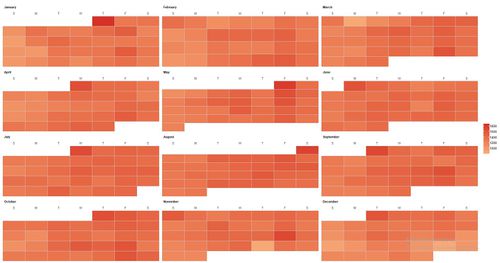
The Calendar plot is used to observe the patterns of crimes at a daily level. The plot shows number of crimes, across the weeks and months, of a year. The data used for the Calendar plot is aggregated for every year, at the daily level for all months, based on the user’s input. The user can select the Crime Type and the Year from drop downs, to vary the plot as required.
For the plot, variables such as “Month”, “Day” and “Week Number” were derived from the date-time stamps in the original dataset. It creates a plot based on a vector of dates and fill values. Based on the user’s input , the data set is called and the crime number values are aggregated dynamically. This is assigned to the fill values vector. The range of dates is assigned to the date vector. The ggcal() function is called to plot the same. The “scale_fill_gradient” is used to set the colour range by providing hexadecimal values for the high, medium and low gradations.
The package used for the calendar plot is “ggcal”. It’s a custom package that has been developed. It can. This can be imported into R using the following command: devtools::install_github("jayjacobs/ggcal").
Reference: https://github.com/jayjacobs/ggcal
Sunburst
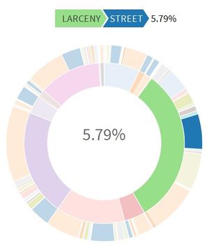
A sunburst plot is used to depict the relationship between variables as sequenced data. For this the “sunburstR” R package is used. The user can choose the year and time of day of the crime. The graph plots Plots the type of crime and the vicinity where the crime occurred based on this input. The package allows the data in the format of “Sequence” followed by the “Number”. The “Sequence” column contains the order of variable values separated by a hyphen, in this case the format is “ Type of Crime – Vicinity”. The “number” column contains the corresponding number of crimes based on the aggregations.
The user can view the different type of crimes and the vicinity along with its share with respect to the total crimes.
The Time Series Forecast
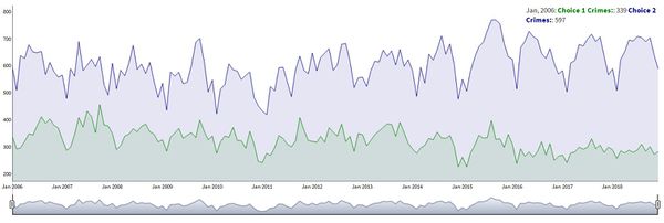
The data prep for the time series was done by using the monthly aggregate values for the number of crimes for the following crimes:
• Traffic
• Robbery
• Larceny
• Grand Theft Auto
• Drugs and Alcohol
• Dangerous Weapons
• Assault
Crimes such as homicide, sex related crimes were excluded due to their unforeseeable nature. The data present spans across the years 2006 to 2016.
The monthly level was chosen because Daily Level meant forecasting two years’ worth of daily data (730 data points) which affected the forecast accuracy whereas Monthly level meant predicting 24 data points and we obtained better accuracy.
The forecasting was done in R using auto.ARIMA() AND THE Forecast function as part of the forecast package in R. The forecasted crime numbers for each precinct were obtained for the years 2017 and 2018.
The dygraphs package was used to plot the time series values across the years (inclusive of the forecasted values). The “xts” package was used to convert the month and the year for the dyGraph plot. The forecasted values are highlighted in the graph using the function dyShading().
For the R shiny visualisation, user has the option to vary the time frame using the slider. The user can select two precincts to compare the crime numbers. The graph shows the two points (based on the mouse hover at the specified time).
Crime Statistics Calculation and Representation
The final step of the analysis is to aid the aim of calculating the number of sources to be deployed for all precincts in New York. For obtaining this, a series of calculations were made for each of the 77 precincts present at the Year Level (2010 to 2018), in the following steps:
1. The population data for New York City was downloaded from for the year 2010. The percentage increase of the population for each of the five different boroughs is as follows:
2. The population for the years 2010 to 2018 was estimated using the given percentage changes.
3. After the population estimation, the yearly crime rate was calculated:
Note: The number of crimes taken for the above calculation, for the years 2017 and 2018 were taken as a summation of the Forecasted values from the Time Series.
4. The deployment of resources (Number of police officers) was then, calculated using the statistic[1]
Heat Map
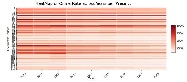
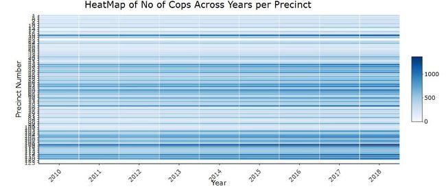
For the Shiny App visualisation, the Crime Rate and The Number of Police officers’ tables were used. The table consists of aggregate year wise values of the Crime Rate and Police Officer Number with the Precinct number as rows and years 2010-2018 as columns. The precincts 14, 22, 122 and 123 were excluded from the analysis due to being outliers. The R package “HeatMaply” was used to depict the variation in values as a heat map. The precinct numbers were converted into Row Indices and the tables were transformed into matrices. This matrix was used as input to display the heatmap using the heatmaply() function. An appropriate colour gradient was chosen. Adding the Plotly() functionality to it made it interactive on the mouse hover.
The first heat map depicts the Crime Rate from the years 2010 to 2018 for each of the 77 precincts of the City Of New York. The red colour gradient was chosen as representative of crime rate.
The second heatmap shows the Number of Police Officers from the years 2010 to 2018 for each of the 77 precincts of the City of New York. The blue colour gradient was chosen as representative of the colour gradient.
For both the heatmaps above the X Axis represents the years and the Y Axis represents the precincts.
INSIGHTS AND IMPLICATIONS
While the overall crime numbers and rates have reduced over the years, certain crime types have seen an increase. Brooklyn has the highest overall crimes numbers, but places like The Bronx has the highest crime rates for Dangerous Weapons and Drugs and Alcohol related crimes. Manhattan has the highest number of Sex related crimes compared to the other boroughs. The NYPD should deploy their specialized crime units at the affected boroughs based on these findings. Traffic offences have increased significantly over the years and tend to be on the higher side during the evening implying the NYPD traffic unit should deploy extra officers and resources during these peak hours.
Most crimes like assault and harassment occur at places of residence and on the street, while crimes like larceny tend to occur more at stores and supermarkets as well. While most major crimes like dangerous weapons, assault, sex crimes and drugs and alcohol related crimes occur at night, Burglaries are in high numbers during the afternoon and evenings. The NYPD can plan their patrolling patterns and shifts using these insights.
From a seasonal point of view, overall crimes numbers are low during the winter season i.e. from November to February. Holidays like Christmas and Thanksgiving saw low crimes numbers, but other significant holidays like Halloween, 4th of July, and St. Patricks day saw an increase in the number of crimes. Appropriate deployment of police officers and patrol units should be made during these days and season
FUTURE WORK
With the availability of Police Officer count at a precinct level, an optimization model along with our crime analysis, crime rate and police officer estimation calculations can be made to efficiently allocate the right number of police officers at a Precinct level.
The NYPD crime data can be utilized for creating a location based predictive model like Epidemic-Type Aftershock Sequence Model for Crime Prediction. The ETAS model will utilize past crime data such as location, time of day and type of crime to predict hotspot locations for future crimes based on probability values. Visualization of findings will help assist law enforcement agencies for strategic or tactical action. The ETAS algorithm is based on the foundation of reaction-diffusion models of crime.
ACKNOWLEDGEMENTS
The authors wish to thank Prof. Kam Tin Seong for his guidance on the various analytical techniques and R packages that may be used and feedback on visualisation techniques. We would also like to thank Tan Ying Xuan, Nurul Asyikeen Binte Azhar and Rachel Tong of Term 1 2017-18.

