Group25 Proposal
|
|
|
|
|
|
|
Introduction
Buses forms a significant part of public transport in Singapore, Singapore's bus system has an extensive network of routes covering most places in Singapore, with over 3.9 million rides taken per day on average as of 2016, and is the most economical way to get around, as well as being one of the most scenics. There are more than 300 scheduled bus services, operated by SBS Transit, SMRT Buses, Tower Transit Singapore and Go-Ahead Singapore. The newest bus operator, Go-Ahead Singapore started operation from 4 September 2016. There are also around 4,600 buses currently in operation.
Transportation plays a cardinal role in escalating the mobility, prosperity, and connectivity of a community. The more the people are satisfied with the public transportation, the more they tend to use it. The more the people use public transportation, the higher are the chances of them not buying a personal vehicle. The higher the chances of people not buying a personal vehicle, the lesser we will see cars running on the road. The lesser the cars running on the road the lesser will be the pollution generated. So, If we look at the macro picture, we see that not only the society gets affected by public transportation system but also the whole world. And, everything then comes down to the satisfaction level of the people using it.
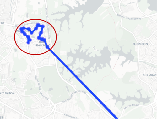
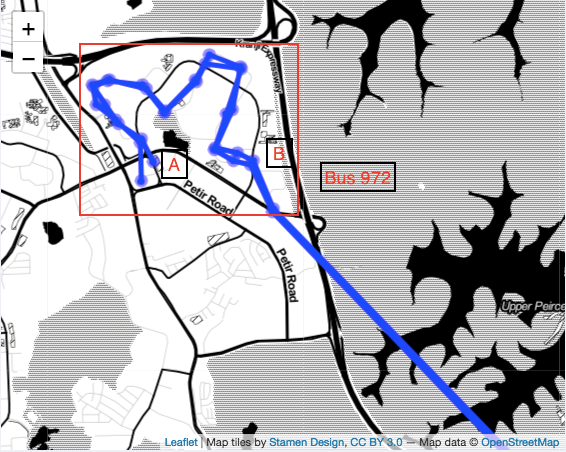
Our main objective in this project was to look for bus routes having similar looping pattern as bus 972 as shown below, we call such routes as problematic routes.
These problematic routes can result in a substantial waste of time for the people traveling from the starting point to its destination point as they have to unnecessary travel through all the bus stops in the loop until the bus takes the highway route. This futile traveling leads results in a waste of time, waste of money and bus overcrowdedness.
Example of the problematic bus route(Bus - 972)
|
|
Inspiration
According to Travel+Leisure and other such reputed websites, Singapore comes second in the list of top 15 countries with the best land transportation system. Because of the effective connectivity of bus stops and MRT stations, economic ticket rates and less traveling time, people usually go for using buses as their primary means of transport. As we can see below according to the data we found out that in the year 2016 48.2% of the total Singaporeans were using Buses and since then the numbers have been going up. This ever-increasing number of bus commuters require us to pay more attention towards making bus routes and buses more efficient for the commuters.
A peek into the proportion of people using different transportation and the trend of number of people using bus over the years
|
|
Review and critic
One of the problem in working on optimizing the transit routes is the conflict of interest between operators and the bus commuters. While having a very connected and dense network is very beneficial for the passengers, building such a network can actually be very expensive to the operators. Thus, keeping the operators and the passengers on the same page can be really difficult and this is what actually leads to a not very optimal solution.
Van Nes and bovy in (200)did a study on the importance of urban transit network design. They stated that six kinds of objective functions from the three main perspectives, the passenger, operator, and social welfare perspectives were mainly used in past studies. The objectives are listed below:
- Minimize passenger time travel, which includes access time, waiting time and in vehicle time.
- Minimize passenger travel time given a limited budget.
- Maximize cost effectiveness which is defined as the ratio of the total revenues minus operational cost.
- Maximize operator profit which is the total revenues minus the operational cost.
- Minimize the total cost that is the operational cost plus traveler cost.
- Maximize the passenger load in the public transport.
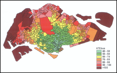
These six objectives were made into an analytical model based on an assumed urban area of one-kilometer square. This area was served with one or more parallel transit lines having uniform line spacing. The stop spacing for all the transit line was also uniform. The transit fares were fixed. The focus was on the influence of the objective on the resulting key design variables i.e. stop spacing and line spacing. After comparing the different network attractiveness and performance characteristics resulting from different objectives, Van Nes and Bovy concluded that minimizing the total cost was the most suitable objective in urban transit. There have been many other works as well on optimizing the Singapore transportation services and all of them are directed towards solving a different kind of problem. Among such works, There is a paper done by students of NTU. This project is tailored in a way of optimizing public bus transport network in Singapore using spatial parameters and demographic information Part of their research was on Travel Time Analysis, of which their main focus was on travel time to place of employment as the destination. With the necessary available demographic data from employment departments, they measured the travel time to inter-zone level. The average travel time to all employment zones by bus, ATEbusi is used as the measure of accessibility of bus services for zone i.
|
|
where Ej is employment in zone j, tijbus is travel time from zone i to zone j by bus.
|
|
Taking these use cases as references, we have based our research with new problem statements by studying if there is a need for rerouting of the bus routes by estimating the travel time and to explore the bus complexity through Network Model.
Source of Dataset
| Data | Source |
|---|---|
| Singapore Bus Stops | https://www.mytransport.sg/content/dam/datamall/datasets/LTA_DataMall_API_User_Guide.pdf |
| Singapore Bus Routes | https://www.mytransport.sg/content/dam/datamall/datasets/LTA_DataMall_API_User_Guide.pdf |
| Singapore Bus Services | https://www.mytransport.sg/content/dam/datamall/datasets/LTA_DataMall_API_User_Guide.pdf |
| MRT Stations coordinate | https://www.mytransport.sg/content/dam/datamall/datasets/LTA_DataMall_API_User_Guide.pdf |
About Dataset
Our data is collected using LTA's API to access their database and scrape the data by using Python. The dataset that we currently have are:
1. Singapore Bus Stops.
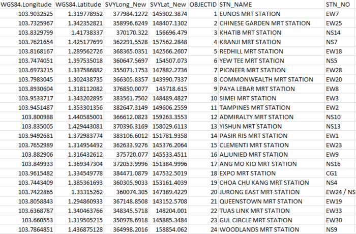
This dataset contains a list of all currently existed Bus Stops across whole Singapore. It contained 4,985 data consist of a unique code as well as the latitude and longitude coordinate for each Bus Stop. However, as the coordinate is based on WGS84(World Geodetic System), we have to convert the coordinate into a SYV21 system. Detailed step to convert will be explained in the report.
Singapore Bus Stops
|
|
2. Singapore Bus Routes.
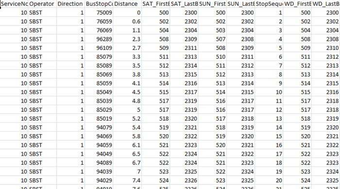
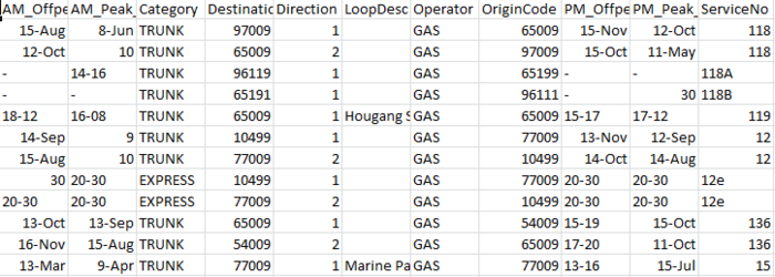
This dataset contains a list of all route that Singapore bus currently have. It contained 25,959 data consist of bus stops code and the bus service number, as well as the distance between each bus stops that buses follow.
Singapore Bus Routes
|
|
3. Singapore Bus Services.
This dataset contains a list of all Singapore Bus that currently in service. It contained 1,410 data consist of buses code and the destination code for that bus.
Singapore Bus Services
|
|
4. MRT Stations coordinate.
This dataset contains coordinate of all Singapore MRT Stations. Unfortunately, the file is in SHP and we can only open one of them .SHP file using JMP. Therefore, there is no detail regarding the name of the MRT stations. We will have to manually match the data with the MRT Station in google map based on this coordinate. The coordinate is based on SVY21 system.
MRT Stations coordinate
|
|
Design Framework
According to the above mentioned problem statements, we have divided our application framework into 2 parts - Rerouting Analysis & Network Analysis.
1. Rerouting Analysis
To understand the rerouting of bus routes and too see which buses required rerouting we used visualisation of the bus route path by plotting on Leaflet Map along with data analysis techniques.
Some of the buses take a substantial amount of time than actual to travel from starting point to the destination. One Such route is “972”.
From Figure 1, we can see that Bus “972” circles around Bukit Panjang picking up passengers and then transits into the highway. For a person who starts at starting point and to reach the destination, it takes him more time than actual as extra time is lost in circling around an area instead of taking direct route.
Bus 972
|
|
1.1. Identify Routes that require Rerouting
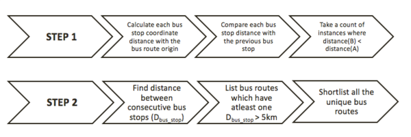
Our main challenge was to find bus routes similar to “972”. For this purpose, we built a rerouting algorithm to identify the buses similar to “972”.
Flow diagram to show the working of our rerouting algorithm
|
|
From Step 1, we selected bus routes which had count > 4 because for a bus to circle or loop around an area, generally it will have a minimum of 8 bus stops in the loop, so we selected count 4 (half of 8) . In step 2, we considered distance between bus stops to check if the bus stop is taking a highway or not. We then shortlisted common routes form both steps and obtained 44 bus routes which satisfied both criteria from step 1 and step 2. Out of 44 bus routes, we manually shortlisted 22 bus routes with the help of Leaflet map Visualisation of the bus route path.
Recommended to introduce Feeder Buses in these routes 110, 23, 39, 5, 502, 518, 52, 538, 59, 129, 81, 85, 858, 972, 982E
Night Riders – 1N,2N, 3N, 4N, 6N, NR1, NR6
1.2. Identify Optimal Bus Stop to Introduce Feeder Bus
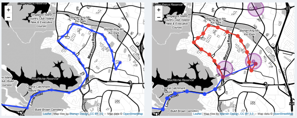
For each of the above routes, it is important to find optimal bus stop where the feeder buses should be introduced. Firstly, we intuitively select one bus stop from the visualization of the bus route on map where we want to introduce feeder bus. We used “observe event” function in leaflet to capture the selected bus stop. Taking th index of the selected bus stop for a route, we have sliced the main route data into Feeder Bus and Transit Bus. The same is plotted on the Leaflet map as seen in Figure 2. The feeder bus route is colored in red and transit bus route colored in blue. The purple colored circle represents the nearest MRT Stations.
Slicing the original route into two parts
|
|
2. Network Analysis
We built a network model on Singapore Bus Routes to analyze the activity of the bus stops and to understand the connectivity of a selected bus stop.
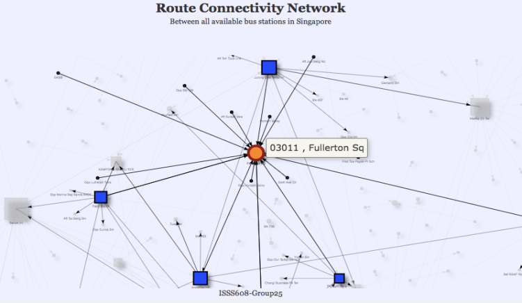
Key thing to note in the Network Model – This Network Model is built on the origin-destination level of each Bus Stop and corresponding Bus Routes. Blue Square represents Bus Interchange and Purple Circle represents Bus Stop and the selected bus stop is highlighted in orange.
We performed Network Analysis at 2 levels – Degree Centrality (To analyze the activity of Bus Stops) and Betweenness Centrality (To understand the connectivity of the selected bus stop)
2.1. Activity of Bus Stops-
For a selected bus stop, there are a lot of in and out bus routes passing through it. To represent this in a network, we used the Degree Centrality which represents the node strength of bus stop denoted by the size. Therefore, the bigger the size, the more strength a node has, and thus bigger activity for the bus stops. For example, The Fullerton Square bus stop has high activity similar to the Bus Interchanges, it is clearly visible from the size of the bus stop which is comparable to the Bus Int. Such Bus Stops with good node strength should be considered for upgrading to the Bus Interchange with better infrastructure that is convenient for boarding and alighting of the passenger’s.
Route Connectivity Network
|
|
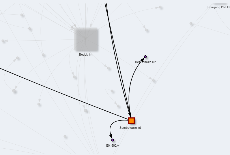
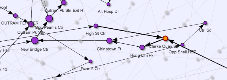
Ideally, all Bus Interchanges should have bigger node strength, but we found few Bus Interchanges with less activity/node strength like the one highlighted below.
Example of Bus Interchanges With Less Activity
|
|
2.2. Connectivity of Bus Stop –
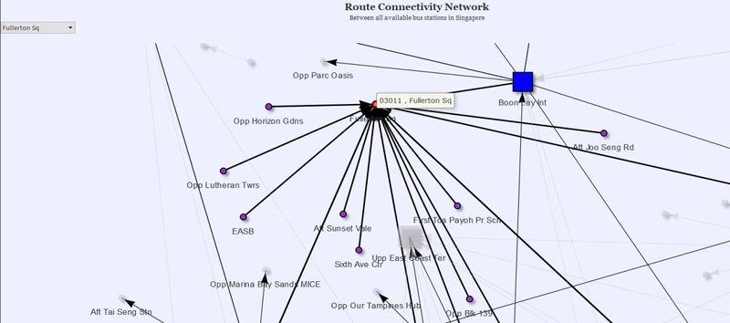
To understand how well a bus stop is connected to other places/destinations, we have analyzed the connectivity of Bus stops by calculating the Betweenness centrality in the network modeling. This quantifies the number of times a node/bus stop acts as a bridge along the shortest path between two other nodes/bus stops. The size implies the connectivity of the bus stop. For the same bus stop – Fullerton Square, it is seen that the Betweenness Centrality is very little as seen by its size. Therefore, we can interpret from the model that even though the activity is more for Fullerton Square, the connectivity (i.e. the complexity) is less.
Route Connectivity Network
|
|
Although this behavior is interesting, what we want is actually the opposite. We want to see bus stops with a low degree (i.e. low in activity) but high in Betweenness. This means that those bus stops is connecting a lot of other bus stops and in turn, will be suitable for the upgrade into either interchange or terminal. However, in our initial analysis, we have not managed to find such bus stops. This is further proofing that, at least in term of bus services origin and destination, Singapore bus network is already quite efficient.
2.3. Connectivity Detail
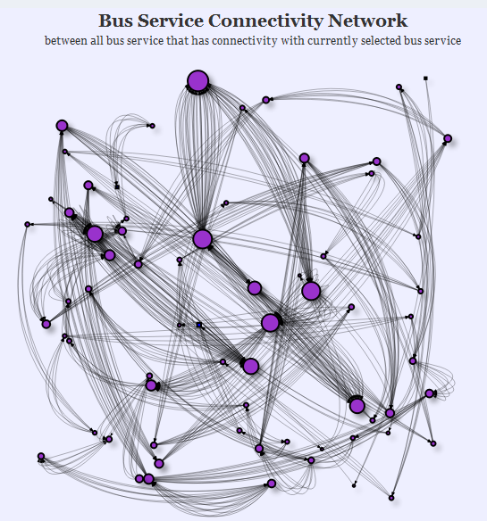
We also created a network model for the user to be able to analyse the bus in more detail level. Here, the user can the detail network model for any of the selected bus service code and see the connectivity of that bus with the other buses. For example, the following network model is from bus service “167”. It travels from Sembawang interchange to Bukit Merah interchange.
Bus Service Connectivity Network
|
|
The objective for this network model is to allow the user to see in which area these buses travelling together (i.e. sharing the route together). In order to avoid bus bunching scenario (the same bus at the same route in the same time), the user can use this model as a reference to disperse the route. Notice that in some area, the line is more intense than the other and the size of some bus stops is bigger than the other. This indicates that bus service “167” shares route with a lot of other busses in that area. In fact, overall, bus “167” shares its route with 89 other busses, as shown below.
Output Illustrating the Connectivity of the Bus
|
|
2.4. Experimental Connectivity Detail
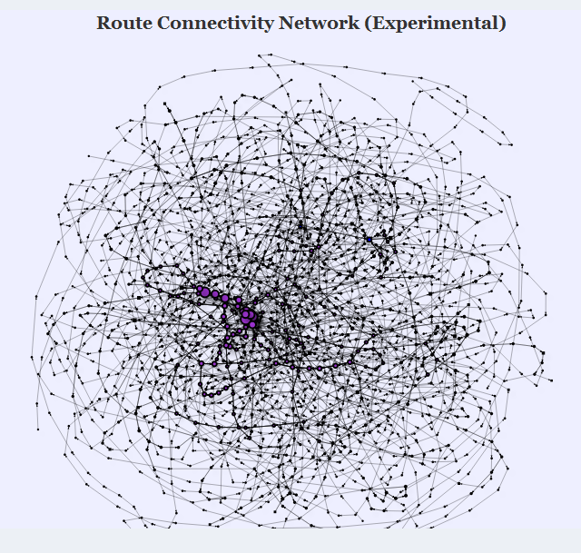
In order to see the detail of previous section networks, we created another network analysis that allowed the user to see the entire bus route associate with the selected bus service. Instead of just showing where they share the route, this network graph actually plots the entire bus stop all of associated bus service as a node along with their route. However, because of hardware limitation, this plot is too heavy to be fully utilized on our machine, though it is capable to analysing small detail. Using bus “167” again for example, below is the sample network graph.
Route Connectivity Network
|
|
The network graph above shows not only bus service “167” route, but also plot the other 89 busses route. This will give the user the ability to analysing each and every bus stop connection within “167” route, or any other bus services route. One of the analyses that can be done in this network graph is to see the complexity of the bus route itself. Below is the small highlighted area inside the network graph.
Zoomiing inside the Network Graph
|
|
Notice that in only this small area of the network graph, there exists multiple bus routes merging. Based on this, the user can then analyse which part can be considered for optimization.
Issues & Problem
1. Problematic Bus Routes
Some of the buses take a substantial amount of time to travel from starting point to the destination. For example, the route given below is of bus number 972, As we can see for a person to travel from the starting point to the ending point, he has to travel through a lot of bus stops which actually doesn't fall on his route which results in wasting the time and also money of the commuter. These kinds of buses usually circle around an area, picking all the passengers up and then transits into the highway. Now, such bus routes can cause overcrowding in buses and delay for the passenger alighting at the end of the circle before the transit.
2. Activity of Bus Stops
While visualizing the connectivity of the buses from their starting bus stop to their destination bus stop, we realized that there were few bus stops whose activity i.e. buses coming in and going out from that particular bus stop was similar to the bus interchanges. We call such bus stops as potential bus stops which can be upgraded to bus interchange.
3. Connectivity of Bus Stop
Connectivity is another measure which has to be considered before coming to a conclusion that a bus stop can be upgraded to a bus interchange. So, only when the connectivity of the potential bus stops as explained above is really good i.e. the potential bus stop is connected to various other destination points we can suggest that these bus stops can be converted to bus interchange.
Challenges
1. To detect if the circling path is to the starting or ending of the bus route, we have used the index of the selected bus stop
If,
index(selected bus stop) > total bus stops in the route/2,
then it is considered as looping at the end of bus route otherwise it is considered as looping at the starting of the bus route.
To measure if the selected bus stop is optimal or not, we have anlysed it by computing the time saved if feeder bus is introduced at that point.
To compute Duration/Time Taken parameters, we applied basic speed formula, i.e, speed = distance travelled/time taken.
We assumed that the average speed of the bus is 30km/hr and distance travelled is the absolute Euclidean Distance calculated from the SVY21 coordinates of the bus stops.
Actual Time Taken = (Distance of the bus route(km)/Average Speed(kmph)) * 60 + (buffer of 0.5min stop at each bus stop)
Transit Time = (Transit Distance of the bus route(km)/Average Speed(kmph)) * 60 + (buffer of 0.5min stop at each bus stop)
Time Saved = Actual Time Taken – Transit Time
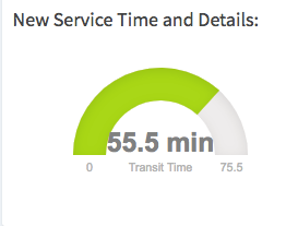
Gauge to reflect new service time and details
|
|
Visualizing actual time taken and the time saved
|
|
Apart from time saved, we considered nearest MRT Station also a parameter to decide the optimal bus stop to introduce the feeder bus because when the feeder bus picks up the passengers around an area, the passengers can either select the nearest MRT station to travel further or to take respective bus.
From the MRT stations dataset we gatthered, we for the selected bus stop, we calculated the coordinate/Euclidean distance of that bus stop to each of the MRT stations and then found the nearest MRT station to the selected bus stop. We can also see the same visually from the graph as shown in Figure 2 with purple circles.
Distance to the Nearest MRT station
|
|
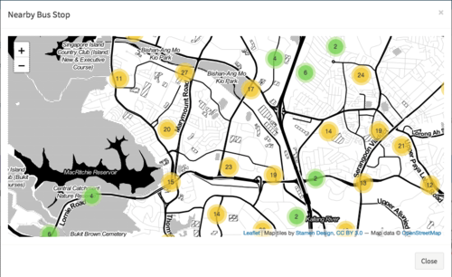
Along with the Nearest MRT Station, for a quick analysis and exploring the number of bus stops near the selected area, we built an interactive point symbol map using “Marker Cluster” package in R as shown in below, which clusters the bus stops and shows number of bus stops in that area.
Visualizing near by bus stops
|
|
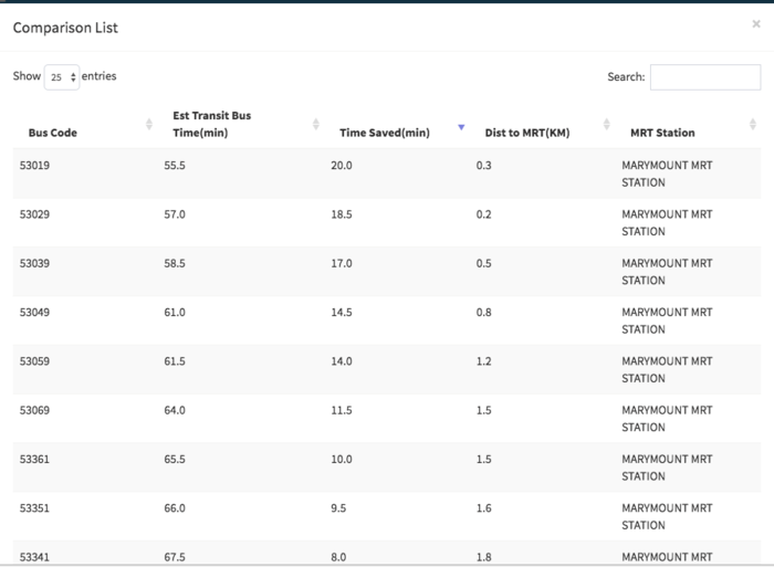
In the second step, we compare the first selected bus stop with other nearby bus stops to find the most optimal cut for the feeder bus. A nested for loop was used to loop across each bus stop and calculate the above mentioned parameters. A comparison list built is as shown below:
Comparision List
|
|
Now, from this comparison table, user can analyse which is the optimal cut for introducing feeder bus and rerouting the main bus route.
2. Challeneges in Network Analysis
2.1. Data Manipulation
One of the biggest challenge of the network analysis is data manipulation. Our network analysis required extensive data manipulation, from constantly changing the datatype, combining multiple column from multiple data, merging multiple dataframe, etc.
2.2. Visnetwork Package parameter
Our network graph is created using visnetwork package, and there are extremely many parameter inside visnetwork package. To be able to understand what each parameter used for required extensive learning of visnetwork.
2.3. Network Layout
Because the huge amount of nodes and edge, determining the best way to visualize the network is not easy. We go through multiple trial and error to finally manage to find the best way to visualize the network graph.
2.4. Hardware Limitation
Currently, our machine can barely render the experimental network graph, and to go deeper level of detail is virtually impossible. Note that our final datasets contain more than 4900 nodes and would have more than 20000 edges
