Group01 Report
LINK TO PROJECT GROUPS:
Please Click Here -> [1]
Cybersecurity
|
|
|
|
|
Contents
Introduction
PUT YOUR CONTENT HERE |
Objective and Motivations
PUT YOUR CONTENT HERE |
Previous Works
PUT YOUR CONTENT HERE |
Dataset and Data Preparation
PUT YOUR CONTENT HERE |
Design Framework and Visualization Methodologies
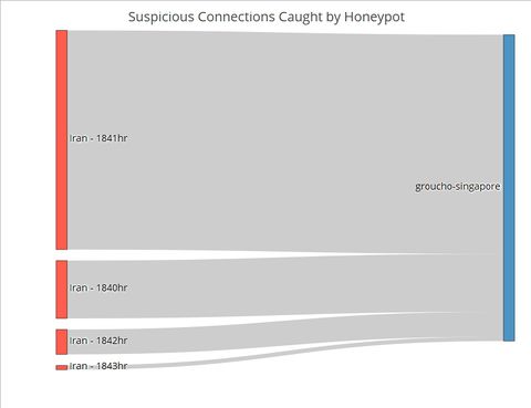
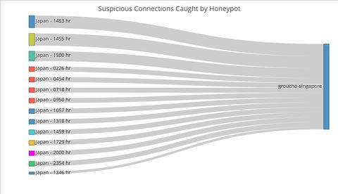
In designing our R Shiny application to visualise suspicious Honeypot activity, we consulted Stephen Few’s whitepaper on the common pitfalls of dashboard design[1]. We found that our initial wireframe suffered from some of the pitfalls, namely displaying excessive detail, arranging the data poorly and misusing colour. Thus, we went back to the drawing board and arrived at a new three-tiered design that avoided those pitfalls. Control ChartPUT HERE Network ChartPUT HERE Sankey ChartTo this point, the user has identified the day which has significant suspicious activities using the control chart, and the countries where the activities originate using the network graphs. The final step of this visualization journey is to find out the exact timing of the activities, which will allow cybersecurity experts to perform further investigations and take targeted measures. For instance, the experts could explore the data to see if the attackers were targeting certain TCP or UDP ports which by extension would suggest that certain applications running at those timings contained exploitable loopholes or backdoors. Fig. 1. The number of connections from Iran by the minute on 6 May Contrast the Sankey chart of connections from Iran to that of connections from Japan (Figure 2). While Japanese connections were more frequent (i.e. occurring at more timings across the day) than Iranian ones, there were less of them for each given minute. This stark contrast is further proof that the Iranian connections were indeed carried out as an attack. Fig. 2. The number of connections from Japan by the minute on 6 May |
Insights and Implications
It is impossible to tell if a single network connection is an attack or not. While the intent could be malicious, it could also be benign, for instance when a person makes a typo in the URL and thereby establishing a connection by mistake. |
Limitations and Future Work
The app in its current iteration is not designed for real-time monitoring. Future work would include adapting the code to ingest real-time data and create a loop to refresh the analysis periodically. The time taken to refresh the analysis would be shorter than the interval in which network traffic is analysed for suspicious activity. The app could be deployed within Big Data Architecture that use Apache Spark for analysis, which is a common solution, as the Spark engine comes with APIs for R. In fact, with enough data points, the dashboard could even be expanded to include a predictive module that anticipates where and when the next cyber-attack will take place. |
Conclusion
This project attempts to tackle the complexity of cybersecurity and visualise suspicious attacks that are highly likely to be actual attacks in a meaningful and intuitive manner. That is not an easy task given that cyber-attacks can take place at any time, from anywhere, at any intensity (e.g. number of connections) and in many different forms. Hence tools to aid cybersecurity experts in detecting and defending against cyber-attacks need to continually be refined and upgraded. This project is a first step in that direction. |
Acknowledgements
The authors wish to thank Dr. Kam Tin Seong, Associate Professor of Information Systems (Practice), at the School of Information Systems in Singapore Management University, for his patient mentorship and guidance in making this visualization project a resounding success. |
References
[1] Few, S. (2006). Common Pitfalls in Dashboard Design. Retrieved from https://www.perceptualedge.com/articles/Whitepapers/Common_Pitfalls.pdf on 1 July 2018. |


