Group03 Report
Perceiving Evil: The Study of the Corruption Perception Index
|
|
|
|
|
|
|
Contents
Issues and Problems
First launched in 1995, the Corruption Perceptions Index (CPI) has been widely credited with putting the issue of corruption on the forefront of the international policy agenda. Transparency International (TI), is an international non-governmental organization based in Berlin, Germany which acts to combat global corruption and prevent criminal activities arising from corruption.
TI publishes the CPI, annually ranking countries "by their perceived levels of corruption, as determined by expert assessments and opinion surveys. The CPI generally defines corruption as "the misuse of public power for private benefit".
However, it has been a challenge to validate whether CPI is an accurate index to represent corruption. For instance, there is criticism in the usage of CPI’s methodology. Some flaws pointed out included: (1) it is too simplistic to capture CPI by a single score, (2) by measuring perceptions and not actual corruption itself, CPI will probably be reinforcing clichés and stereotypes and lastly (3) CPI measures the public and not private sectors.
Motivations and Objectives
The team’s motivation for this project is two-fold, firstly to understand if the CPI methodology is indeed too simplistic by looking at the underlying data that forms the final CPI for each country. Secondly, the team will like to observe if certain stereotypes that the public may have for different countries and / or regions are justified.
The CPI currently ranks 176 countries on a scale from 100 (very clean) to 0 (highly corrupt). Denmark is the least corrupt country in the world, ranking consistently high among international financial transparency, while the most corrupt country in the world is North Korea, remaining on 8 out of 100 since 2012.
To verify the trends and patterns the CPI has with world statistics, the team referenced the World Bank Open Data website and married the World Development Indicators (WDI) with the CPI data set from Transparency International (from 2012 – 2016).
Our study aims to create an exploratory data visualization app that provides an overarching view of a country’s CPI with its underlying WDI, with emphasis on several aspects:
- Understanding the underlying survey results and metrics which form the final CPI numbers
- Find out if there are correlations between CPI and the 3 Es:
- Equality for Gender (e.g. labour participation rates)
- Economy (e.g. GDP, income gap)
- Education (education attainment, government expenditure on education), through looking at the relevant WDIs.
The reason these 3 topics were selected was that there were previous studies that touched on the relationships between CPI and education [ref 9], equality [ref 10] and economy [ref 11]. In this way, we hope to debunk any stereotypes and myths that the public has for each country.
Review and Critic on Past Works
Visualizing World Bank data is not a novel effort and there has been extensive work done to show the data in an easy-to-understand format, and the team sought to emulate such efforts.
Stream Graph from Column Five
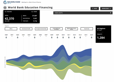
Column Five, a media company that helps to conceptualize and design visualization for other organisations came up with a stream graph implementation of educational financing data for the World Bank.
The Stream Graph is a form of stacked area graph that has values displaced around a varying central baseline. It is most useful to display changes in data over time of different categories through a graph that resembles a flowing stream. The team tried implementing this visualization over multiple categories but due to the number of countries involved, even filtering did not provide a suitable visualization for the data. When the stream graph is implemented on a singular data field, e.g. CPI, it looked like a stacked area graph and did not provide additional useful knowledge.
Circular Graph
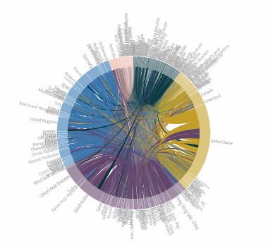
Circular graphs such as the chord diagrams are popular as they are useful to represent complex information, specifically information that spans numerous categories and if the data set consist of a long axis to show the relationships between the categories. Previous groups (e.g. Group 1 from the 2017/18 Term 1 cohort) have did a commendable job representing complicated data such as the World Bank data set through Circlize in R.
Having said that, there are still limitations to this visualization. For example, as the field of view is limited to 360 degrees, there is a limit to how many variables can be shown at once. Also, it gets hard to compare the different countries’ values as there are over 150 countries. Each country’s values could be accessed through zooming into the visualization, but there are limitations in comparing data region to region or countries within a region. It is an aesthetically pleasing and comprehensive data visualization, but its practicality could be improved. The example below is a Remittance Flow for countries under the United Nations. Again, the countries seem to be clustered together and its readability is affected.
Visual Design Framework
The general approach by the team is to provide a user-friendly interface for data visualization, scalability for future expansion of more fields and self-initiative enough for first-time users to garner insights from. There is a trade-off between aesthetics and usefulness, but the team choose the most appropriate visualizations through an iterative process of acceptance and rejection, before deciding on which techniques and packages are used in the final product. The process below shows our framework (which will be explained in detail in the following sections):
Back to Project Group Page


