Group12 Visualization
 Have the Nations really progressed ?
|
|
|
|
|
|
|
|
|
Contents
Insights
We can broadly divide our approach into two types:
Time series graphs are important tools in various applications of statistics. When recording values of the same variable over an extended period of time, sometimes it is difficult to discern any trend or pattern. However, once the same data points are displayed graphically, some features jump out.
A Map chart allows us to visualize spatial relationships in data by indicating data on geographical maps.
Visualization
We use a lot visual metrics to formulate the trend of each indicator that has been chosen for the analysis. Below we have given some sample visuals of the time series trend taking for example, Afghanistan and Singapore countries as sample.
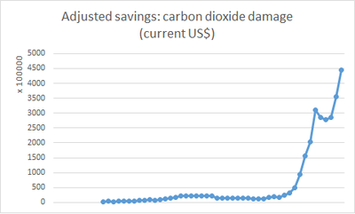
- Plot 1: In this visualization, we have plotted the time series trend of Adjusted Savings from Carbon dioxide damage in USD in Afghanistan. We can clearly see, from 1960-1965 there was no readings of this measure in the nation, after 1965 there has been a uniform trend over the years until 2006, after 2007, there was an uptrend of the savings value. It is evident that the value is the maximum in 2017, making the value for the year 2018 still higher.

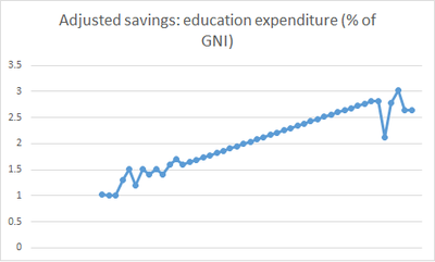
- Plot 2: In this visualization, we have plotted the time series trend of Education Expenditure for Afghanistan in % GNI. We can clearly see, from 1960-1965 there was no readings of this measure in the nation, after 1965 till 1970 there has been fluctuating expenditure on the education, but after 1970 its a perfect uniform trend over the years until 2010, At 2011, there had been a huge downfall in the trend and then it again rose and fell.

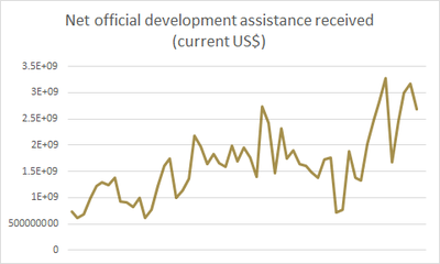
- Plot 3: In this visualization, we have plotted the time series trend of Net Official Development Assistance received from India. We can clearly see, from 1960-2017 there has been irregular trend, no any repetitive trends present and the overall trend over the years has increased, the value of 500 Million USD in 1960 has rose to 2.5 Billion USD in 2017.

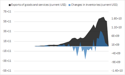
- Plot 4: In this visualization, we have plotted the time series trend of The Exports and Goods and services and Change in Inventories of Singapore in USD.The trend clearly shows that there has been a consistent rise in the vale of exports of goods from Singapore. The other graph tells us the changes has been so wide, regularly there has been eradication of goods stock in Singapore over the years.

Tools for Visualization and Data Cleaning
Visualization
- We use different tools for the visualization of the data. These include R Markdown, R Shiny, Tableau for now.
- We use the R tool to model the entire project. In R Shiny, we use the xts package for data manipulation and beneficiary in plotting time series chart. We also use ggplot2, plotly, lubridate for plotting visuals in R and manipulating the date structure. Following it, we use dynlm/ardl a tool for time series regression analysis. We have also planned to forecast the future values of the indicators for a country using the R package forecast.
- We also use the Tableau for the quick visualization of any data. The Tableau has more packages for making the visuals with much less effort. In Tableau there is a restriction to use a limited number of rows for visualization, hence we use only a certain specific rows for the visuals in Tableau.
Data Cleaning
- We have a lot of data to be cleaned for the proper data set for the analysis. The data cleaning is done using the SAS-JMP tool, removing the necessary rows and recoding the missing values. Besides, we also use Microsoft Excel 365 for small and quick cleaning.