From Visual Analytics and Applications
Jump to navigation
Jump to search
World Energy Production & Consumption: A Visual Study
Motivation
Energy growth drives the well-being and prosperity across the globe. Growing demand for energy has to be met in a safe and environmentally conscious manner. Rapidly changing energy dynamics determine the course of our economic development, geopolitics, technological breakthroughs, massive investments and trade flows.
The main objective of this project is to study the dynamics of regional energy production and consumption of the different countries of the world to identify the dominant as well as weaker player in the world energy market
Though reports from various organizations such as EIA, IEA, OPEC, BP are available, most of the visualizations are static and do not aid exploration, limiting the scope of further drilling down to the areas of particular interests. Hence, we've decided to take up rich data-set provided by BP & explore the information related to energy production and consumption across countries, which might otherwise be hidden in the existing static visualizations.
|
Objective
Static visualization and reports do not allow for direct interaction with data, enhanced assimilation of information, quick access to relevant insights and drill-down analysis. By using interactive, visual data analytics techniques we will be bringing the above-mentioned capabilities to the interface.
We will be using the world energy datasets from BP along with the CO2 emissions to come up with more detailed visualizations including some level of interactivity to enable users to drill down in the world energy data & reveal specific insights.
|
About The Data Source
BP plc, formerly British Petroleum, is a British multinational oil and gas company headquartered in London, England. It is the world's sixth-largest oil and gas company, the sixth-largest energy company by market capitalization and the company with the world's twelfth-largest revenue (turnover). It is a vertically integrated company operating in all areas of the oil and gas industry, including exploration and production, refining, distribution and marketing, petrochemicals, power generation and trading. It also has renewable energy interests in biofuels and wind power.
For 66 years, the BP Statistical Review of World Energy has provided high-quality objective and globally consistent data on world energy markets. The review is one of the most widely respected and authoritative publications in the field of energy economics, used for reference by the media, academia, world governments and energy companies. A new edition is published every June.
For the purpose of this project, we are using the BP Statistical Review of World Energy data.
The dataset consists of energy consumption and production data from around 1965 for 2017 for more than 90 countries spanning across regions Africa, Europe, APAC, CIS, Middle-East , North America, S. & C. America. Energy resources are categorized as Primary Energy(Oil, Coal, Gas, Hydro, Nuclear); Other Renewable resources(Solar, Wind, Biofuels, Geothermal etc.).
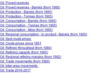
Below figure shows the different data we have for Oil in the dataset:
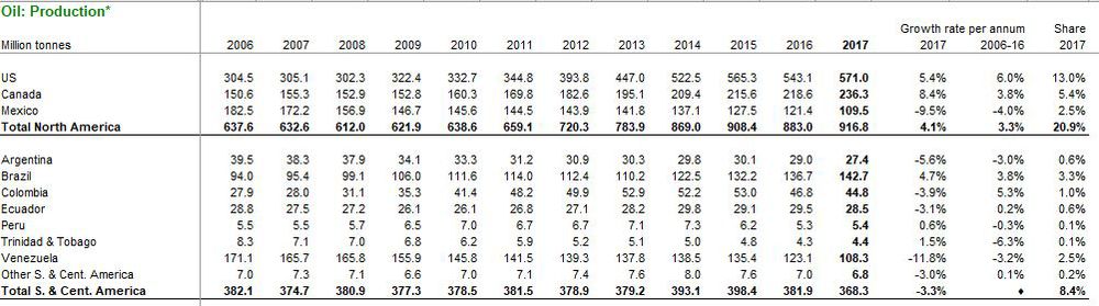
A closer look at the tab Oil: Production - Tonnes (from 1965) reveals the below information regarding Oil production across different countries of the world:
Similarly, we have different datasets each for the different forms of energy like Natural Gas, Coal, Nuclear Energy, Biofuels etc.
|
Critique of the Existing Visualizations
We noticed that all the existing visualizations in the BP Statistical Review report are static in nature which limits the usage of the plots and restricts information retrieval. Below image shows a sample visualization from the report:
As shown above, the visualization does not allow user to dig deeper into the dataset. Hence, to enhance usability of the the data, we have come up with interactive plots in order to gain deeper insights.
|
Dashboard Design
Global trend in Energy consumption for years 2006-2017 across energy types: Stacked Area Chart
A Stacked area chart gives us a good understanding of the rate at which world energy consumption is changing with time along with the trends for individual components.
Tools Used: Plotly
Country-wise percentage consumption across various energy types: Sunburst Plot
Usage: World energy profile consists of Non renewable energy sources such as coal, oil and gas as well as renewable sources like hydro energy, nuclear energy and other renewables like solar, wind, biogas etc. Sunburst Chart allows the user to interactively drill down and understand the percentage contribution of a region to World energy Production detailed for each energy type.
Critique: Sunburst is a form of a radial chart which breaks out general categories into subsets to better understand the components that make up or contribute to the whole. This form a visualisation is similar to a treemap however it is easier to see multiple layers of data with sunburst, while the treemap is better for comparing categories within the same hierarchical layer.
Disadvantages: Deeper slices exaggerate their size, and look visually larger. This type of visualization requires the quantitative comparison of angles, instead of lengths, which is difficult for the human eye.
Tools used: SunburstR
Country-wise Energy Consumption Portfolio and energy trends: Geofacets
Production vs Consumption landscape for each energy type: Interactive Scatter Plot
Relative positioning of countries in terms of usage per energy type: Ternary Plot
|
R Packages Used
We have used the following R packages to come up with our visualizations:
dplyr: A Grammar of Data Manipulation. It is a fast, consistent tool for working with data frame like objects, both in memory and out of memory.
tidyr:It's designed specifically for data tidying (not general reshaping or aggregating) and works well with 'dplyr' data pipelines
reshape:Casts a molten data frame into the reshaped or aggregated form you want
readr :The goal of 'readr' is to provide a fast and friendly way to read rectangular data (like 'csv', 'tsv', and 'fwf'). It is designed to flexibly parse many types of data found in the wild, while still cleanly failing when data unexpectedly changes
ggplot:A system for 'declaratively' creating graphics. You provide the data, tell 'ggplot2' how to map variables to aesthetics, what graphical primitives to use,
and it takes care of the details
Plotly:Easily translate 'ggplot2' graphs to an interactive web-based version and/or create custom web-based visualizations directly from R
SunburstR:Make interactive 'd3.js' sequence sunburst diagrams in R with the convenience and infrastructure of an 'htmlwidget'.
Crosstalk:Provides building blocks for allowing HTML widgets to communicate with each other, with Shiny or without (i.e. static .html files)
Geofacet:Provides geofaceting functionality for 'ggplot2'. Geofaceting arranges a sequence of plots of data for different geographical entities into a grid that preserves some of the geographical orientation
|
References


