Social Stratification Mappers Proposal
Exploring Inequality’s Geographic Dimension Across Neighbourhoods in Singapore: It's Driving Forces & Touch Points
Contents
Introduction
Amidst the recent debate over growing social inequality in Singapore such as the distinct clustering of elite schools and varying access to resources, the dangers of hardening social mobility pose as a concern for a culturally diverse nation that has upheld its values of social cohesion and racial harmony. In bridging social divide, Singapore has put in place various community programmes to create shared experiences and promote inter-communities mixing.
Using geospatial techniques in R, the dashboard serves to explore the geographic dimension of social inequality, by mapping the extent of social segregation and accessibility to important spaces across neighbourhoods. This is done in three approaches. First, we analyse whether there exists social segregation across subzones using the Entropy-Based Diversity Index, based on three dimensions of inequality - race, age and housing type. Second, using spatial point pattern analysis at the HDB postal code level, we visualise whether there exist housing type clusters that could point towards social inequality and whether certain towns are overpopulated with a specific housing type. Third, using the Hansen Accessibility Model, we map out available touch points that could facilitate social mixing, particularly the ease of access to primary schools. We also see whether there is any variation in accessibility between the elite and mainstream primary schools for different housing types. This is because an important aspect of social inequality is having reasonably fair access to resources. Lastly, we move into solutioning and explore whether there exist sufficient common spaces that allow for social mixing, such as parks, and identify areas that are underserved for urban planners to focus their attention on for future space planning.
Motivation and Objectives
1. Discover Drivers of Inequality – Race, Age, Housing Type
Our project was motivated by the ongoing debates on social inequality but a general lack of “hard evidence” especially on the geospatial aspects, of social inequality. Our dashboard aims to equip urban planners with a geospatial tool for visual discovering of social inequality across neighborhoods based on the three dimensions of drivers of inequality – race, age, housing type.
2. Find Touch Points for Social Mixing – Amenities & Common Spaces
We also map accessibility of each HDB postal code to the nearest school to see whether some households are disadvantaged in access to elite schools than mainstream schools. More importantly, we go beyond highlighting “pain points” but dive into “solutioning”. We hope to equip planners with the ability to visualize how the spaces (e.g. parks) they have built can serve as important touch points to promote social mixing within and across neighbourhoods.
Data Sources
Our team's datasets are retrieved from https://data.gov.sg
|
Type |
Format |
Data |
Source URL |
|
Boundary (Polygon) |
SHP |
OSM Layer (Singapore) |
OpenStreet Map |
|
Boundary (Polygon) |
SHP |
Master Plan 2014 Subzone Boundary (No Sea) |
https://data.gov.sg/dataset/master-plan-2014-subzone-boundary-no-sea |
|
Demographics |
CSV |
Estimated Singapore Resident Population in HDB Flats |
https://data.gov.sg/dataset/estimated-resident-population-living-in-hdb-flats |
|
Demographics |
CSV |
Dwelling Units under HDB's Management, by Town and Flat Type |
https://data.gov.sg/dataset/number-of-residential-units-under-hdb-s-management |
|
Demographics |
CSV |
Residents by Age Group & Type of Dwelling, Annual |
https://data.gov.sg/dataset/residents-by-age-group-type-of-dwelling-annual |
|
Demographics |
CSV |
Land Area and Dwelling Units by Town |
https://data.gov.sg/dataset/land-area-and-dwelling-units-by-town |
|
Demographics |
SHP |
Singapore Residents by Subzone and Type of Dwelling, June 2016 |
https://data.gov.sg/dataset/singapore-residents-by-subzone-and-type-of-dwelling-june-2016 |
|
Demographics |
SHP |
Singapore Residents by Subzone, Age Group and Sex, June 2016 (Gender) |
https://data.gov.sg/dataset/singapore-residents-by-subzone-age-group-and-sex-june-2016-gender |
|
Demographics |
SHP |
Resident Population of Other Ethnic Groups by Age Group, Ethnic Group and Sex, 2015 |
|
|
Amenities |
CSV |
Primary Schools |
https://data.gov.sg/dataset/school-directory-and-information |
|
Spaces |
SHP |
Parks (including playgrounds) |
Analytical Mapping
1. Social Segregation Index at Subzone Level
While there had been studies done on racial, age and housing mix, these were typically done at the aggregate level that measures a subzone’s composition of race, as compared to the national average. While this was informative, it only informed us where different population groups stay – and not whether they mix with one another. This provided little actionable insights for urban planners to turn into operations. What was more useful was whether there were sufficient opportunities for citizens of different race, age and housing type, to mix with one another. In spatial demography, measuring the extent of segregation between population groups would help urban planners to understand social cohesion and integration in our society [4].
We thus selected the entropy-based diversity index as the social segregation measure for race, age and housing type. This diversity index goes beyond measuring dissimilarity, isolation and interaction between two population groups (as is common for literature measuring Black-White segregation), and allows multi-group measure of segregation [5]. Living away from one another could imply that population groups are segregated [6]. We used this to measure whether citizens of the four national races experienced complete segregation, or no segregation; and do the same for housing type (an indicator of income) as well as age.
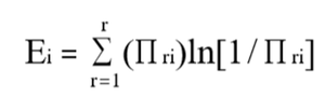
This was then visualized in a choropleth map. Each subzone would have its entropy score, or diversity, defined as the follows, where πri refers to a particular racial/age/housing type group’s proportion of the population in subzone i.
We also plotted the histogram of segregation to see the distribution of the diversity indices, which can be filtered by subzone and housing type. For detail on-demand, we also complement the above map with a parallel coordinate plot to view the composition of each demographic type across subzones.
2. Spatial Point Pattern Analysis at Postal Code Level
There has been work done on the visualization of demographic data by subzone. However, by and large, these data are typically analysed by the subzone level than by the postal code level. We analyse our data at the postal code level because social inequality is typically defined at the household level, especially since Singapore is a small country where analyzing by subzone is equivalent to assuming different regions develop unequally. But point symbol map would not give a good visualization due to the abundant amount of postal code data. Instead, we use the Kernel Density Estimation, a frequently used technique to determine hotspots of point locations, to easily identify spatial clusters – by race, age and housing type.
This density-based measure is visualized in a kernel density map. To test statistically and allow users to have a distance-based measure, we support the visualization with the Ripley’s K Function and the Nearest Neighbour histogram. The K-Function is a method to estimate the second-order properties of a point process by constructing a circle of radius h around each point event, I and counting the number of other events j that fall inside this circle. Under the assumption of CSR, the expected number of events within distance h of an event is: 𝐾 ℎ = 𝜋ℎ2, where ℎ = the radius of the circle. K(h) > 𝜋ℎ2 if point pattern is clustered. This is visualized as such; if the line falls above the confidence band, there is clustering. If it falls within, the clustering is statistically insignificant.
3. Accessibility to Schools and Parks
Using the Hansen Accessibility Model, we mapped out each household’s ease of access to schools – mainstream and elite schools. Accessibility refers to the ease of reaching a destination. For our application, the origin zones would be the HDB blocks and the destination zones will be the amenities. A higher Hansen Accessibility Index would mean that the HDB block is very accessible to that particular school type – elite or mainstream.
We also assessed accessibility to parks (which includes playgrounds); common spaces where we expect them to be easy-to-reach, open platforms that can promote social mixing within neighbourhoods. We wanted to identify areas that are underserved for urban planners to focus their attention on for future space planning.
The approach of this measure to the calculation of a zone's accessibility is to add together the opportunities available in each other zone, weighted by a function of the difficulty of reaching that zone.
Design Architecture
1. Visual Design Framework
The 3Ps Visual Design Framework was designed during the course of our R application development. First, we started off with the Purpose, and then we determined the Processes required to achieve it, followed by the R Packages required. Some of the new packages experimented include mapedit for user interactivity and SpatialAcc for accessibility distance measures. The reason for selection is explained in the subsequent sections.
2. Data Preparation
First, aggregated data at the subzone level on race, housing type and age demographics were obtained from data.gov.sg. This data includes both public and private housing types. Household level data at the HDB postal code level on housing type were retrieved from Siew et al (2018)’s previous project on Centroid Amenities. Besides demographics data, schools and parks data were obtained from data.gov.sg.
Some of the spatial files came raw as KML format. These were converted to SHP format using QGIS in order to be imported into R by the sf and rgdal packages. Primary school data were geocoded using the onemap API to obtain the geometry attributes from the postal code. Transformation to WGS84 was performed for openstreetmap compatibility, and separately transformed to SVY21 for distance-based measures for use in the Hansen Accessibility Model. Data was also transformed to ppp format for spatstat compatibility for the kernel density analysis.
As for the demographics data, percentages of the population of each demographic type out of the total population of each subzone was calculated. Normalization was performed so that the values were comparable across age, gender and housing type. Data merging and transformation was also done so that it could be analysed and visualized geospatially in R.
3. Interactivity & Insight Generation
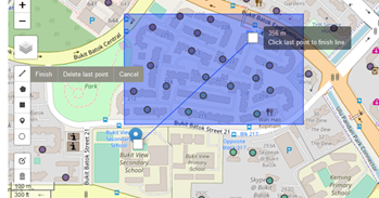
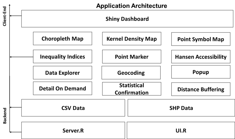
To allow users to interact, mapedit was used to allow urban planners to draw distance buffers to catch the nearby HDB postal codes that fall within a certain distance from any amenities.
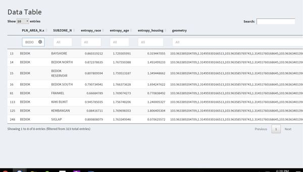
A data table was also displayed for detail on demand references.
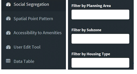
The dashboard also has an interactive toolbar that allows users to switch between the three dimensions of inequality – social segregation, spatial point pattern analysis, and accessibility to amenities. It also allows users to filter by Planning Area, Subzone and Housing Type.
4. Architecture Design Framework
The application was developed using R Shiny, with the following application architecture and features in the client and backend.
Case Study: Urban Planning to Foster Social Cohesion
User: Agencies involved in urban planning, in the aim to foster social cohesion and reduce communal enclaves
Objective: Identify areas with low segregation indices and low access to important amenities, then plan for efforts to redistribute amenities and spaces to promote social mixing
With the input of the respective datasets and supporting data and the installation of the relevant tool packages, SocialMapper presents to the user three levels of analysis in the visualization of inequality’s measures – social segregation, spatial clustering and accessibility. Each level of indicator provides a different perspective to provide a more comprehensive understanding of the geographic dimensions of inequality.
Indicator One: Degree of Social Segregation
The first indicator is the Social Segregation score, measured by the entropy-based diversity index, which enables users to view how close or how segregated different population groups are from one another, within a subzone.
Based on Race, the entropy-based diversity index shows that subzones in the outer parts of Singapore (i.e. residential towns away from city) tend to have higher diversity indices. The higher the index, the greater the diversity mix – that is, the more opportunities for social cohesion and racial harmony to be fostered.
One hypothesis is that the outskirts of Singapore have a higher proportion of new or Build-To-Order (BTO) flats while the central areas of Singapore tend to have higher transaction of resale flats. The housing ethnic policy is introduced to the new flats, and could possibly be less closely controlled for resale flats. Urban planners or social planners may want to focus their attention on areas with low diversity index to promote interethnic community programmes.
Based on Age, the entropy-based diversity index shows that Northeastern areas such as Punggol and Sengkang areas have lower diversity in age than the Eastern coastal areas such as Marine Parade, Frankel and Kembangan. This is not surprising given that Punggol and Sengkang is a young estate with mainly young families only, while estates like in the Eastern coastal areas are mature estates with many multi-generation families living there.
Urban planners may want to redistribute their new flats across different subzones, than clustering them in one area, if having a good age mix is an important success factor of social cohesion and equality.
Based on Housing Type, we see that some subzones like Kembangan have high diversity scores. When we zoom into the parallel coordinate plot by the Bedok planning area (which Kembangan is a subzone of), we see that the estate has a good mix of all housing types – 1-2 room flats as well as 5-room flats. On the other hand, subzones like Taman Jurong have low diversity scores, as they have roughly equal composition of each housing type. Urban planners may want to ensure a good diversity of housing type within each subzone, to ensure sufficient opportunities for interactions between citizens of high and low Socioeconomic Status (SES).
Indicator Two: Degree of Clustering by Spatial Point Pattern
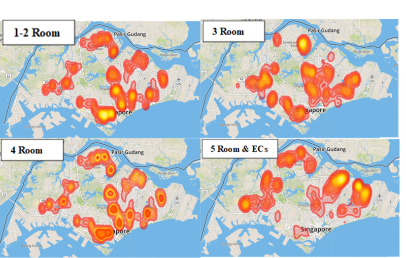
The second indicator is the Kernel Density Estimation (KDE) Analysis, which looks at areas in which different population groups cluster, to identify “enclaves” that warrant further attention. We see that there are clusters of 1-2 room flats in the South and South Eastern regions of Singapore. The 3-room flats are clustered at the Northern region, while the 4-room flats are almost equally distributed across Singapore and the 5-room and EC flats are clustered in the Northeastern region of Singapore.
Urban planners may want to study whether spreading the housing type out across subzones, as in the case of the 4-room flats, may help promote social mixing and reduce the social class distinction – that is, to avoid an estate clustered with “1-2 room flats” or an estate solely with “5-room flats” as seem to be the case for the newer estates like Punggol and Sengkang.
To test for statistical significance of the clusters, the Ripley’s K Function was plotted for each room type. We can see that the 5-room flats are statistically significant at even low radius, where the 1-2, 3 and 4-room flats are significant only for radius>30
Indicator Three: Degree of Accessibility
a) Amenities: Mainstream vs Elite Schools
The third indicator is the Hansen Potential Accessibility (HPA) Model Analysis, where each HDB postal code is calculated with an accessibility score to see how well it performs regarding its accessibility to the nearest mainstream school, nearest elite school and the nearest common space (parks) that can encourage social mixing. We experimented with SpatialAcc and REAT methods, but selected SpatialAcc method for it is computationally more efficient given the vast amount of postal code data that we have. We set the minimum distance that a primary school student is willing to travel, as 5km, a reasonable threshold for a primary school. The power of the model, alpha, was also optimised to a small value of 0.01.
Using the Hansen Accessibility Index (SpatialAcc method), we compared the accessibility of each HDB postal code between elite and mainstream primary schools. Interestingly, elite schools are most accessible by residents in the East, especially those living in the Bedok and East Coast regions, as can be seen by the blue clusters in the East areas. Residents living in the Northwest seem to be highly disadvantaged. With a threshold set as 5km, these students are not within reach from primary schools and thus coloured as a N.A. value.
As vacancies in primary schools in Singapore are based on home-school distance in the priority of (1) within 1km, (2) between 1km and 2km, and (3) outside 2km, students living in the Northwest would find almost impossible chances of entering an elite school. On the other hand, students living in the East would find relatively plenty of opportunities to enter an elite school. With “every school is a good school” slogan failing to convince parents, this unequal geographical spread of elite schools is not ideal to promote inter-SES mixing in ensuring “good” opportunities for all.
b) Common Spaces: Parks
We also looked into ‘Parks’ as common spaces are important to promote social mixing, especially amongst families with children. Upon zooming in, we can see that only a few estates have closer proximity to parks (dark blue). Urban planners may want to leverage on areas with low accessibility (yellow) and plan for common spaces to enhance the potential Hansen Accessibility Index, to create more opportunities for social interaction.
This is further confirmed by the below histogram of the accessibility index, which is left skewed. Most HDB postal codes are not accessible to parks. That said, the data used consists only of parks (and playgrounds) owned by the National Parks (NParks). Parks belonging to Town Councils were not included in the data, and can be considered for an urban planner’s analysis, once data sharing is facilitated across agencies.
Future Works
A usability test could be conducted to better understand needs and formulate a user-friendly UI for urban planners. Future works should also improve the data spread used and the methods employed, such as the follows.
Social Segregation Index – Thiele’s H Index
While we used the entropy-based diversity index, a more accurate measure would be the Thiele’s H Index that would take the weighted average deviation of each subzone’s entropy from the planning area’s entropy, expressed as a fraction of the planning area’s total entropy.
This would factor in each subzone’s contribution to the planning area and have a scale of 0 to 1, easier to compare across neighbourhoods – than the current entropy-based diversity index with no scaling. The entropy index varies between 0, when all subzone areas have the same composition as the planning area (i.e., maximum integration), to a high of 1, when all subzone areas contain one group only (maximum segregation).
Go Beyond HDB Dataset
As the postal code data was available only for HDB dwelling type, the dashboard lacked private estate analysis. Often, private estate dwellers are the most inaccessible to common spaces and warrant for more attention in exploring inequality. They may also be more (or less) accessible to elite schools, of which was not analysed. Comparing access between public and private estate residents may shed light towards a diverging SES.
User Interactivity
As data for demographics typically change on a yearly basis, we can include an upload dataset user function in the application to enable users to upload refreshed data and analyse yearly. More user selection tools such as the method of interval used for the choropleth map can also be considered. Bandwidth selection for the kernel density plot can also be included.
References to Related Works
1. We would like to credit the following referenced work's data adopted in our dashboard.
Centroid-Amenities: An Interactive Visual Analytical Tool for Exploring and Analysing Amenities in Singapore
Authors: Siew Xue Qian Jazreel, Tay Wei Xuan, Sean Koh Jia Ming
Link to App: https://jazreelsiew.shinyapps.io/AppV2/
2. The following also lists the referenced literature considered in our problem statement and methodology.
[1] Ministry of Education (2018, May 15). Speech by Mr Ong, Ye Kung, Minister for Education, at the Debate of President’s Address: The Unfinished Business of Tackling Inequality.

Retrieved August 7, 2018, from Mininstry of Education website:
 https://www.moe.gov.sg/news/speeches/speech-by-mr-ong-ye-kung--minister-for-education--at-the-
    debate-of-presidents-address--the-unfinished-business-of-tackling-inequality(Last updated 2018, August 6).
[2] Ministry of Communications and Information. (1989, January 6). Speech by Mr S Dhanabalan, Minister for National Development, at the 1989 New Year Gathering for community

leaders at the People’s Association Auditorium on Friday, 6 January 1989 at 7.30 pm [Press release].
Retrieved August 7, 2018, from National Archives of Singapore website:

 http://archivesonline.nas.sg/; Wee, A. (1989, January 7). Racial enclaves forming – Dhana. The Straits Times, p. 1. Retrieved from NewspaperSG.
[3] Leong, Chan-Hoong (2018). Commentary: Inequality has a geographic dimension - between and within neighbourhoods in Singapore. Retrieved August 7, 2018, from

https://www.channelnewsasia.com/news/commentary/inequality-in-singapore-exists-across-within-neighbourhoods-10276898
[4] Sparks, C. (2014). Measuring Residential Segregation using R. Spatial Demography 2014 2(1): 72-78
[5] Hong S-Y, O’Sullivan D, Sadahiro Y (2014) Implementing Spatial Segregation Measures in R. PLoS ONE 9(11): e113767. doi:10. 1371/journal.pone.0113767
[6] Patrick Sturgis, Ian Brunton-Smith, Jouni Kuha & Jonathan Jackson (2014) Ethnic diversity, segregation and the social cohesion of neighbourhoods in London,
 Ethnic and Racial Studies, 37:8, 1286-1309, DOI: 10.1080/01419870.2013.831932
