ISSS608 2017-18 T3 Assign Teng Fei Data Preparation
|
|
|
|
VARIABLE SELECTION
| Methods | Visualization |
|---|---|
| 1. Zero values identification
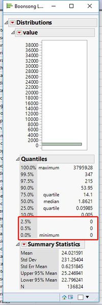
First we will open the data file through JMP and have a look at the data. We can see that there are lots of 0 values in our data set.
|
|
| 2. Group Creation
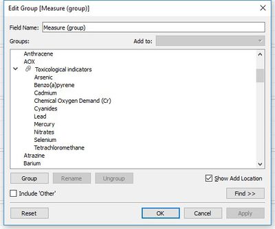
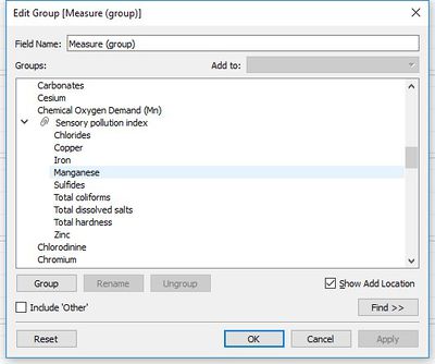
And then we can see that there are 106 different chemicals and water properties in this water sensor readings but we don’t need them all. So we will make different groups of chemicals based on water quality monitoring to make our visualization part more efficient. First we import the data into Tableau, create a new sheet. And then we create two new groups which is Sensory pollution index and Toxicological indicators. The Sensory pollution index group contains Chlorides, Copper, Iron, Manganese, Sulfides, Total coliforms, Total dissolved salts, and Total hardness. The Toxicological indicators group contains Arsenic, Benzo(a)pyrene, Cadmium, Chemical Oxygen Demand(Cr), Cyanides, Lead, Mercury, Nitrates, Selenium, and Tetrachloromethane. All of these variables will seriously affect the water quality, so we want to focus on the patterns of them. |
GEO-MAP VARIABLE PREPARATION
| Methods | Visualization |
|---|---|
| 1. Create Location Excel File
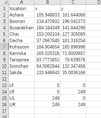
Since we want to find some trends and anomalies in the preserve, we can use the map which the community provides to make a better visualization. First we should create an Excel file which contains the coordinates of every location and the border of the background map. |
|
| 2. data sets join
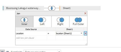
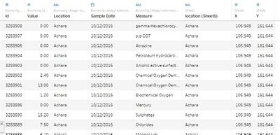
And then we will import the Boonsong Lekagul waterways readings and our location file into Tableau. We will do a inner join between these two data sets. |
|
| 3. add the background image
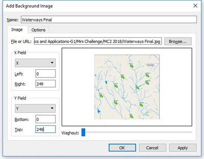
And then we create a new sheet, drag the X coordinates into Columns, drag the Y coordinates into Rows, drag the ID into color and drag the location into details. After that we will set our background image as the map file which Community provides. We select map->select background images-> select add image, and we set the file URL to the location where we stored the image. Then we change the border of X and Y to 0-249 |
|
|
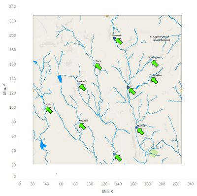
After that we will get our initial Geo-map. |

