ISSS608 2017-18 T3 Assign Wang Runyu Data Visualization
|
|
|
|
|
Question 1: Patterns of all of the bird species
Tableau Workbook
Tableau is used to preform visual analytics for this question. The workbook can be opened through this [1].
Overview Patterns
The plot below indicates the birds appearance of all the species. The darker color indicated more appearances are recorded at the same location. All species spread over the entire preserve. Most of birds form their own society. They likely to live together as a community.
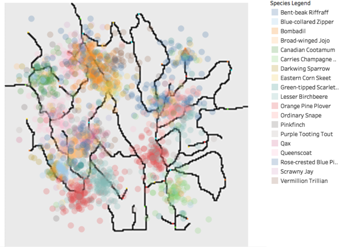
To confirm the pattern for every bird species, plot the graph and observe the location. Below are some examples.
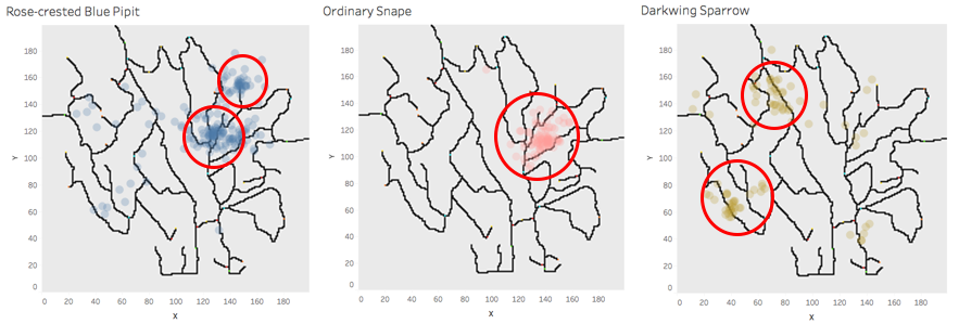
Form the pattern, we can find that all the birds species intend to live together. Some are living closer and some bird community are more widely spread.
Pattern Over the Years
The are graph shows that there is no significant number of audio recording provided before 2010. We can interpret meaningful result from insufficient data. So in this assignment, we will only take the audio recording from 2010 onward into consideration.

Besides that, the above area plot shows the bird population peaked at 2015 and decreases after that.
On the same time, from the plot below, we see that rose pipit's population tend to decrease steeper than others after 2015.
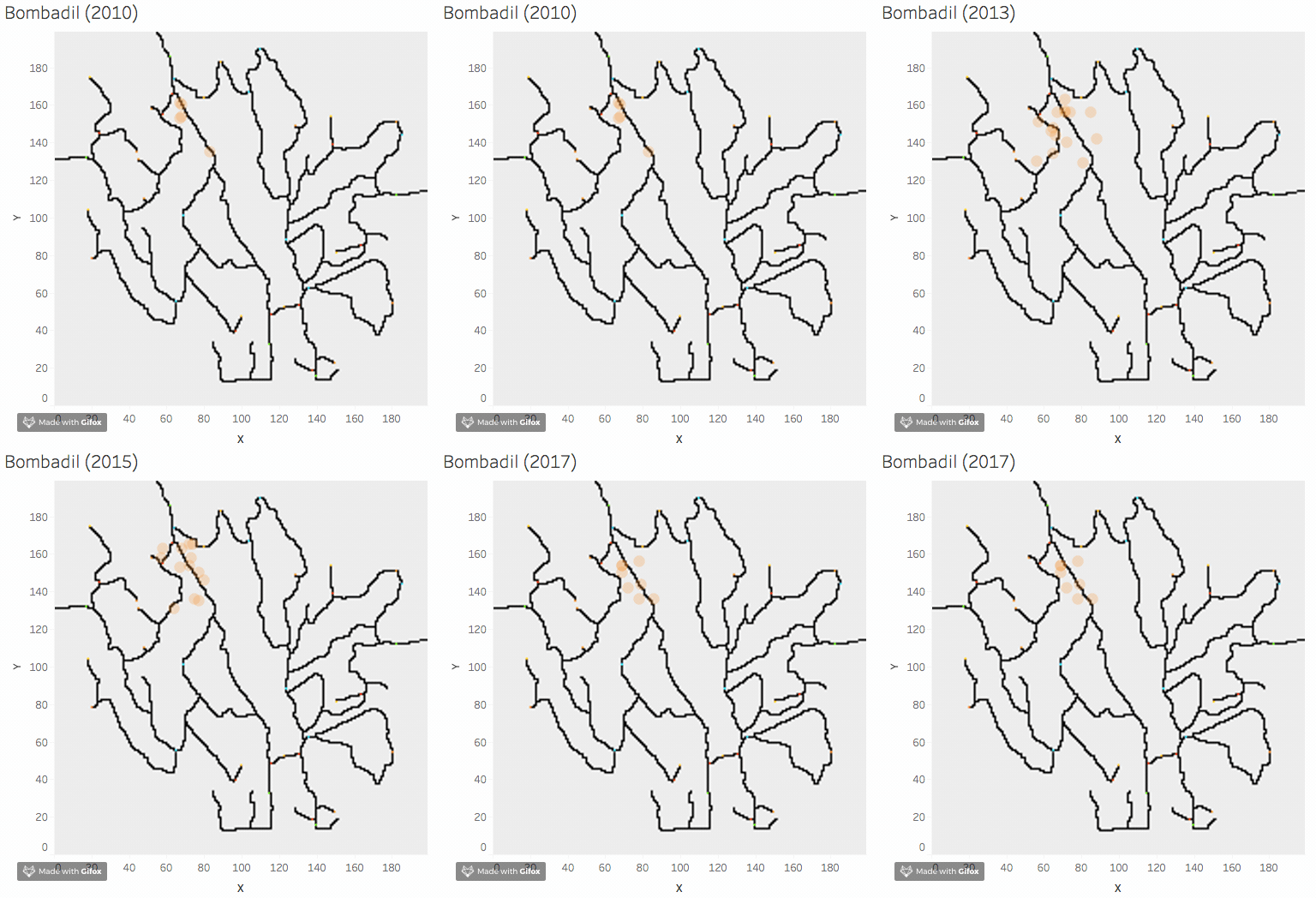
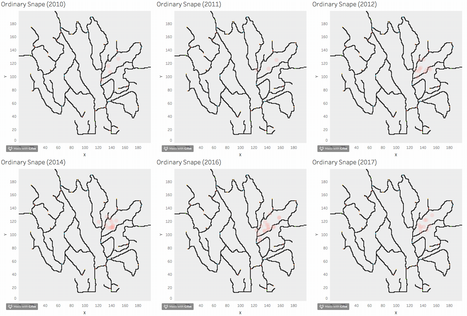
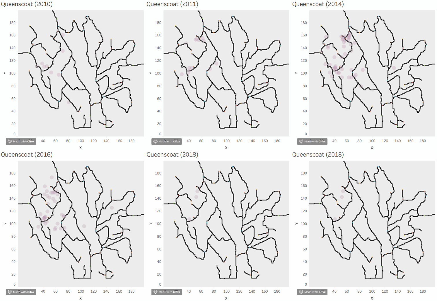
From 2010 to 2018, we can find most of the birds, expect rose pipit are living in the same region over the years. The rose pipit community are moving to the bottom of the map.Below are four examples: Bombadli, Ordinary Shape, Rose Pipit, Queenscoa.
Pattern of Different Quarters
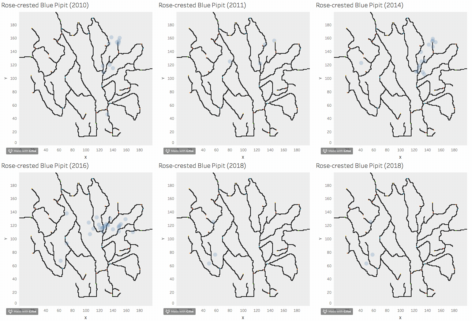
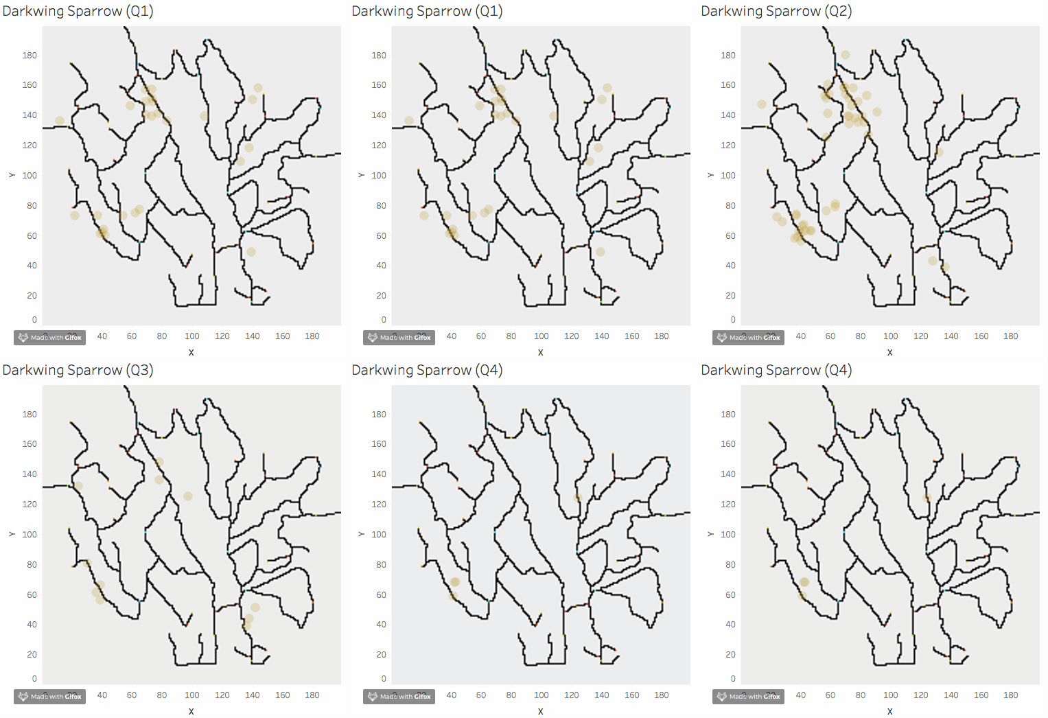
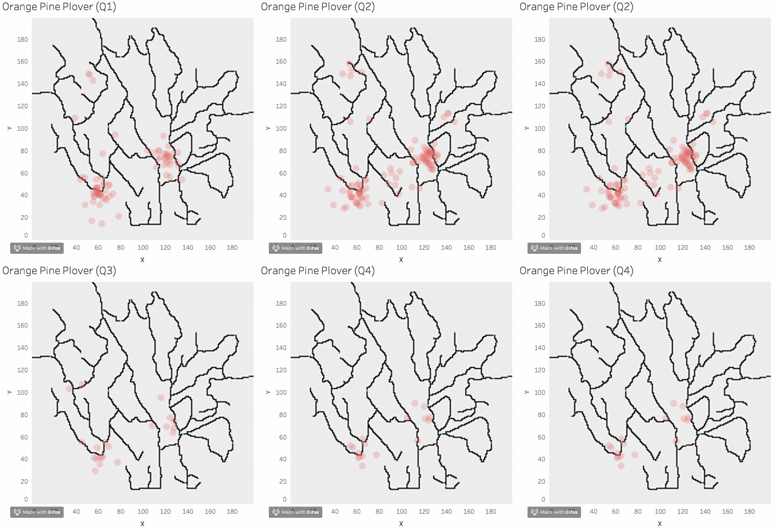
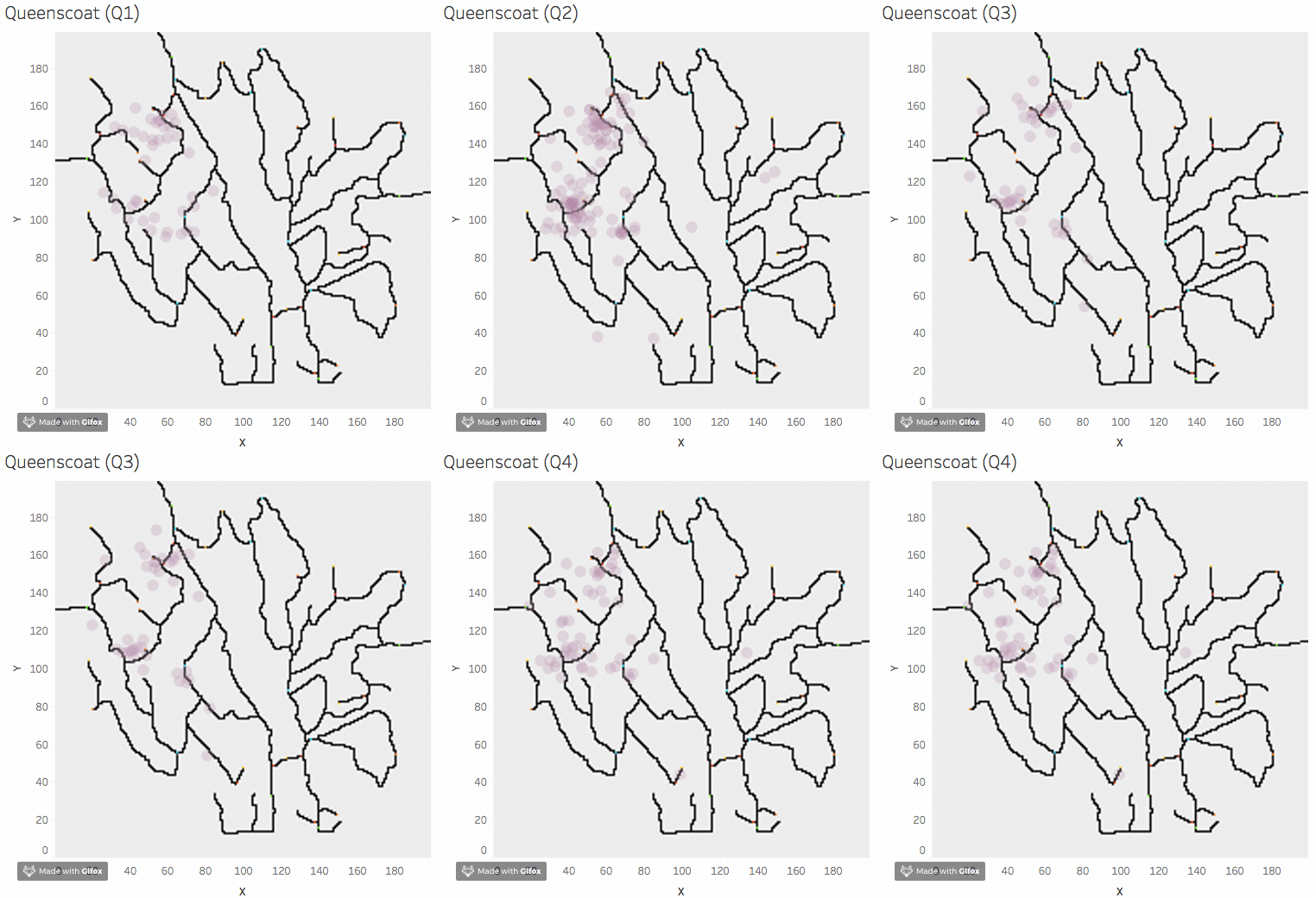
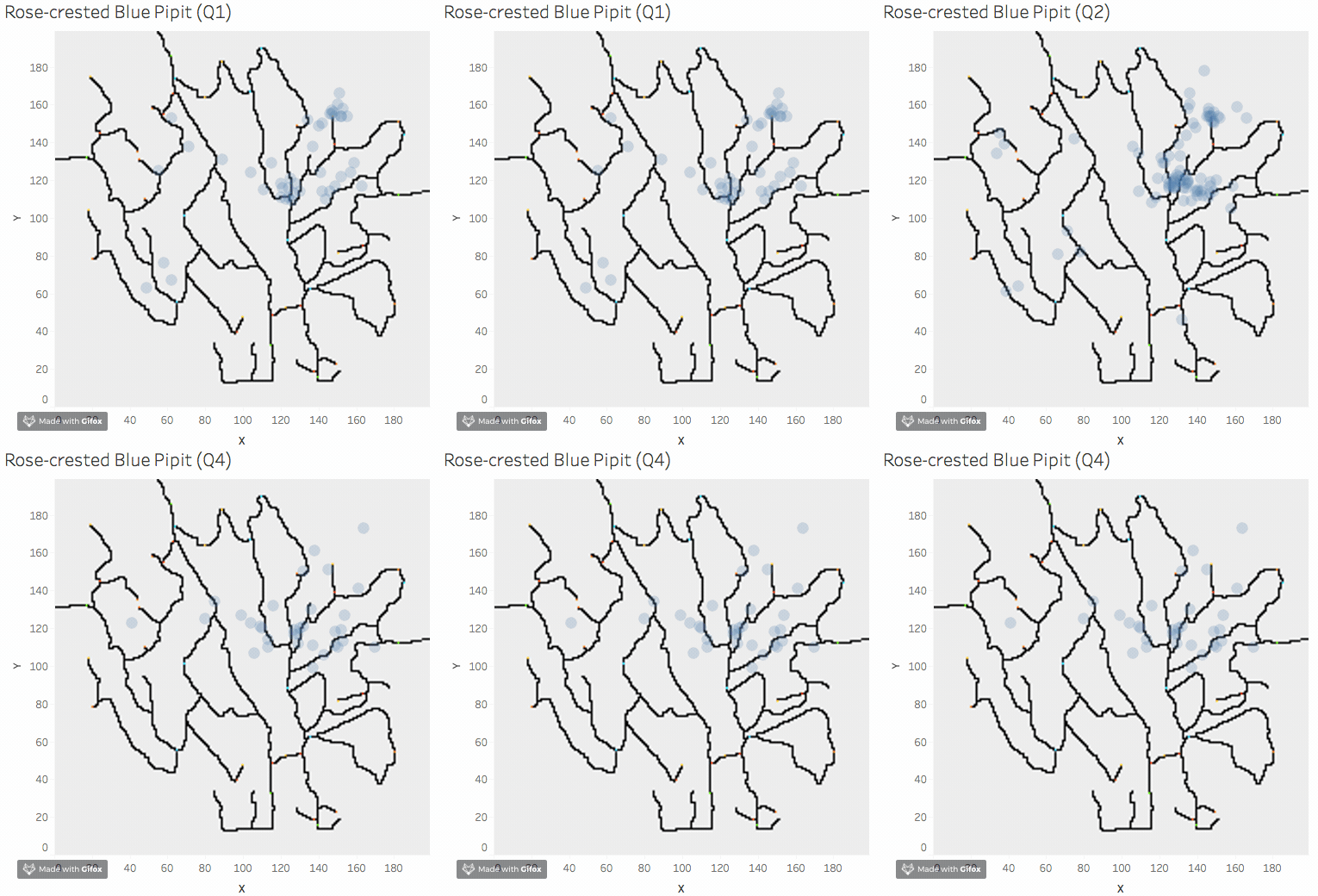
Among four quarters, by looking through all the species, we can see that birds are more active during in quarter 2, and less active during quarter 1, 3 and 4. That is likely due to seasonal migration. Below are four examples: Darkwing Sparrow, Orange Pine Plover, Queenscoat, Rose-crested Blue Pipit.
Pattern Around Dumping Site
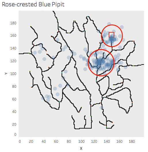
We study the possible pattern difference caused by dumping site. By going through all the bird species, we can see only rose pipit community is overlay with the dumping site. The red rectangle represents dumping site and the red color circle represents the two rose pipit community.
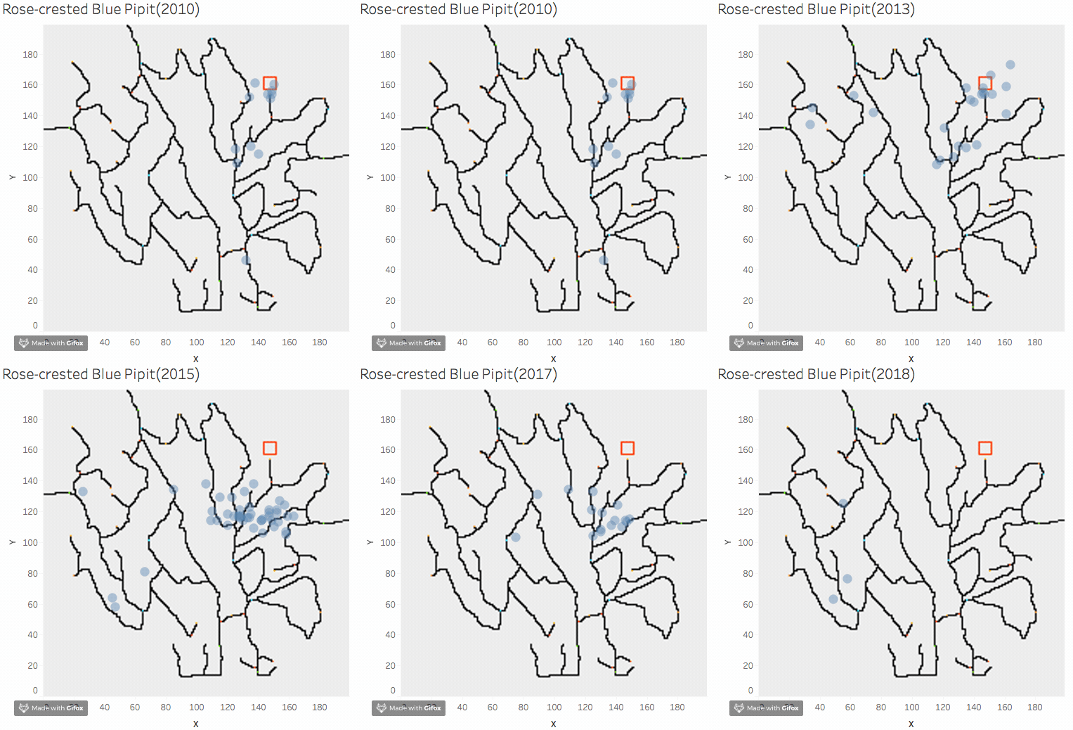
We further investigate the each single year. From 2010 to 2014, we can see that rose pipit forms community besides dumping site. however after 2015, we can not find rose pipits near dumping site at all.
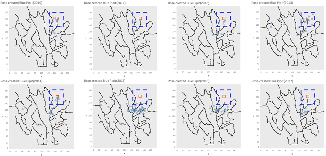
Below animation below concludes the movement of rose pipit from 2010 to 2017. The change before and after 2015 may indicate that rose pipit is affected by the dumping site. And it also suggest that the dumping site starts its operation in 2015.
Discussion
From above, we have following findings:
1. Different birds like to live together and form their own community.
2. From 2010 to 2018, all species of birds, expect rose pipit, are not moving their habitat. And they are not living close to the dumping site
3. From 2010 and 2014, rose pipit community are overlapping with the location of dumping site. From 2015, rose pipit community are moving away from the dumping site and has changed the location towards the bottom of map. From this, we suspect that dumping site cause the movement of rose pipit's habitat.
Question 2: Bird call classification
R Markdown File
I use R to prepare the data and plot chart for visual analytics and build machine learning model. The code can accessed at this link.
Visual Analytical Approach
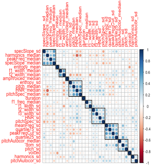
As the text format outcome from seewave package(analyzeFolder function) contains 69 features, it is not practical for us to analyze all the features visually. In the first step, I use findCorrelation() function to eliminate highly correlated features. I set the pair-wise absolute correlation cut off to 0.6.
Correlation Plot
Furthermore, we are going to remove highly correlated features based on observations from corrplot. Perform the clustering on the variables and choose one variable to represent the cluster.
I use the following way to filter out variables within the same cluster.
For example, in the cluster of 'specSlape_sd', 'harmonics_median', 'peakFreq_median' and 'specSlape_median', 'specSlape_sd', 'harmonics_median' and 'specSlape_median' are higher correlated to variables outside of the cluster. So 'peakFreq_median' is selected to represent this cluster.

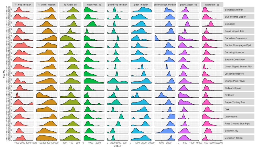
The next step, we are going to use trellis density plot to identify the bird call visually. We need to reduce the number of features to a manageable level and these density plot of this list of variables must be appealing for analyzing visually by density plot.
Trellis Plot for Variable Density
Use the features selected, the trellis density plot can plotted as below.
By visually compare the value of Test Birds audio file and the density plot above, we can conclude that audio file 2 and 9 'sounds' like rose pipits

Machine Learning Approach
Besides, visual analytics approach, we can also identify the rose pipit's call by building classification model. In this assignment, I applied random forest and decision tree here. The performance results is as below. Target of the model is to identify whether the bird call is rose pipit or not.
Random Forest classified audio file no.9 and 13 as rose pipit
Decision Tree classified audio file no.9 as rose pipit
Discussion
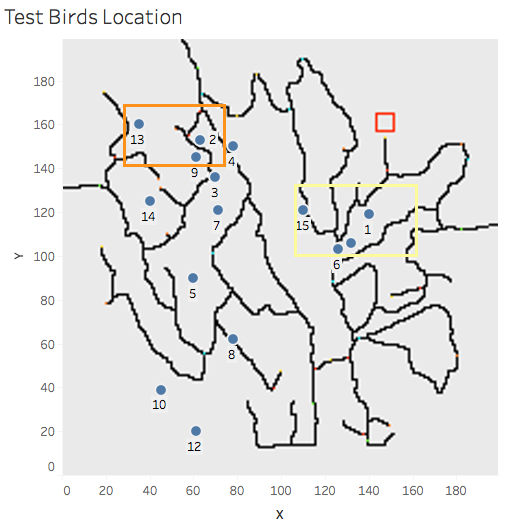
In the last section, audio file no. 2, 9 and 13 have been classified as rose pipit. We find their location on the map.
From the observation in Question 1, location of the three audio file are not close to usual habitat of rose pipit. These recordings very likely are outliers. We cannot conclude that rose pipits are found across the Preserve.
The orange rectangle indicates the location of audio file no. 2, 9 and 13.
The yellow rectangle indicates the usual habitat of rose pipit.
