ISSS608 2017-18 T3 Assign Joel Choo Peng Yeow Are You Guilty
"You See, But You Do Not Observe"
- Sherlock
Looking Deeper Into The Network Of Connected Individuals
|
|
|
|
|
|
|
Contents
Do You Plead Guilty?"
Data Preperation
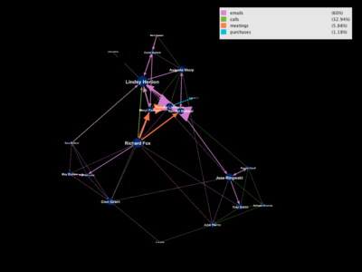
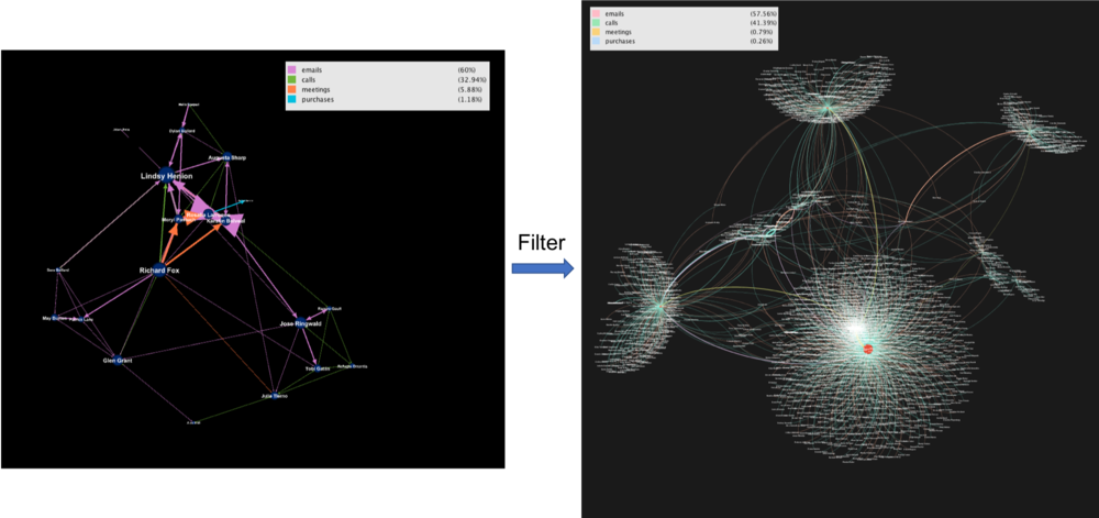
Using the list of suspects provided by the insider, we would like to determine if anyone else appears to be closely related to the group and which employees are making suspicious purchase. The below depicts the original network of the list of suspicious individuals provided by the insider. The size of nodes and node labels indicates the in-degree each node appears within the dataset. Larger node represents that many edges go in the node and communications are directed at them.
Lindsy Henion, Richard Fox and Jose Ringwalk seems to be the prominent ones here and we will investigate further.
After filtering all activities that happened in the company, we obtain 1722 employees (nodes) and 1904 activities (edges) as seen below.
Understanding Centrality Measures
In a connected graph, closeness centrality (or closeness) of a node is a measure of centrality in a network, calculated as the sum of the length of the shortest paths between the node and all other nodes in the graph. Thus the more central a node is, the closer it is to all other nodes. We will use this metric to identify who are close to the group of suspects.
Betweeness on the other hand represents the degree of which nodes stand between each other and high betweenness means more information will pass through that node. Removing the node will lose a large part of the graph.
After running the algorithm in Gephi, we obtain the centrality measures. Betweeness are skewed right and lesser observations have a high betweenness. Closeness on the other hand are distributed more evenly and we would expect many employees to be closely connected.
Solving The Crime
Finding Those Who Are Close And Crucial To The Group
Using closeness as the size of a node, we have obtained a network with many who seem to be close to the suspicious group. 896 nodes remain on the filtered graph and we will use them to find out their interactions over time.
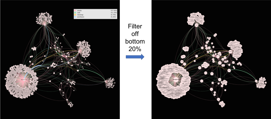
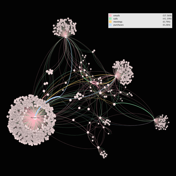
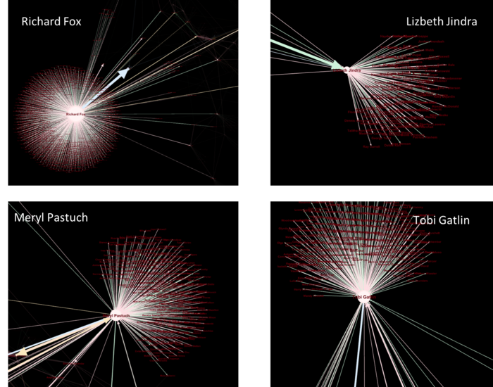
With betweenness as the size of the node, there are 4 big players in the company and they are likely to be very influential people.
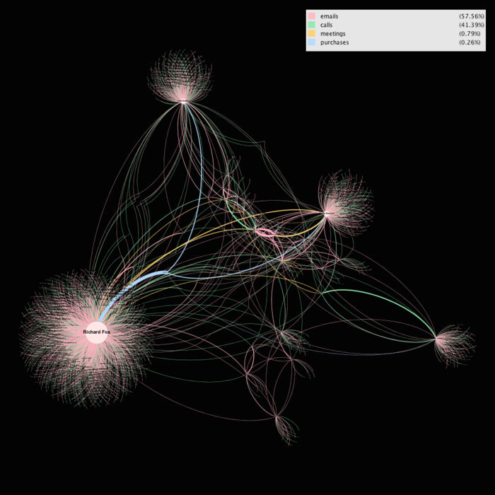
An Overview of the network graph shows how important the big 4 is to the company with betweenness as a centrality measure.
Suspicious Purchases
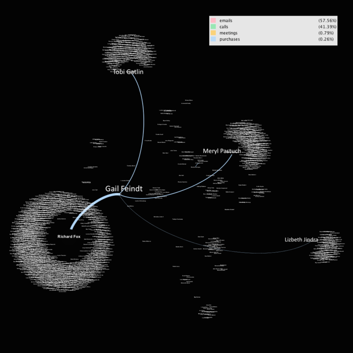
Coincidentally, the bulk of purchase orders were made by the big 4 as well, Tobi, Meryl, Lizbeth and the bulk came from Richard with a total of 15 purchases. This should not be a coincidence and further investigations should definitely be conducted on the four of them.
How Have The Organisational Structure & Communications Changed Over Time?
|
No. |
Species Name |
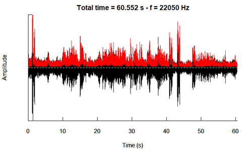
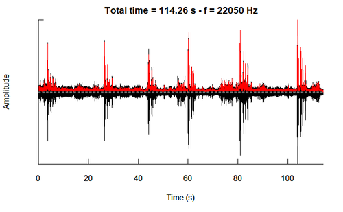
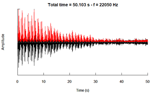
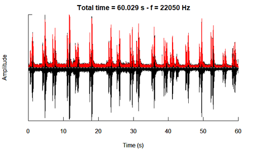
Oscillogram |
|
1. |
Bent Beat Riffraff |
|
|
2. |
Blue Collared Zipper |
|
|
3. |
Bombadil |
|
|
4. |
Broad Winged Jojo |
|
|
5. |
Canadian Cootamum |
|
|
6. |
Carries Champagne Pipit |
|
|
7. |
Darkwing Sparrow |
|
|
8. |
Eastern Corn Skeet |
|
|
9. |
Green Tipped Scarlet Pipit |
|
|
10. |
Lesser Birchbeere |
|
|
11. |
Orange Pine Plover |
|
|
12. |
Ordinary Snape |
|
|
13. |
Pinkfinch |
|
|
14. |
Purple Tooting Tout |
|
|
15. |
Qax |
|
|
16. |
Queenscoat |
|
|
17. |
Rose-Crested Blue Pipit |
|
|
18. |
Scrawny Jay |
|
|
19. |
Vermillion Trillian |
Testing Birds
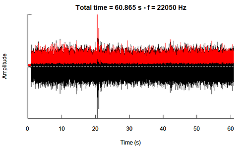
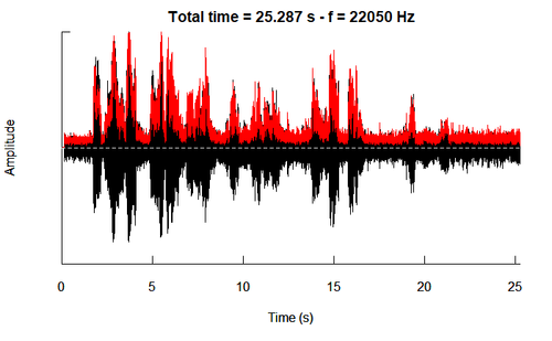
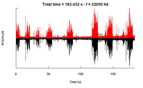
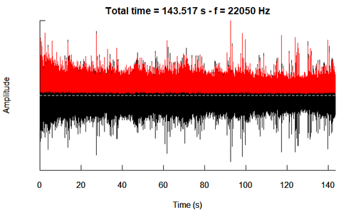
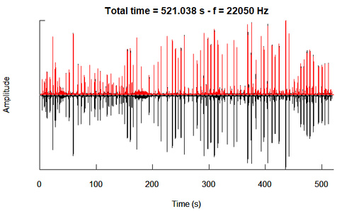
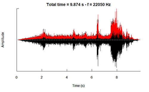
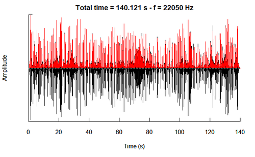
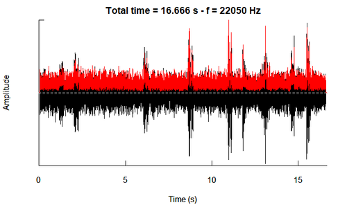
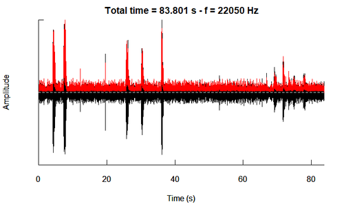
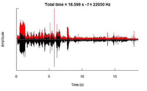
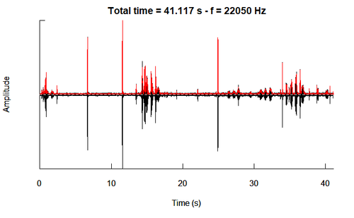
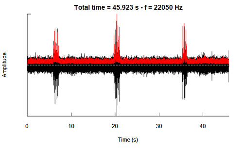
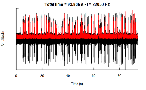
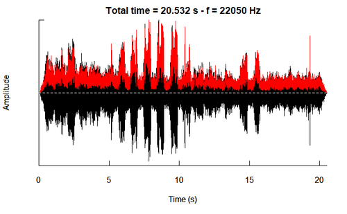
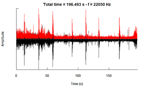
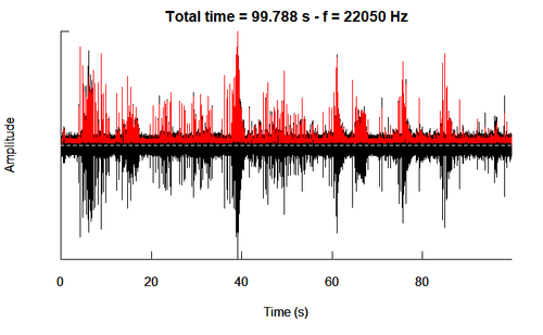
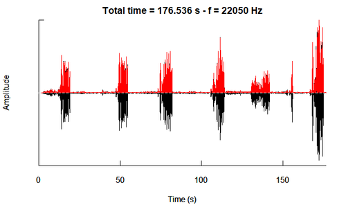
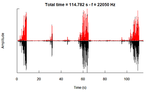
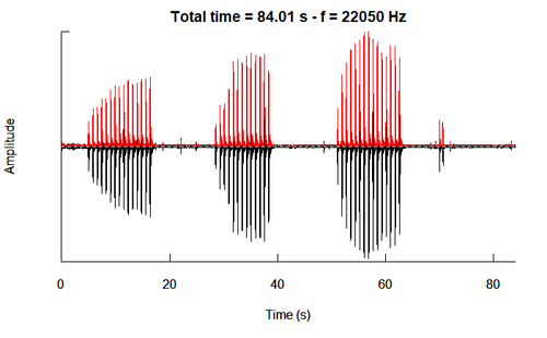
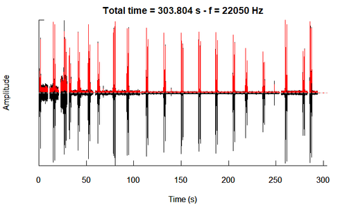
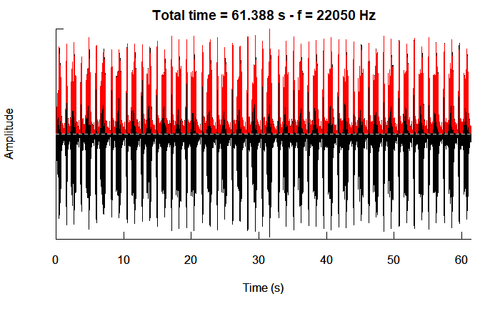
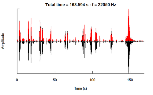
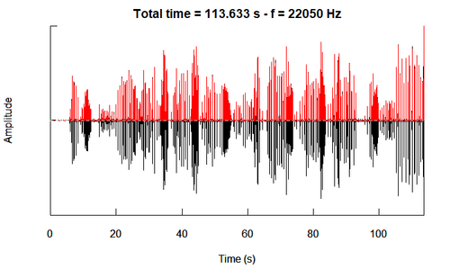
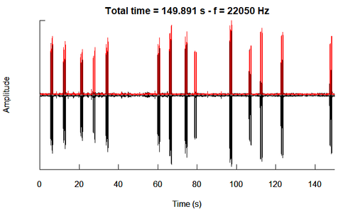
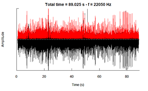
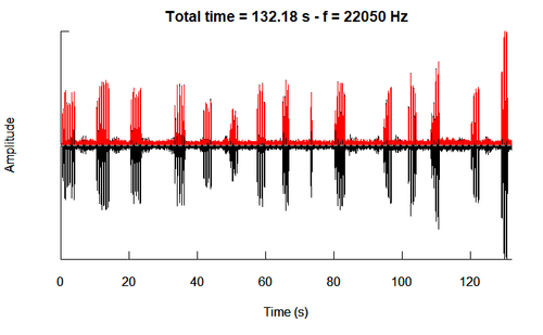
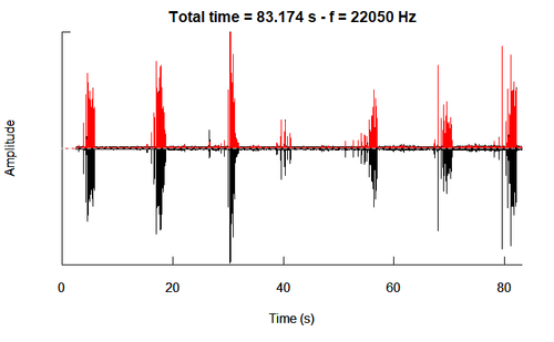
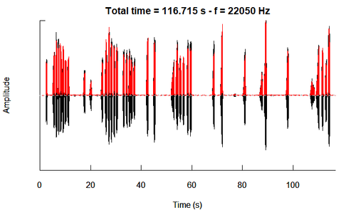
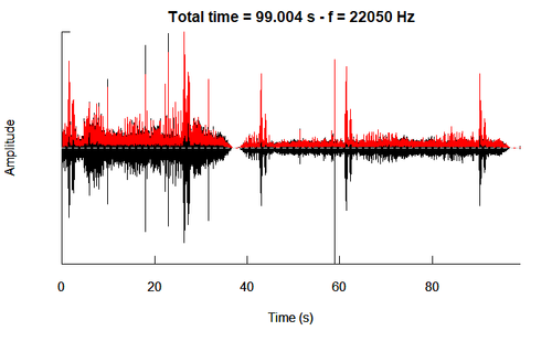
The oscillograms of each of the 15 test birds are as follows.
The predicted species is indicated in the last column, after visualising and comparing the similarity of the amplitude plots. Our results show that the predicted species based on oscillogram visualisation, matches the predicted species based on envelope plot visualisation. This is not a surprise because the envelope is obtained from the oscillogram.
We plot both, because the envelope gives a quick comparison while the oscillogram provides a more indepth visualisation.
|
ID |
Oscillogram |
Predicted Species |
Same as earlier predicted by envelope? |
|
1 |
Eastern Corn Skeet |
Yes. Though, this is quite close to the Rose-Crested Pipit. However, the Pipit produces more ‘chirps’ per 100 sec, as compared to the Skeet. | |
|
2 |
Rose-Crested Pipit |
Yes. | |
|
3 |
Queenscoat |
Yes. | |
|
4 |
Bombadil |
Yes. | |
|
5 |
Canadian Cootamum |
Yes. | |
|
6 |
Qax |
Yes. | |
|
7 |
Canadian Cootamum |
Yes. | |
|
8 |
Green-Tipped Scarlet Pipit |
Yes. | |
|
9 |
Rose-Crested Blue Pipit |
Yes. | |
|
10 |
Qax |
Yes. | |
|
11 |
Scrawny Jay |
Yes. | |
|
12 |
Qax |
Yes. | |
|
13 |
Qax |
Yes.
| |
|
14 |
Bombadil |
Yes.
| |
|
15 |
Pinkfinch |
Yes. |
