ZL-Conclusion
|
|
|
|
|
|
Trend Analysis
To get the timely information, I set the time range from 2008 to 2016. Then I check the trend of each measure. There are several types of trend:
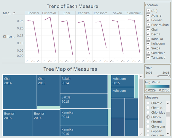
- Fallen off: according to the chart below, during 2008 to 2016, the level of Chlorodinine is high in 2015; Boonsri, Busarakhan, Chai, Kannika, Kohsoom, Sakda and Somchair were involved. However, in 2016, the level of Chlorodinine were sudden drop. No matter the average value or the sum value, were both decrease a lot.
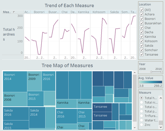
- Soar up: This type of trend means in one year the measure level was jumped up. As the chart below, in Boonsri, Busarakhan, Chai, Kannika, Khosoom, Sakda, Somchair and Tansanee, the level of Total Hardness was sudden increased in 2014 and 2015.
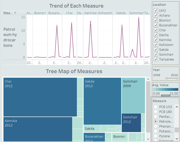
Another example of Soar Up is Petroleum Hydrocarbons:
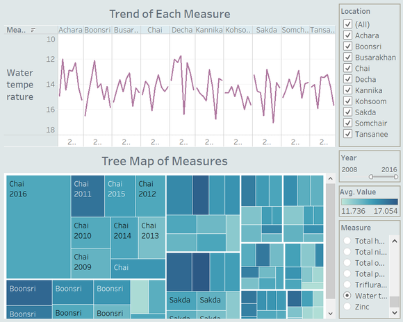
- Continuing Wobbles: Take Water Temperature as the example. In recent years, the water temperature of each sampling sites fluctuates constantly. From the chart below, there are no obvious outliers, however, I still need to check the control chart to get more accurate testing result.
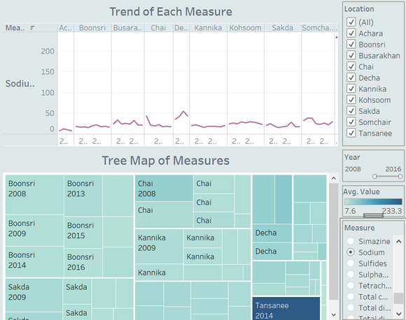
- Relatively Flat: Some measures did not change significantly, they keep the flat level in several years. No sudden rise or sudden drop, just like the Sodium.
Water System Analysis
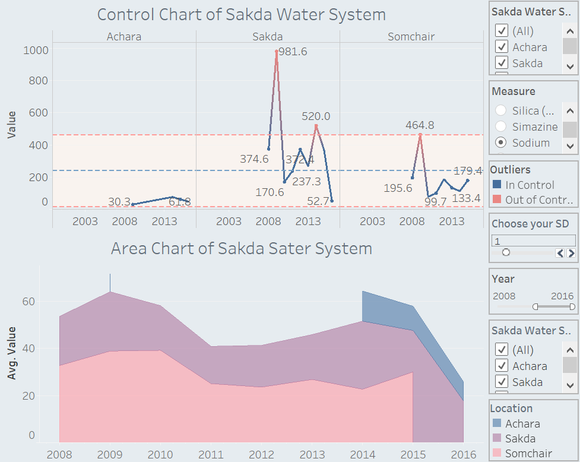
Despite of the overall trend, I also want to find out the relationship within one water system and to see how the watershed integrity could influence the water quality. First, I check the Skada Water System which is composed of three sampling sites – Achara, Somchair and Sakda. Let me use the Sodium as the example:
In this water system, Achara and Somchair are upstream, Sakda is downstream. The Sodium level of Sakda is obviously higher than the upper limit, so I treat it as out of control, which means in Sakda, the Sodium was accumulated too much. Then I check the Area Chart, it looks like the trend of Somchair and Sakda is close. However, I still need more evidence to proof my thought.
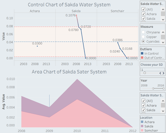
Next, I check the control chart and area chart of Cyanides. From the control chart, it is obvious that the pollutant content is high in Sakda, 2008. It was higher than the upper limit. After 2008, the trend goes down, meanwhile, the trend of Cyanides in Somchair has the same trend.
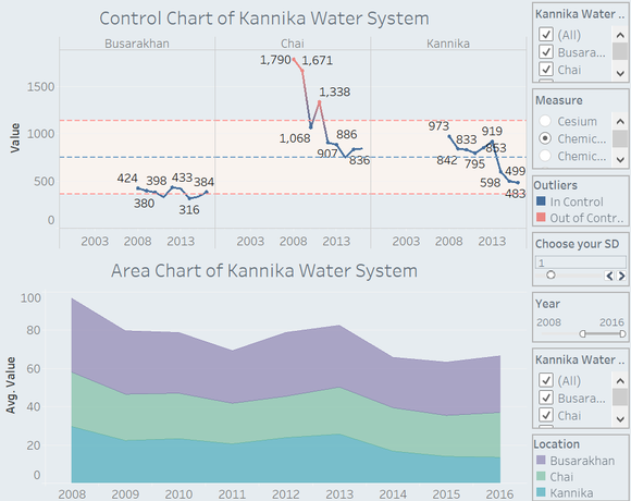
To get further convincing, I also check the Kannika Water System which is composed of Busarakhan, Chai and Kannika. In this system, Kannika is the downstream, Busarakhan and Chai is upstream. The reason that I didn’t choose Boonsri and Kohsoom as upstream is these two sampling sites are too far away from the downstream, the pollutant in Boonsri and Kohsoom may not affect the waterway near Kannika.
For Kannika system, I choose Chemical Oxygen Demand as the example. From the control chart, this measure in Chai is over the upper limit in several years. Then I check the area chart, the fluctuation in three sampling sites are almost the same.

