ISSS608 2017-18 T3 Assign Priyadarsan Shankar Data Preparation
VAST Challenge 2018: Suspense at the Wildlife Preserve
Mini Challenge 2 - Like a duck to water
|
|
|
|
|
|
|
Contents
Data preparation
The steps taken to prepare the data for analysis and visualization are illustrated below:
Multiple readings
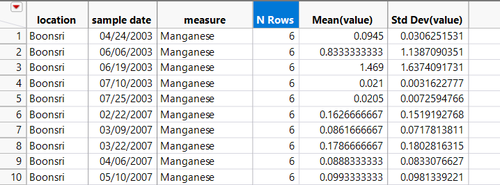
There are instances where sensors in some locations are collecting multiple readings in a day like Chai. Since the time dimension column of the time series data is not coded with a granularity lower than day to a time at which the reading was taken level, the time series cannot be used as is. First, we calculate the mean and standard deviation of each measure at each location over the readings from 1998-2016. So the data is imported to JMP and grouped by Sample date, Location and Measure name, then the value which has the least Z score is chosen as the value for that location and measure for that day. Also a number of records column that JMP creates automatically is kept with the data for frequency analysis.
Geocoding
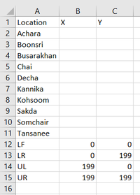
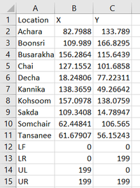
A CSV file is created as below to set the map between a (0,0),(199,0),(199,199),(0,199). This dataset is imported to tableau and the Boonsong Legakul preserve map is imported as background. The arrows marking the location of each sensor at the 10 locations are annotated and their X and Y values added to the initial CSV file.
This dataset with the geocoded locations is joined with the original water sensor readings measurements data on Location to Geocode it.
Calculated fields
The formula based calculations performed to create the visual models for data discovery are illustrated below:
Outliers check
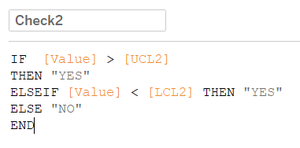
Calculated fields are created to identify extreme values for each chemical measure at each location. The measures are grouped on location level and the mean value and the standard deviation throughout the years from 1998 to 2016 is calculated and the each measured reading is compared with the mean (+ or -) 1.5 and 2 standard deviation values and are flagged as YES or NO whether they are extreme compared to the 1.5/2 standard deviation values.
Toxicity
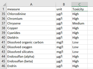
The contaminant measures are looked up in the EPA National Primary Drinking Water Regulations and based on their effects on human and animals/birds they’re categorized into Toxicity levels of HIGH/MEDIUM/LOW(EPA guidelines). The fictious chemicals are rated based on the information in VAST MC2 2017.
Time to next/Time since last
To analyse the sampling frequency at each sensor location across the Boonsong waterways, two calculated measures are created which count the days between each subsequent measurement taken for each measure at each sensor location one measuring the number of days between the current measurement and the prior measurement taken and another measuring the number of days between the current measurement and the next measurement taken. For this, the data is sorted in Location, Measure and then Sample date and then the formulae are applied as below:
Water quality index
Water Quality Index (WQI) is a worldwide standard by which water quality data is summarized for reporting to the in a consistent manner. It is like the UV index or an air quality index, and it tells us, in simple terms, what the quality of drinking water is from a ground/drinking water supply.
The WQI is calculated as weighted sum of the below measure values:
Biochemical Oxygen Demand
The Biochemical Oxygen Demand (or BOD) is a measure of the amount of food for bacteria that is found in water.
Dissolved Oxygen
The dissolved oxygen test measures the amount of life-sustaining oxygen dissolved in the water. This is the oxygen that is available to aquatic life in the water.
Fecal Coliform
Fecal coliform is a form of bacteria found in human and animal waste.
Nitrates
Nitrates are a measure of the oxidized form of nitrogen and are an essential macronutrient in aquatic environments, they can also cause serious illnesses in fish.
pH
The pH level is a measure of the acid content of the water. Most forms of aquatic life tend to be very sensitive to pH. If the pH is below 7, it is classified as acidic, while water with a pH greater than 7 is said to be alkaline.
Temperature Change
The water temperature of a river is very important, as many of the physical, biological, and chemical characteristics of a river are directly affected by temperature. Using the same thermometer, the water temperature should be checked at the test site and at a similar site one mile upstream.
Total Dissolved Solids
This is a measure of the solid materials dissolved in the river water.
Total Phosphate
Phosphates are chemical compounds made from the elements phosphorous and oxygen.
Turbidity
Turbidity is a measure of the dispersion of light in a column of water due to suspended matter.
Calculation and interpretation
The values unavailable in the given data source are assumed to be in a normalcy throughout the period. The Q values are calculated for each measure based on the Q value chart for that measure. The calculated Q value is weighted against the weight factor for that measure and the weighted Q values are summed to get the WQI value. Formula:
The calculation is done in excel as below:
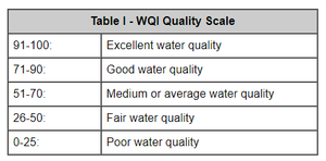
The value is read and interpreted as water quality per the below table.
Methodology
The methodology of this analysis is split into three, aligned with the questions in the challenge to be answered.
Visualizations - Trend analysis
Below are the visualizations for Trend analysis:
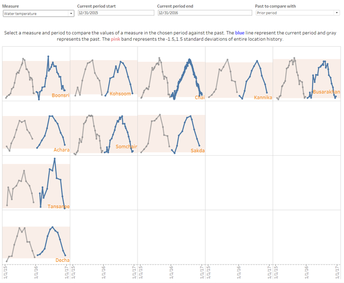
Trellis line chart
The below trellis line chart is a facilitates a trend comparison between a measure’s values across each measuring station through time. The blue line represents the trend in the chosen current period grey line represents the values in the past period chosen for compare with. The pink band is the -1.5, 1.5 standard deviations band for the historical data, which will aid pick out the extreme lows and highs that the past has not seen.
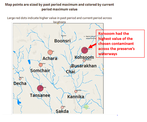
Mapping maximums
The locations are represented on a map with their points colored by a chosen period’s maximum value of the chosen contaminant, the size of the bubbles are the past period maximums of the same measure, which helps identify a varying trend.
Statistics table
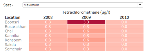
This viz is a year after year STAT table to view the change in contamination level of a chosen contaminant as numbers on a yearly level to view the contamination spikes and dips.
Daywise trend
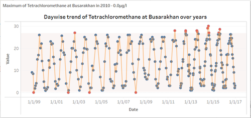
This viz is a line chart of values of a chosen measure of the full time span of measurements with the -1.5, 1.5 standard deviation bands and the outliers outside the band coloured red to show the volatility in the trend of a chemical’s levels.
Trend and peaks line chart
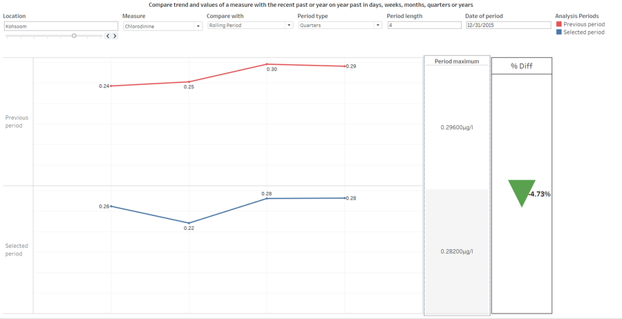
This is a comparison tool viz where a location and measure are chosen first. Then a comparison period is chosen in aggregation level of days, weeks, months, quarters and years. The values of the measure in that station is compared in that aggregation with the ROLLING PERIOD past or a YEAR ON YEAR past. There’s also a table to compare and present the percent increase or decrease in peak contamination level across the periods. This is to visualize how different the present scenario is from the history of the preserve.
Radial plot of seasons
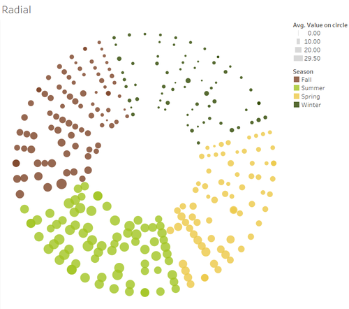
The concentric circle plot visualizes each year as a circle and each point representing a week sized by the value of the chosen measure’s presence at the chosen location. The dots are colored by season. This plot puts to perspective the variation of values across the different seasons(The seasons are assumed to follow the USA year as the water temperature values point exactly to it) of the year while also providing scope to visualize sampling of the measures at seasonal level.
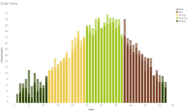
Seasonal clustered bar chart
The clustered bar chart visualized the value coupled with the radial chart across the seasons in a year level. The bars can display the value of measures at the chosen location or the number of samples taken in a weekly level of a measure at a chosen location.
Visualizations - Sampling analysis
Below are the visualizations for Sampling analysis:
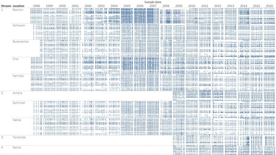
Samples across time
This viz aims to identify pattern and frequency anomalies in the sampling of the measurements of the different measures in a stream, location level. Each point represents a day in which a sample was taken for one measure which is one row. The missing spaces are the days with no measurements.
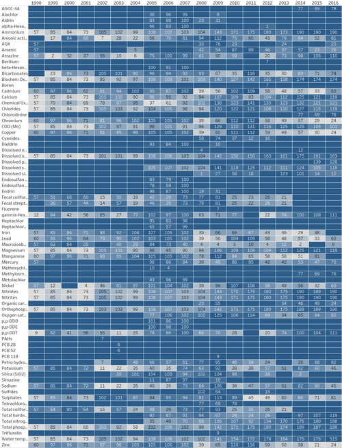
Sampling count heatmap
The below heatmap is a ranking of the years by number of samples taken for each measure which form the rows. The number in the box is the number of samples of that measure taken in that year and the heatmap is colored by the rank of count across the years. This heatmap will be filtered by location when viewing for analysis to provide accurate context.
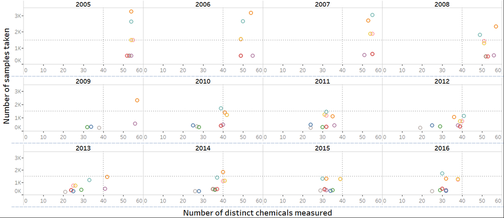
Samples vs Chemicals scatterplot
The below viz is a quadrant analysis of the sampling nature at measuring station level across years. Plotting the number of samples taken of all measures against the number of unique measures measured at the measuring location level can be used to analyse any anomalies in sampling rates over the years and if they are uniform across locations.
Days to and since cyclic plot
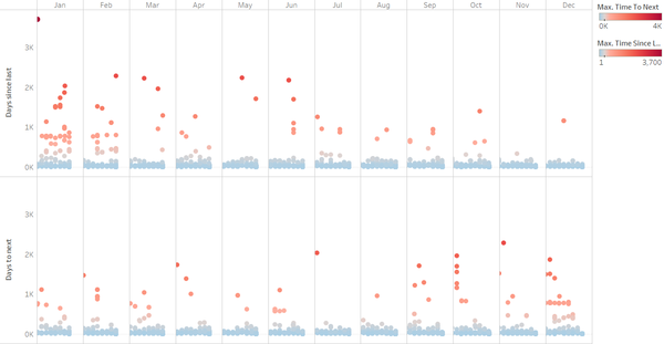
The below cyclic dot plot visualizes the time gap between subsequent measures of a measure at each sensor location level in a cyclic month across the years fashion to identify measurement frequency, strategy and anomalies and characterize them within months.
Visualizations - Contamination analysis
Below are the visualizations for contamination analysis:
Contamination level rank heatmap
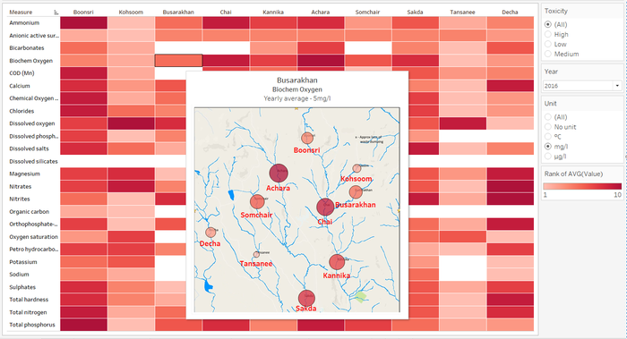
This viz is a rank heatmap to identify the locations that have a consistent high contaminant levels across the different contaminant measures compared to the other measuring station locations around the preserve along the water ways. There’s also a map view of the same visualization for context.
WQI map
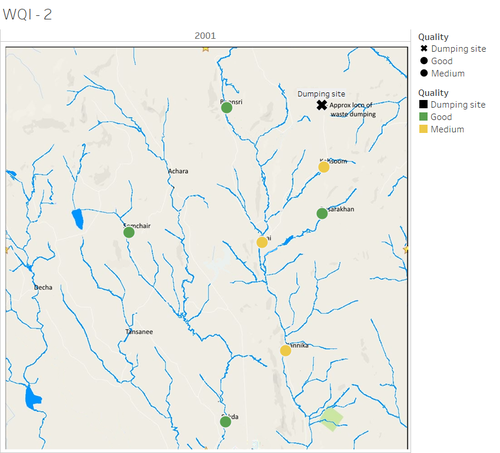
The water quality index bin representing the water quality is measured and plotted at the different measuring sites on the map of the preserve. This is to aid analyse the trend of contamination level across the Boonsong Legakul waterways through the years and also identify the role and possible link to the dumping site which is suspected to be the primary source of chemical contamination.
WQI control chart
The WQI control chart plots the changes in water quality index over the year at location to identify anomalies and analyse the root cause of changes in water quality levels in concordance with the furniture factories setup timeline inside the preserve.
Dashboard design
Dashboards - Trend analysis
Below are the dashboards for Trend analysis:
Past vs Present
This dashboard provides a view for comparing the trends and values as numbers across the years for any measure across the locations ordered by stream and also a view on the map for perspective.
IMAGE HERE
Spike compare
This dashboard is a comparison tool for comparing the trend and period spikes in a rolling period or year on year basis and see the percentage increase in any form of aggregation from days, weeks, months, quarters or years if there’s an increase or decrease in contamination by that measure between the periods.
IMAGE HERE
The circles of seasons
This dashboard puts in a seasonal perspective plotting the values of a measure at a location for each week as a point on one concentric circle for each year to view the trend of values across seasons and how the sampling rate varies. The circles are complemented by the clustered bar chart for trend perspective.
IMAGE HERE
Dashboards - Sampling analysis
Below are the dashboards for Sampling analysis:
Samples over time
The sampling dashboard is a visualization of the days in which measurements were taken with each row as a measure.
IMAGE HERE
Samples vs Measures
This dashboard is an over year quadrant analysis of the number of samples taken vs the number of distinct measures measured in a year to identify changes in sampling strategy over time.
IMAGE HERE
Dashboards - Contamination analysis
Below are the dashboards for Contamination analysis:
Contamination by locations
This dashboard ranks the locations by chemical contamination measure-wise in a chosen year to identify locations with higher overall chemical contamination.
IMAGE HERE
WQI over years
This dashboard visualized the water quality index calculated at each water sensor measuring location at a yearly level to view changes in water quality and the influence of the dumping site proximity.
IMAGE HERE
