Group14 Report
|
|
|
|
|
Contents
Overview
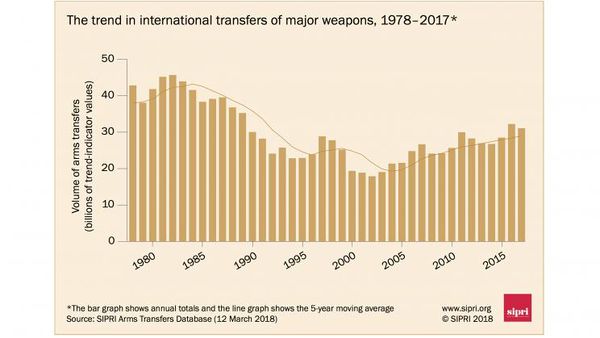
The global arms trade has been a major concern as the international transfer of arms between states could lead to wars, crimes against humanity and contribute to serious violations of international human rights. The Stockholm International Peace Research Institute (SIPRI) conducts research on arms transfers between regions and states aimed at increasing the fundamental understanding of the impact of arms transfers and to support policymaking. SIPRI aims to contribute to greater transparency in the global arms trade to ensure responsible international arms transfers, hence helping to prevent violent conflict, alleviate tensions and warn about potentially destabilizing arms accumulations. Based on the latest publication by SIPRI in 2017, a rising trend is observed in the volume of international transfers of major weapons, with the highest volume of arm transfers recorded between 2013 to 2017, since 1990 [1]. Research conducted by SIPRI also shows that the global arms trade industry is continuing to export weapons into for deadly armed conflicts. [2]
Trend in International Arms Transfers,1978 to 2017
|
|
Motivation and Objectives
Based on the Global Peace Index 2018 published by the Institute for Economics and Peace, we have identified the countries with 'Low' and 'Very Low Peace' global peace index. [3]
Our project aims to identify the trends and patterns in the international arms transfers at the regional and country levels for these countries and we wish to explore the arms trade dependencies of these countries with other countries. We also aim to explore the major importers and exporters of arms weapons and to find out the relationships between the global arm importers and exporters. Our team is motivated to design a dynamic and interactive dashboard to provide students and policymakers a better understanding and holistic view of the global arms trade.
Through our analysis, we hope to address the following:
1) To explore the arms imports at regional and country level
We want to observe the trends in the global arms imports, find out the countries and regions with the highest arm imports and also identify if there are any unusual patterns in the global arm transfers over the years.
2) To explore the arm trade dependencies between countries
We would like to explore the chord diagram and network chart to find out the exchange of arms transfer between countries.
3) Analyse the top exporters of arms
For a particular region or country, we would like to find out which are the top exporters supplying arms and find out the trends in the arms suppliers across the years.
4) Explore the arms imports with the economic and population indicators
Our group wishes to find out if there is a relationship between the economic and population indicators with the arms imports of countries.
Past Works
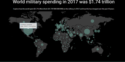
A number of applications exist for the visualization of arms trade data. SIPRI produced an interactive web platform using data in their published database but focused on military expenditure instead of arms trade flows (http://visuals.sipri.org/).
|
|
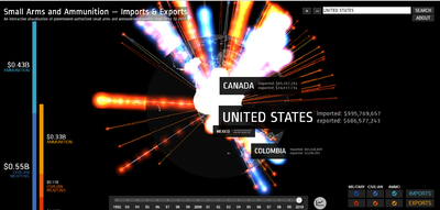
More prominently, Google produced an interactive platform visualizing the imports and exports of small arms and ammunition [7]. These applications, while enhancing the interpretability of published data, often focus only on one aspect of the arms trade using a singular visualization technique (http://armsglobe.chromeexperiments.com/).
|
|
To value-add to this, we contribute an application featuring multiple visualizations, each providing a different aspect of exploration. The following sections describe our approach to the problem and how the application was designed and built.
Design Framework
Our analysis of the SIPRI arms imports data is done the following way:
1. Visualisation of Arms Dependencies
2. Visualisation of Arms Trade over time
3. Visualisation of Arms Import by FDI, GDP and Population
Visualisation of Arms Dependencies
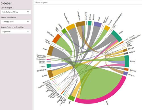
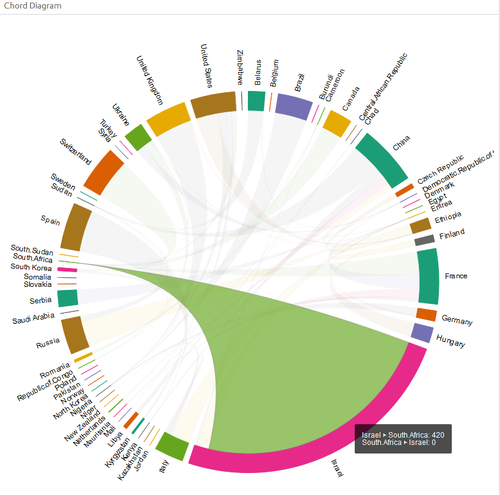
Chord Diagram To visualise the arm imports dependencies between countries, chord diagram was used.
Package(s) Used
The chorddiag package in R allows to create interactive chord diagrams using the JavaScript visualization library D3 from within R using the htmlwidgets interfacing framework.
It is also possible to utilize the circlize package to visualize the chord diagram with added customizable functions to visualize additional plots within the chord diagram. However, circlize package lacks the interactivity for users on the chord diagram itself. For example, users will not be able to highlight trade flows of interest within the chord diagram itself. The chorddiag package requires the data to be in a square matrix format, hence multiple data wrangling had to be performed to ensure that datasets had to be in square matrix format prior to plotting of the chord diagram.
Application Users are filter by the region to find out the total imports trade flow for countries in the selected region. In addition, users can also filter by the 5-year interval time periods. Users can hover over a particular arc to find out the intra country import details. In the example below, the tooltip shows that South Africa imports 420 arms imports (TIV millions) from Israel.
|
|
|
|
Tree Map
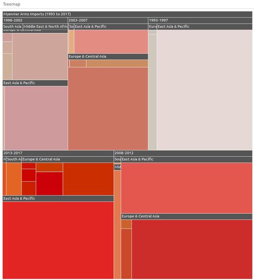
The treemap allow users to filter by country to visualize the selected country’s dependencies on other countries for arms in 5-years period from 1993 to 2017.
Package(s) Used
The treemap package was used and it has powerful set of tools to transform, analyze, and color the treemap.
The functionality of the treemap is combined together with the interactivity of the d3.js treemaps in R though the d3treeR htmlwidget. d3treeR is built to work seamlessly with treemaps from the R treemap package.
Users can filter by a particular country to visualize the selected country’s dependencies on other countries for arms in 5-years period from 1993 to 2017.
Application The treemap is structured in a hierarchical format by Year_Range, Region and Country and the measure value, Total arms imports. The total imports value is used to determine the size of each treemap node. Regions with bigger rectangle size are bigger suppliers of the arms to the selected country in the filter option. When Users can click on a particular region, the treemap further drills down into the countries level for the selected region. Users will be able to identify the selected country dependencies of arm imports both at the region and country level.
|
|
Arms Trade Network
Similar to the Arms Trade Dependencies section where users can visualize where a particular country in a selected region obtain their arms from, the network diagram is also able to do so. However, the chord diagram is only suitable for visualizing bilateral trade flows. With a network diagram, users can not only see where the interested country is importing from, but users can also easily see at a glance which other countries in the same region are these exporters exporting to.
Package(s) Used Visnetwork packages is used as it highly customizable and is interactive. It was possible for us to also use the D3network package, which allows for interactivity for users. However, it was not eventually used as it lacks the customizability offered by the visNetwork package, where it is possible to change the icons and the physics of the nodes as well.
Application
Users can filter by Region and the 5 year time period to see which countries in the selected region are importing their weapons from. The countries are colour coded accorded based on the region they reside. This is useful as users can also identify the regions in which a particular country is importing from and see if a country is importing more or less from a specific region.
Users can hover over a particular country of the selected region and time period and the network graph will highlight countries supplying arms to that particular country.
2. Visualisation of Arms Trade over time
Ridgeline Plot
The ridgeline plot is a convenient way to visualise the changes in the arms imports over time from 1993 to 2017 for the series of countries.
Package(s) Used
The ridgeline plot between countries and the arms imports is created using the ggplot2 and ggridge packages. From the ggridge packages, the geom_density_ridges function is used to calculate the density estimates of arms imports values and plots the density estimates using ridgelines. The ggridge plot is useful as it can compare the trends in the arms imports of several countries together.
Application
Users can filter by the region to find out the distribution of import values for the countries in the selected region over time.
Users can visualise the distribution of the import values for countries of the selected region by the 5 year time period and also by the export regions.
3. Visualisation of Arms Import by FDI, GDP and Population
We used the bubble plot to compare the arms imports values of individual countries with the social and economic indicators of the countries, which are the Population Size, net Foreign Direct Investment inflow (FDI) and the Gross Domestic Product (GDP) per capita.
Package(s) Used
plotly package is used as it is an interactive, browser-based charting library built on the open source JavaScript graphing library plotly.js. The plotly library contains the ggplotly function, which will convert ggplot2 figures into a Plotly object.
Application
Users can select different years to to see how the arms imports changes with the social and economic indicators for the country. For India, users can see that the arms imports increases with increasing FDI.
Discussion
What has the audience learned from your work? What new insights or practices has your system enabled? A full blown user study is not expected, but informal observations of use that help evaluate your system are encouraged.
Future Work
A description of how your system could be extended or refined.
Installation Guide
including hardware configuration and software integrationn.
User Guide
Step-by-step guide on how to use the data visualisation functions designed.
References
[1] Stockholm International Peace Research Institute. https://www.sipri.org/research/armament-and-disarmament/arms-transfers-and-military-spending/international-arms-transfers
[2] Amnesty International. https://www.amnesty.org/en/latest/campaigns/2017/09/killer-facts-the-scale-of-the-global-arms-trade/
[3] The Institute for Economics and Peace. http://visionofhumanity.org/indexes/global-peace-index/

