Difference between revisions of "Observations & Insights"
Pachen.2017 (talk | contribs) (Created page with "<!-- BANNER --> <div style=background:#ffffff border:#A3BFB1> 150px|left|width="100%" <font size = 5; color="#000000" style="Calibri">Mini-Challenge 2 Overview...") |
Pachen.2017 (talk | contribs) |
||
| Line 13: | Line 13: | ||
| | | | ||
|}<br> | |}<br> | ||
| − | =Data selection for chemical components= | + | =Question 1: Data selection for chemical components= |
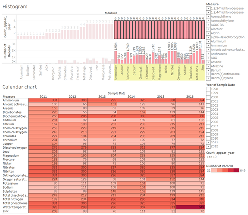
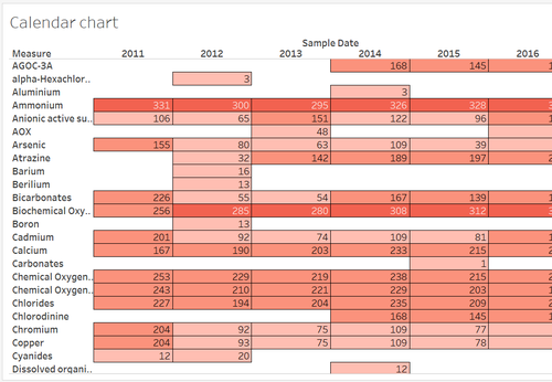
| + | We only pick 2011s to 2016s data to filter the chemicals we are concerned. Research period is 6 years. Using histogram, we filter out 6 years and see the below calendar chart. It gives us 29 measures and no blank records inside. | ||
| + | Import data “Boonsong Lekagul waterways readings.csv”. Explore data by JMP. We found this dataset displays multiple different values among the same sample data, measure, and locations. Shown as below picture. However, we could use average value to compute when using Tableau. Therefore, decide to leave it at first. | ||
| + | |||
| + | [[File:an4_1.png|500px]] | ||
| + | |||
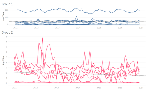
| + | Question 1 is asking chemical contamination. Therefore, we exclude Biochemical Oxygen, Chemical Oxygen Demand (Cr), Chemical Oxygen Demand (Mn), Dissolved oxygen, Oxygen saturation, Total dissolved salts, Water Temperature. Most of the measures are used for evaluating the water quality. Also, exclude Nitrates because of small value. Grouping each average value during 2011s to 2016s manually, got 2 main groups and 6 chemicals cannot group, need to explore more. | ||
| + | |||
| + | Group 1: | ||
| + | Bicarbonates, Calcium, Chlorides, Copper, Nitrites, Orthophosphate-phosphorus, Sodium, Sulphates (8 chemicals) | ||
| + | Most of the amount of average value is large except Bicarbonates We can also tell dominant pattern which spikes in early period of 2012 and the end of 2014~2015. The distribution of most chemical values inside are around trend line which is stable. These chemicals were being manageable well. | ||
| + | |||
| + | Group 2: | ||
| + | Ammonium, Chromium, Lead, Nickel, Potassium, Total nitrogen, Total phosphorus. (7 chemicals) | ||
| + | The amount of average value is not that large. We can also tell dominant pattern which spikes in 2012~2013, 2014, and 2016. The trend we could tell it’s downward. | ||
| + | |||
| + | [[File:an4_2.png|500px]] | ||
| + | |||
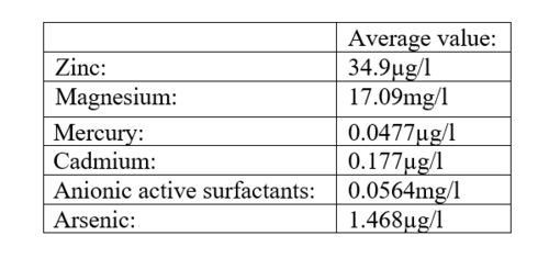
| + | The rest 6 chemicals cannot group together. | ||
| + | |||
| + | [[File:an4_3.png|500px]] | ||
| + | |||
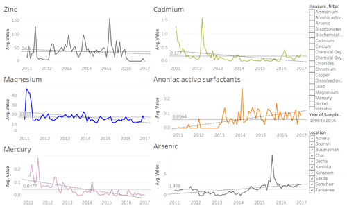
| + | From below 6 charts, we could find that charts about Zinc, Magnesium, Cadmium, and Mercury, trend is downwards. The charts about Anionic active surfactants, and Arsenic, trend is upwards. However, we should zoom into recent years which is from 2013 to 2016. Looks like Zinc, Cadmium, Anionic active surfactants and Arsenic have been released recently. | ||
| + | |||
| + | [[File:an4_4.png|500px]] | ||
| + | |||
| + | Explore 4 chemicals which raised up recently. Explore data by places. | ||
| + | |||
| + | i) Zinc: from below line chart, Zinc was detected as 157.5 µg/l on March 2015. Zinc was detected at Tansanee for 154 µg/l. Though the sensor at Tansanee did not have full records to detect Zinc for full period. | ||
| + | |||
| + | ii) Cadmium: from below line chart, we could tell Cadmim was released from Busarakhan and Somchair from 2013 to 2016. However, it did not exceed the expected range. This heavy metal was still being manageable. | ||
| + | |||
| + | iii) Anionic active surfactants: this contamination was detected as 0.2683 mg/l on February 2014 and exceeded the expected range. When we trace from location, we find that Kohsoom and Boonsri is the same river system and these two released the most. Tansanee exceeded the expected standard on July 2017 and Decha exceeded on May and November 2016. Decha should be watched out that these two data are quite closed and near present. | ||
| + | |||
| + | iv) Arsenic: Arsenic was detected as 9.334 µg/l on August 2015 and exceeded the expected range. Tansanee released the most for 17.14 µg/l. The same as Zinc, the sensor at Tansanee did not have full records to detect Arsenic for full period. | ||
| + | |||
| + | [[File:an4_5.png|500px]] | ||
| + | [[File:an4_6.png|500px]] | ||
| + | [[File:an4_7.png|500px]] | ||
| + | [[File:an4_8.png|500px]] | ||
| + | |||
| + | =Question 2a: What anomalies do you find in the waterway samples dataset? How do these affect your analysis of potential problems to the environment?= | ||
| + | |||
| + | (1) No consistency. Some of waterway data did not have records | ||
| + | Using calendar chart, we could easily tell that some of chemical did not have any records in that year. It would cause the sampling methodology inaccurate. Therefore, when we compare the value of measures, we could only choose non-gap year measure. | ||
| + | |||
| + | [[File:an4_9.png|500px]] | ||
| + | |||
| + | (2) Should not use haphazard sampling | ||
| + | Haphazard sampling is one of the non-statistical sampling methods. This method does not care about suitability and just randomly pick the sample. The problem is the risk of sampling cannot quantify and sampling error may be larger. The last of problem is inefficient though the cost of this method is cheap. | ||
| + | |||
| + | Below chart is Nickel’s line chart. We could tell that every dot is not equivalent because data pick is not regular. | ||
| + | |||
| + | [[File:an4_10.png|500px]] | ||
| + | |||
| + | (3) Some places of sensors should be placed more | ||
| + | To be more accurate, sensors should be placed on each river’s upstream and downstream. The lift sensors at Decha and Tansanee are not enough. Should place more sensor at the upstream and downstream of these two places’ river. Also, if we have already known the direction of factory, nearby places should have sensors too. | ||
| + | |||
| + | [[File:an4_11.png|500px]] | ||
| + | |||
| + | (4) Data from Tansanee is much higher than other 9 places | ||
| + | From below chart, we can easily tell that average of value at Tansanee is much higher than 9 places. We found that Tansanee only has 2011 to 2015. However, picking records year at Decha and Achara are the same as Tanesanee which also means 2011 to 2015. | ||
| + | |||
| + | Then, we aggregate number of records to see the accumulated number. Tansanee is the smallest. We assume that the number of data is not sufficient which causes the skewness. | ||
| + | |||
| + | [[File:an4_12.png|500px]] | ||
| + | |||
| + | =Question 2b: Is the Hydrology Department collecting sufficient data to understand the comprehensive situation across the Preserve?= | ||
Revision as of 00:24, 9 July 2018
| Background | Preparation | Visualization | Observations & Insights | Feedback |
Question 1: Data selection for chemical components
We only pick 2011s to 2016s data to filter the chemicals we are concerned. Research period is 6 years. Using histogram, we filter out 6 years and see the below calendar chart. It gives us 29 measures and no blank records inside. Import data “Boonsong Lekagul waterways readings.csv”. Explore data by JMP. We found this dataset displays multiple different values among the same sample data, measure, and locations. Shown as below picture. However, we could use average value to compute when using Tableau. Therefore, decide to leave it at first.
Question 1 is asking chemical contamination. Therefore, we exclude Biochemical Oxygen, Chemical Oxygen Demand (Cr), Chemical Oxygen Demand (Mn), Dissolved oxygen, Oxygen saturation, Total dissolved salts, Water Temperature. Most of the measures are used for evaluating the water quality. Also, exclude Nitrates because of small value. Grouping each average value during 2011s to 2016s manually, got 2 main groups and 6 chemicals cannot group, need to explore more.
Group 1: Bicarbonates, Calcium, Chlorides, Copper, Nitrites, Orthophosphate-phosphorus, Sodium, Sulphates (8 chemicals) Most of the amount of average value is large except Bicarbonates We can also tell dominant pattern which spikes in early period of 2012 and the end of 2014~2015. The distribution of most chemical values inside are around trend line which is stable. These chemicals were being manageable well.
Group 2: Ammonium, Chromium, Lead, Nickel, Potassium, Total nitrogen, Total phosphorus. (7 chemicals) The amount of average value is not that large. We can also tell dominant pattern which spikes in 2012~2013, 2014, and 2016. The trend we could tell it’s downward.
The rest 6 chemicals cannot group together.
From below 6 charts, we could find that charts about Zinc, Magnesium, Cadmium, and Mercury, trend is downwards. The charts about Anionic active surfactants, and Arsenic, trend is upwards. However, we should zoom into recent years which is from 2013 to 2016. Looks like Zinc, Cadmium, Anionic active surfactants and Arsenic have been released recently.
Explore 4 chemicals which raised up recently. Explore data by places.
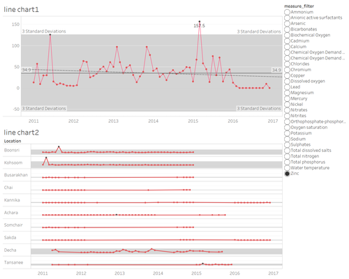
i) Zinc: from below line chart, Zinc was detected as 157.5 µg/l on March 2015. Zinc was detected at Tansanee for 154 µg/l. Though the sensor at Tansanee did not have full records to detect Zinc for full period.
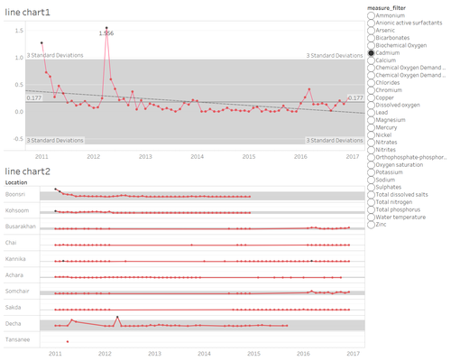
ii) Cadmium: from below line chart, we could tell Cadmim was released from Busarakhan and Somchair from 2013 to 2016. However, it did not exceed the expected range. This heavy metal was still being manageable.
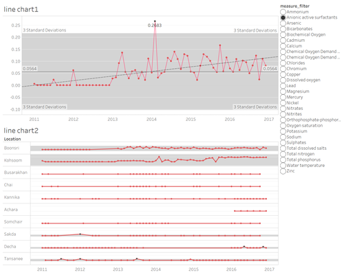
iii) Anionic active surfactants: this contamination was detected as 0.2683 mg/l on February 2014 and exceeded the expected range. When we trace from location, we find that Kohsoom and Boonsri is the same river system and these two released the most. Tansanee exceeded the expected standard on July 2017 and Decha exceeded on May and November 2016. Decha should be watched out that these two data are quite closed and near present.
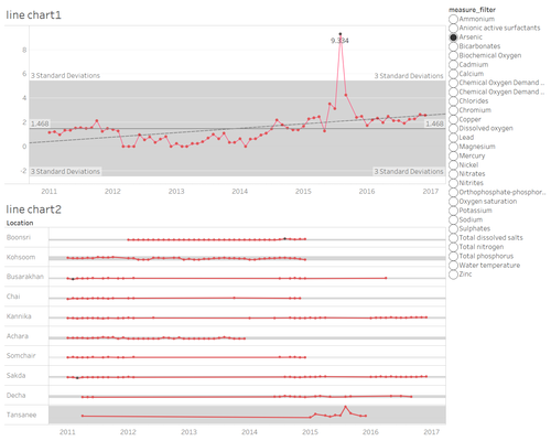
iv) Arsenic: Arsenic was detected as 9.334 µg/l on August 2015 and exceeded the expected range. Tansanee released the most for 17.14 µg/l. The same as Zinc, the sensor at Tansanee did not have full records to detect Arsenic for full period.
Question 2a: What anomalies do you find in the waterway samples dataset? How do these affect your analysis of potential problems to the environment?
(1) No consistency. Some of waterway data did not have records Using calendar chart, we could easily tell that some of chemical did not have any records in that year. It would cause the sampling methodology inaccurate. Therefore, when we compare the value of measures, we could only choose non-gap year measure.
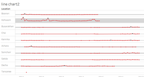
(2) Should not use haphazard sampling Haphazard sampling is one of the non-statistical sampling methods. This method does not care about suitability and just randomly pick the sample. The problem is the risk of sampling cannot quantify and sampling error may be larger. The last of problem is inefficient though the cost of this method is cheap.
Below chart is Nickel’s line chart. We could tell that every dot is not equivalent because data pick is not regular.
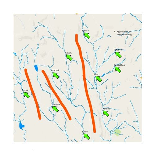
(3) Some places of sensors should be placed more To be more accurate, sensors should be placed on each river’s upstream and downstream. The lift sensors at Decha and Tansanee are not enough. Should place more sensor at the upstream and downstream of these two places’ river. Also, if we have already known the direction of factory, nearby places should have sensors too.
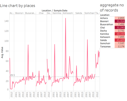
(4) Data from Tansanee is much higher than other 9 places From below chart, we can easily tell that average of value at Tansanee is much higher than 9 places. We found that Tansanee only has 2011 to 2015. However, picking records year at Decha and Achara are the same as Tanesanee which also means 2011 to 2015.
Then, we aggregate number of records to see the accumulated number. Tansanee is the smallest. We assume that the number of data is not sufficient which causes the skewness.
