Difference between revisions of "ISSS608 2017-18 T3 Assign MENG XIANGYI Visualization"
Xymeng.2017 (talk | contribs) |
Xymeng.2017 (talk | contribs) |
||
| Line 1: | Line 1: | ||
<div style=background:#F6CECE border:#A3BFB1> | <div style=background:#F6CECE border:#A3BFB1> | ||
| + | [[Image:111.JPG|400px]] | ||
<b><font size = 6; color="#8B4513"> VAST Challenge 2018:Mini-Challenge 2: Like a Duck to Water </font></b> | <b><font size = 6; color="#8B4513"> VAST Challenge 2018:Mini-Challenge 2: Like a Duck to Water </font></b> | ||
</div> | </div> | ||
Latest revision as of 23:12, 8 July 2018
|
|
|
|
|
Contents
Measure Changing Analysis
Overall Change
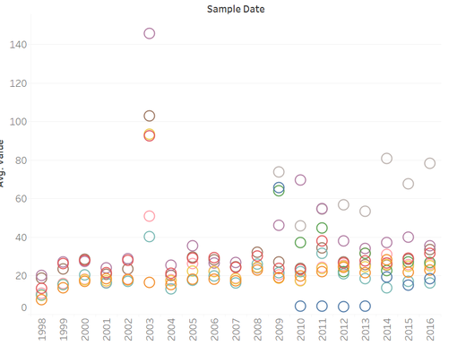
Since the dataset is sequence data from 1998 to 2016, we are interested in how the values of measures change as for different location, we can see how the average value of measures varied by years. We can see that the average value of Kohsoom, Somchair and Kannika is very high in 2003. And the value of Tansanee increase greatly from 2009-2015.
Chemical Change
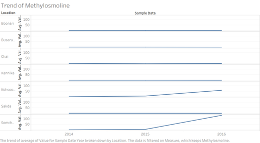
Now let’s look at the Chemical change, from the Measures, we can see there are more than 100 chemicals provided, some of the measures have low values which may be not useful for our analysis. From all the chemicals I also notice that chemical Methylosmoline only have recording from 2014-2016, so we can explore and see whether it has impact generating the pollution.
Water Temperature
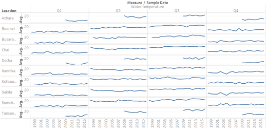
Than we are interested in exploring the water temperature of different location changing by years, From the figure we can see the trends of water temperature in different location, and how they change by years, we show the graph in quarter format, since it would be clearer to see the comparation. And we can see that the highest water temperature appears in Q3 which are July, August and September. what’s more we notice that there are limited data for location-Achara, Decha and Tansanee.
Macrozoobenthos
As for acrozoobenthos, since is use a different unit compare to other chemical measures, from the graph below we can see this measure of different location during 1998 to 2016, we find that the data was been recorded quite continuously and all location are in gradually growing trend, however, for year 2014, the value of Macrozoobenthos in Kannika and Sakda increase greatly. And we notice that the data for Decha and Tansanee is not sufficient.
Geographical Location Map
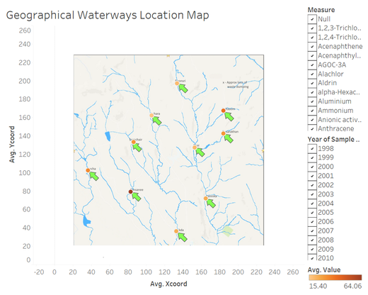
Now we can use the waterways site map with coordinates to do geographical analysis, since each record has their own coordinate, we want to use it to see the chemical difference in each location. Use the Filters to display recording as long as we want from 1998 to 2016, and also filtering the measure that allowed to choose one measure every time. The visualization is finally display in dashboard. See the figure below.
