Difference between revisions of "Fu Yi - Visualization"
Yi.fu.2017 (talk | contribs) |
Yi.fu.2017 (talk | contribs) |
||
| Line 31: | Line 31: | ||
<div style="background:#2b3856; border:#002060; padding-left:15px; text-align:left;"> | <div style="background:#2b3856; border:#002060; padding-left:15px; text-align:left;"> | ||
| − | <font size = 4; color="#FFFFFF"><span style="font-family:Century Gothic;"> | + | <font size = 4; color="#FFFFFF"><span style="font-family:Century Gothic;">Question 1</span></font> |
</div> | </div> | ||
| + | =Is the company growing?= | ||
The tool to visualize the overall picture of the company growth is Tableau. | The tool to visualize the overall picture of the company growth is Tableau. | ||
| Line 41: | Line 42: | ||
[[Image:Visq1.png|1550px|frameless|center]] | [[Image:Visq1.png|1550px|frameless|center]] | ||
| − | |||
Purchase number is a strong indicate of a company whether its business was running good or not. For Purchases cycle plot, we can see from 2015 to 2016, all the 6 months from July to December exceed the average number of purchases, most of them they are above the reference line, so we can assume that in the first 6 months, the scenario for purchase was also increasing, the company was running good business in 2015~2016. However, the situation in 2016 to 2017 changed dramatically. All the increasing trend turned to be flattened, except July and September. Many months experienced an extreme decreasing trend line, which indicate that the company business experienced a down trend, not as good as its previous year. | Purchase number is a strong indicate of a company whether its business was running good or not. For Purchases cycle plot, we can see from 2015 to 2016, all the 6 months from July to December exceed the average number of purchases, most of them they are above the reference line, so we can assume that in the first 6 months, the scenario for purchase was also increasing, the company was running good business in 2015~2016. However, the situation in 2016 to 2017 changed dramatically. All the increasing trend turned to be flattened, except July and September. Many months experienced an extreme decreasing trend line, which indicate that the company business experienced a down trend, not as good as its previous year. | ||
| Line 52: | Line 52: | ||
The full picture of the company operational scenario indicated by 4 types of activities. Based on the changes on Purchase, Calls and Emails in 2015 – 2016, the company ran a good business. However, the company witnessed a down trend in 2016 – 2017. [https://public.tableau.com/profile/fu.yi#!/vizhome/VASTChallenge_2018MN3_Q1/Activitytrend2015-2017 Click here to view Tableau of the full picture] | The full picture of the company operational scenario indicated by 4 types of activities. Based on the changes on Purchase, Calls and Emails in 2015 – 2016, the company ran a good business. However, the company witnessed a down trend in 2016 – 2017. [https://public.tableau.com/profile/fu.yi#!/vizhome/VASTChallenge_2018MN3_Q1/Activitytrend2015-2017 Click here to view Tableau of the full picture] | ||
| + | |||
| + | |||
| + | <div style="background:#2b3856; border:#002060; padding-left:15px; text-align:left;"> | ||
| + | <font size = 4; color="#FFFFFF"><span style="font-family:Century Gothic;">Question 2</span></font> | ||
| + | </div> | ||
| + | |||
| + | =Insider try to tell the suspicious purchase is?= | ||
| + | |||
| + | After applied Fruchterman Reingold layout method to the suspicious dataset, edit Area = 10000, Gravity = 15. After that, I ran Betweenness Centrality and Eigenvector Centrality, rank the size and colour according to these 2 statistic measures. Betweenness Centrality is a measure of centrality in a graph based on shortest paths, represents the degree of which nodes stand between each other. Eigenvector Centrality represent the importance of the node. A high eigenvector score means that a node is connected to many nodes who themselves have high scores. The larger the circle, the higher the Betweenness Centrality value, the darker the colour, the higher the Eigenvector Centrality value. | ||
| + | |||
| + | The first picture shows the entire connection for all suspicious nodes from insider. The second one filter only show the purchase. We can see that Rosalia requested a purchase from Jenice. | ||
Revision as of 17:31, 8 July 2018
|
|
|
|
|
|
Question 1
Is the company growing?
The tool to visualize the overall picture of the company growth is Tableau.
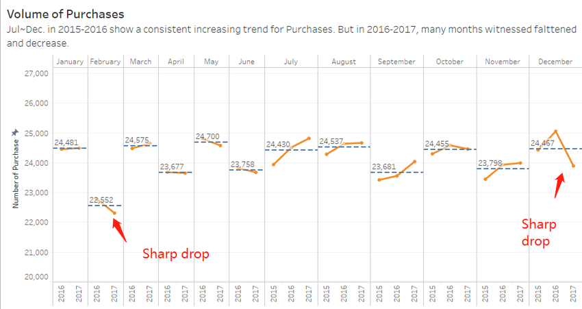
First, I bring in four data sources, the categories are: Calls, Emails, Meeting and Purchases, change the variable type accordingly, as we have the data from July 2015 to December 2017, it is appropriate to show the monthly changes within the company across the year. Then, I create sheet for each category by using cycle plot to compare the monthly changes across different year, because each month has different number of days, for certain month like February, the days are naturally less than other month, to eliminate the bias, it should compare the month to itself check what the pattern changes. Moreover, I add a reference line to display the average value for each month, so can refer the changes to this line, it gives a better picture.
For Calls and Emails, the changes follow the similar pattern. Overall even though we miss out the first 6 months data in 2015, we are still able to tell that in 2015, the communication volume is increasing, because all of the rest of months from July to December in 2015 display a steep increasing trend, there is no reason that the first 6 months would have opposite trend if the company was in same operation condition. On the other hand, when it comes to 2016 to 2017, the scenario changes. In general, the increasing trend becomes more flattened, some of the months even witnessed decreases, like February and December.
Purchase number is a strong indicate of a company whether its business was running good or not. For Purchases cycle plot, we can see from 2015 to 2016, all the 6 months from July to December exceed the average number of purchases, most of them they are above the reference line, so we can assume that in the first 6 months, the scenario for purchase was also increasing, the company was running good business in 2015~2016. However, the situation in 2016 to 2017 changed dramatically. All the increasing trend turned to be flattened, except July and September. Many months experienced an extreme decreasing trend line, which indicate that the company business experienced a down trend, not as good as its previous year.
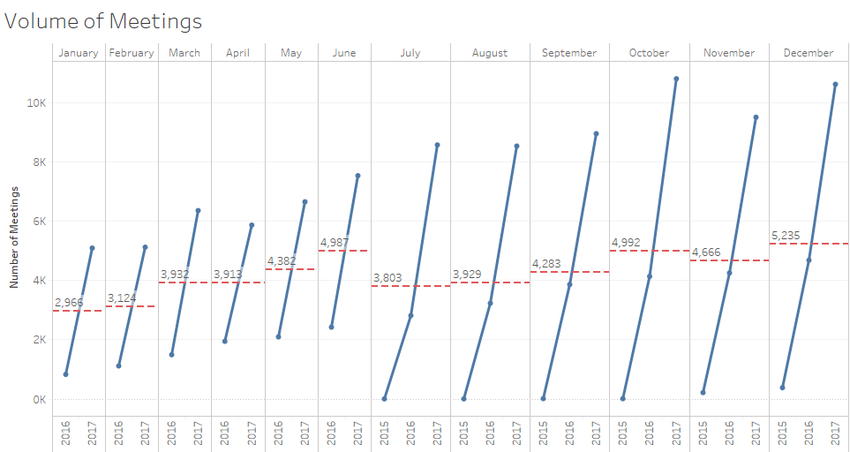
For Meetings, the number of meetings present increasing, but it cannot indicate that the company operational perspective was doing well.
The full picture of the company operational scenario indicated by 4 types of activities. Based on the changes on Purchase, Calls and Emails in 2015 – 2016, the company ran a good business. However, the company witnessed a down trend in 2016 – 2017. Click here to view Tableau of the full picture
Question 2
Insider try to tell the suspicious purchase is?
After applied Fruchterman Reingold layout method to the suspicious dataset, edit Area = 10000, Gravity = 15. After that, I ran Betweenness Centrality and Eigenvector Centrality, rank the size and colour according to these 2 statistic measures. Betweenness Centrality is a measure of centrality in a graph based on shortest paths, represents the degree of which nodes stand between each other. Eigenvector Centrality represent the importance of the node. A high eigenvector score means that a node is connected to many nodes who themselves have high scores. The larger the circle, the higher the Betweenness Centrality value, the darker the colour, the higher the Eigenvector Centrality value.
The first picture shows the entire connection for all suspicious nodes from insider. The second one filter only show the purchase. We can see that Rosalia requested a purchase from Jenice.


